Best Of
Re: Spending Plan Redesign: Share your feedback here!
The Idea post for column selections sticking can be found here:

Re: Spending Plan Redesign: Share your feedback here!
I do not like the new Planned Spend set up. For one the bills are all lumped together. I preferred to have the Bills, Subscriptions and transfers/Credit Cards all separated out and I do not want to have to filter by each category when I want to look at that category. I want to see an overview of Bills, Subscriptions and Credit Cared/Transfers at a glance and not in one long list.
Secondly, the columns in the Planned Spend are cluttered and the width is not appropriate. The date field specifically is very wide which shortens the column width for the Payee and category which are cut off. Additionally, if you modify the columns it resets to default when moving between different planned spend categories. Modifying the columns to revert back completely defeats the purpose of modifying the columns. Some people may want the other columns but we should be able to choose which columns appear and that setting should stay when navigating between categories. Please fix the default width of the date column so it is more appropriate and allow column modifications to actually save.
Thirdly, The Income and Bills have excluded transactions as a separate field below the main section. Please put it back in the main section and not separate. I want to see all the transactions in that Category and not have to click extra buttons to see it or scroll through a wasteland of extra landscape of screen to view the excluded transactions.
Personally I do not care for the Spending Plan updates. Too "unicorn and rainbows" and less financial business. Please revert it back to the previous version or at least give the option for those who really find the new updates inconvenient and not conducive to monitoring and planning financial budgeting.
 DME0177
Re: Spending Plan Redesign: Share your feedback here!
"I have to manually resize or hide columns, and worse, it doesn't even remember my preferred setup as I navigate between sections!"
It's a bit weird and inconsistent.
- In Other Spend, it remembers the column setup as you click on different category bubbles.
- In Planned Spend, it doesn't remember the setup when you open different planned expense items.
 DryHeat
Re: Spending Plan Redesign: Share your feedback here!
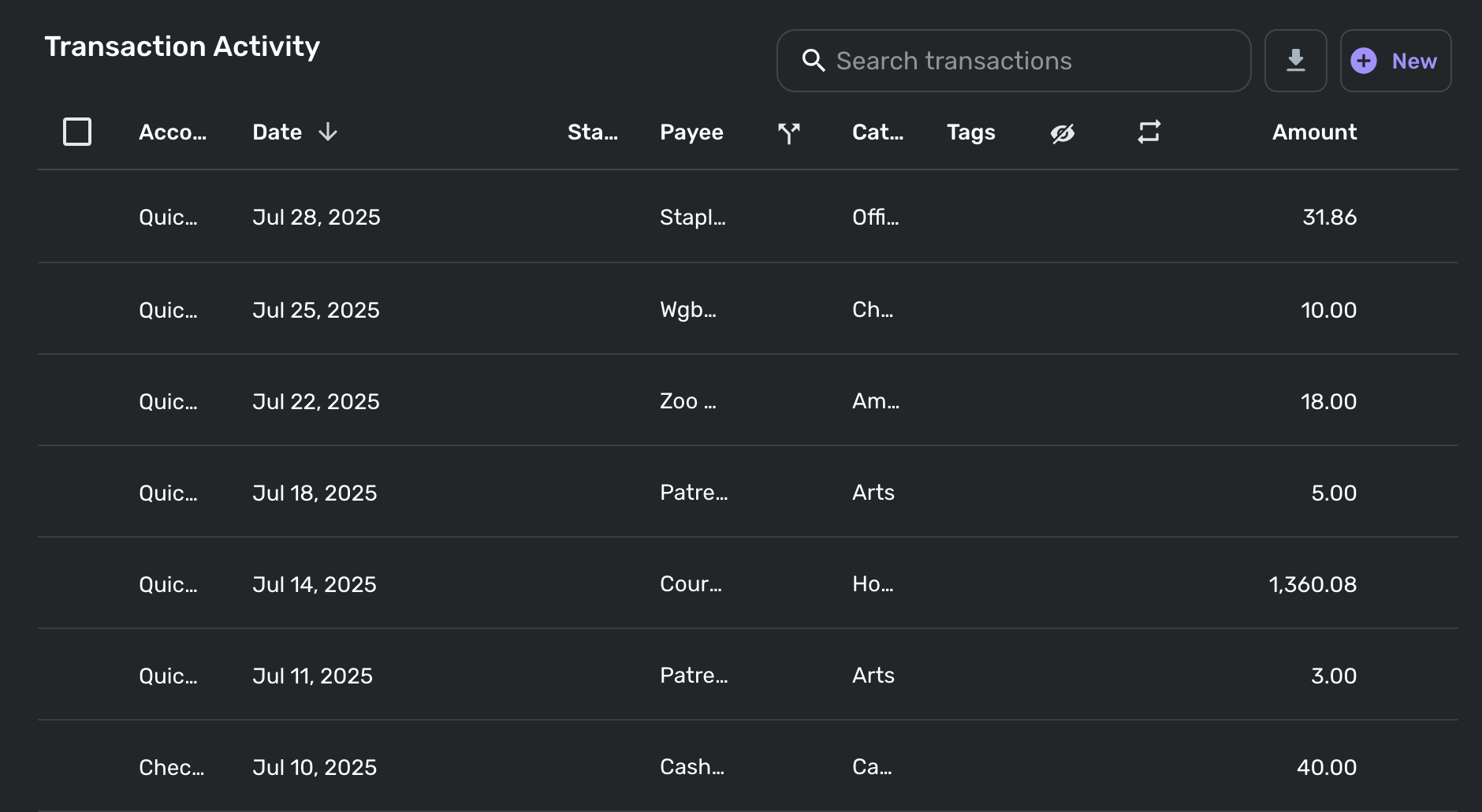
I just opened the new spending plan on my laptop (13" Macbook Air) and the itemized transaction activity for each section is completely unreadable, presumably because that horizontal real estate has been taken up by non-collapsible navigation categories (Income/Bills/Planned Spend/etc.). Now in order to actually be able to see the information I want for transactions, I have to manually resize or hide columns, and worse, it doesn't even remember my preferred setup as I navigate between sections!
Please add some kind of default setting or built-in remembered state so I can manually set my preferred column configuration and then not have to worry about it each time.
Here's a sample of my completely unreadable transaction activity in other spend. Note that for me the most important categories are Payee, Category, and Amount, two of which are incomprehensible as-is.
 elewing
Re: Unable to add PayPal Savings (edited)
Apologies for the late reply. Thank you for the update. I will reach back out and try to get this handled for myself and others. The last email chain I have is them asking for more files/info, then silence. By no means should it have been closed.
rwhoppe
Re: Notifications Reappearing
In this order -
I cleared the notifications in the web app, then went to iPhone. The notifications were still there so I cleared them, closed the app, then went to iPad, the notifications were still there so I cleared them and closed the app.
I then went to iPhone, opened the app and paused notifications and closed the app. This paused them on all 3 devices. I then checked the web app on my Mac, and 2 of the notifications reappeared, so I deleted them again. They did not reappear on the iPhone or iPad.
I turned notifications back on using the web app on my Mac, and disabled all of those I don't care about.
I currently have the app open on all 3 devices, and the notifications are empty on all 3.
I'll come back whenever notifications come in and report whether or not this has worked.
Thanks again.

Re: Spending Plan Redesign: Share your feedback here!
I also think that bills and subscriptions make sense together, but I'd want transfers to be separate from that.
EL1234
Re: Spending Plan Redesign: Share your feedback here!
I understand the not-entirely-positive reactions I have see in this thread.
But, on the whole, I much prefer the new Spending Plan layout.
I think the main navigation bar is better to look at and gives a more immediate understanding of how the pieces of the Spending Plan fit together.
And I like having Regular bills and Subscriptions in one listing. (I seem to be alone on that.) Conceptually they are very similar to me and prior to using Spending Plan I never segregated them. Sure, it's nice to be able to filter the list for one or the other. But having them all feed in to one negative number makes more sense to me.
I admit that having Transfers in a separate section might make even more sense. I would put it between Income and Bills with a +/- sign because Transfers can go either way. But I can live with that the way it is.
Spending Plan retains some of the flaws from the previous iteration — in particular the inability to preserve column layouts. But I think it's a big improvement.
DryHeat
Re: Ability to sort or rearrange Planned Spending/Spending Plan items (edited)
Sorting Planned Spending Items:
If you added expense items to your Planned Spending some time ago you may have just selected a Category and left the optional expense name blank. If so, those expenses may not sort correctly by name.
To fix it, just edit the expense, type in the name, and hit Update. Now the sorting should work. (Newly created expenses will fix this for you from now on.)
DryHeat
Re: Spending Plan Redesign: Share your feedback here!
"I think you are missing the point though that the old Spending Plan let you see all 4 things (Income, Bills, Subscriptions, Transfers) and their individual subtotals on the same page…"
No, I understood your point. Seeing the subtotals was very important to you and you want that back.
But it wasn't important to me. I always did my month-to-month comparisons by flipping through the expanded bills lists, then the expanded subscriptions lists, etc. So the new system works fine for me.
We understand each other… and we agree on moving the Transfers out. We just don't agree on everything.
DryHeat