Best Of
Re: Reconciling the Accounts (Checking, Savings, Credit Cards, etc.)
I don't reconcile at all as I just double check with Quicken Classic. Between the two, I catch any errors I've made.
Your method seems as good as any. Some people just use the review column. They leave all their transactions unreviewed (marking unreviewed any transactions that Simplifi automatically marks reviewed) until they get their statement.
 SRC54
SRC54
Re: Spending Plan Redesign: Share your feedback here!
I believe @DryHeat is right as mine were not sorting alphabetically either and the first three random have no Expense Series Name specified. They sort correctly on amount.
I added the default name into the Series, and now it is alphabetized.
SRC54
Re: Spending Plan Redesign: Share your feedback here!
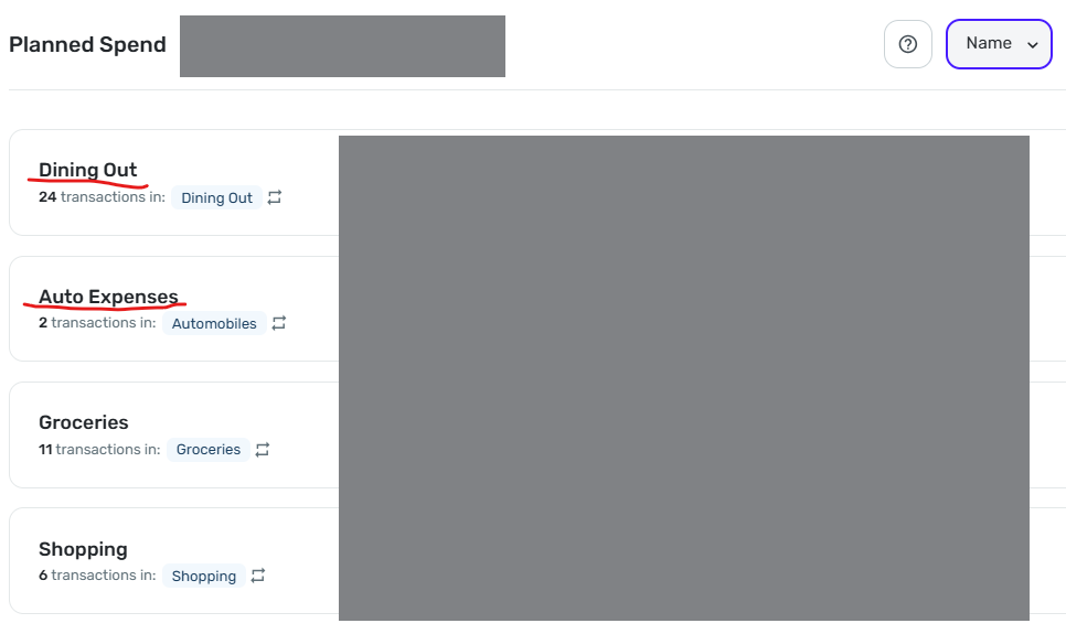
Sorting by Name does not work correctly.
As you can see in the image below, "Dining Out" is sorted above "Auto Expense." This persists even if I sort by amount, then resort by Name (as I did multiple times before taking this screenshot).
 DryHeat
Re: Unable to create a 2nd or 3rd space
You won't have to recategorize existing transaction in your original space.
However, there seems to be no way to move an account (including any categorization work you have done on it) into a new space. And if you delete it in the original space and add it in the new space you will be back to square one for that account.
(NOTE: This is based on my experience several months ago. But I don't think it has changed.)
DryHeat
Re: Spending Plan Redesign: Share your feedback here!
@Coach Natalie — "Have you checked in other browsers or anything along those lines?"
Yes. Chrome & Edge. Same result.
However, I believe I have discovered why it malfunctions. I believe Simplifi treats the name as "empty" for purposes of sorting when the default name is used for the "expense series."
As you know, the "Expense name (optional)" field is, well, optional when creating an "expense series." If you don't enter a name, the series automatically uses the name of the Category.
"Dining Out" is the only expense series where I left the optional name blank and allowed Simplifi to provide the name by default, like this:
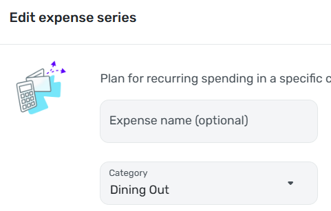
For all my other "expense series" I typed in the name myself, like this:
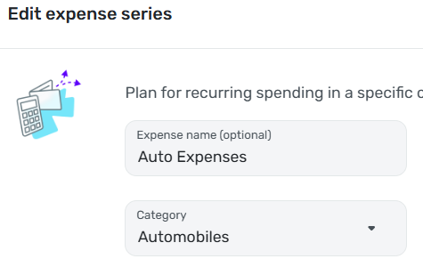
I tested this idea by manually entering "Dining Out" in the "Expense name (optional)" field. This caused the Name sort to function correctly.
NOTE: I believe this to be a bug, but I hesitate to suggest that. The response to other "bugs" I have reported has been that Simplifi considers something a bug only if there is no way for the user to work around it — which I obviously can do here. However, I have the advantage of having spent years in software development. I'm not sure a typical user would easily figure out that the fact that the expense series is labeled "Dining Out" doesn't mean that Simplifi will treat it as being named "Dining Out."
DryHeat
Re: Spending Plan Redesign: Share your feedback here!
I really like the look of it. Especially having the numerical operators on the left hand side illustrate what is happening with the budget nicely. You guys did great!
I second SRC54's comment - "Spend" should be corrected to "Spending"
 zilacus
Re: Spending Plan Redesign: Share your feedback here!
I can appreciate Income being separated from expenses, but lumping subscriptions in with bills just makes things more messy.
Right away, it feels more difficult to be able to tell what has changed from one month to another, and it requires more clicks to be able to see month to month on bills and subscriptions directly from the Spending Plan. It's always been very important to me to be able to see these things separately at a glance, since bills are a necessity and subscriptions are something I can control if I need to. One category in the left panel with two separate dropdowns in the right panel with their own totals would make much more sense to me.
I do appreciate Goals being their own category now though. I would like to see them above Planned and Other Spending though, since they're static numbers.
djob13
Re: Spending Plan Redesign: Share your feedback here!
Column customizations in Planned Spend and Other Spend are not "sticky."
Unlike in the main Transaction Activity lists for accounts, your column customizations in Spending Plan are lost if you move away from the list. You have to redo them each time.
The lists in Planned Spend and Other Spend are using the new column customization system that allows you to select, move, and resize the columns to see the information you want. That's good, but…
—In Planned Spend the customizations are lost when you move from one Planned Spend expense to another. So if you customize the columns while looking at "Dining Out," for example, you have to do it all over again when you switch to "Auto Expense."
—The situation in Other Spend is a bit better. The customizations are maintained as you move from one expense bubble to another, but are lost if you switch to another section (Bills, for example) and then switch back.
DryHeat
Re: Spending Plan Redesign: Share your feedback here!
Things I like
- It's colorful and looks nice
Things I don't like
- I used to be able to go to spending plan and scroll down to see my transfers. Now I have to click spending plan, click bills, click the dropdown and select transfers.
- I can no longer hide one side of the transfer. The positive side of the transfer is greyed out because I have it hidden from the spending plan but it is still tied to and underneath of the negative side of the transfer. I no longer have the option to completely hide those.
For some added context; I have recurring transfers setup for my credit card bills every month with the average amount for them. This allows me to look at the projected cashflow for my bank account and include the average spend on those credit cards to give me a pretty good idea of projected cashflow. When I originally setup simplifi I wasn't able to find another way to do this. If there is a better more preferred way to accomplish this I'm willing to redo my setup. Looking forward to others feedback here as well.
Btbkilla
Re: Spending Plan Redesign: Share your feedback here!
New Spending Plan went live for me so I am testing it this morning. Very pastel (I'll say no more concerning the pale colors). Overall, I like the new organization.
Comments:
I wish we could sort Bills, then Subscriptions and then Transfers seeing each list one after the other instead of just showing all Bills or Just Bills, just subscriptions, just transfers. I am sure I will get used to it, and it is more logical to combine them this way.
I still don't like using the verb spend as a noun when a perfectly good noun, spending already exists. Planned Spending and Unplanned Spending would be clearer and better usage too.
Question:
I have noticed that the new Spending Plan automatically includes split transactions that include spending and/or income with transfers splits. Is this new or did I just miss it before? I haven't had any of those lately. But again, it makes sense to include those transfers since you would want to have the spending and income accounted for.
SRC54