Best Of
Re: Reconciling the Accounts (Checking, Savings, Credit Cards, etc.)
I use that method (marking transactions as Reviewed) and while it's very useful, it's not foolproof. For example, I noticed about a couple months in that my Target Redcard wasn't syncing transactions. If a transaction got deleted by mistake (either by me or due to a glitch in the system), that would also fall through the cracks unless I noticed it.
(Because Simplifi also pulls in account balances, that wouldn't affect my cash flow projections, but it could affect the spending plan).
 EL1234
Re: When editing transactions, don't automatically mark them as 'Reviewed' (edited)
When working with transactions, if you change the flag from one color to another color, then the Reviewed will change from being unmarked (not reviewed) to reviewed (green). I recommend a change to have the Reviewed to be a manually selected field. I use a flag (purple) to denote that a transaction has been cleared or is pending and then when I reconcile the statement, I change the flag to green and manually click the Reviewed. This way, I can easily search for the transaction that have been reconciled and the Reviewed matches.

Re: TIAA Reporting Connection Issues
I've had the same fdp 155 error for months! Is it really bring worked on? When I contacted support they just offer me lifehub. Why try something new if the problem persists? On a lark I tried [removed - competitor mention] and it worked with tiaa, so it's definitely a quicken thing.
Re: Recycle Bin for Deleted Transactions (edited)
FWIW, I think the ideas of "Recycle Bin" and "Auto Backup and Restore" are very different. I don't think providing one will effectively handle the need for the other.
A Recycle Bin is usually used on an object-by-object basis to examine and perhaps restore individual objects (in this case transactions). For example, Windows Explorer has a Recycle Bin where you can look at recently deleted files and bring one or more back if needed.
An Auto Backup and Restore facility is usually used to save the state of a full system — such as a database — so that the entire prior state can be restored in case of serious disruption. For example, SQL Server provides such a facility to preserve and restore entire databases to an earlier state. But everything done after the backup is lost.
 DryHeat
Re: Spending Plan Redesign: Share your feedback here!
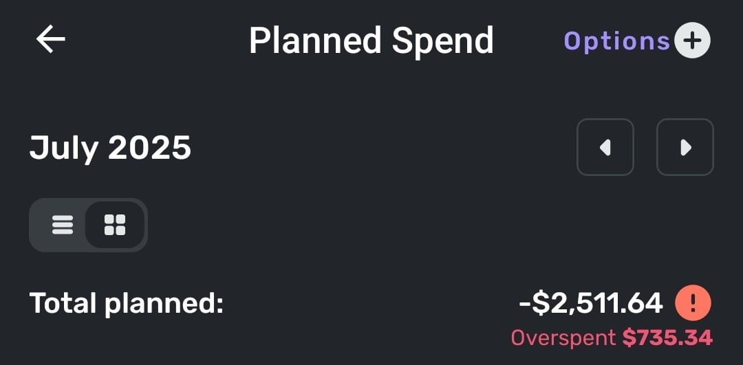
In the Planned Spend view Simplifi seems to be insisting I've overspent, despite not currently having any categories of planned spending that are overspent. Unsure if it's using my current categories today as its baseline or if it's using what they were on July 1, as I did modify them over the course of the month. If it's the latter I would suggest that this view instead uses current categories.
onyx
Re: Spending Plan Redesign: Share your feedback here!
Reference: Mobile View
I’m sorry, but the redesign of the Spending Plan is really disappointing. Visually, it’s unattractive, and more importantly, the user experience feels like a step backward. It now takes multiple clicks to access information that used to be available in one clean, consolidated view. Before, I could move between spending categories and see breakdowns all in one spot. Now, trying to compare something as basic as bills versus subscriptions takes three separate clicks.
The original interface didn’t need a full redesign. It worked well. What it needed was refinement of the existing features, not a complete overhaul. For example, it would’ve been much more helpful to expand the functionality by allowing planned spending items to show up in the cash flow view. That’s a practical update that would’ve improved usability without compromising the simple layout that made this app stand out.
If other users like this new direction, fine, but is there at least an option to toggle between views? Because what drew me to Simplifi in the first place was how intuitive and clean it felt. This redesign trades that clarity for complexity.
And honestly, if you’re looking to improve functionality, a better use of development time would’ve been enhancements like making split transactions more flexible, being able to tag or link parts of a transaction to different subscriptions/recurring bills. That’s what users like me have been waiting for, not a cosmetic overhaul that makes navigation harder.
 Beltifi
Re: Spending Plan Redesign: Share your feedback here!
It doesn't show on the dashboard, but it does show when looking in the Spending Plan. So, it's not totally gone, just not available at a glance.
I don't want to speak for everyone, but this entire update feels very form over function to me. Not everyone uses the app in the same way though or will agree on how things should be setup. A change that's great for one person is probably going to be terrible for another. I think it would make sense for the UX team to try to focus more on customization going forward, just as a suggestion.
djob13
Re: Spending Plan Redesign: Share your feedback here!
The Spending Plan redesign took the most valuable part of Quicken Simplifi and made it worse. I am not a fan of the redesign.
Let me start off by saying that the Spending Plan is the reason I use Quicken Simplifi. No other budgeting software I have tried has automatically allowed me to setup Bills and Subscriptions and Transfers as their own bucket in the Budget/Spending plan without having to mess with categorizations of transactions to force create Fixed and Flexible buckets. I want my budget to tell me just three main things:
1) what is my Fixed burn rate (i.e. Bills/Subscriptions and Debt Payments/Recurring Transfers that are out-the-door expenses that I've obligated myself to pay each month and either cancelling the payment is impossible without an asset sale of some sort or cancelling/adjusting the payment requires cancelling/adjusting a service I'm signed up for),
2) how much is left to spend after my Fixed burn rate is subtracted from my expected Income, and
3) how much is then left to Save after my expected Planned expenses (e.g. gas, groceries) and "Other Spending" allowances are covered.
I also want my budget to be easy and nice to look at so I don't avoid glancing at it when I'm making purchasing decisions.
The old Spending Plan covered most of my needs. It had a clean and simple design with the totals/what's left numbers being in large font and bolded where appropriate. The numbers were also the primary focus in the desktop version with its top-down design versus the left-right design of the new Spending Plan which makes you focus on the icons and the words first and so the numbers become a secondary feature that you have to train your eye to find on the page. Ultimately I don't like the new aesthetics/layout and thought the old version aesthetics of the Spending Plan to be much better in the desktop app and better focused on the important information, i.e. the numbers.
The old design looked much better on the Mobile version too with the pie chart front and center instead of being squished at the bottom like the new version has it since the left-right buckets are taking up 2/3 of the screen. I'll argue that when you are out shopping and want to quickly glance at how much flexible money do you have left to spend, the pie chart and the "Left this month" number are the only information you need in the moment to make a decision. So this should have front and center attention on the mobile version and the bucket details should go back to having a small focus on the page so you can go dig in if you want but aren't distracted by the clutter if you just need to know "how much do I have left this month and is it enough to splurge on a Starbucks coffee".
I also loved the collapsible sub-categorization of the Income/Bills bucket in the old Spending Plan. You got each sub-category (Bills/Subscription/Transfers/Income) sub-total in big font numbers and you could leave the categories collapsed for normal glancing through without the transaction clutter or if you wanted to dig in you could expand to see the transactions easily. The new Spending Plan destroyed all of this by creating a cluttered mess of a transaction register that is now everything that is a Bill/Subscription/Transfer and tried to pawn off a Filter drop-down as a viable solution to having messed up what was a good thing with the collapsible sub-category view. Also the sub-totals for each sub-category if you do Filter the Bills bucket are in TINY font. The individual transaction number fonts are much bigger than the highly valuable sub-total number. A budget should be simple to use which means total numbers need to be the focus of everything and detail views there as supporting actors for detailed monitoring and troubleshooting.
Now to get into some mechanical changes. Removing Savings from Bills/Income was the right move and will always be the right move. I approve of this entirely. When budgeting, I need to make sure my obligations (fixed expenses) are covered and that I can buy groceries and gas and pet food (Planned spending). After that, I can assess how much I can allocated to Savings versus giving myself free reign as Other spending. So while savings needs to be a priority when managing finances, it is also is one of the most flexible buckets that will ebb and flow as Fixed expenses change month-to-month (e.g. less available for Savings in months where semi-annual insurance bills hit or annual subscriptions like Microsoft 365 hit) or if emergencies happen (e.g. roof replacement). I usually keep my Savings goal automatic monthly allocation to zero and then may set custom amounts each month based on how much is indicated as "Left available" for the month. Or I just have a savings target in mind for the month and aim to keep my "Left available" above that target (e.g. if I want to save $2k then my left available needs to stay above $2k for that month).
Splitting Income and Bills/Subscriptions/Transfers is more controversial to me, and I ultimately do not like it at all. The only thing I think was missing on the old version was a total number on all the expenses sub-categories in the Income/Bills bucket. But you could easily math this yourself by subtracting the "left to spend" number from the Income number. Savings being in the mix in the old spending plan could make this more complicated if you didn't have your savings set to zero. But other than Savings being in the wrong bucket (always needed its own bucket), the old Spending Plan was NOT BROKE. That's my opinion, of course. It is nice seeing the Bills total number emphasized in the new version, but now I have to math the "left to spend" number myself. Which makes cross checking the Planned and Projected Other spending buckets against what is left after Bills a bit more annoying. I'd rather see the old version re-introduced and simply add that "Bills total" number somewhere (like an extra collapsible bucketing around the Bills/Subscriptions/Transfers).
If there's absolutely no going back to combining the Income/Bills buckets in the Spending Plan, then at least go back to the old view's collapsible sub-category bucketing for the Bills. Or add a toggle button so people can have that old view or the new transaction register hell view if they prefer.
Last complaint, there's no quick navigation button in the desktop version that I can find to jump you back to "Today" (i.e. current month) if you are looking forward many months in the Spending Plan. Did confirm the Today button is alive and well in the mobile version, but I don't see it in the desktop version. Would be a helpful add if this is a miss and not just me being blind.
TLDR overview of change requests on the new Spending Plan:
- Lean back towards the aesthetic of the old desktop version Spending Plan to focus more on numbers and less on unimportant details (i.e. less on words)
- Revert the mobile version back to the old aesthetic with the focus on the "Left this month" number and pie chart
- Keep Savings separate and everyone wins (i.e. don't change what you've changed; it's perfect)
- Lump Income/Bills back together but give Bills an extra collapsible total category that gives Bills total sum
- Or show somewhere the calculated "Left to spend" after Bills section expenses so we don't have to manually calculate that ourselves going forward
- Go back to collapsible sub-categories in the Bills section instead of a filterable register that is horrible to look at and use
- Add the Today quick navigation jump back to current month button in the desktop version
Edit: We also need a view option in Bills to hide the "Excluded from Spending Plan" side of transfers. I excluded those for a reason and don't want them junking up my Spending Plan views. A button or setting option to hide those would be perfect.
Re: Spending Plan Redesign: Share your feedback here!
I like the new aesthetic! The layout and colors work very well.
I must agree with many others that Bills and Subscriptions (and Transfers) should be separate.
Also, the usefulness of the spending plan is limited as long as we are hindered by the functionality of Savings Goals. We need more flexibility with the savings goals. The solution of hiding savings goal transactions from the spending plan is insufficient because you cannot hide individual splits in a split transaction, and - what is more - it defeats the purpose of having a budget.
It seems that the ability to "Release to Spending Plan" would be a relatively straightforward upgrade, given that a similar function already exists for Planned Spending. It wouldn't be a perfect solution, but it would address a couple of the biggest shortcomings of Savings Goals: a) the inability to treat a withdrawal from a savings goal as a credit to the spending plan, and b) the inability to release planned savings to the spending plan. Since contributions to savings goals are debits against the spending plan, it seems logical that withdrawals from savings goals would be credits back to the spending plan.
Thanks for your hard work to continue making Simplifi more useful to all of us!
azs0018