The new (early access) web UI is not going in the right direction

I'm (was) on Version: 4.59.0 (32308/fc3f026f9b/v103.5.4-patch-1)
Context: I do most of all my activity on a computer via the keyboard. Keyboard shortcuts and all.
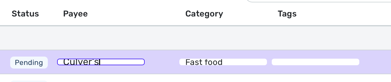
The new Transactions layout is very disruptive.
- It takes way too much space for the information displayed. So it's just a large waste of screen real estate :( there is enormous padding between each columns, you see less of the text and more of empty blank space.
- it feels more sluggish than the previous transactions UI was, which is really unfortunate.
- the search bar now imposes that you search numbers by indicating whether it is postiive or negative?! Why? When I look for "50", I want to see all transactions that have 50 anywhere in the transaction fields, not just credit transactions for the amount of $50, filtering out debit transactions for $50. This doesn't make sense to me.
- Hitting [tab] after entering a note wipes the note away. You need to press [enter] instead. Not sure how many notes I'll lose before relearning this one.
- Hitting [tab] after choosing a category does not go to the tags cell, it goes somewhere else, not sure where. Need to bring the focus back with the mouse/trackpad :(
I have reverted to no early access and I am praying that someone from Simpilifi Product sees this and corrects course before it is made into the new Generally Available version.
Comments
-
I tend not to use Keyboard Shortcuts as much (other than tab to switch fields), however, I agree the amount of "reserved" whitespace is a bit much.
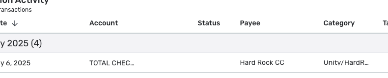
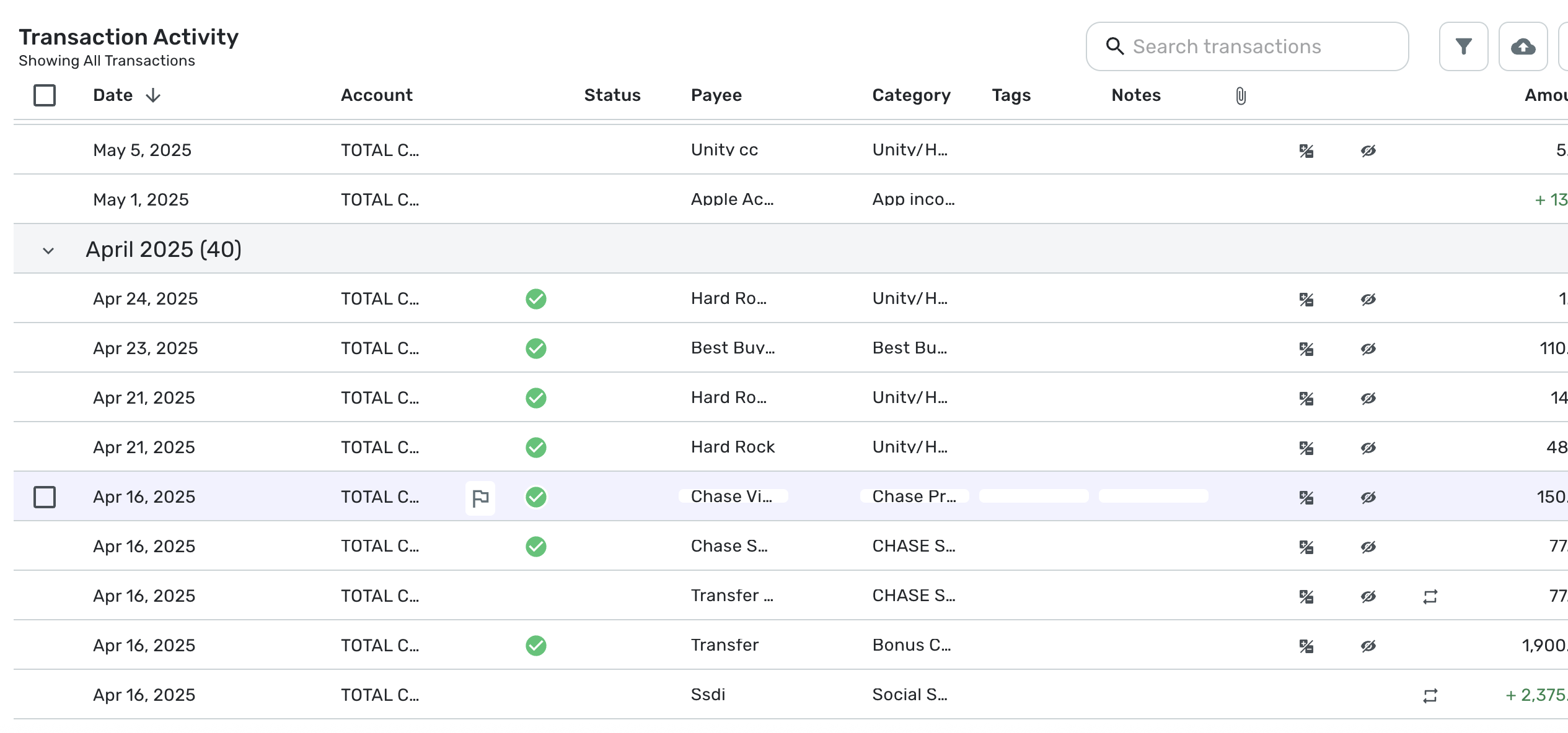
I'll post a screenshot (but limit dollar amounts) to illustrate - I turned on every single field offered, but things like account name, payee, and category are being cut off when there's enough room to display either the whole text or significantly more for them. - "TOTAL C" for example when if you removed spacing you could fit "TOTAL CHECKING" easily - yes, i understand the need for some whitepace, but look at the amount of space after the date field, the dates will never really be much longer than that:

—
Rob Wilkens
1 -
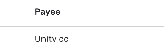
I went into Simplifi for the first time in a couple of days, and the Payee and Category fields in the register have changed. They now have a VERY short height—shorter than the font size of the text within it.
I have tried opening Simplifi in both Chrome and Safari, and this issue is the same in both. I've attached a screenshot below of the too-short input cells/rows.
Are others experiencing this?
 2
2 -
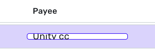
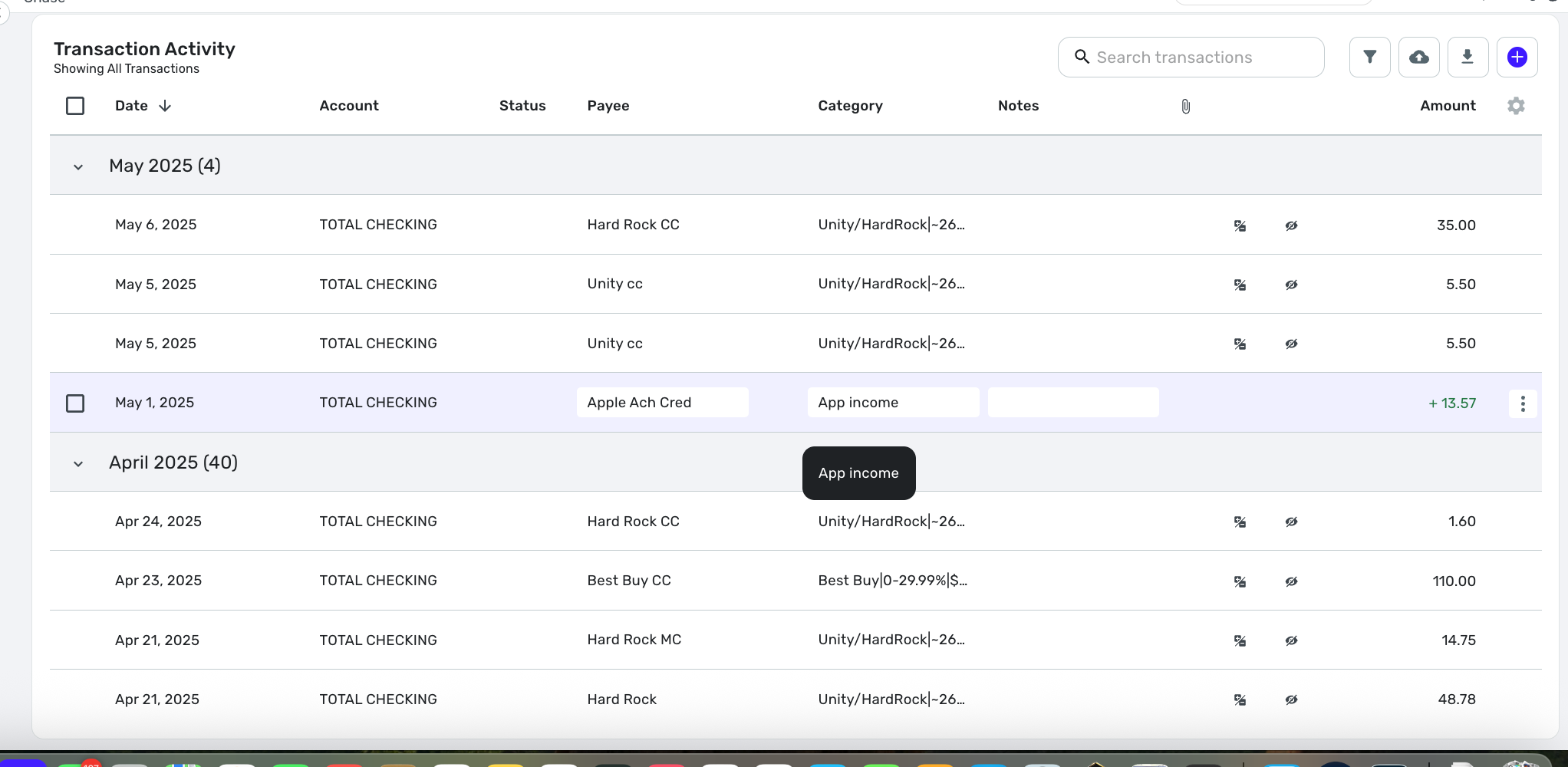
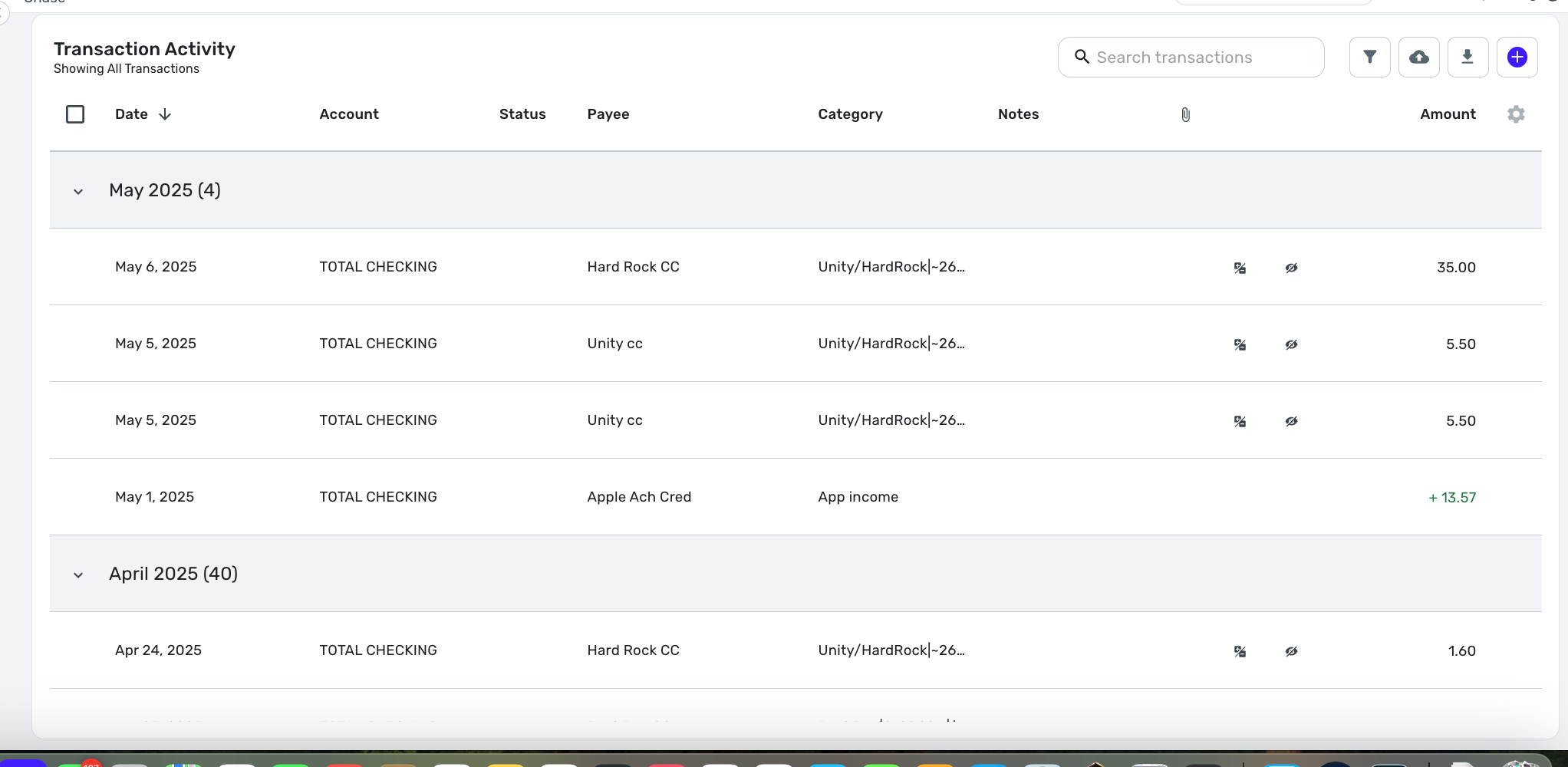
Also, funny enough, i just in the last version of my app fixed this exact kind of issue, look how the "y" gets cut off on the bottom in the payee name -
It looks like "Unitv" but it's "Unity"
If I try to edit inline it it's worse:
—
Rob Wilkens
0 -
Comment deleted. No longer relevant.
0 -
Right at 10:08 when you posted here (and you included a register at the time, i noticed you removed it on edit), I also posted something about this (in reply to someone else talking about it) here
If I were Simplifi's Product Team, I would back out this change, but don't lose the code, it's clear they are working on something, take the feedback we've given them, bring that code back into alpha testing, and put the last "good" version back on the website for now. I'm sure the transaction register is a separate source file, and as such, ideally, they'd just be able to back out that one change (maybe the whole version temporarily).
-Rob
—
Rob Wilkens
0 -
+1 on there being too much vertical padding. If the team does decide to go in this direction as the default please re-add the "Tight" option to Row Height for people who are okay with the higher information density
3 -
Horizontal AND vertical padding should either be smaller or have options to allow that.
However, the vertical height reserved for the text display needs to be slightly increased, or the font size needs to be decreased.
I agree that on TV (like the commercials they run on CNBC, I've seen), the better spacing is easier on the eyes, but for those who want to be able to view more of their data at once, a more compact view would be a good option to offer.
—
Rob Wilkens
2 -
Okay, interestingly enough to me, when I go to my lower resolution monitor (not the higher resolution monitor in HiDPI mode), there is PLENTY of room to display all the text in every field of the transaction register.
I think they need to test this app in development in HiDPI mode.
The way I turned this on on my Mac Mini (with a non-apple monitor) was to go into display settings, and choose to view all resolutions, and select the highest HiDPI mode available — my default resolution for my main display is 2560x1440 but with HiDPI those two numbers were each cut in half to 1280x720 but it looks much better on the eyes.
But 1280x720 HiDPI mode is where i'm seeing the problems with the register having too compact text fields.
There is PLENTY of room on my 1920x1080 display (which technically offers a 960x540HiDPI setting, which i'm now not sure i want to even think about turning on).
-Rob
EDIT: Zooming way out (to 50% zoom) lets the HiDPI higher-of-the-two resolution displays better fit all the text in. But at 50% zoom the payee text reserved height seemed to be less than the account reserved height, see:
—
Rob Wilkens
0 -
Way too much whitespace, agreed.
0 -
I guess maybe it's because my account is old.
But my pre-existing "Row Height" setting -
Which can be seen in a screenshot I recently posted (will repost it here soon) had issues…
Turns out my old setting was NOT ONE OF THE CURRENT OFFERINGS.
If I went into the register settings and changed row height, I was offered either "Comfortable" or "Smaller". But both of these were significantly taller than I had before (and I guess "maybe" it's a good thing I can't get back my old setting, as there are issues today.
But the bug I see is that Row Height should probably be checked and set from the existing setting to match today's offerings. If it's smaller than today's settings, it should be changed to match today's settings.
My old row height looked like this - THIS WAS LAST NIGHT AND I CAN'T GET IT BACK:
I believe this is the new way it looks when set to "Smaller" (note: i had to go to 67% zoom on my WQHD monitor in HiDPI mode to be able to read the text on the next 2 screenshots):
So the current smallest setting is larger than what I had.
Also, here's how a larger "comfortable" row height is supposed to look today:
My bug report, again, is that I had a non-existent setting before, and there were display issues with the old setting on the new transaction register.
—
Rob Wilkens
1 -
Regarding input fields..
Looks like you had the same issue I just reported.
Your account has a pre-existing row height setting, which is not one of today's offerings.
If you go to register settings and change row height, you will see two offerings. Either of the new settings should fix the display problem you reported with input fields. It did for me, anyway.
Just know they're both taller than you have now, and you will not be able to get your old row height back.
-Rob
—
Rob Wilkens
0 -
While I don't hate it, my main complaint is that the rows are too wide apart, but this is somewhat because I use a larger font in Safari. If I decrease the font size, the row height is about right (I used the smaller row height setting in Simplifi) but it is harder for me to see. (Yep, I'm old.)
I am always for more control for the user whenever possible.
Steve
Quicken Simplifi (Safari & iOS) Since 2021
Quicken Classic (MacOS) Since 2009
Dollars & $ense (DOS) and MS Money (Windows) 1987-20090 -
Latest web update now cuts the g, p, y etc. letters in Transactions.
0 -
This update is HORRIBLE! Who asked for this, with so many other important items in the backlog?
Please shrink the row heights and bring back the ability to mark "Reviewed" on hovering over a line item.
Please! Thanks…
0 -
I agree that the new UI updates to the transaction list are worse than before. The new row height options are both way to tall to see a decent amount of data at once, and I can't get back to my old setting. And the default column widths don't make a lot of sense - too much space to display tiny icons for exclusions/recurring, and not enough space to show more of the text fields. I know the columns can be re-ordered and re-sized, but its very difficult to make the adjustments I want and have it preserve them. The old layout was much more sensible to me even in its default arrangement.
1 -
Hey everyone, thanks for the feedback!
The new account register design was not intended to go live yet. This has been corrected. Keep an eye out for an announcement in Updates From the Product Team for when this feature does go live! At that time, we will also have an official feedback thread.
Thank you!
-Coach Natalie
3 -
Thank you for all the great feedback.
Sorry, this is totally on me. A couple of weeks ago, I set up our system to turn this feature on with the 4.59 release, thinking we would be ready, but late last week, we decided it needed more work, and we decided to postpone it. Unfortunately, I forgot to change this in our system so…oops.
We understand that the transaction list is probably one of the single most important features in the product and where most of us spend a large amount of our time when using Quicken SImplifi. This is why we've been working on replacing it for quite some time. The new register is supposed to be faster, allow for re-ordering and resizing columns, among a host of other small new capabilities. We want to get it right.
Your feedback is super important and will help us focus on the things that matter to you.Thanks again. We'll keep working on it.
4 -
Anyone notice recently that under Early Access that the 'Tight' Row Height option was no longer available. I do see it when I switch off Early Access.
Please do not remove the Tight option.
Thanks
0 -
I'm happy to report that the too-short input field is now resolved in my interface.
1 -
Yup. My thanks to the Simplifi team for a quick update that restored the search amount +/- issue and the squeezed textbox issue.
Btw, Ima add to the whitespace discussion by saying that people (me, for instance;) would love a "Super-Tight" or "Ultracompact" setting. Honestly, the "Tight" setting is okay, but still not aggressive enough in presenting data to maximize productivity.
Imho, UI thought leadership has unwisely advocated for sparse data presentation. Don't fall for their talking points. The philosophy makes no sense. I won't indulge a "the wrong people are holding the mic" rant…perhaps you take my point.
Question: "What is the biggest bottleneck in computing?"
Answer: "From the screen to your eyes."1 -
I'm in total agreement with Rob from above postings. The move to a new interface is always a welcome change but it needs to be fully tested in every browser and at every resolution to be sure the functionality is the same across the board. Don't release to the public when there are so many issues. That is not a good reflection on the organization as a whole. Product manager needs to work more closely with developers to make sure what gets pushed out is truly ready to be pushed out. Don't let the developers make that call! I myself have purchased this three times now and after each time have requested a refund because of the issues. We should not have to do that.
0 -
@pst @Sabrina Blue @kgpreet @spamwich @MikeBtp @Anonymous_Stranger @trewbux @MWA @cgoneal
Please check out this request for sessions regarding the new register design!
-Coach Natalie
1


