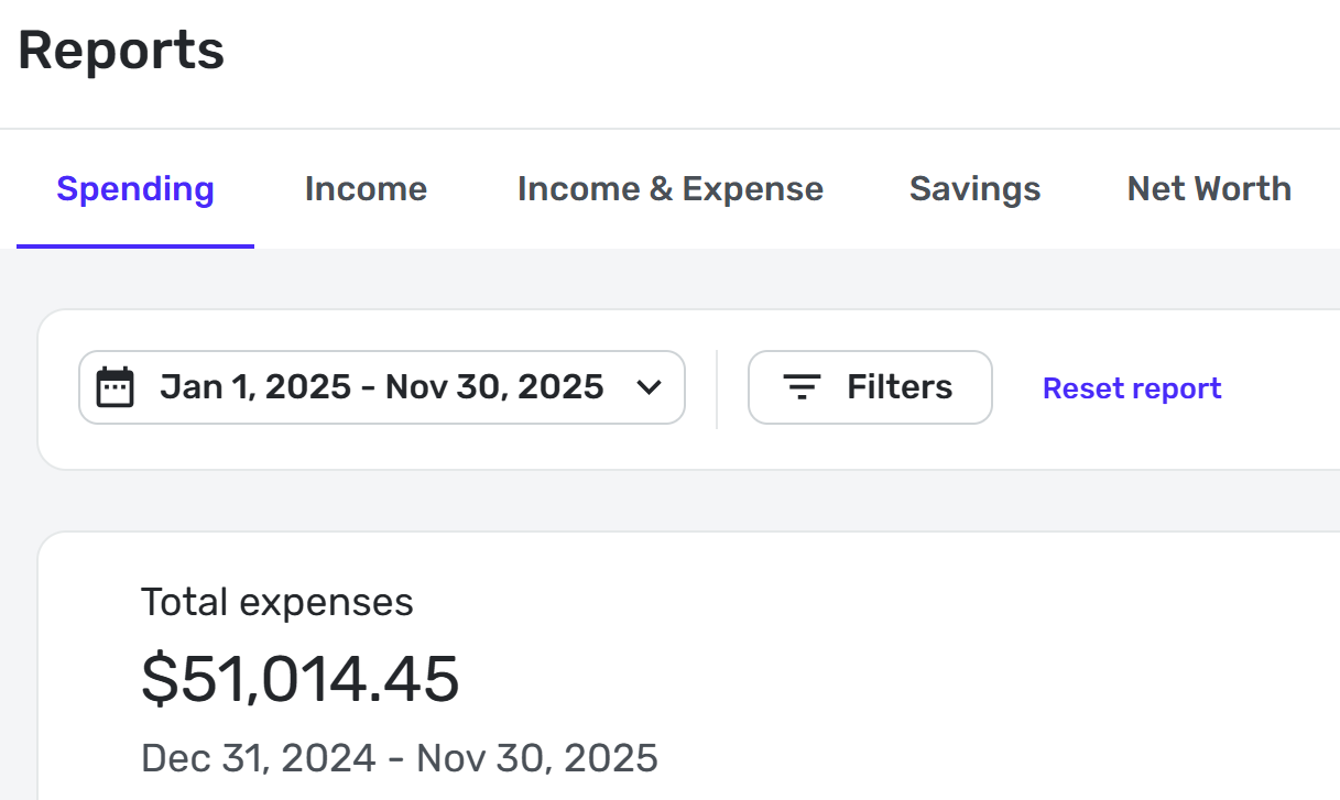
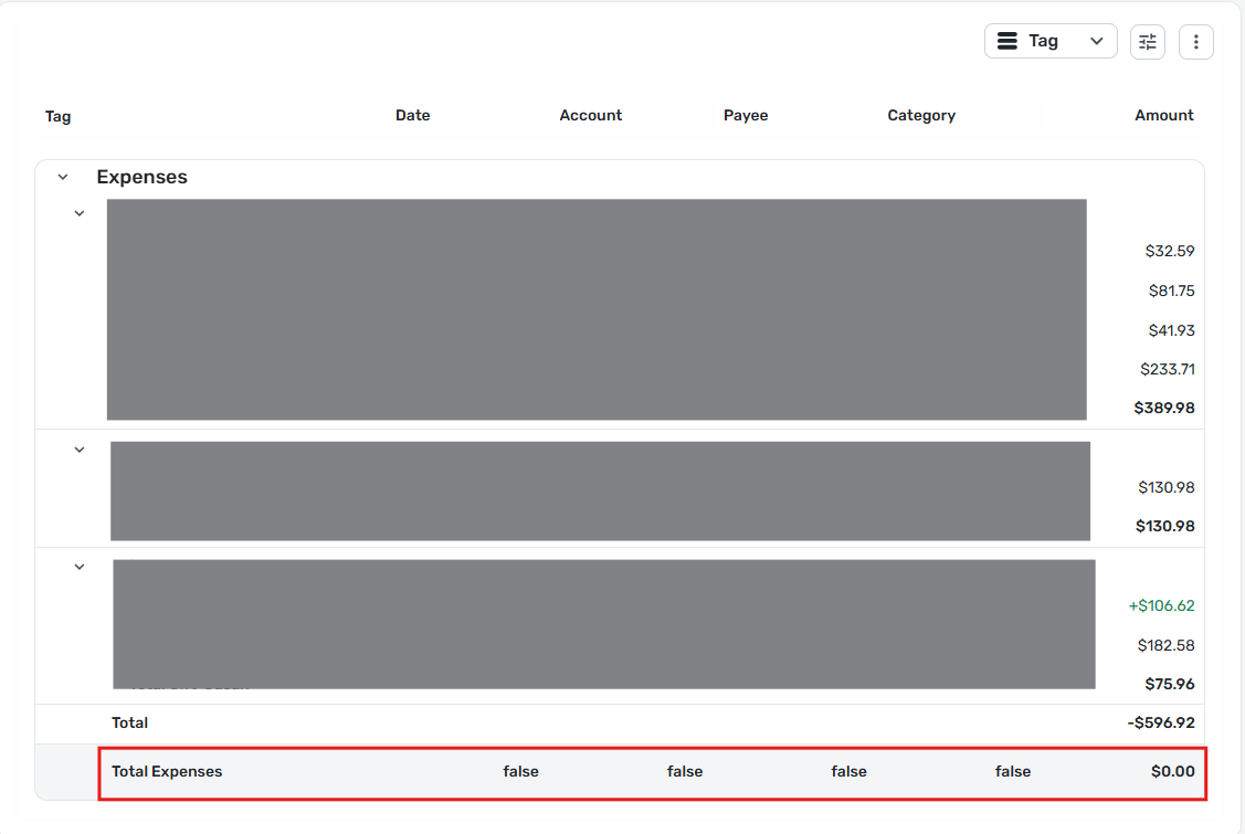
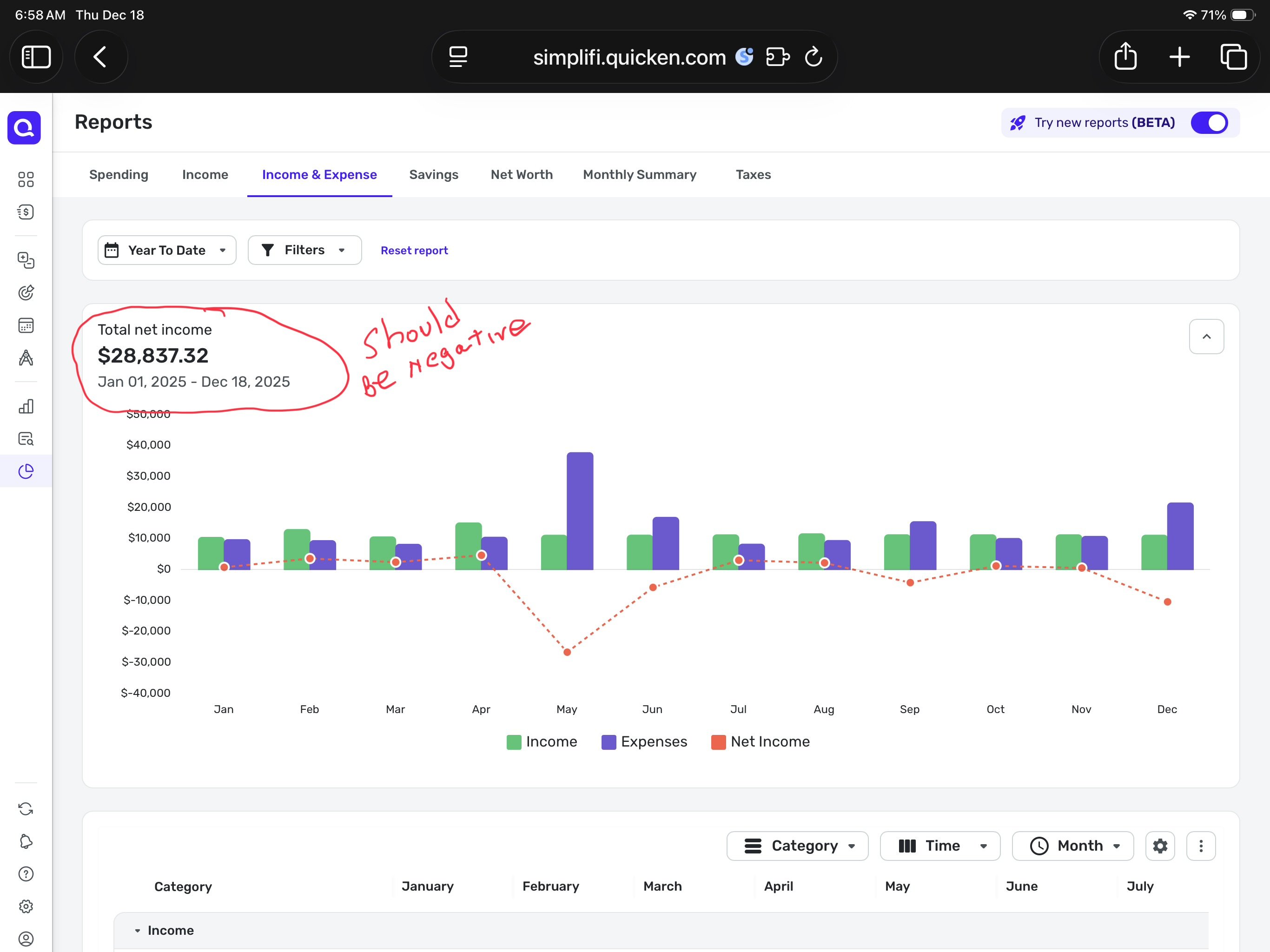
Enhanced Reports: Share your feedback here!

2»

Comments

  • MishaM
    MishaM Member ✭✭✭

    Another defect (not sure if it was mentioned already): Starting date under the total expenses is not the same as the one selected:

    image.png
  • DryHeat
    DryHeat Superuser ✭✭✭✭

    Spending Report line "Total Expenses" shows Amount=$0.00, "false" in all other columns

    I ran a Spending Report by Tag, filtered to show only certain tags (3 of them). The results were as described in title. I am using the BETA reports. Here's an image of the entire report:

    image.png

    DryHeat
    -Quicken Classic (1990-2020), CountAbout (2021-2024), Simplifi (2025-…)

  • RobWilk
    RobWilk Superuser ✭✭✭✭✭

    @SRC54 i believe this matches how it worked for me as well.


    Rob Wilkens - RobWilkens.com

  • Coach Natalie
    Coach Natalie Administrator, Moderator admin
  • BHazeltine
    BHazeltine Member ✭✭

    I was not able to open the net worth report at all. And I think it would be very helpful for the spending report to open with all categories collapsed. As it is, I had to scroll through lots of individual transactions that I wasn’t interested in, or collapse multiple categories that I wasn’t interested in.

  • RobWilk
    RobWilk Superuser ✭✭✭✭✭

    There was an update today, after I applied it, the issue I reported (with respect to 'negative spending') was corrected, awesome. I like the new reports a lot better so far. I realize a lot of work may remain.


    Rob Wilkens - RobWilkens.com

  • jdtrujillo
    jdtrujillo Member
    edited December 4

    DISREGARD - Someone already brought up the issue. Upvoted.

    I noticed that in the new reports (Beta), when you turn them on, you removed a feature that provided excellent visual insight into income and spending trends, which was the "Over Time" graphs.

    Was this done on purpose, or is this an oversight? It would be a shame if you end up taking nice features away in an effort to make things better—just my two cents.

  • SRC54
    SRC54 Superuser ✭✭✭✭✭

    @RobWilk I updated to 4.86.1 today and the Spending Report no longer has the discrepancy. That was fast work. Good job to the team.

    I also like the new reports. I would like the Spending Report to remember the collapsed category settings and to print it that way as well.

    But I am impressed with the fast improvements.

    Steve
    Quicken Simplifi (Safari & iOS) Since 2021
    Quicken Classic (MacOS) Since 2009
    MS Money (1991-2009) and Dollars & Sense (1987-1991)

  • Jenny T
    Jenny T Member ✭✭✭

    Overall, I am liking the new reports as well. Most of my thoughts have all been mentioned in others' comments, but just to reiterate, these are the features I'm liking/disliking so far:

    Liking:

    • The option to display all categories and the donut graph including all of them and not just the top categories.
    • Subcategory reporting appears to be working as I always expected and are "drill-down" instead of them being treated the same as all other categories for reporting purposes.
    • Excited that these changes will be applied to mobile in the future as well! I currently don't even bother with the reports in mobile.

    Possible Bugs:

    • In the spending report, the "everything else" group color in the donut and in the category list don't match (i.e. "everything else" is gray in the list and blue in the donut (same color as the category next to it).
    • In the income report, the colors on all/most of the categories don't match in the donut and list (i.e. Employment Income is blue in the list and red in the donut.

    Possible Enhancements:

    • Ability to resize and manage displayed columns or column order
    • Ability to use more complex filters like before (the standard Filter menu isn't flexible enough)
    • Add an expand/collapse all (or to a certain tier somehow?)
    • Add the option to have no grouping (i.e. grouping = none) so it's more like a traditional transaction list. I know many have said they like the tiered approach/view, but if I'm going to look at details over graphs/dashboard type information, I don't necessarily want to scroll through those extra rows for every use case.
    • Ability to save custom report views
    • Trend reporting (i.e. stacked bar or sankey style); reports should start at the graphical level and then drill into the details. While I overall like the recently introduced Income & Expense report, I still really want this in graphical form (maybe this is the "over time" reporting mentioned as in the works??)
    • Improved date range navigation - for example, a way to look at reports weekly, monthly, quarterly, yearly and scroll back and forth between those periods while retaining the same filters and level of detail. This would be similar to how you scroll month to month in spending plan. It's possible the over time/trend reports could meet this need as long as you can see grand totals, categories, subcategories and transaction details flexibly based on your selection in the charts/graphs. When trying to use the Income & Expense report to do this, you leave the screen to see the transaction detail and have to return to the top and scroll to where you were again.
    • As the report graphs continue to improve, add a report dashboard that shows all of the graphs in a quick view with the option to drill into the details on the additional report tabs. I think I'd want this separate from the similar reports on the current dashboard - almost like a data/trend analysis home page that includes spending trends, income trends, net worth trends, cash flow (past & future), possibly spending plan trends. I would want to choose the default timeframe for each report as well as which ones are displayed for me. Being able to select the same base report more than once with different saved views might also be helpful!

    Thanks for continuing to improve the system and requesting feedback!

  • jc303
    jc303 Member

    Thank you for making the changes to the net worth report! That is immensely helpful. One minor piece of feedback is that from a UI perspective it is not intuitive that changing the filters in the table below the chart is what is needed to change the granularity of the chart itself. I'd have a single set of filters/controls that work for both the chart and the table if that's how it is going to work.

  • FutureEye
    FutureEye Member ✭✭✭✭
    edited December 9

    One of my major wish was ability to export networth data over time. This way I feel like it is my data and I have access to my data. Simplifiy made this possible. Thank You!

    Few feedbacks -

    1. When I extracting networth report, it does not show networth value. It shows breakdown of assets and liabilities. Can we make the excel report as blanket table of data and a pivot like report from that?
    2. The month or dates does not show the year.
    3. The value does not exist, it shows as num error instead of 0 or something.
    4. I just need the raw data as per day and per month. I can create report then. This is what I finally need.
  • Bek0862
    Bek0862 Member

    Hi I just want to report a bug in the Income Report. Not sure if its been reported yet and I know its the BETA version but wanted you to be aware the Pie Chart and legend colors are not in sync. Example: Dividend and interest are one color on the chart and the legend has the colors reversed.....

  • Coach Natalie
    Coach Natalie Administrator, Moderator admin

    I am seeing the same thing and have let our product team know. Thank you for reporting this!

    -Coach Natalie

  • SRC54
    SRC54 Superuser ✭✭✭✭✭
    edited December 11

    @Bgz Is there a place at the bottom of that screen to Reset Report?

    Edit: Your message disappeared so will assume it got deleted. 😀

    Steve
    Quicken Simplifi (Safari & iOS) Since 2021
    Quicken Classic (MacOS) Since 2009
    MS Money (1991-2009) and Dollars & Sense (1987-1991)

  • Coach Natalie
    Coach Natalie Administrator, Moderator admin
    edited December 11

    @SRC54, you can find the separate post here:

    The comment was split into a new discussion since it doesn't belong in this feedback thread for the "Beta" Reports.

    Thanks for helping out!

    -Coach Natalie

  • SRC54
    SRC54 Superuser ✭✭✭✭✭

    @Coach Natalie Thanks for letting me know. I replied there.

    Steve
    Quicken Simplifi (Safari & iOS) Since 2021
    Quicken Classic (MacOS) Since 2009
    MS Money (1991-2009) and Dollars & Sense (1987-1991)

  • jdtrujillo
    jdtrujillo Member
    edited December 11

    In the Income Report, the Account Column seems to have a character limit and cuts off the name of the account if it is too long. The resizing of the different columns doesnt seem to fix this.

    image.png

    Side Note: The "Show All Categories" LOVE… the everything else category was annoying.

  • jdtrujillo
    jdtrujillo Member

    Reporting Feature Request / Feedback:

    MINT used to have a way to do a comparison between two dates… it was extremely useful to know how your spending or income was trending for different periods. So, for example, mid-month, you could compare for example your spending on groceries versus the same period the previous month.

    If there were a way to add this to Simplifi, it would be amazing!

  • N4KHQ
    N4KHQ Member ✭✭✭✭

    The reason I have $0 for several income fields is because the rule to update a sub category is not working. It is now assigning the parent category instead of the sup category shown in the rule. The income and expenses report works if I manually add the correct category. When will this be fixed?

  • Screenshot 2025-12-14 at 2.17.56 PM.png

    I like the new reports beta, but would appreciate if all the line items were collapsed by default. There's a lot of transactions in the YTD view, and would like to select what I drill into it. I also noticed that in certain cases the scroll jumps to the top which is annoying.

  • N4KHQ
    N4KHQ Member ✭✭✭✭

    Any updates on the 0 showing in Income - Expense Report? The problem is I have rules to assign a sub-category and the report it putting all but Interest in the parent category Personal Income. Interest is a sub category but it had tax note. The ones not working are sub categories of Personal Income I created.

  • SRC54
    SRC54 Superuser ✭✭✭✭✭
    edited December 15

    I looked through the comments above but didn't find anything about this oddity, so forgive me if this is already known, reported or commented upon:

    In the Income Report, when I sort by Payee instead of Category or Account, I get Expenses when I expected only incomes. Every single payee is listed regardless of whether it's an income or expense.

    In the Expense Report, I found the same thing. I hadn't noticed it before since the incomes were (are) at the bottom of the list.

    This is not the way it is done in the old reports. There only Expense Payees are shown in the Expense Report or Income Payees in the Income Report, which is what I would expect.

    Edit: Of course, I can filter out the expense categories in the income report and filter out the income categories in the expense report as a workaround but it seems that Simplifi should automatically do that.

    Steve
    Quicken Simplifi (Safari & iOS) Since 2021
    Quicken Classic (MacOS) Since 2009
    MS Money (1991-2009) and Dollars & Sense (1987-1991)

  • yfor11
    yfor11 Member ✭✭

    In the income report the colors of the pie chart slices do not match the colors of the categories legend.

    See attached example. Long term capital gains is red in the pie chart and purple in the legend.

  • Coach Natalie
    Coach Natalie Administrator, Moderator admin

    @yfor11, thanks for reaching out to the Community!

    Since this issue is not present in the Income Report without the "Beta" switch being enabled, I presume you are seeing this issue with the Beta Income Report specifically, and have therefore merged your post with the official feedback thread for the Beta Reports.

    With that, the issue with the graph colors not matching the legend in the Income Report has already been reported here:

    I hope this helps!

    -Coach Natalie

  • WCR
    WCR Member

    The previous reports page allowed longer Payee and Account names to be viewable. Now I can't see the full names. I try to make the columns wider, but there's a limit to how wide I can make them, which is pretty restrictive.