Simplifi (Web): Move Income Transactions from "Everything Else"

I have two monthly deposits for Social Security Income and while my spouse's is explicitly shown in various Reports, mine always winds up in "Everything Else". In the transactions:
- both are set as recurring
- Series as "Social Her" and "Social Him"
- both got the same checking acct
- both have category "Paycheck"
- both have no tags
What setting would change "Social Him" to be explicitly shown and not lumped into "Everything Else"?
Comments
-
Hello @BlueGrits,
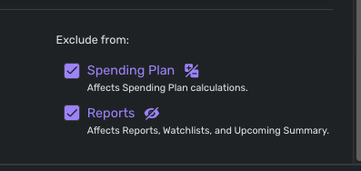
Thanks for reaching out! I think we will need some more information to understand your situation. Are you stating that your two deposits are not showing up in Reports at all? Can you provide a screenshot showing the details of the recurring series? I would also have you verify if the recurring series is set to be excluded from Reports.
Let us know!
-Coach Jon
-Coach Jon
0 -
I confess I'm totally confused —- but seem to have fixed everything for the transactions.
I viewed the the subject transactions in another report and the entries looked different and inconsistent from one another (possibly a holdover from when I first started using Simplifi). I edited to make them all consistent and now all seems okay — I think.
Now to figure out the latest problem — "Income & Expense" shows a table of data, but no graph. Will try again after clearing cache & cookies to see if that helps.
0 -
Hello @BlueGrits,
I am glad everything seems to have been fixed from your side regarding the recurring transactions!
For the graph not showing up in the Income & Expense report, I would try signing out and back in or trying with another web browser/incognito mode to see if that works.
-Coach Jon
-Coach Jon
0 -
Hello @BlueGrits,
I am just following up after confirming some information with my product team for the Income & Expense issue you reported. I have confirmed that the Income & Expense Report has officially replaced the Net Income Report on the Quicken Simplifi Web Application, and that there was no graph included for this report at first.
Our product team has now enabled the graph for Quicken Simplifi users, so you should now see the graph for this report!
I hope this helps!
-Coach Jon
-Coach Jon
1 -
Thank you.
I just wish there was some simple way to see what makes an ongoing income stream from being placed into an "everything else" category.
0 -
Hi, I've been following this because my wife and I both get social security. Hers just started last month, and I have mine in the recurring as Steve's Social Security and hers as Linda's Social Security, so no difference with what you and I do there. I also have different categories so the taxes report can keep up with hers and mine. (They are Steve's SS and Linda's SS with the tax line, social security self and social security spouse.)
When you say "everything else", do you mean the "other spending"? Or do you mean it ends up the Spending Report as spending. Is it possible you have categorized your social security as an expense category and so it is showing up as a negative expense?
Perhaps too, you can check whether new income gets including in the Spending Plan income. Go to the spending plan: income and over on the far right click the 3 dots to make sure it says "automatically include" to make sure that any new income gets listed there. I am just brainstorming here.
If you are both have Medicare premiums deducted, I know a trick to get the Medicare payment in the Bills/Subscriptions list while keeping the income part in the Income list.
Hope you get it all figured out. I am sure you will!
Steve
Quicken Simplifi (Safari & iOS) Since 2021
Quicken Classic (MacOS) Since 2009
MS Money (1991-2009) and Dollars & Sense (1987-1991)0 -
Steve, I was referring to Reports charts like "Income" that sweep source sources into a generic "Everything Else" bucket. I kept tinkering and somehow - no idea how - got both our SS incomes listed. My monthly pension is still stuck in "Everything Else" but haven't a clue as why. I keep thinking there must be some test or condition which determines whether something goes into the "Everything Else" bucket — but what is it???? I know it has nothing to do with how frequently the income arrives as our yearly lump sum shows up on its own. I just wish the condition(s) were documented somewhere!
Just in case anyone has ideas, here's how my pension transactions are all listed:
Recurring
Series Name: Pension
Account: Checking
Category: Paycheck
Tags <none>Exclusions: None
If I look in the Series History, all the payments are logged there.
1 -
Hello @BlueGrits,
Thanks for the reply. Can you provide a screenshot showing the Income report showing this "Everything Else" bucket? I know the Spending report has a "Everything Else" bucket, which includes everything outside of the top 8 spending categories.
-Coach Jon
-Coach Jon
0 -
You mentioned that your Social Security transactions have the Category "Paycheck" and that your Pension series also has Category "Paycheck."
This is a wild guess, but have you checked to see that the actual Pension transactions also have exactly the same "Paycheck" Category as your Social Security transactions?
(Sometimes the Category gets changed when a series-matching transaction gets downloaded. And sometimes there are two Categories with the same name but different parent Categories.)
DryHeat
-Quicken Classic (1990-2020), CountAbout (2021-2024), Simplifi (2025-…)0 -
@DryHeat — I had previously created a Category "Pension" that got lumped into "Everything Else", so I switched the category to "Paycheck" in the hope that was the key to having it broken out individually. I just switched all the entries back to a category of "Pension", but that didn't do anything — it's still lumped into "Everything Else".
I just keep thinking there must be some test that used in Simplifi to determine whether or not something goes into an "everything else" category…. If only I knew that!
0 -
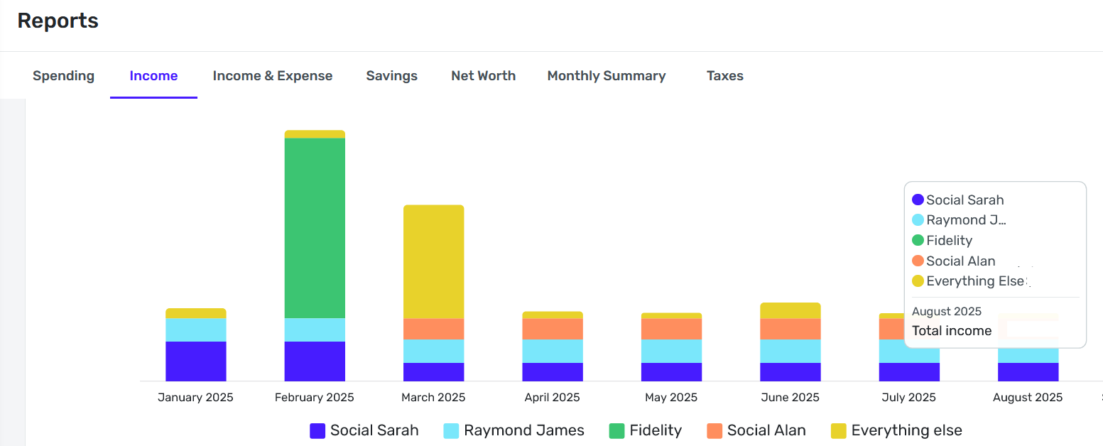
@CoachJon Here is a copy of the Income report showing the "Everything Else". For July and August, the only thing which falls into "Everything Else" is the pension deposit.
Note that I only include my credit union checking/shares account and two savings/sharedraft accounts.
 0
0 -
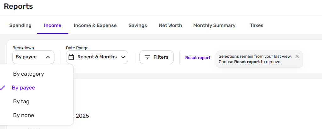
It looks like your graph is broken down by Payee, not by Category.
If so, that would explain what you are seeing. Only the top Payees are shown individually and the rest are grouped in to "Everything else." Each of the top Payees gets it's own color bar.
If you set Breakdown to "By category" then all of the Paycheck items will be lumped together in one color bar.
DryHeat
-Quicken Classic (1990-2020), CountAbout (2021-2024), Simplifi (2025-…)0 -
@DryHeat — correct, the grouping is by Payee. The Pension amount is about 8% of the total income on what would be a "normal" month for us. It would be down around 1 or 2% on an extraordinary month.
If I sort by Category, I get a solid blue bar chart — not a stacked bar chart with colors as with Payee. The same goes if I sort by Tag (because no incomes are tagged).
Do you think if I went back and set up tags for each transaction and then did a sort by tags that I'd get away from (mostly) the "Everything Else" problem?
0 -
I see that you replied to me yesterday, and that you are now in Dryheat's capable hands. Sorry I initially misunderstood.
Have you tried using the Income and Expense Report with Row by Payee? I pretty much use that report a lot more now than the old Income and Expense reports. The Everything Else bucket has been a source of consternation.
Steve
Quicken Simplifi (Safari & iOS) Since 2021
Quicken Classic (MacOS) Since 2009
MS Money (1991-2009) and Dollars & Sense (1987-1991)0 -
If I sort by Category, I get a solid blue bar chart — not a stacked bar chart with colors as with Payee.
It's not exactly a sort, it's a breakdown based on the Category. So, assuming you are categorizing all of your income with the same Category, you are going to end up with just one bar.
Do you think if I went back and set up tags for each transaction and then did a sort by tags that I'd get away from (mostly) the "Everything Else" problem?
Everything with the same Tag will go into the same color portion of the stacked bar chart. So you would have to use a different Tag for each source of income that you want to break out.
But you may still have the problem with "Everything Else." On my charts, if I have more than 4 different Categories (or whatever) included I end up with an "Everything Else" section. If I have 4 or less I don't.
DryHeat
-Quicken Classic (1990-2020), CountAbout (2021-2024), Simplifi (2025-…)0 -
I guess I'm missing it…. I defined several methods of income (see below) so I expected a report of "Income" bar chart over time to create a stacked bar chart reflecting each method of income. per month instead of a solid blue bar named "Income". Was that wrong? I'm at a loss now as to how methods of income .
Income:
- Dividend
- IRA
- Paycheck
- Pension
0 -
@BlueGrits "I defined several methods of income"
It's hard to tell what's wrong, in part because I'm unsure what "methods of income" means. If you mean you have given each such "method" a specific Category then you should be able to see a stacked bar chart of those Categories (as long as you choose Category as the Breakdown for the report - see image below).
BUT… Simplifi does the breakdown in the Income report according to top-level categories, not subcategories. So if all of your "methods" are given sub-categories under Income, you will only see one solid color bar.
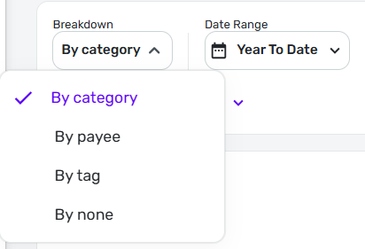
[EDIT] An alternative would be to use one of the other Breakdowns (Payee or Tag) and see if that meets your needs. If all of the transactions in each of the "methods" you mention have the same Payee — for example, all Paycheck transactions have the same Payee — then you may get the result you want.
DryHeat
-Quicken Classic (1990-2020), CountAbout (2021-2024), Simplifi (2025-…)1 -
When you created your categories, did you define them as 'income' categories? ff not, you can redefine them. @BlueGrits
-Rob
—
Rob Wilkens
0