Investments Performance tab not displaying correctly.

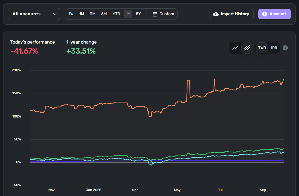
My Performance tab is showing incorrect & nonsensical information. As I understand it, all trend lines should start from zero to properly show relative performance, but they are displaying in a way that makes no sense.
Also, my investments in these accounts certainly did not lose 41% today. None of this is correct.
It displays this way on the web interface and the app across several devices.
Comments
-
Hello @jgo,
Thanks for reaching out! The Performance tab in Investments tracks the rate of return for your investments. There are a couple of ways it does this. You can track the TWR (time-weighted rate of return) and the IRR (internal rate of return) for your investments. TWR measures the compounded rate of return for your investments over time and does not take cash moving in and out of the account into consideration. IRR measures the return between two dates and does take cash moving in and out of the account into consideration. Our support article goes into more detail on Performance Over Time for Investments here:
As for your graph, the trend lines you mentioned wouldn't necessarily start from zero, as it is measuring the time range you select above the graph. Hovering over the 1Y option you have highlighted in your screenshot would show this range.
I hope this information helps clear up any confusion.
-Coach Jon
-Coach Jon
0 -
This tab & chart used to behave in a rational manner. When I would select a time range, the left end of the chart would have all trend lines converged at 0, and then I could see how each account diverged and returns were higher or lower over time. It was a useful way to compare accounts and see progress.
This version of the chart is useless. My accounts have roughly similar compositions — do you really think the orange line has been performing over 100% better than the others?
Do the performance numbers in the top left make sense to anybody? Do you really think I lost 41% in one day, and does that look like it's reflected in the chart? It's broken.
0 -
Hello @jgo,
Thanks for the response. I cannot account for how your graph used to work, unfortunately. Performance Over Time is a time period calculation and will vary based on the time period you have selected. Scrolling down in the Performance page, below the graph, will also show the Day % and time frame % to help users with how the graph is displaying this data. Hovering over the graph at any point in time will show you those percentage changes over time as you move along the graph. If the graph matches the data being presented, then I am not sure this would be a bug. Can you verify if this is the case for you?
-Coach Jon
-Coach Jon
0 -
How does it make sense for a chart to show performance within a given time frame START at 118% for one account and 11% for another? 118% of what? 11% as compared to what? It's the beginning of the measured area. It should start at zero and diverge from there, like it used to.
The numbers above the chart don't make sense either. See this image:
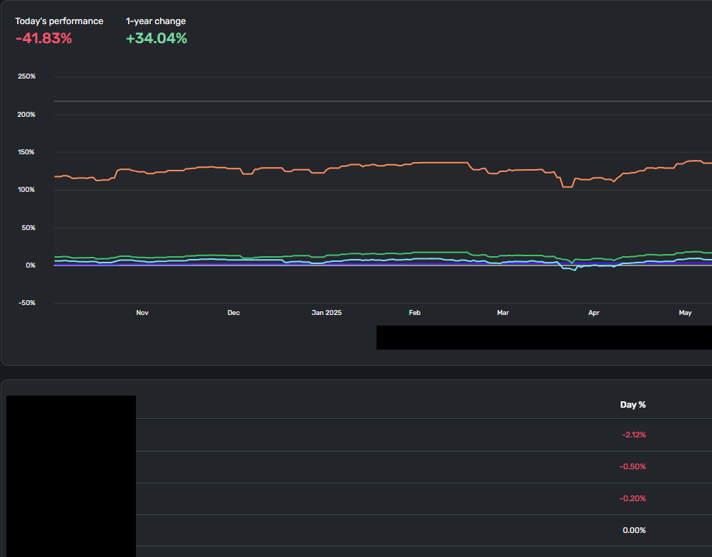
-41.83% today? None of the listed accounts is down by anything CLOSE to that amount. So where is this coming from?
0 -
Hello @jgo,
I reached out to my team to clarify specifically how this information is calculated. Once I hear back, I will be sure to let you know here. I gave the information you presented here as an example, so we should receive a good answer to your inquiry.
Thanks for your patience.
-Coach Jon
-Coach Jon
1 -
I agree that the TWR graph makes no sense for me either. It says that it does not take into account cash in or cash out, but in fact, it does show exactly that. I took a significant amount of money out of one account and it shows a massive drop in "performance". The investment screens need a lot of work.
1 -
Hello @jgo and @BHazeltine,
I am back with some information from our product team regarding this inquiry. It looks like there is a recently introduced bug that is throwing off the calculations for the Performance tab in Investments. Our product team is working on a fix, and once done, the numbers should then return to normal.
I hope this helps clear up any confusion, and thank you for your patience!
-Coach Jon
-Coach Jon
0