Net Worth Feature: Share your feedback here!

Go ahead and explore the new Net Worth feature and tell us what you think! We’d love to hear how it’s helping you track your financial progress and any ideas for improvements.
Here is the announcement for this feature with more details:
-Coach Natalie
Comments
-
The new Net Worth graph on the Dashboard is great! However, I noticed that the precision in Ms isn't helpful with no decimals. Mine currently shows multiple y-axis lines with the same repeated label of $xM. Should be $x.xM.
1 -
Where are you seeing this? Is it on the web or mobile app?
0 -
Web. Both Dashboard and Net Worth tab
1 -
@alkaboy, thanks for reaching out!
You are likely referring to the new Net Worth feature, which has been rolled out to a small percentage of Early Access users. Unfortunately, we here in the Community don't have access to this new feature yet, so we can't take a look at it with you.
With that, you will likely need to contact our Chat/Phone Support Team directly to report any issues, as they will have the necessary tools to troubleshoot with you and get the issue reported.
Otherwise, once this feature is more "official", we will have a dedicated feedback area here in the Community where you can report any issues or offer suggestions.
Sorry for not having more information, but I hope this helps!
-Coach Natalie
1 -
It showed up yesterday morning for me and I have played with it. It's VERY nice. I imported some historical data in a couple of my asset accounts to try to make the 5 years look right as it seems to think I was worth nothing at that point.
So I guess I will try to do the rest of my accounts too. As I understand it, the history won't show up in the particular accounts but will be used by Net Worth and maybe some other reports. Up to now, I hadn't worried about that.
It would be nice if we could just set what our net worth was in say Jan 2021 instead of importing it account by account.
I am fine with including all accounts, and it's great that one can exclude certain accounts. You might want to make that amount what is listed at the top of the Account List as well.
I'll keep playing with it.
Steve
Quicken Simplifi (Safari & iOS) Since 2021
Quicken Classic (MacOS) Since 2009
MS Money (1991-2009) and Dollars & Sense (1987-1991)1 -
Stopping by to confirm I also see this bug in the Desktop/Web app in the new Early Access Net Worth feature.
The y-axis shows the same abbreviated number vertically up every mark (for example: someone would see $1M, $1M, $1M, $1M on each tick mark all the way up) instead of increasing as it should. As @alkaboy noted, probably just due to a decimal place restriction.
Updating the Web/Desktop app display to match the Mobile app's display, which has the extra decimal place (so the above example would instead be $1.0M, $1.1M, $1.2M, $1.4M), is hopefully all that's needed to resolve.
4 -
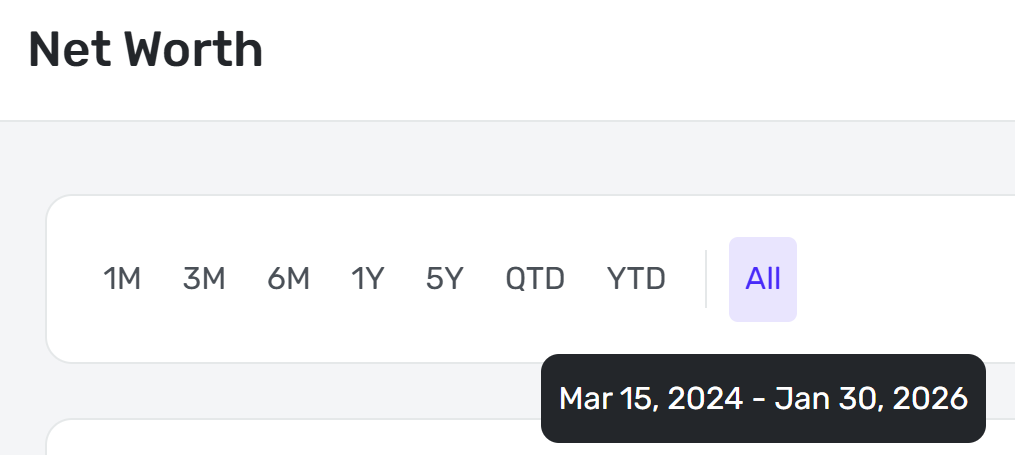
Looks great! But please!! Make the "All" button on desktop be all historic data, not just since joining Simplifi. On mobile the "All" button is correct and shows all historic data.
 1
1 -
The Net Worth section of reports shows actual dollars (not in Ms) so a non-issue there.
0 -
Also, the coloring/symbol of Debt is misleading:
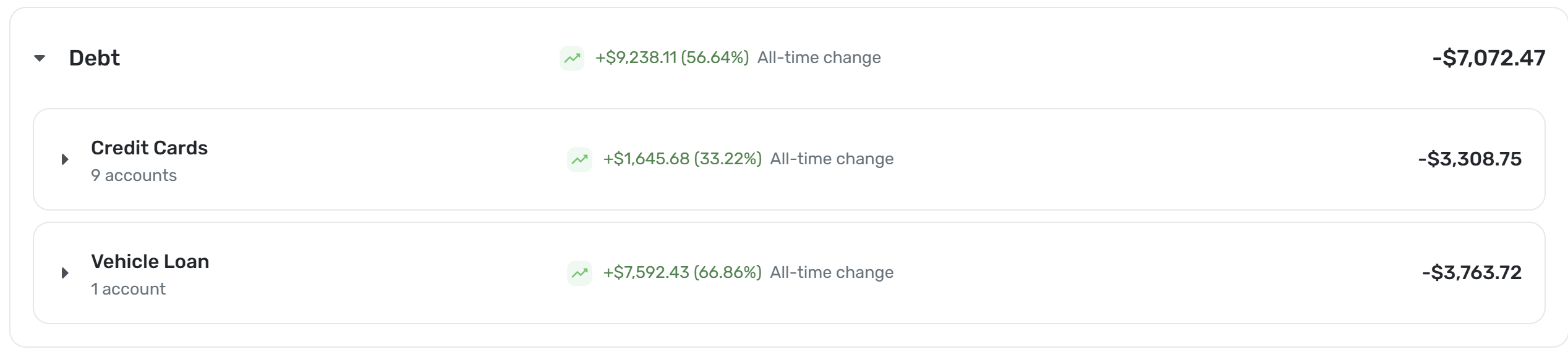
My debt went down by 9.2K. It should be green, but show -$ and conversely be red when debt goes up and show +$. It would be helpful to also invert the icons for debt - green when arrow icon is trending down, red when arrow icon is trending up.2 -
This is one thing I missed when I moved from mint app. Great addition.
3 -
- The Android app currently lacks a "Year-to-Date" (YTD) filtering option.
- There is an inconsistency in how the "All" timeframe displays imported data. I imported history from Mint dating back to 2013, but I only joined Simplifi in 2023. The mobile app correctly displays the full history (from 2013) when "All" is selected. However, the web version incorrectly limits the data to my Simplifi start date (2023).
- As @MishaM noted , debt reduction is visualized incorrectly. When a debt balance decreases, the interface presents it as "going up" rather than showing a reduction in liability.
- Poor tablet optimization - On both Android and iOS tablets, the UI does not utilize the available screen real estate effectively. It mirrors the mobile phone layout, resulting in wasted space. The tablet view should align more closely with the web layout.
- The new Net Worth card is missing from the dashboard. While other users report seeing this feature, it is completely absent on my Android device and the web.
2 -
Loving it so far! Don't like that when I exclude accounts, it still shows them. When I exclude things, I ACTUALLY want them to be excluded.
1 -
Thank you for the addition. Two important important improvements below:
- The Web version "All" view needs to include all imported history. (iPhone version currently supports this correctly)
- The iPhone mobile version: the x-axis labels should change to years labels when view "All" history. I have 16-years of imported data and the historical chart is showing only months on the labels for the x-axis.
0 -
Nice to finally see some charts on the mobile dashboard. would love to see a budget line chart to shows the lines for planned amount and current spending for the current month to get an Idea of how thing are going.
and if we can get a reconciliation feature…
0 -
The new Net Worth feature is not available in QBP. It should be, or at least the additional abilities it brings to Net Worth analysis should be.
The Net Worth report that is available in QBP lacks at least a couple of things that the new Net Worth feature apparently has. (See highlighted items in the feature list below.)
Viewing Preferences:Hide cents, scale the graph from $0, or use a zoomed viewAccount Changes:Track dollar and percentage changes for each account over your selected time rangeDebt to Asset Ratio:Understand how your liabilities compare to your assetsAsset and Debt Breakdown:View detailed breakdowns by dollar amount or percentage
QBP is designed to serve both business and personal needs. The ability to compare assets to liabilities, see percentage values, and rescale the graph would be just as useful to QBP users as it is to Simplifi users.
DryHeat
-Quicken Classic (1990-2020), CountAbout (2021-2024), Simplifi (2025-…)1 -
This is a great feature. It would be nice if it can include an option to predict projected future net worth!
0 -
There needs to be a way to set a start date for the graph regardless of which time option you select. This is not a useful graph for looking at more than 1 yr of history, but right now my option is 1 yr, or this.
Also, I miss having the asset/account breakdown in the graph. I don't want the snapshot of today's asset breakdown, I want to see how my accounts or at least asset classes have changed over time.
1 -
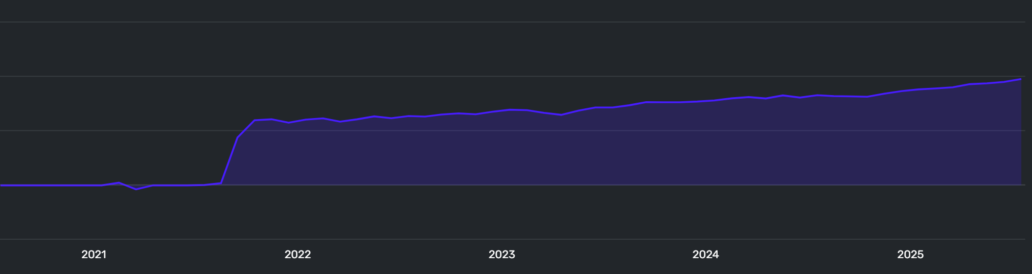
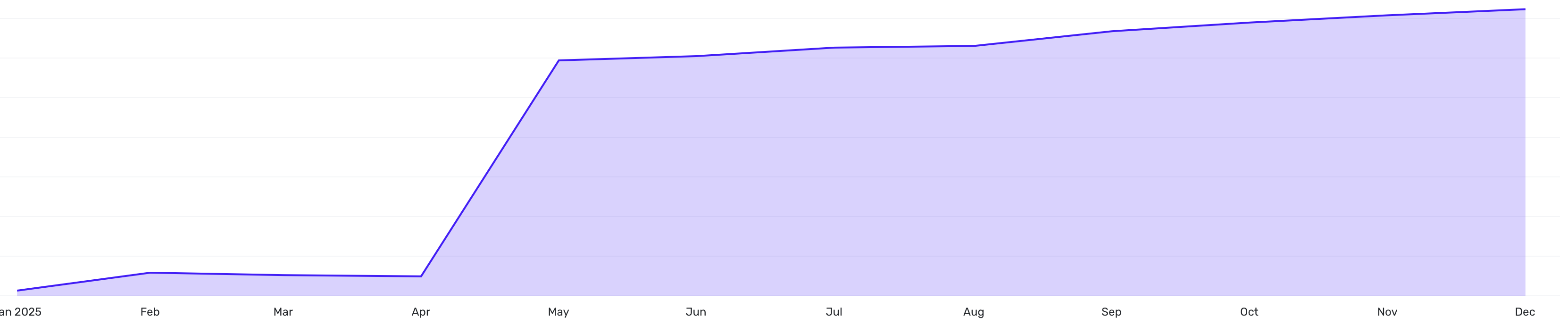
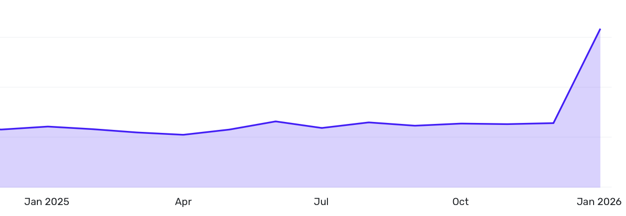
It appears that Net Worth Feature is, in my case, ignoring historical data (as happens as well with the Enhanced Net Worth Report):
Net Worth Feature Graph:
Enhanced Net Worth Report:
Old Net Worth Report:
Main difference is that new reports don't include my house value until April 2025 even though I imported the historical data back to 2021.
Steve
Quicken Simplifi (Safari & iOS) Since 2021
Quicken Classic (MacOS) Since 2009
MS Money (1991-2009) and Dollars & Sense (1987-1991)1 -
6. The YTD calculation is currently calculating balances from the end of Jan 1st to the current date. The correct way to calculate this is from the closing balance of Dec 31st (the previous year) to the current date.
0 -
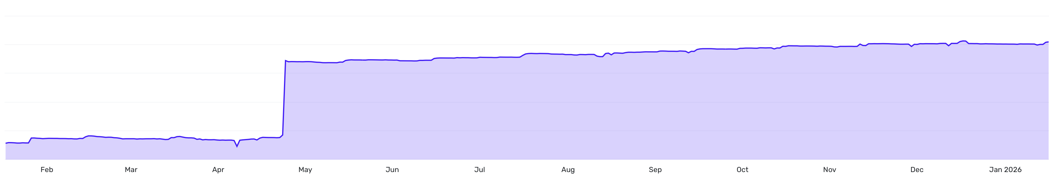
Love the concept, but the recent snafu with manual accounts seems to be affecting my historical data. That big leap in Jan 26 shouldn't be there. The value of my manual accounts - for cars and real estate - have been fairly consistent for all of 2025.
 2
2 -
An option to hide the change over time of banking accounts like checking, savings, etc, since they might fluctuate wildly, but keep them as part of the net worth.
0 -
Very nice, but I'd really like the "over time" area chart to be a stacked area chart showing each breakdown over time visually. Having the breakdown only for the current date is not enough. Furthermore, I'd like to have options for the breakdown over time be by type (like you have now) and also by account and even by investment if possible so I can see if any account or investment got big or small and when that happened. I know your designers probably think it's too much data to show, but I'd really like to have the choice to turn those options on. If it's slower to render I'm ok with that.
1 -
Really liking this feature! Can confirm I'm seeing the bug others are seeing on the web version for the same M$ amounts repeating on the y axis of the net worth chart.
Also, the net worth report under the reports section is very useful but now there's net worth data in it's new dedicated section as well as in the reports section. It would be more efficient to have everything in one place under the new net worth section so we don't have to go back and forth for different views of the data.
0 -
The Net Worth calculation is not working for me. I have 2 HELOC accounts and they are being incorrectly handled. They are being added not subtracted. For example, HELOC A has a balance of $10K and HELCO B has a balance of $200K. That is the current balance owed, not the available credit. The Net Worth is correctly adding the value of all of the assets, but when it calculates the value of all of the debts, those HELOC accounts are being subtracted from the total debt balance. For example, there is a Mortgage of $400k and when combined with the HELOC accounts it is reducing the debt to $190K ($400K - $10K - $200K) when my actual liabilities are $610K ($400K + $10K + $200K). That inflates my Net Worth by $420K or 2 x the HELOC total ($10K + $200K).
1 -
I like the concept but the Y axis on the zoomed view chart rounds to the nearest million and repeats this same number on every level of the chart. Pretty worthless. If you change it to complete view, it is pretty flat line across the year and again, rounded to the nearest million. AI says no way to change the decimal level of detail. Missed opportunity.
[Edited - Readability]
0 -
Same issue as others, rounding to the nearest Million gives me the same number on every level of the Y axis on the chart. Changing to full view down to $0 makes even decent changes look like flat lines. We need at least 1 decimal place on that Y axis to be useful.
0 -
It is interesting that the scale on the mobile app includes the 1 decimal increase needed to show a reasonable number but the browser based does not.
0 -
The new net worth dashboard is nice. There is a bug that existed before this dashboard on net worth number: the net worth value under reports does not match up the net worth in the new dashboard. the missing data is education related savings (the report net worth value does not also match the all accounts value in the main dashboard for the same reason).
0 -
The issue with the Ms in the graph has been reported and will be fixed soon!
-Coach Natalie
0 -
I just added a manual 529 account with a $1000 balance, and I see it in the Net Worth section as expected. I don't see any discrepancies between that section and the dashboard card, though. Can you provide screenshots showing the issue, please?
-Coach Natalie
1


