Faster Navigation for the Web App: Share your feedback here!

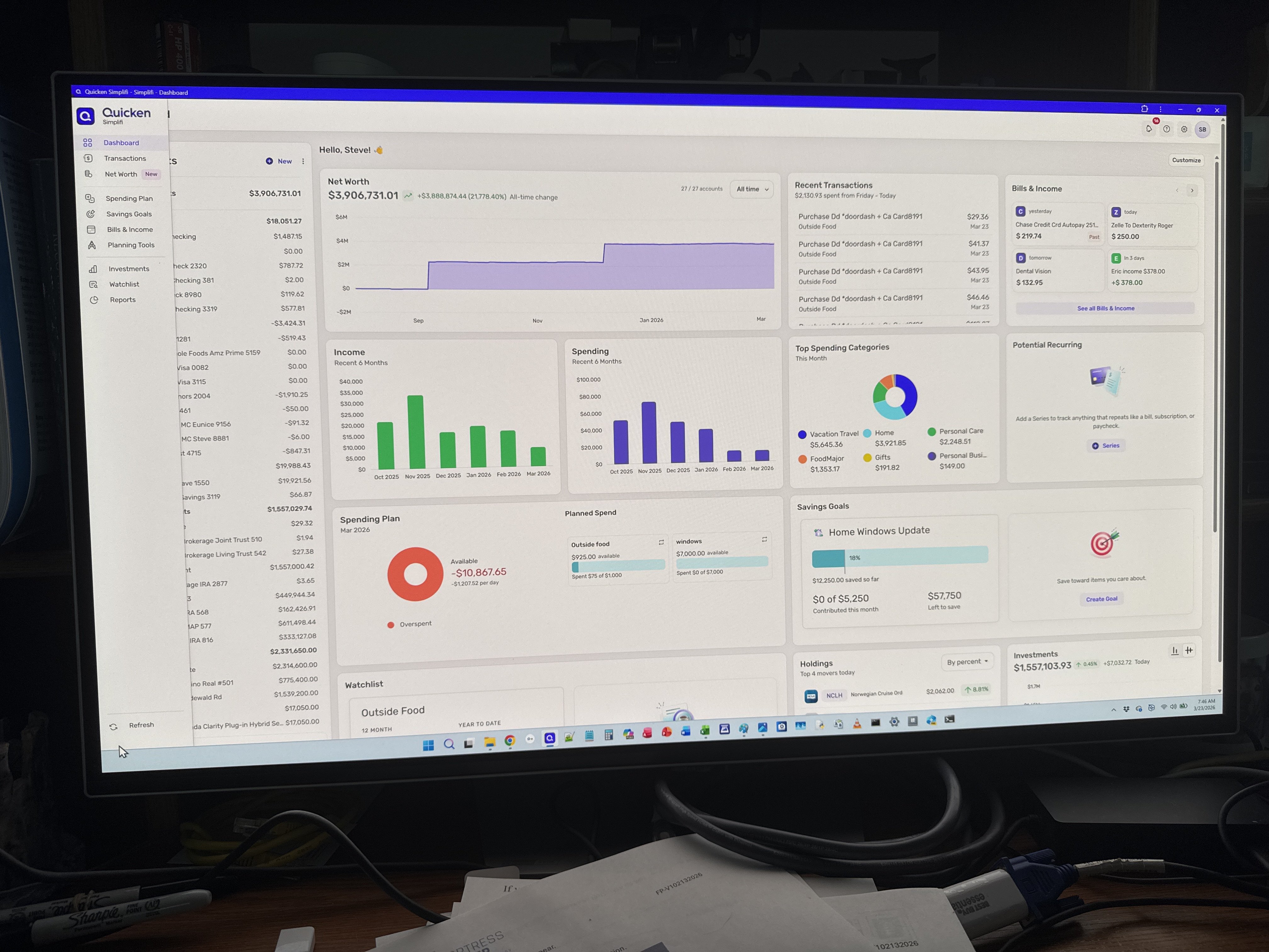
With the recent enhancements we made to navigation on the Quicken Simplifi Web App, we want to hear from our users! Let us know what you think by commenting below.
Our announcement here has more details on the changes:
-Coach Natalie
Comments
-
More logical placement and seems to work well.
1 -
Wow, that was fast; I had just closed out Simplifi not that long ago and reopened it, and there it is. I think it will be a bit easier to find things especially for new users.
Also, I think y'all made the account name bar a little more compact (not as tall) so it takes up less room? If so, nice touch.
Steve
Quicken Simplifi (Safari & iOS) Since 2021
Quicken Classic (MacOS) Since 2009
MS Money (1991-2009) and Dollars & Sense (1987-1991)1 -
This is a significant improvement over the old placement.
It is more in line with how modern apps position these kinds of resources, so it feels more intuitive.
DryHeat
-Quicken Classic (1990-2020), CountAbout (2021-2024), Simplifi (2025-…)1 -
-
You’ve moved Setting and other buttons from the lower left (off the active screen, so you had to scroll down to reach it ofttimes) to the top of the screen. That was good (great). But it’s absurd that you didn’t also move the refresh icon to the same location….Please make this change.
0 -
I like the cleaner look…more polished!
0 -
@LatAmSojourner, your post has been merged with the official feedback thread for the navigation changes, which are currently in Early Access testing, so it can be reviewed by our product team.
Thanks for your feedback!
-Coach Natalie
0 -
@LatAmSojourner on my Web screen the refresh button shows up on the bottom left without having to scroll down. I concur that it should be moved to the upper right hand corner if it cannot be fixed scrolling.
Steve B
Ex Fortran, Cobol, Basic, MS Access and VBA (Visual Basic for Applications programer
Been using Simplifi since Dec 2026.
1 -
Not everyone’s screen shows the same thing…
0