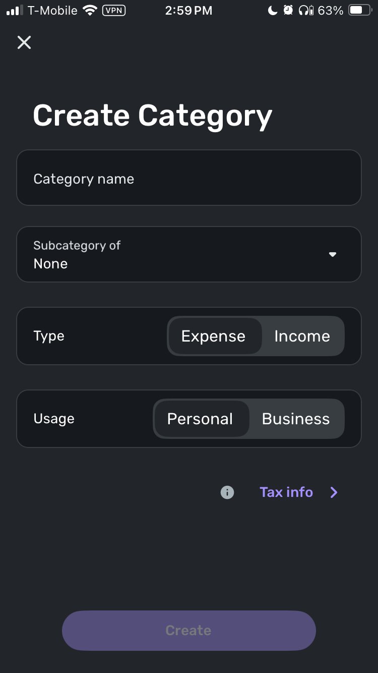
Mobile App: Improve toggle functions when creating a Category (edited)
Is it possible to NOT toggle between the income/expense selection when creating a new category. It is hard to tell which one is selected when using mobile app, especially if in dark mode.Would be better just to keep the item selected in focus.
Thanks for a great product.
Comments
-
Hello @Micky1701,
Thank you for coming to the Community to provide your feedback! Since it sounds like you're asking for a change to the process for creating a new category, I changed your post to an Idea. Ideas that get enough votes may be implemented in the future.
To clarify, is the primary issue that the toggle is low contrast, which can make it hard to see which option is selected?
Thank you!
-Coach Kristina
0 -
Yes that is the issue and not sure if the selection should toggle back and forth. Meaning if I select expense and then select expense again it auto toggles to income. Not sure why that is necessary. If I select expense twice why not just stay with expense. Thanks.
0 -
I voted against this "for now" because while I am not totally against it, I feel like there are many more important 'ideas' that should be addressed first, so I don't want this to get priority in terms of development time. I am only one user, though, and others can cancel out my downvote.
—
Rob Wilkens
0 -
The voting system gives developers a sense of how many people find a suggested change useful.
Downvoting a suggestion because you want some other idea you like better to have higher priority seems like an unfair manipulation of the system. If everyone did that, folks would be sabotaging perfectly valid suggestions just to try to keep their own favored changes at the top of the heap.
I think downvoting should be reserved for those situations where you honestly believe that the suggested change would make the program worse.
DryHeat
-Quicken Classic (1990-2020), CountAbout (2021-2024), Simplifi (2025-…)0 -
In my opinion, this is not something that "has" to be addressed. It's a toggle, you tap it it switches to the other option. I'm not against it working the suggested way, but i'm not really for it either, notably because mobile apps are on smaller screens and I have a larger (less precise) finger. Tapping to toggle kind of makes sense to me. I also would visibly see what is going on and intuitively understand it.
—
Rob Wilkens
0 -
@RobWilk "In my opinion, this is not something that 'has' to be addressed."
I understood that… but that was not the point of my post.
My point was about the propriety of downvoting a suggestion — not because you think it's a bad idea, but because you have other things you feel should be addressed first. That seems like gaming the voting system.
DryHeat
-Quicken Classic (1990-2020), CountAbout (2021-2024), Simplifi (2025-…)-1 -
The simple fact is that I'm okay with the existing functionality, and almost prefer the way it currently works for reasons i stated. We have the downvote functionality for a reason. Like I said, I am just one vote.
-Rob
—
Rob Wilkens
0 -
The toggle is not necessary in my opinion and has no logical purpose. I would not want an ON and OFF switch to toggle if I just press ON two or more times in a row. ON is ON. It really wouldn't make such an issue of it if the toggle selection was not so ambiguous to visualize. Just really hard to figure out which option was selected. I usually need to create a subcategory just to verify the selection of the main category. Just me I guess.
0


