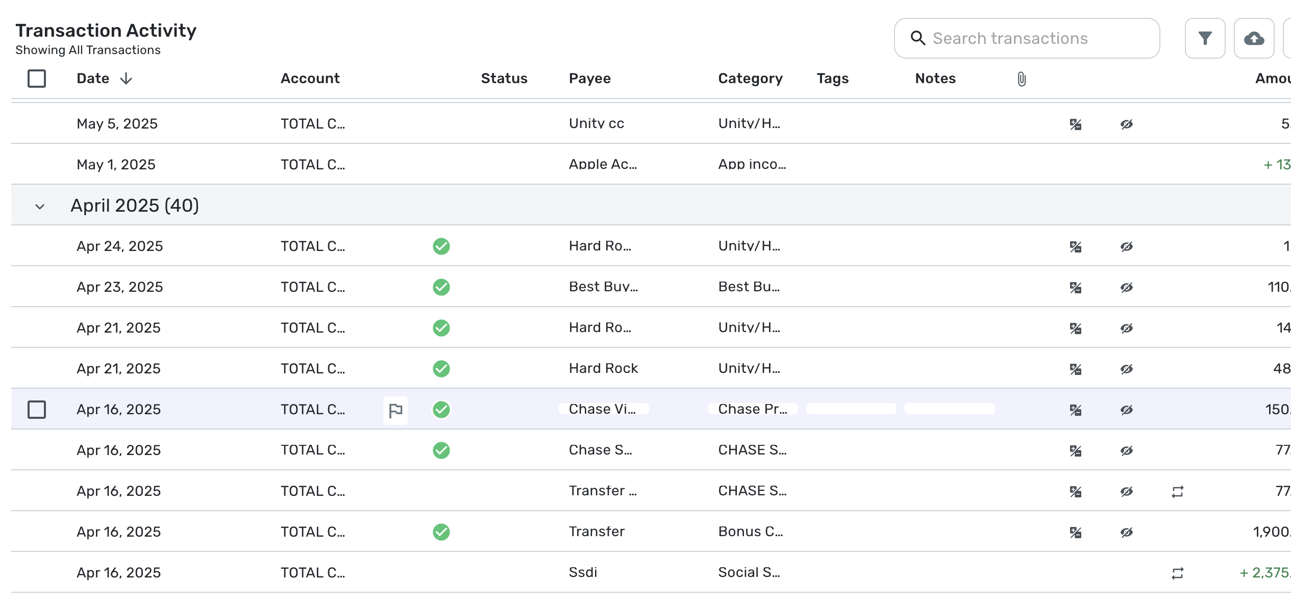
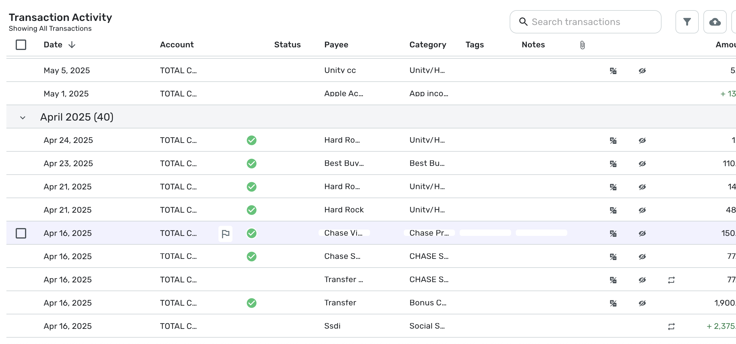
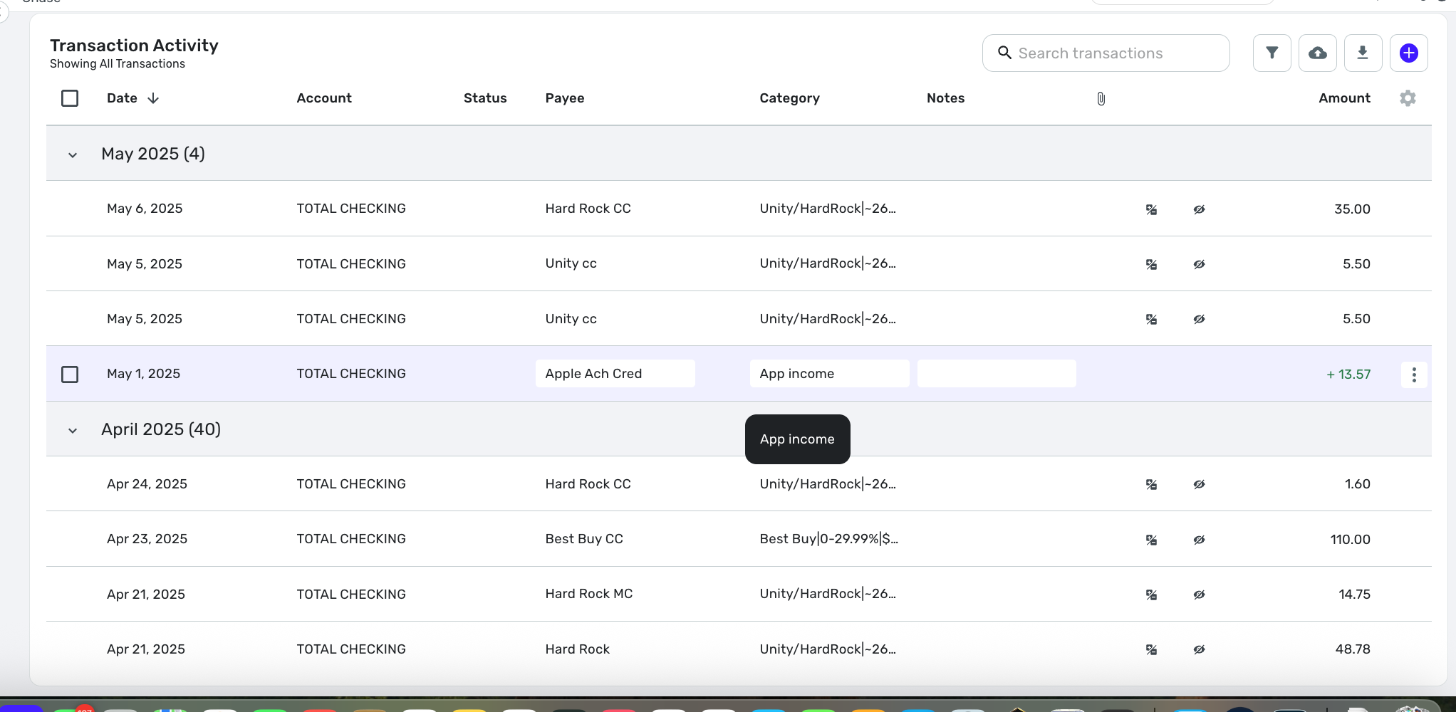
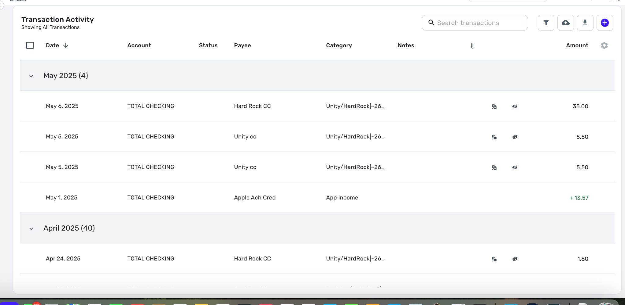
I'm (was) on Version: 4.59.0 (32308/fc3f026f9b/v103.5.4-patch-1)
Context: I do most of all my activity on a computer via the keyboard. Keyboard shortcuts and all.
The new Transactions layout is very disruptive.
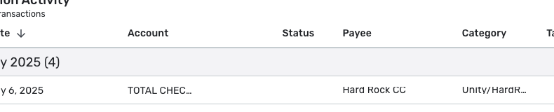
- It takes way too much space for the information displayed. So it's just a large waste of screen real estate :( there is enormous padding between each columns, you see less of the text and more of empty blank space.
- it feels more sluggish than the previous transactions UI was, which is really unfortunate.
- the search bar now imposes that you search numbers by indicating whether it is postiive or negative?! Why? When I look for "50", I want to see all transactions that have 50 anywhere in the transaction fields, not just credit transactions for the amount of $50, filtering out debit transactions for $50. This doesn't make sense to me.
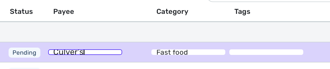
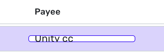
- Hitting [tab] after entering a note wipes the note away. You need to press [enter] instead. Not sure how many notes I'll lose before relearning this one.
- Hitting [tab] after choosing a category does not go to the tags cell, it goes somewhere else, not sure where. Need to bring the focus back with the mouse/trackpad :(
I have reverted to no early access and I am praying that someone from Simpilifi Product sees this and corrects course before it is made into the new Generally Available version.