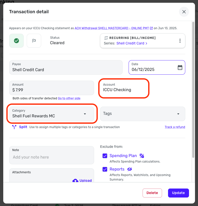
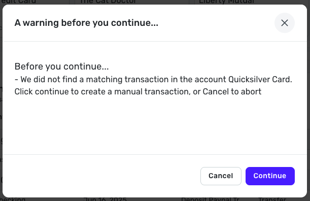
Then the user needs to enter a transfer, there is a transaction that is the “to” where the funds are to go and a transaction of “from” where the funds are coming from. This is confusing to users that do not have an accounting understanding and the use of a journal that shows the debits and credits to the two accounts.
Recommendation is to modify the Transaction screen to show the “to” at the top with the amount, “to” account, the tag, the category and the tags as well as the ability to split the transaction. Then below it would be the “from” account, that shows the amount, the “from” account, category, and the tags as well a to split the transaction.
Since Simplifi is a computer program on the web, using the approach described above will crate the two transactions, the “to” would be the positive transition is the “from’ would be the negative. Also, these two transactions would automatically be linked and not require the user to validate the link. The link validation should be kept as this is what would confirm the two transactions.
This would simplify the understanding of transfer transactions and then the system can mark as a transfer of funds or a credit card payment to keep the budget, spend plan, report and other aspect within Simplifi simple and direct. From reviewing other programs of this nature, this would move Simplifi out front of the pack – this would generate more users to try the program, accept the program and increase the marketing and revenue. As well as meeting the Simplifi mantra of “simple to use, easy to enter and keeping track of money in a manner that does not require accounting knowledge beyond the “to” and “from” aspects.”