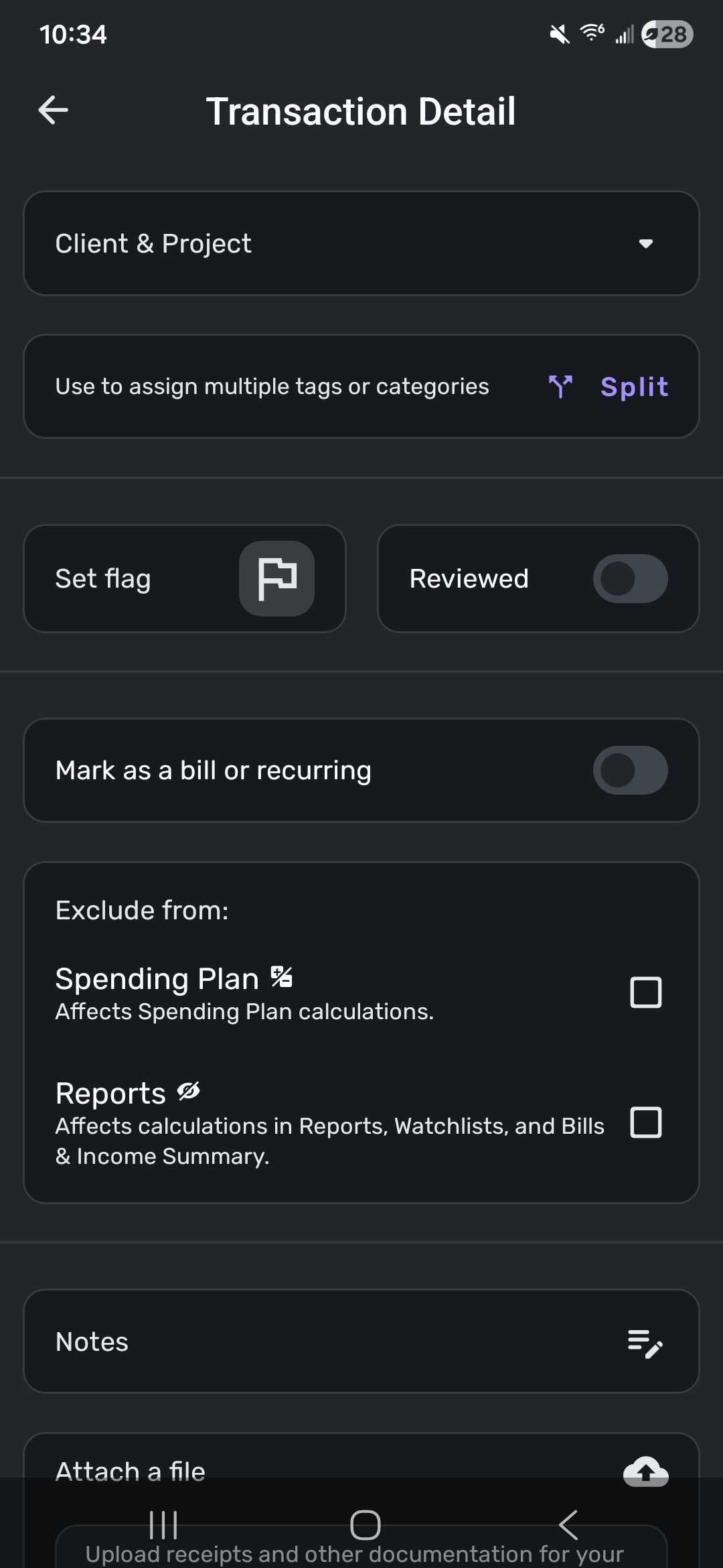
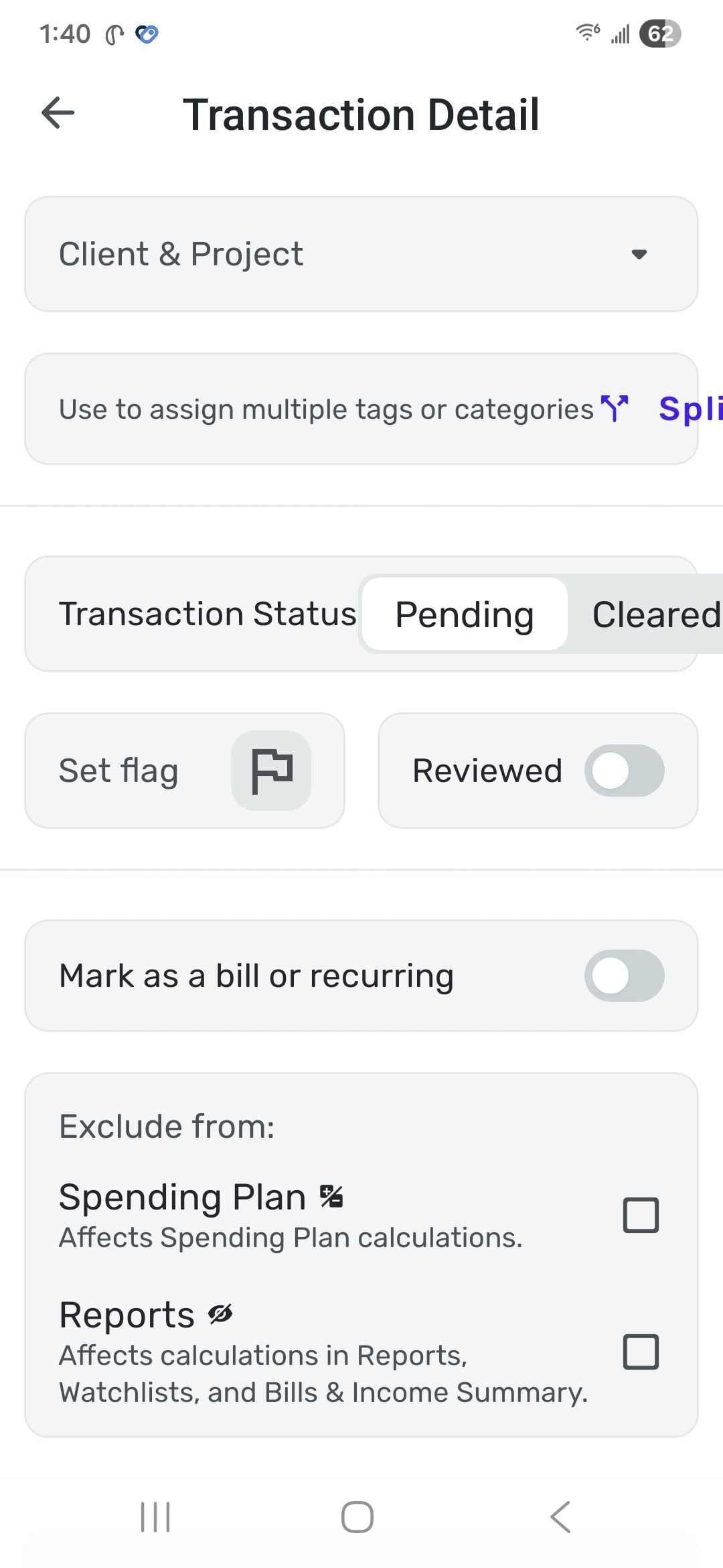
A portion of the detail view extends off the screen to the right. It's still functional but looks bad. part of the word "Split" is missing and the "Cleared" portion of the toggle extends beyond its shaded background container. The problem seems to be that the label text in both cases is just too long to leave space for the operational elements.
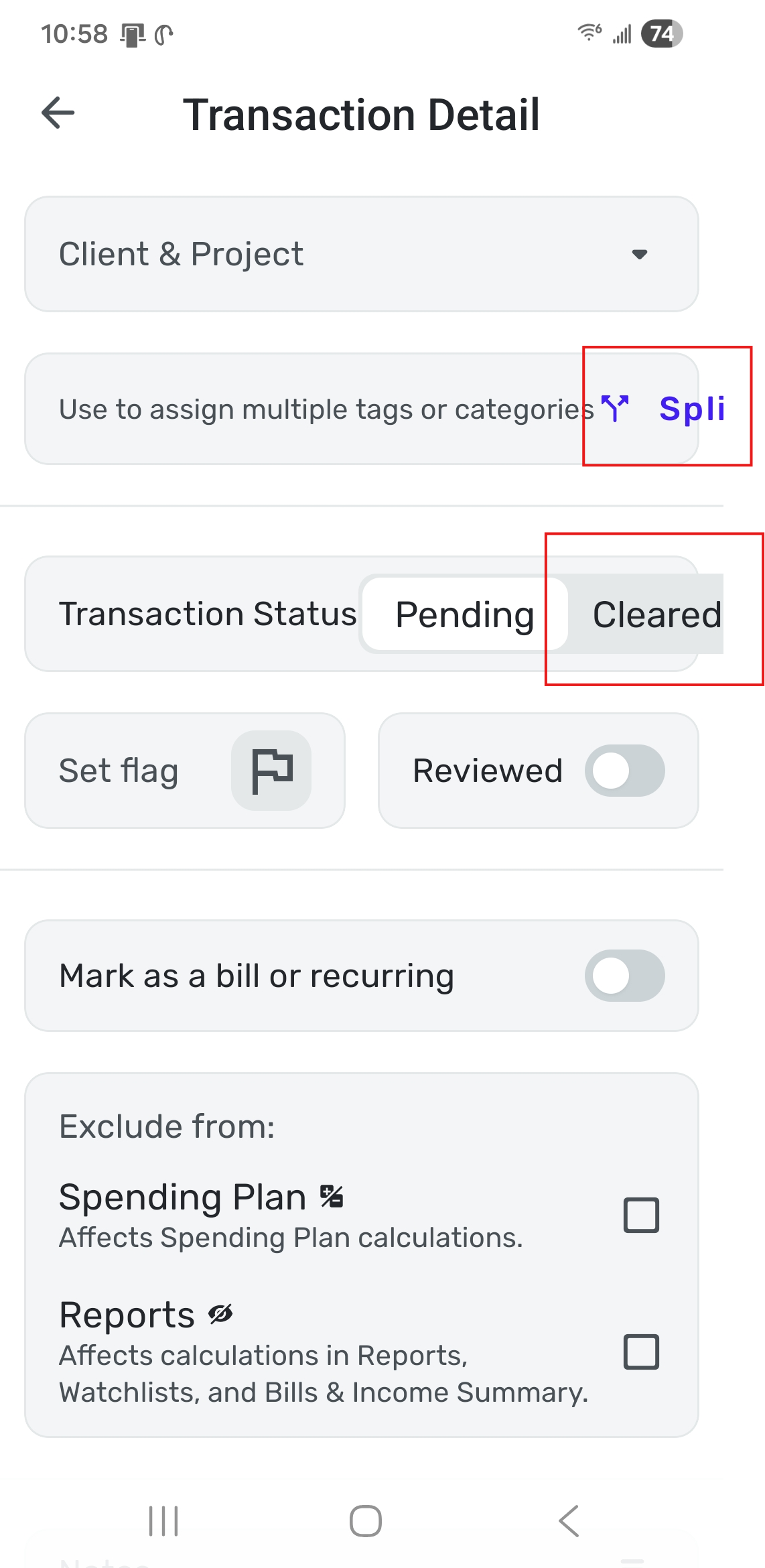
Phone is a Samsung Galaxy s24+.