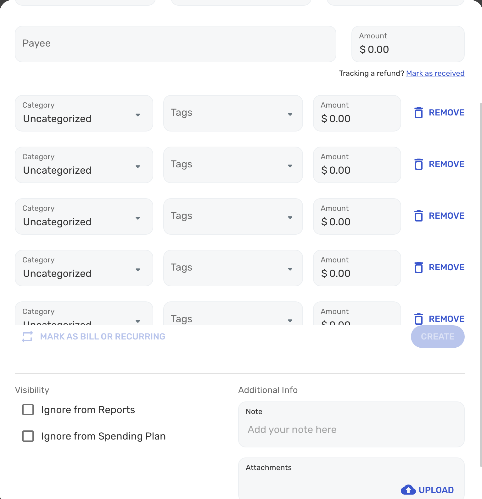
3.69 broke the 'Create Transaction' modal for splits (edited)

MrGood
Member ✭✭✭✭
When splitting transactions, I can only create 5 splits before I am unable to scroll further (and unable to get to the 'Add Row' button). The Create button also is out of place. I'm fairly confident this issue was introduced with v3.69. This happens with multiple browsers.


Tagged:
0
Comments
-
Hello @MrGood,
Thank you for taking the time to report this issue to the Community, although I'm sorry to hear that you're experiencing this behavior in Simplifi.
We are easily able to reproduce this issue internally, and it's very strange! We did get it reported, so I will be sure to get your info added to the ticket and then let you know when there's an update.
-Coach Natalie
SIMPL-145090 -
Thanks @Coach Natalie.
In the interim, for those impacted by this, the mobile app is working fine for complex split transactions.1 -
The Delete and Update Button Blocks Access to Attachments

0 -
Hello @Redraiderr2009,
Thank you for reporting this to the Community, although I'm sorry to hear that you're also seeing a visual issue with the Transaction Detail modal on the Simplifi Web App.
I went ahead and merged your post with another of similar behavior, and I also got your information and screenshot added to the existing ticket for this issue. I will be sure to let you know once an update becomes available.
With that said, however, would you mind confirming if the issue you're seeing is occurring in Light Mode as well? Also, is the example transaction that you provided above a split transaction? If so, how many splits does the transaction contain?
Thanks in advance!
-Coach Natalie0 -
Hello @MrGood & @Redraiderr2009,
We went ahead and got a Community Alert created for this issue, so please be sure to follow along there for updates instead.
https://community.simplifimoney.com/discussion/4122/new-11-28-22-issues-with-the-transaction-detail-modal-and-splits-on-the-web-app/p1?new=1
-Coach Natalie
1 -
The Edit Transaction pop-up box needs a little attention. The line to Delete or Edit the transactions cuts through the "Ignore" check boxes, or worse, if there are several split transactions, it cuts off the transaction information and can preclude adding more. See screen shots.

 In the top example, the problem can be resolved by reducing the screen zoom to much less than 100%, but then the print is so small as to be useless.0
 -
Hello @bcrossman,
Thank you for posting to the Community regarding this issue, although I'm sorry to hear that you're also seeing this issue with the Transaction Detail modal on the Simplifi Web App.
As you can see, this is a known issue. I went ahead and merged your post with the existing one for this issue, and I also suggest following the Community Alert referenced above for updates.
With that said, however, to help the Product Team better understand what's going on, did you only see the misplaced buttons after adding a split line, or does the first screenshot above show a transaction without any splits added?
Thanks in advance!
-Coach Natalie0 -
I can't believe this is still ongoing. It seems remarkably consistent and easy to reproduce.
The buttons don't seem explicitly misplaced, but rather the "div" (container) with the create/update/delete buttons does not shift appropriately as the number of splits grows beyond two.
My current workaround for this (I split a lot because of Amazon, Home Depot & Costco) is to use the web inspector tools to hide that div (the UI element containing the errant buttons), finish populating all my info, then use the inspector to display the div again so I can actually save.
I wouldn't recommend this workaround if you're not at least a bit familiar with web development/design tools.1 -
@TheNigerianPrince -- Thx for the workaround. Was able to use it via the element inspector on Chrome.1
-
First screen shot is without any splits added.Coach Natalie said:did you only see the misplaced buttons after adding a split line, or does the first screenshot above show a transaction without any splits added?
1 -
Note the location of the "Mark as bill or recurring" and "Delete" and "Update" in the image below... they are on top of the 5th category of the split while the 6th category of the split falls below them. Definitely not correct and what's worse is that the category and amount of the 5th row of the split can't even be seen! One may argue that I am splitting things to too granular of a level, and to be honest, doing it this way in this single transaction was an experiment for me. Regardless, the software should be able to handle such a scenario. Just wanted to bring this to your attention. Thanks!
 0
0 -
Hello @mewhtx,
Thank you for posting to the Community regarding this issue, although I'm sorry to hear that you're also seeing issues with the Transaction Detail modal on the Simplifi Web App.
As you can see from this ongoing thread, this is a known issue. As our Product Team works to resolve it, we have a Community Alert available here that can be followed for updates. I'd also suggest reviewing the conversation above, as a workaround was posted by another user. You can also use the Simplifi Mobile App to enter splits in the meantime.
I hope this helps!
-Coach Natalie0 -
Hi,
When I add more than 4 split transactions, the last split is covered up and not useable because it is under the Delete and Update Buttons. This also happens when trying to create the transaction. This is on the Web version. See snapshot below. Can you please fix this?
0 -
Hello @Suki,
Thank you for posting to the Community regarding this behavior, although I apologize that you're also seeing this issue in Simplifi.
As you can see from the above discussion, this is a known issue. We don't have an ETA on a fix as of yet, however, I'd definitely suggest following our Community Alert for updates.
https://community.simplifimoney.com/discussion/4122/new-11-28-22-issues-with-the-transaction-detail-modal-and-splits-on-the-web-app/p1?new=1
Much appreciated!
-Coach Natalie0 -
Existing transactions
->Edit transaction
->Split Transaction
4th split category is obscured by "Delete" "Updated" bar
Creating transaction from scratch and then splitting it, 5th split row is obscured by "Mark as bill or recurring" "Create" bar:
0 -
This is a known issue:Should be fixed in release 3.74.01
-
Take a look at the screenshot. When viewing a transaction I can't scroll the dialog down to see other attachments.
 0
0 -
The problem:
When I open a transaction that already has an attachment, then upload another attachment, the "update" button to submit the change is still greyed out. I am unable to save the new uploaded attachment unless I change some other field unnecessarily.
Steps to reproduce issue:- Go to Transactions view.
- Make a new transaction (or use existing) and save the transaction. In my case, there is an existing attachment. Close dialog.
- Open the transaction dialog again.
- Add another attachment.
- Notice you can't save the dialog because the "UPDATE" button is disabled. That's the bug.
0 -
Hello @bears007,
Thank you for reporting these issues to the Community, although I'm sorry to hear that you're experiencing this behavior in Simplifi.
Though I'm not sure if what you're reporting is part of the same issue, as you can see from the above discussion, we are seeing some issues with the Transaction Detail modal on the Simplifi Web App; one of the issues has to do with Attachments specifically.
We have an Alert available here that can be followed for updates: https://community.simplifimoney.com/discussion/4122/new-11-28-22-issues-with-the-transaction-detail-modal-and-splits-on-the-web-app/p1?new=1
If the issues are still occurring after the fix version of 3.74.0, please let us know, and we can report what you're seeing as separate issues.
-Coach Natalie1 -
@Coach Natalie - The original issue I posted appears to be resolved in the latest release (with early access features enabled).
1
This discussion has been closed.
