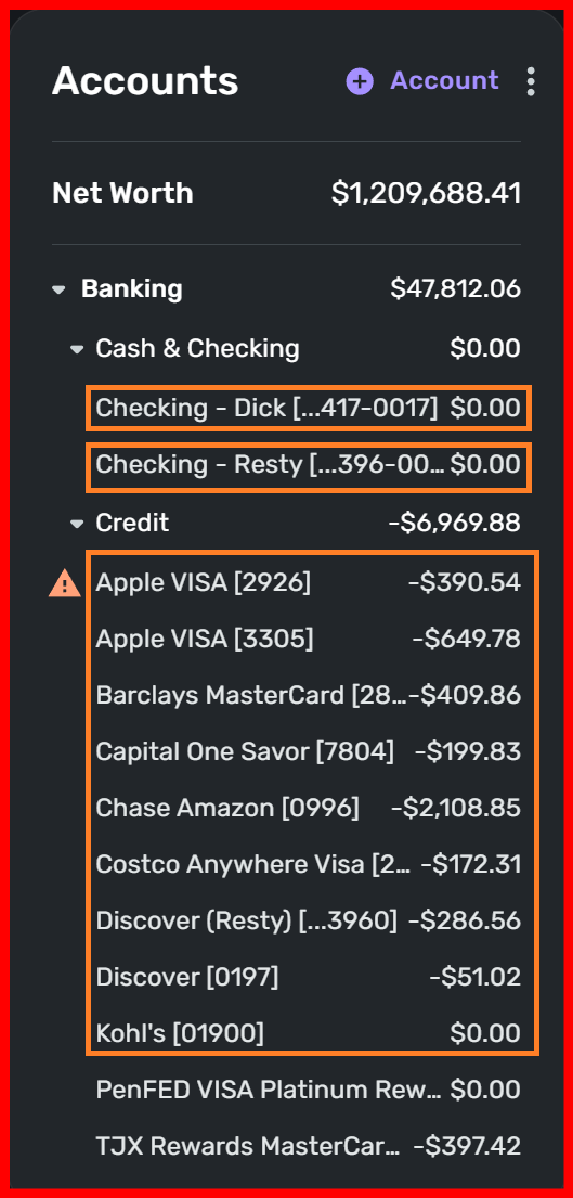
Many of my account names are truncated because the Accounts window on the dashboard is so narrow compared to the other windows which really don't need to be so wide. Since the Accounts window is the most important window everyone wants to see, it would make sense to give it a bit more horizontal "real estate" on the dashboard screen and narrow the other windows down a bit to make everything fit nicely. I know we can't resize the windows because this is a web-based app, but having the Accounts window wide enough to read most of the account names would be a welcome change. Thanks!