Spending Plan Redesign: Share your feedback here!
Comments
-
Has QS removed the summary of to do items from last month's Spending Plan? @Coach Natalie
0 -
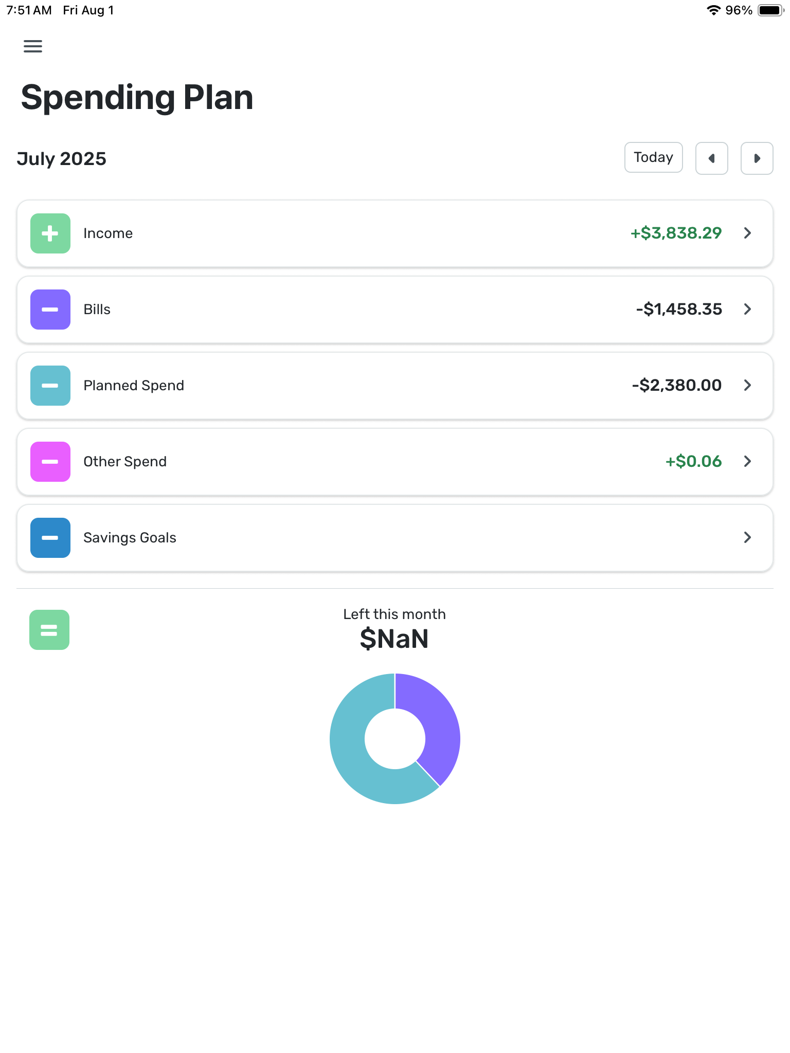
What has happened here? Some of the previous months spending plans which used to show ‘Left this month’ as $0.00 now show $NaN since the update.
0 -
I strongly disagree with your statement "A bill is a bill". It is not true. I will think about unsubscribing. Quicken is supposed to help me organize, but now everything is mixed up in a big bag instead of having separate sections - organization 101
0 -
I rarely use the Per Day number, but I see it as a potential useful number tool because it quantifies the magnitude of spend that could throw off your plan and push you to negative if you spent that each day for the rest of the month. For example, if running a tight budget one month with only a small amount in the left available then your Per Day allowance may only be $1-$5 per day which means the decision to grab a snack or coffee on way to/from work actually matters in the context of that month’s spending plan and needs to be more closely considered than if you have more flex in your plan with a $10-$50 per day allowance.
Have you heard of Nick Magguilli’s new book “Wealth Ladder”? He has a heuristic (the 0.01% rule) where you divide your net worth by 10,000 and that gives you a sense of the daily discretionary spend that you could probably spend without messing up your overall financial picture. For example, he says the Level 2 net worth ($10,000 to $100,000) as when you get “grocery freedom” in sense of if you want eggs and ice cream that week then you can buy them if you want. By the 0.01% rule says, an extra $10 per day of discretionary spend isn’t going to make a big difference on your wealth at Level 2 net worth.
Those are the kind of thinking frameworks where I can see value in the Per Day number because it helps you focus on the magnitude of expense that actually needs scrutiny and frees you to worry less or not at all on smaller expenses (unless they add up which would be reflected by an erosion of that Per Day number until you are clued in to pay attention to those small spend decisions).
1 -
@donnajean, I'm not personally seeing any issues with past months —
Have you checked from a different browser or incognito/private mode? And what about the Mobile App, if you use it? What other months do you see the $NaN in?
-Coach Natalie
0 -
@Max1223 — Good question… It made me think about it…
I use the "per day" number as a very rough gauge of what the raw "left this month" number means for my unplanned spending in relation to how much of the month is yet to go. Sure, I could do a mental calculation, saying to myself "Let's see, I've go about two weeks to go so that means…" But this just makes it easier.
Unlike some folks, I put only my most significant categories in Planned Spend. Because of the way my life works, there is a significant amount of Other Spend but very little consistency in where exactly that money goes. In the last couple of months, for example, I spend a considerable amount on planes and ferries. In the couple of months before that, I spent none. I could create temporary Planned Spend items for these things, but I don't find it worthwhile.
Of course, I understand that the "left so far" number is hazy because Bills aren't always for the amount predicted and Planned Spend doesn't ever go as planned. But it's as good as it gets.
DryHeat
-Quicken Classic (1990-2020), CountAbout (2021-2024), Simplifi (2025-…)1 -
Suggestion: Make the icon colors more meaningful.
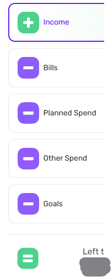
The Spending Plan uses a variety of colors for the plus, minus, and equals icons in the navigation pane. But for the most part the colors seem random and don't really convey much information.
The exceptions are the green for income and the green/red changing icon for "Left this month." Those make sense.
I would suggest using the same color for all the "minus" icons. Something like the illustration on the right.
DryHeat
-Quicken Classic (1990-2020), CountAbout (2021-2024), Simplifi (2025-…)0 -
I do not agree that transfers are bills. I used the transfers section to separate my automatic savings/investments from other bills and now I do not have a clean view of what is a bill and what is going into savings. In other words, this update has conflated essential spending (bills) and non-essential (transfers). I used this to get an idea of my budget needs, and savings rate. Filtering isn't good enough, it adds a step. Please revert this change! Or show in categories like is done with "other spend".
2 -
"@DryHeat thanks , I actually do the opposite as I try to capture ALL my daily spending, like dining out, groceries and such in the Planned Spend."
Not exactly opposite, I think. I also capture dining out and groceries, along with thinks like auto and shopping, in Planned Spend. Those are areas where I have a good idea of what I will spend each month
But I have a substantial amount of Other Spend that is not consistent from month to month. One month it's travel, another education, another unusual pet expenses. It's the month-to-month inconsistency that (to me) makes these inappropriate for Planned Spend.
If you are capturing all your daily spending in Planned Spend, you must have a much more consistent life than I do. Or perhaps you fiddle with your Planned Spend numbers during the month. Either way, that doesn't work for me.
DryHeat
-Quicken Classic (1990-2020), CountAbout (2021-2024), Simplifi (2025-…)0 -
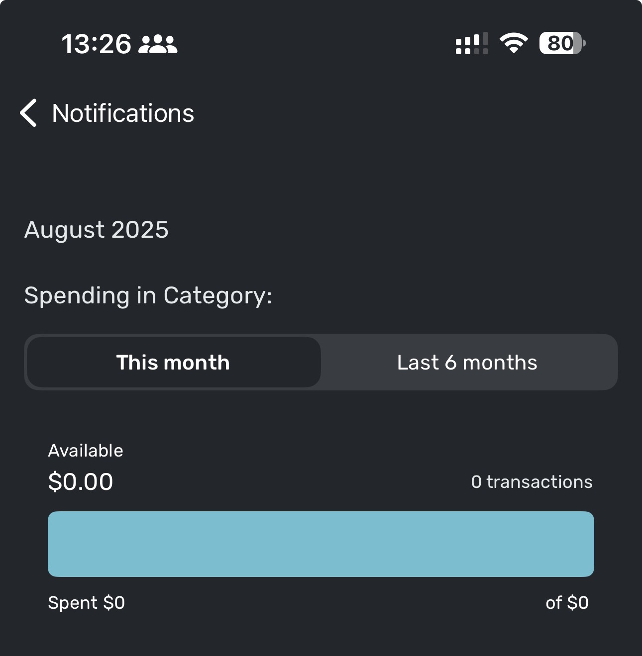
iOS. Got a notification that spending for a category was over limit:
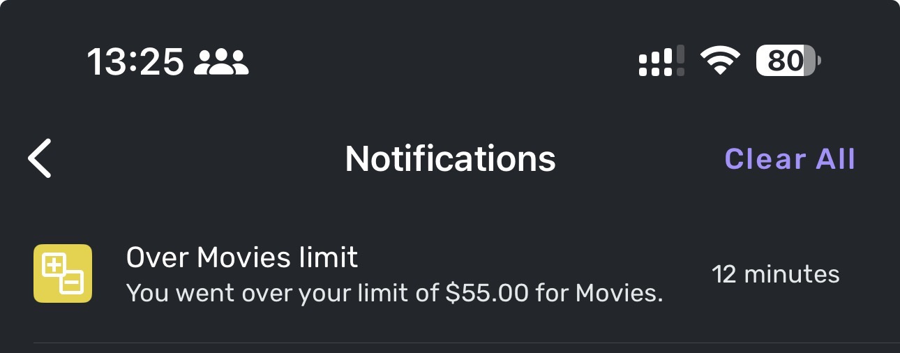
Tapping the notification showed me this:
Tapping 'Last 6 months' gave me this:
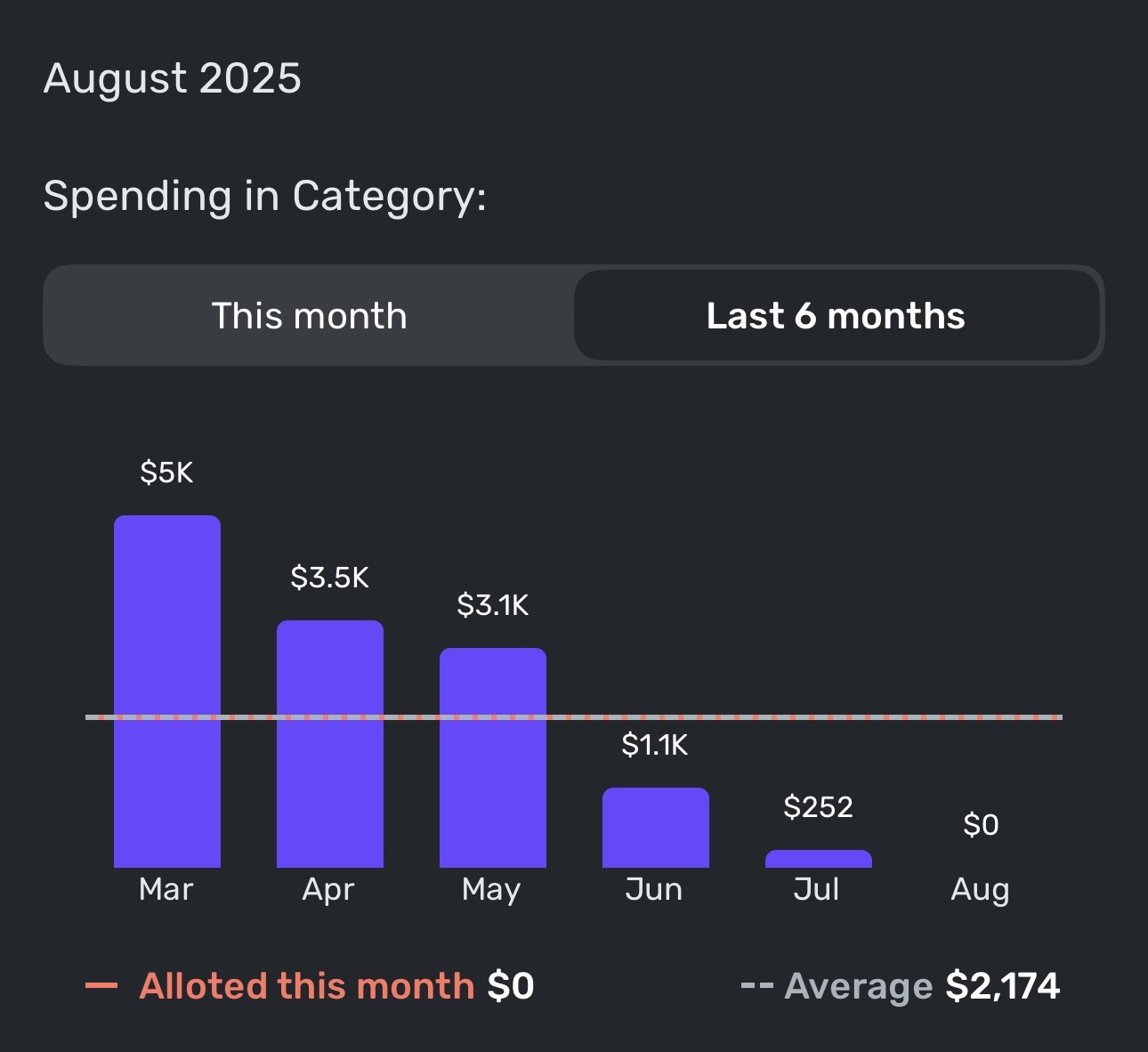
Now, I like movies as much as the next guy, but I think there might be an error here.
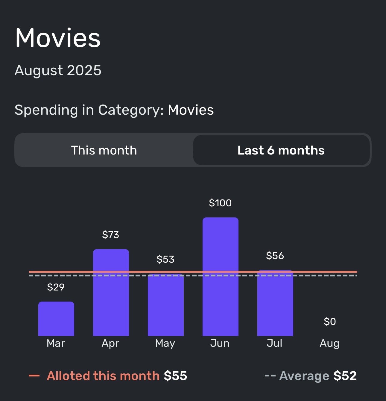
To note, this ONLY happens when accessing this section directly from the notification. When I navigate to this section the usual way, I get the following (which is accurate):
 0
0 -
@DryHeat I use rollovers for things like Vacation and Education/Classes. Other things like Auto repair expenses are in Spend as rollovers.
I have an annual budget each, divide it by 12 then roll it over each month. so yes, month to month it varies, but shows where and when the money went. I try to manage to the total per year. This way, the year is planned and hopefully minimizes the Other category. When i start to see consistent "others" I think about how to incorporate into the Spend.
I think both ways, rollovers in Spend or seeing the expense in Others work…personal preferences!
1 -
-
@cloudquick, disregard! I see the issue on the Mobile App as well and have passed it along.
Thanks for letting us know!
-Coach Natalie
1 -
@Max1223 You asked to hear how folks use the Per Day number, so here it goes…
On the first of the month the Per Day number told me I could afford a small latte at my local boutique coffee shop. By the sixth of the month I had enough per day to spend to buy medium latte (if I haven't been buying that daily small latte.) by the fifteenth of the month my per day spend was enough to by a large latte every day for the rest of the month or I could skip the latte and get a #3 at In-N-Out for the rest of the month ( again, if I haven't been buying the smalls or mediums already). Buy the 25th of the month I have enough per day available to really splurge and take mi espouse to the Vitage Press for an all-out 3 course dinner with wine unless of course I had already spent the Per Day on all that other stuff.
Danny
Simplifi user since 01/22
”Budget: a mathematical confirmation of your suspicions.” ~A.A. Latimer1 -
Oh, just now noticed that the "left per day" is back.
Danny
Simplifi user since 01/22
”Budget: a mathematical confirmation of your suspicions.” ~A.A. Latimer1 -
I do too, have a Planned Spend for dinning out. I don't use the Per Day number in this way. This was more of a tongue-in-cheek response. I'm set up a lot like you are. I have all my spending in the Spending Plan and keep Other Spending as near to zero as possible. @DryHeat gives a good use example that is a more practical usage.
Danny
Simplifi user since 01/22
”Budget: a mathematical confirmation of your suspicions.” ~A.A. Latimer0 -
OK, I'm being a bit verbose here, but one more comment related to the actual topic of this thread - Feedback on the new Spending Plan design.
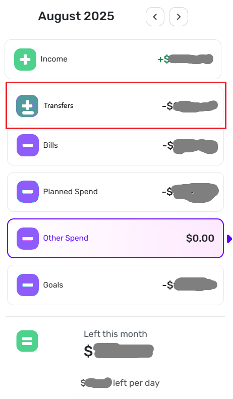
It's been several days now and I'm still in the transition phase, but I find myself wanting badly for the Transfer section to be more readily accessible.
I have 7 automatic transfers set up at my various financial institutions and these are set up in QS as recurring transfers with additional non-recurring transfers during any given month. Yes, these are all excluded from the Spending Plan and Reports, but they are there, and I do like to keep track of them as the month progresses.
In keeping with the new design, I find myself "expecting" to see "Transfers" in the master list on the left. I understand that due to the nature of most transfers being excluded from the Spending Plan and/or Reports, that they don't impact the Available and Per Day numbers like the other sections do, but these are substantial movements of funds and it's good to keep track of them. Another option would be to keep them with "Bills" but go back to something like the original Spending Plan layout with a summary bar and dropdowns for "Bills," "Subscriptions," and "Transfers/Credit Card payments"
Danny
Simplifi user since 01/22
”Budget: a mathematical confirmation of your suspicions.” ~A.A. Latimer0 -
@Coach Natalie The $NaN error occurred when I edited the July spending plan this morning (added a transaction to zero the balance left to spend). I have always done this at the end of every month with no problem. Then I saw when I use the left arrow to view previous months, some of them now show the error as well. This is a new error since the update. I am seeing this when using the iPad version of the software, however the website version looks good (no error there).
0 -
@donnajean, thank you for the reply!
I myself have some unresolved items, but I need to leave them that way so I can capture videos of the process to update our help article. When I do so next week, I will keep an eye out for this issue and get back to you and we can go from there.
It sounds like you resolved all outstanding items and then allotted the leftover funds elsewhere to get down to $0 Left This Month — did you do so by contributing to Savings Goals, or what's your process so I know how to test it from my end?
Enjoy the weekend!
-Coach Natalie
1 -
@Coach Natalie I just debit my ‘Month End Carryover’ category (created under ‘Income’) on the 31st of the month with whatever amount of money I have left over (say $100), then I credit the same $100 to the same ‘Month End Carryover’ category on the 1st of the new month. I’m essentially rolling over any unspent money to the start of the next month.
0 -
@Coach Natalie I think I'm having carry over issues as well, but different ones than above.
In July, I was overspent in a few categories and in Aug, only SOME of the overages carried over.
July

Aug reset itself

I DO have other categories that were OVERSPENT July and the overage WAS reflected in Aug.
It seems a little random why some categories reset themselves and some carried over the overage.
Thanks
0 -
The overspent error on iOS mobile version is continuing even in the new month. It appears to only be referencing the set maxes for each category at the beginning of the month and fails to update when you update each category after the beginning of the month. Product team will need to troubleshoot and fix this new bug.
0 -
You're right about the pie chart, but I'm not aware of any other part of QS that uses these colors in a meaningful way. As for the pie chart, some may like it, but I don't find it helpful. It just repeats the numbers.
I would be happy to do without the pie chart to make room for a separate section for Transfers without exceeding the screen height. Something like this:
[EDITED TO ADD]
When I talk about "these colors" not be used in a meaningful way, I am talking about the colors that I removed from the navigation bar in the image — not the colors that remain. I kept those colors because they match the "money in, money out" usage in the rest of QS.
DryHeat
-Quicken Classic (1990-2020), CountAbout (2021-2024), Simplifi (2025-…)0 -
@Max1223 — "As designed, the different colors make sense."
I agree that they make sense because they are needed to make the pie chart intelligible.
Is there any other way that they "make sense"? Or is it just the pie chart? I want to make sure I'm not missing something.
By the way, my suggested revision of the navigation panel would work just as will with the old colors if people really want them.
DryHeat
-Quicken Classic (1990-2020), CountAbout (2021-2024), Simplifi (2025-…)0 -
The color coding is used on transactions in Bills and Income but I agree not especially meaningful.
However, I do value the pie chart personally as it gives me the sense of how on track I am at a glance. And “Other Spending” is meaningfully color coded in a friendly pink color (less aggressive than the angry orange-red color your pie chart turns if you overspend your income in the month). My spending plan is setup such that as Other Spending (I.e. unplanned spending) goes up Savings usually has to go down. Sometimes there’s some flex in my Planned Spending but I’ve got that total pretty well dialed in to my lifestyle & habits so even if individual category amounts change the monthly total doesn’t change much.
Overall, I think having different colors for the different spending buckets is a good feature and shouldn’t be changed to a single color that would make the pie chart useless and monitoring the different spending buckets less intuitive. Also, reports assign random colors to spending categories as it is. You have to in order to see the different expense types and how they build-up into the total expense number.Edit: I will say I have no real preference for what colors chosen other than them being different for the different buckets.
Edit edit: a past month example of the kind of pie chart I want to see each/most months. The pie chart does help my monitoring
 0
0