Mobile App: Move the 'Reviewed' checkmark to the left side of transactions (edited)

Current implementation is messy, imo.
Check out this awesome screenshot I edited (actual screenshots are blocked 😅)
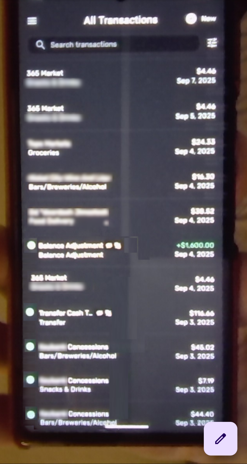
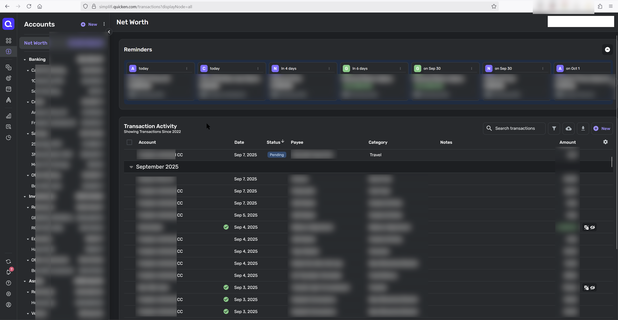
This change would match the layout on web:
Comments
-
@trd716, thanks for sharing your feedback with the Community!
To clarify, are you requesting that transactions on the Quicken Simplifi Mobile App display the "reviewed" checkmark on the left side of the Payee, instead of the right side?
Let us know!
-Coach Natalie
0 -
Yes! It helps me see which transactions are reviewed since they checkmark isn't moving all over the place. And I think it would be more appealing visually. Thanks!
0 -
@trd716, thank you for confirming!
I have turned this into an Idea post so other users can vote on it and our product team can review it. For more details on Idea posts here in the Community, please see our FAQ:
I hope this helps!
-Coach Natalie
1
