Enhanced Reports: Share your feedback here!

With the recent enhancements made to reports on both web and mobile—now available in Early Access—we’d love to hear your feedback! 🎉
These updates are part of our ongoing efforts to improve the reporting experience in Quicken Simplifi, and your insights play a huge role in helping us fine-tune what’s next.
You can check out the full announcement for this feature enhancement here:
-Coach Natalie
Comments
-
When running a report with a custom time frame, it would be highly beneficial to have a dynamic "Current Date" (or "Today") option for the "To" field. For example, if I want to track my spending from January 1st, 2020, to the present day, I currently have to manually input today's specific date. If I run the same report tomorrow, I have to update the end date again. Adding a "Current Date" option would eliminate the need to manually adjust the dates every time a recurring report is run.
1 -
Yes, this is a great idea. I'm on the product management team, and I'll write up a ticket to get this into the features we consider for the future. Our top focus is getting everyone the ability to save reports first, but after that, we'll be open to lots of report enhancements, such as the one you propose above.
1 -
I want to highlight a few current issues, how to address them, and some upcoming changes.
“No Data” appearing in reports - Some users are seeing a “No Data” screen in the Spending, Income, and Savings reports, even when data exists. Clicking Reset will resolve this. During this transition, some reports expect specific configuration elements. If those elements are missing, the report can’t render and displays “No Data” instead.
Report type and row/column settings are reverting to the default configuration for beta users - As we update configurations to automatically add the missing elements (and reduce the issue above), some beta reports will reset. We’re able to preserve filter settings and date ranges, but report type and row/column selections will return to their defaults.
Unfortunately, this will happen again when we turn on the new reports for all customers, which is currently planned for the second week of March. We apologize for the inconvenience.Upcoming change to account grouping logic - For Profit & Loss (Income & Expense), Spending, and Income reports grouped by Accounts, we currently determine whether transactions appear under Business or Personal based on the account’s designation.
In a couple of weeks, we’ll switch to using the transaction’s usage instead. This means that if a personal account contains both business and personal transactions, all transactions will appear in the report according to their individual usage.
Pie Chart Improvements - Currently, the pie chart may display categories twice. This happens when a category is both a Business and a Personal category. The fix we're making is to include whether a category is Business or Personal in the pie chart legend so you can distinguish between the 2.
Net Worth Balance Improvements - Currently, we always use the Bank balance when calculating Net Worth. A number of customers asked us to change this behavior and to use Balance with Pending if they are using that balance.
We're sorry for the inconvenience this may be causing, but we hope you'll like the report improvements. We're trying to minimize the changes, but unfortunately, some can't be avoided.
1 -
@Coach Jon asked me to leave a comment here about
Spending Report on iPadOS 18.7.3 Not Changing Transactions List When Selecting another Category.I have tried resetting the report but the subject functionality still fails. Changing any of the Date Range or Group By filters doesn’t seem to make this feature work either. Please investigate? Thank you.0 -
Choosing "Show all categories" shows a Category in the bar graph even though that Category only has transactions that have been excluded from Spending Plan and Reports.
For example, in the image below I have a main Category with subcategory "Utilities." Two transactions show up in that subcategory for the selected period, even though both are marked as "Exclude from: Reports."
The totals for the main Category and subcategory show up in the report (both in the bar graph and in the detail list) with an amount of $0.00. The two excluded transactions show up in the detail list with amounts of $0.00. (Note: the actual amounts of those transactions are not zero - they only show as zero here.)
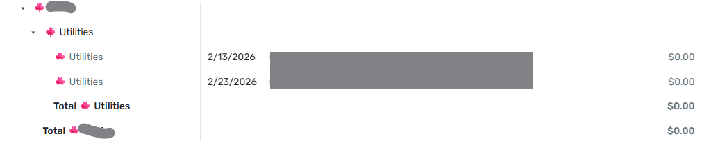
I would expect these transactions not to show up at all in the report. And, as they are the only transactions in the Category, I would expect it not to show up either.
DryHeat
-Quicken Classic (1990-2020), CountAbout (2021-2024), Simplifi (2025-…)0 -
@DryHeat, since the feature you're referencing is related to the new Enhanced Reports, which are currently in Early Access testing, your post has been merged with the official feedback thread so it can be viewed by our product team.
Thank you for bringing this to our attention! We will let you know if any further info is needed.
-Coach Natalie
0 -
I am in a state of shock. Mid tax preparation season, I no longer have a way to re-create an income & expenses export that matches my defined category hierarchy that is usable in Excel.
The .xlsx export function that was so useful, is gone.
The .csv export has the following changes that make it not useful without a LOT more clean up work after each export:
- The category hierarchy is flattened into a fixed depth, so the subcategory relationships I set up are no longer reflected.
- Expenses show up as positive numbers rather than negative numbers - except for the expense totals - so the positive expense numbers add up to a negative total.
- The category totals have been removed. So not only is the category hierarchy altered (point 1 above), the category subtotals have to be added back manually.
I left very similar feedback earlier in the beta period and I am disappointed beyond words to see my feedback ignored.
Here is the list of fixes I would suggest:
A. Bring back the existing .xlsx export immediately - it's very useful. I run a business and not being able to re-create past year reports (or even update a report for the current tax season) represents a LOT of rework for me, and I suspect many other customers.
B. Change the .csv export to not flatten the category hierarchy, add category subtotals, and leave all expense items negative, rather than the mix of positive and negative. If the .csv export had these changes, it would be a reasonable alternative to the existing .xlsx export.
I just can't believe Simplifi has left me with no effective way to export my category hierarchy and see the subtotals in the way I structured the categories. I feel totally stuck.
At minimum please bring back the .xlsx functionality the way it was, right away!
I apprecite the teams' efforts to improve the product, but there are some serious regressions in functionality in this update that are very frustrating to see.
0 -
Summary Report Mismatch:
If you select a time frame, the total expenses for the period dont match the bar chart totals. 0
0 -
Is this when using v6.9 ? This is supposed to be fixed in v6.9.
UPDATE: I got my version numbers mixed up. It should be v6.8. I also checked in with Forteleza and the good news is that v6.8 does fix the tablet issue they were seeing.0 -
@Coach Marcus I am using v6.8.0. The App Store does not show an Update yet.
0 -
You're right. I got the version numbers wrong. It should be v6.8. Let me check with my team about this specific issue. I really thought it was fixed but possibly it didn't make it in time for the release.
0 -
I'm so sorry I missed the points you posted in the beta. You can turn off Early Access to get back to the old reports for now. Let me take a look at the issues you brought up around export.
1 -
I'm having an issue where it lumps 'Everything Else' as the largest category which makes the reports difficult to read or find valuable. For some reason it thinks 'Taxes' are the largest expense and Mortgage gets lumped into 'Everything Else'. I'm on version 6.8, see below.
 0
0 -
Thanks for reporting this. Let me reach out to you directly to see if we can figure out what the issue is.
0 -
Thank you for submitting this issue. I direct messaged you with a question. I think the issue that you're running into and jdtrujillo ran into is related. It appears the way we calculate the balance and breakdown the Bar Chart doesn't match how we breakdown the Pie Chart. I think the Pie Chart is correct so if we just make them match everything will work out. I was also able to reproduce a similar issue to jdtrujillo in my own personal data. I have a lot of investment transactions that automatically appear under spending because they come in as uncategorized. Most of these are positive numbers and not negative numbers so they actually can't be drawn on a bar chart or a pie chart for Expenses. Also, the math will come out differently if the sign isn't taken into account. I think jdtrujillo may have had a similar issue.
2 -
Hi everyone, thank you for reporting your issues here. I apologize but I was on vacation at the beginning of the year and missed the many great comments you posted in the other beta report forum post. I'll go through those tomorrow and will make sure I get any remaining issues into our system for consideration and bug fixing.
I saw there were some posts about the loss of the old inline editing in the Spending and Income reports, and I wanted to address that here. As you probably know, we use anonymized analytics data to understand how people are using the Spending report. From what we can see, a little over half of you click on the pie chart, while less than half edit transactions directly within the report.
As we moved into this new Reports experience, we made a decision to place more emphasis on reviewing larger sets of data and a bit less on editing directly within the report. However, because so many people relied on the Spending report to edit their transactions, we didn’t want to take that capability away. So we moved the old, edit-focused Spending report to a new Spending tab under each account’s transaction list. We did the same for Income. These are available to all Early Access customers. You can review transactions from multiple accounts by clicking on the All Accounts sidebar item.
We felt this functionality really belongs where most transaction editing already happens — in the account transaction lists. This also mirrors where you’ll find similar features in our Quicken Classic products.
You can still edit transactions from within the reports, but it won’t be inline — edits will open in a dialog. Another option is to click on a pie wedge to see all the transactions that make up that segment — editing is inline in that view.
For those of you who mentioned that you missed these reports, we’re hopeful you’ll find that editing your transactions in the transaction list instead of reports becomes a simple workflow change.
0 -
DryHeat, I'm personally with you. If I mark something as excluded from reports, I don't expect them to appear in reports. This is also how Quicken Classic works. However, there was a decision made a number of years ago, based on customer feedback, that some people want to see the excluded transactions so they can catch mistakes or review what was excluded. In this case, these transactions would "appear" but would not be included in the math which is why they show up with a 0 amount. Once we complete our Saved reports work, the plan would be to go back and improve how these types of things. Currently, the thought is to simply make it a display option so someone can decide when they want to show or hide these transactions. I think there is a benefit to being able to see the excluded transactions inline with the rest of the report to see if there may have been a mistake in setting the transaction exclude flag especially if a calculated number doesn't match expectations.
1 -
I understand, and I agree with making this optional. Reports are often created for particular purposes and and there are reasons for excluding certain items.
Here's something else to consider going forward.
The treatment of excluded transactions is inconsistent across different areas of the program. In all cases that I am aware of, the transactions are shown "grayed out." But…
- In Spending Plan | Bills they are segregated and show the amounts.
- In Spending Plan | Other Spend they are not segregated and show the amounts.
- In the Report transaction list they are not segregated and don't show the amounts.
In two of the cases the correct amounts are shown, which is useful. In Reports, the amounts are shown but set to zero, which diminishes their usefulness.
DryHeat
-Quicken Classic (1990-2020), CountAbout (2021-2024), Simplifi (2025-…)1 -
From what I can tell so far, the 'Alternate Row Color' setting doesn't seem to be doing anything on Chrome on a Windows laptop. Other than that, I like what I've seen so far.
Chris
Quicken Simplifi user since 2021.
Quicken Desktop user since 2014.
Spreadsheet user since forever.1 -
You're right. It seems broken regardless of browser or platform. We'll try to fix it. If we can't, we'll remove it temporarily until we can fix it. Thanks for reporting this.
1 -
This is really good feedback. We should be more consistent, and it's interesting to know that seeing the amount is useful. I'll make a note of that.
1 -
I also dislike the 'greyed out' transactions that are marked 'exclude from reports' showing in reports. In my case, while I do not share my data file, I have someone I often 'screen-share' my weekly spending report with to review it —it is kind of a 'sanity-check' for me: Has my spending been 'reasonable' over the last week or so? Right now, as I have withdrawn from a particular prescription drug, I am at 'higher risk' for 'mania' as a withdrawal side effect (mania = higher spending, among other things). So, having another set of eyes to review spending is helpful. There are some transactions I do mark 'exclude from reports' because, for example, I may have returned them and am waiting on a refund and just don't need that counted in my spending, since it was returned (often, when the matching return shows up, I may delete both the purchase and return from history).
I would prefer transactions mark exclude from reports are just — as they say - excluded .., not just from totals but from the 'report' portion.
—
Rob Wilkens
1 -
I tend to agree with Rob and others that excluded items shouldn't be shown in Reports although I can see having them there in "ghost" form could be useful for informational purposes. And sometimes I have excluded things and later decide to un-exclude them.
I hadn't noticed this "feature" because since I still use Classic, and Classic doesn't have the option of including/excluding from Reports, i have a tendency to use one-sided transfers instead and these are not shown in Reports. In Classic, you can optionally show transfers in Reports, so the answer here is to make it optional for Reports in Simplifi to show excluded transactions (and transfers as well). I note that Coach Marcus seems to agree it should be a display option.
Also, and apropos of what Dryheat said above, I don't like seeing grayed-out transactions in Spending Plan either although I can hide them, but it has to be done on a case by case basis.
Good points made by all.
Steve
Quicken Simplifi (Safari & iOS) Since 2021
Quicken Classic (MacOS) Since 2009
MS Money (1991-2009) and Dollars & Sense (1987-1991)0 -
Please tell me if I'm missing something on the Spending Reports page, because my view of it's current state is awful.
- I hate the automatic detailed category pie chart view. I loved being able to go to the Spending Report, and seeing the pie chart with just my top level categories, then being able to click on one of those (say Travel) and and see the drill down of the Travel subcategories and spending for each. I can't find a way to do this now.
- There are dozens upon dozens of "unknown" categories listed under "Everything else". I have meticulously categorized all my transactions, and in the transaction view, everything is categorized properly, yet the Spending Report chart lists unknowns. Even checking the list below the chart shows all items are categorized properly, so why is the chart not seeing categories associated with the transactions, and is marking them as unknown?
- Listing the Expense transactions by category is completely useless to me, and taking away the ability to sort those transactions by date or amount makes it even more useless. Reading through this thread, I understand this ability is available when clicking on a specific category, which could work, but I refer back to point one, with the inability to view top level categories and associated transactions.
Now I did discover that if I filter by a specific top level category, it will show that category the way I want. For example, if I set a filter for the Travel category, I get a pie chart showing all the Travel subcategories and expenses for those. However the transaction list is still sorted by category, with no ability to change it unless I choose a specific subcategory. I can then sort by the various columns.
I'm willing to work around the expense transaction list, but I would really like a pie chart of top level categories back, without having to set a filter for each top level category I want to view.
0 -
@mtrow28 I am a bit confused by your post. Are you using the web app or the Phone app? The Phone App is more limited.
- When I go the Spending Report in the web app (either from Dashboard or Reports) using the new Reports in Early Access, I go to the top level Categories and then can drill down. It also shows all of them (although so far this month I have used only 6 categories). But I think you can click the button at the bottom of the chart screen to show them all:
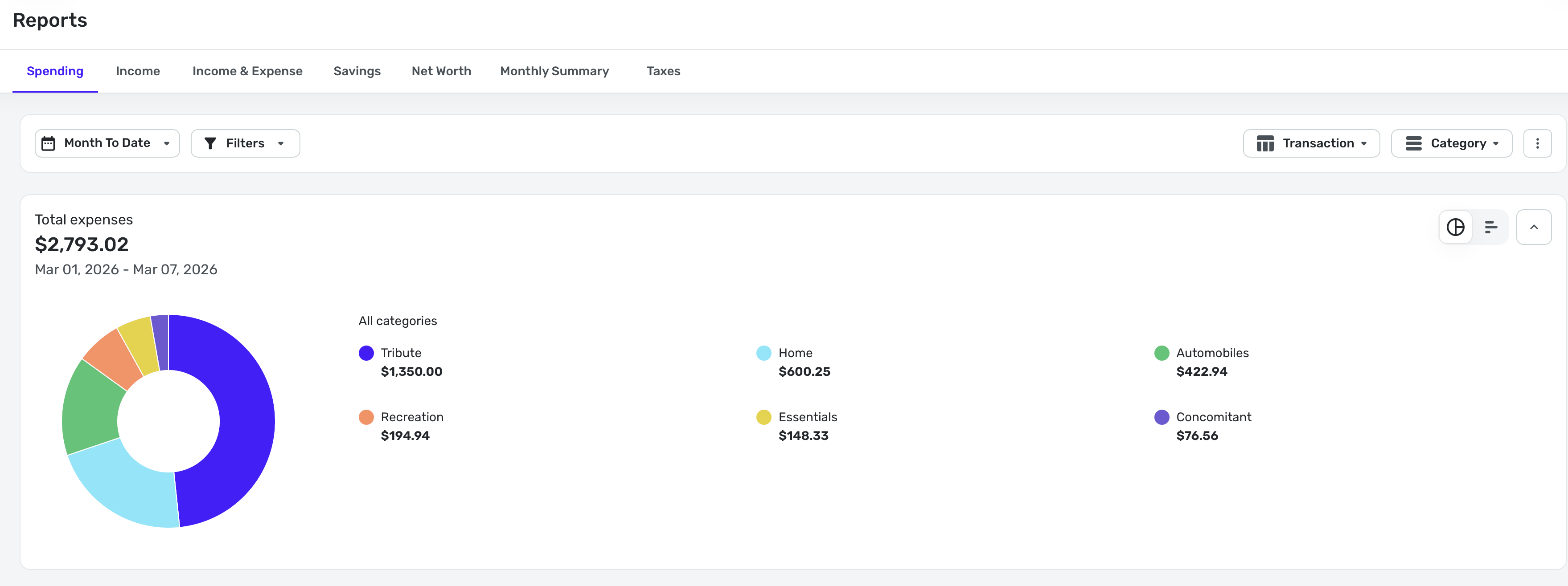
I can then click on Automobiles to see details:
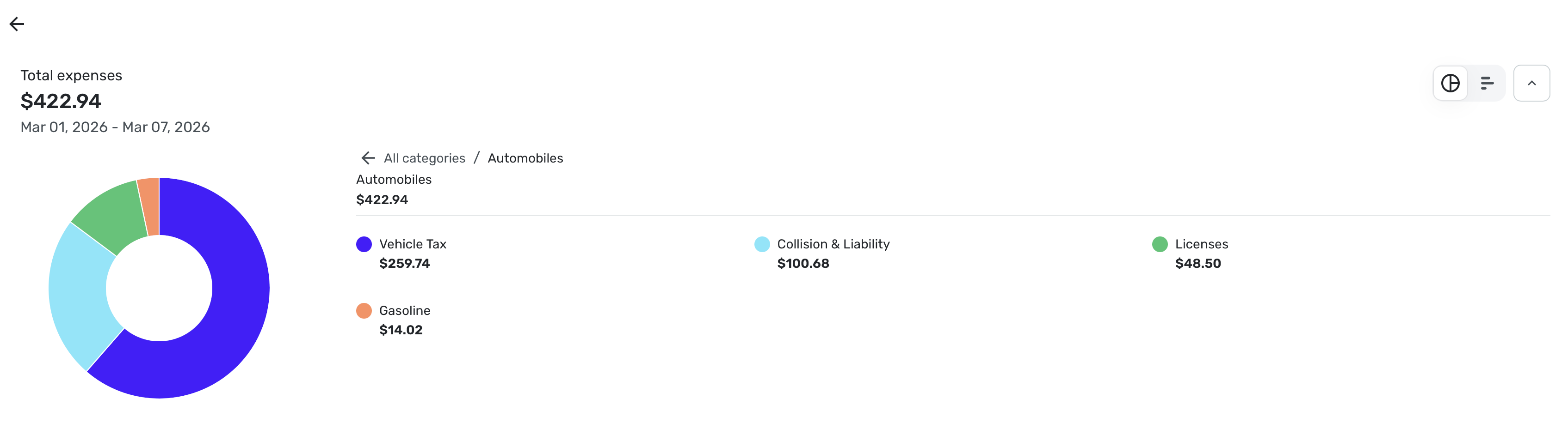
March is my month for renewing tags so I have more than usual.
2. I don't understand what you mean by Unknown Categories. Could you post a screenshot? I am sure I am just misunderstanding what you said.
Steve
Quicken Simplifi (Safari & iOS) Since 2021
Quicken Classic (MacOS) Since 2009
MS Money (1991-2009) and Dollars & Sense (1987-1991)0 -
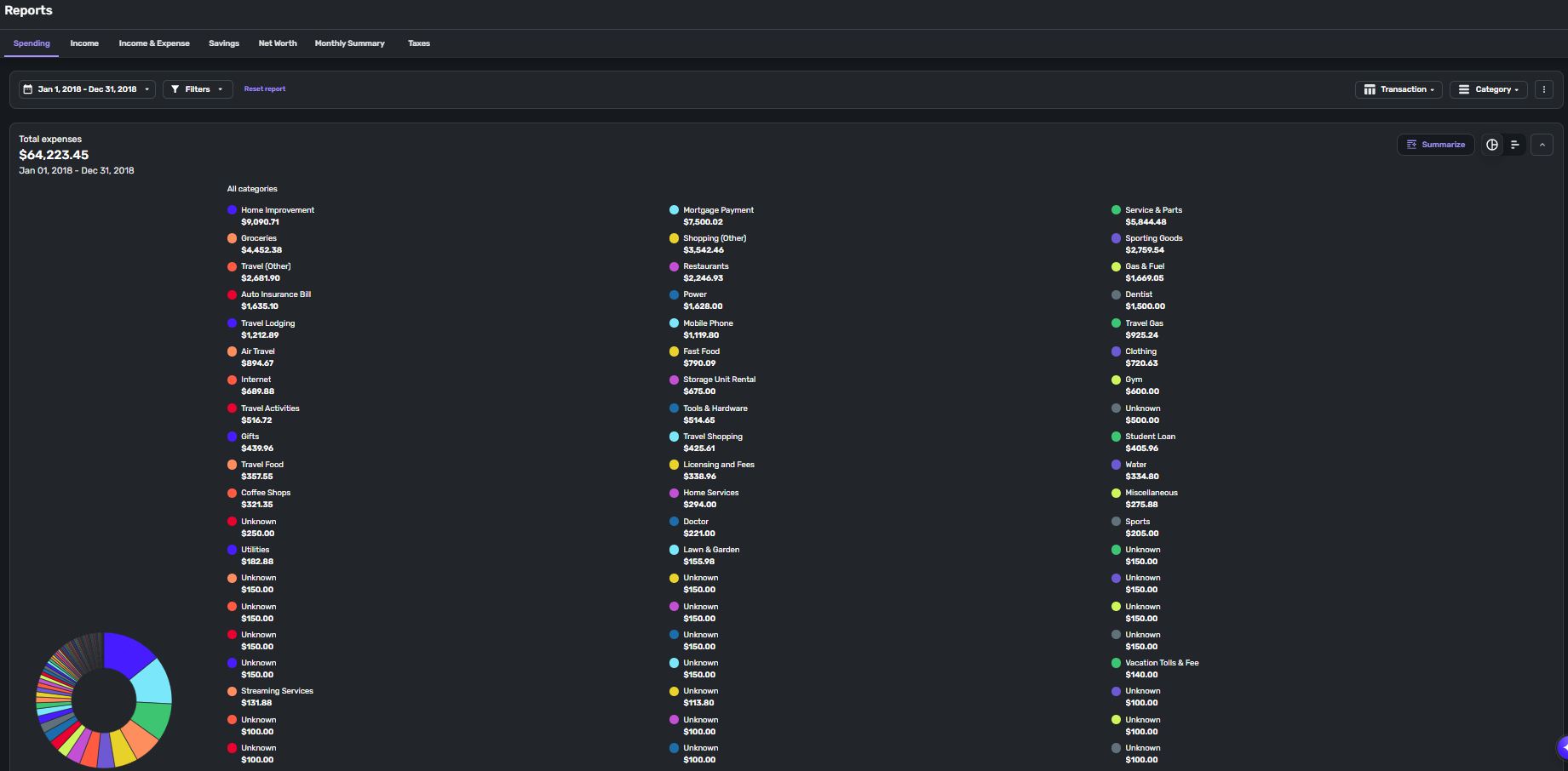
@SRC54 I'm using the web app. After a lot of testing, my experience is inconsistent. Using Enhanced Reports, I get different results based on the time frame for the report. I've tried time frames of Month to Date, Last Month, Last Three Months, Last Year, and gone through and chosen by date over 3, 4, 5, 9 month periods. Most of the time the report shows as you've observed in your screenshots. But there are many times when the report shows as above. That's the entire 2018 year. Now if I change the dates and choose a 3 month window in 2018, the report looks normal, like what you posted. All the "Unknowns" are categorized correctly, yet on this specific report, it can't identify them. Again, this result is random. I've chosen a 6 month window in the past year, and it appears like this, and I've chosen a 9 month window that appears normal. The time frame that most consistently shows the attached result is the full year report, and that's the report I rely on the most.
0 -
@mtrow28 Thanks for the screenshot. Kudos for importing all that data from 2018 into Simplifi. That was no doubt a lot of work. (I'm assuming you haven't been using Simplifi since 2018)
I also wonder if there are some bad categories that got imported. Have you checked Settings: Categories to make sure there isn't an "Unknown" category? When you click on that category, what does it show? Did you check to see what the transactions say when you look at them?
I assume you probably have since you say this is random and other times it doesn't happen.
If these unknown categories are always the same ones and you verify their name(s), I might try renaming them temporarily to see if that fixes the spurious naming. If that doesn't work, you might need to create a new category and move the transactions into it to see if that fixes it. It sounds like some sort of corruption in the categories.
Just some ideas.
Steve
Quicken Simplifi (Safari & iOS) Since 2021
Quicken Classic (MacOS) Since 2009
MS Money (1991-2009) and Dollars & Sense (1987-1991)0 -
The option to filter spending reports by flags seemed to be gone.
0 -
@SRC54 Simplifi user since Mint went under. Was a Mint user since 2012, and yes, it was a lot of work to get all that Mint data into Simplifi, but I'm glad to have it, which makes it extra frustrating when I can't view the data I want to view.
In that view I posted, if I want to view the transactions in the "Groceries" category, I can click on Groceries, and it shows the transactions. Anything categorized as Unknown is not clickable. There is no "Unknown" category in my category list.
If I scroll below the pie chart to the actual transaction list underneath, there is no "Unknown" category.
The vast majority of the "Unknowns" are transactions categorized as "Charity". In that same view I posted, scrolling down to the transaction list, there is a Charity category and all the transactions are listed under there correctly.
So it seems when selecting certain time frames, particularly full year periods, the pie chart graphical portion is not pulling the category data for those transactions. It's odd that it's only for that specific category. I think I identified 2 transactions that are listed in this view as unknown that are not categorized as Charity.
1 -
Well, is Charity a main category all by itself or a sub-category? I might try creating a new category called Charity New and then move the transactions there.
Once you create the New Charity category, you can delete the old one and Simplifi will ask first to where you want to move the transactions. I know that can be scary but just do it carefully and slowly.
Steve
Quicken Simplifi (Safari & iOS) Since 2021
Quicken Classic (MacOS) Since 2009
MS Money (1991-2009) and Dollars & Sense (1987-1991)0