Ability to hide the "Net Worth" and "Reminders" banners in Transaction Activity (edited)

I spend most of my time in the Transactions area when working with the SimplifiMoney website. I've noticed that there is an opportunity to make better use of the vertical "real estate" on this page, whereby the actual transactions section should be allowed to take up the vertically scrollable area of the page.
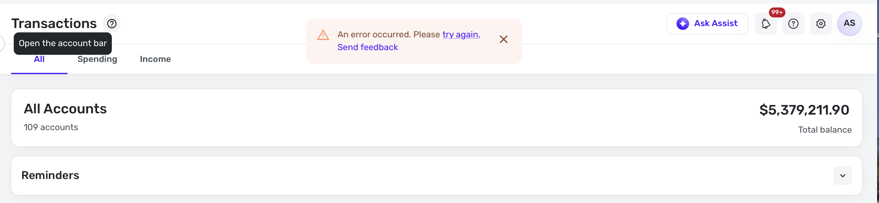
You'll notice the highlighted area in the screenshot below that the "Net Worth" element unnecessarily takes up some of this vertical space. It's redundant as this is available from the pop-out panel on the left above the list of accounts. It also doesn't provide any value in the contect of managing transactions. My vote would be to remove the "Net Worth" section entirely for these reasons alone, but also to free up some vertical space.
Also, the "Bills & Payments" element is something I have never used. It just gets in the way. However, I understand if other users find it valuable, so perhaps there's some justification for it being available. It would help, however, to be provided an option to hide this element for those, like myself, who don't need it nor see the value of having it in this area, especially when there's a way to navigate to the dedicated "Bills & Payments" area from the menu on the left-hand side of the screen.
With these two sections getting in the way, it makes it more challenging to view and work with the items in the "Transactions Activity" area, which is the primary purpose of this page. Could these ideas I shared above be incorporated somehow?

Comments
-
I agree with you, but I don't know if I'd consider it a bug, and if it's a design change, a Coach will have to come here later and turn this into an idea post, which will get my vote if I see it.
—
Rob Wilkens
0 -
I spend most of my time in Simplifi in the transactions screen categorizing transactions. I'd like the option to get more of the screen devoted to seeing these transactions. The top left carrot to get rid of the accounts sidebar is great! I'd also like the ability to get rid all of these items (see screenshot) as I never click on them. This is the transactions header, accounts box, and reminders box. If you scroll correctly you can get rid of some, but why not a "true full screen mode"? Thanks for considering!
 0
0 -
I think something like a full screen mode would be useful.
But I would keep at least the account name at the top of the page. And it would be very convenient if the account name were in a drop-down selector so you could switch accounts without leaving full screen mode.
DryHeat
-Quicken Classic (1990-2020), CountAbout (2021-2024), Simplifi (2025-…)0 -
I also minimize the Reminders/Cash Flow section a lot. And now it seems that Simplifi remembers your last selection when you go back to transactions. So that has helped a lot.
Steve
Quicken Simplifi (Safari & iOS) Since 2021
Quicken Classic (MacOS) Since 2009
Dollars & $ense (DOS) and MS Money (Windows) 1987-20090 -
bumping this old thread.
Please make more room for transactions on the transactions page! At least give us the option to hide all the unwanted features.
0


