We'd love to hear from our users on the new Customize Dashboard features on both the Quicken Simplifi Web and Mobile Apps. Let us know what you think by commenting below!
Here is the announcement with more details on this enhancement:
I know this has been a hotly desired capability… and here it is! This wasn't high on my QS wish list, but any user accessible flexibility and customization is welcome in my book.
Not to brag, since I had no say in the matter, but I landed in the first 20% of the Early Access group this time around and I just finished customizing my webapp dashboard. This is a great feature. Thanks QS Team.
________________________________
What follows is a depiction of my personal customization of the Dashboard. If interested, read on…
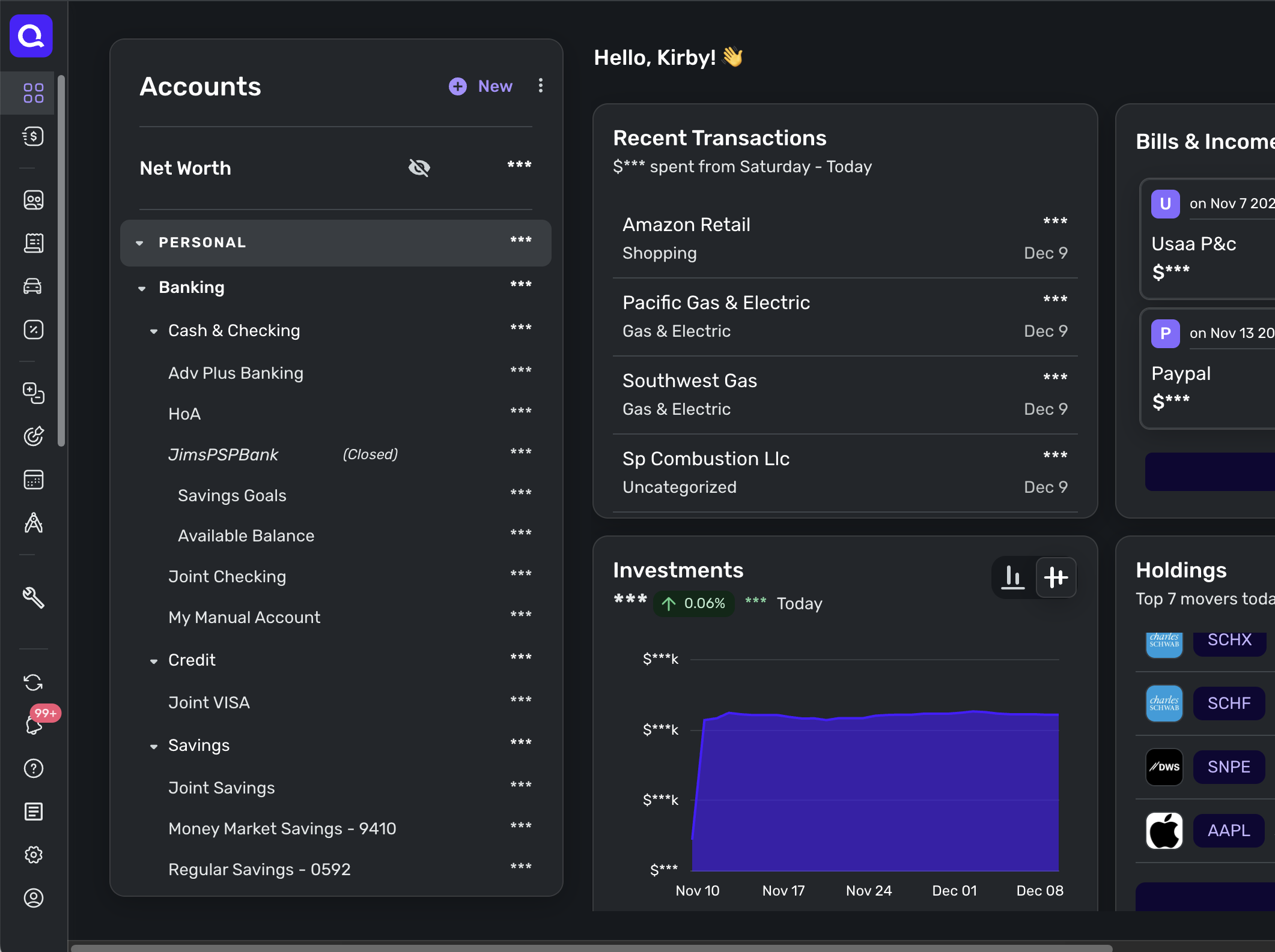
Since the Spending Plan IS my go-to page in QS and, IMHO, the crown jewel of QS, I took this opportunity to move the Spending Plan card to the top of Dashboard! YAHOO!!!
I moved the Income and the Spending cards to the second row. These two cards are my "big picture" or "snapshoot" cards showing me an at-a-glance view of where I am with this month's total inflow and outflow including a comparison with previous month totals.
My Bills & Income and Recent Transactions cards now sit in row three. These two cards give me a bit of "atomization" of the big picture seen in row two.
If I used my Watchlists routinely to monitor specific spending categories I would probably move this card up to just below the Spending Plan card, but I don't, so I'm leaving it visible and placed it to the fourth row.
Finally, I know some folks really dislike the Achievements feature in QS, but I get a kick out of reaching the various thresholds and being awarded the various badges. Since I'm still holding out hope to someday be awarded the 12 month Everything Paid badge, I left the Achievement card visible J4F, and it sits in row five next to my Credit Score Card which in its own way is a reward/achievement badge. I know, it's "silly" and finances are serious business - but still…
Now for the cards I have hidden. I don't do anything with my investment data in QS except to have it available for net worth and so I chose to hide the investment related cards. I have never found the Top Sending Categories card to be all that useful, so it's also now hidden along with the Potential Recurring card, which I found useful for the first few months, but after that most potential recurring expenses suggested have been false positives.
So, there you go, 5 rows of cards in a customized arrangement to my liking showing only what I want to see.
😎
Thanks again QS!
@DannyB Thanks so much for the feedback and the customization details! The team is happy you used and appreciated the ability to customize your dashboard!
The new Dashboard layout is awful! I'm completely onboard with the customization tools that have been offered, but the fact that the Accounts section now fills an entire full-width screen while blocking the at-a-glance functionality that was offered by the previous Dashboard screen is a major downgrade. The old sidebar display of the Accounts list was abundantly adequate to identify linked accounts and balances, while still enabling me to see other tiles in a overall gestalt. Please offer us the option of returning to the older display. At the very least, I would prefer to be able to include the Accounts tile in the customizable list, so that I can move it to where it's less obstructive to a one-screen perusal of my overall financial picture. Candidly, this "update" has me shopping for a different budgeting/financial management app.
This feature is now available to all of Early Access!
Very nice; I notice you can now have more dashboard cards horizontally, so I spent some time moving them around and got rid of 3 I didn't care about. Thanks!
@BIA I admit the accounts section is a bit wide on the Dashboard but when I expanded the web window a bit, I am able to see it and 3 horizontally placed dash cards, and I still have room on my 24" Mac to see Stage Manager on the left and desktop folders to the right.
Maybe they can compact the accounts bar a little.
I like the way you made it possible to organize the top cards on the Dashboard, but I hate the waving hand emoji that says "Hello, Name." Unnecessary and takes up screen space. Remove it entirely or make a setting to hide it.
I thought it was ok. It calls me Stephen, which even at 71 makes me think of my mother. LOL
Hint: You can go to quicken.com and change your name if you want. I assume that is where Simplifi got it.
But maybe it's better that Simplifi use my more formal name. 😂
Here's the link to the place you should post feedback on the new Dashboard features:
[removed link to merged thread]
One of the coaches will probably combine this post there.
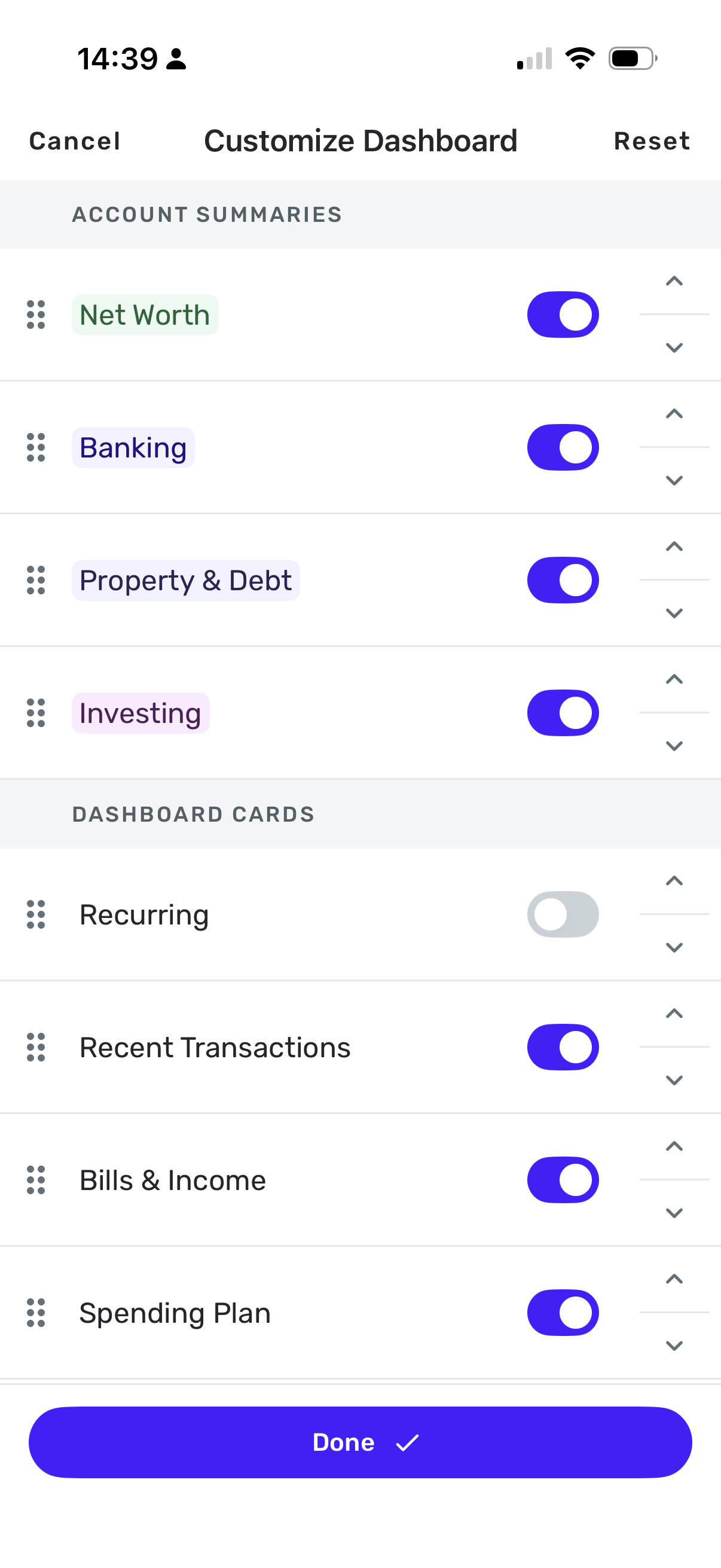
Hide Dashboard cards using on/off toggles
where is that toggle ???
@neon45 On the web app, you click on the Customize button at the top right of the Dashboard Page. You can toggle them on or off and move cards up and down in the order you want.
On the phone app, you click on the Pencil icon next to your name on the Dashboard and then hit Manage Cards.
If you don't see the Customize buttons or the pencil icon, you may need to check in Settings that you have the Early Access feature on.
Thanks… The Early Access isn't turned on. I'll hang out until the feature is sent to everyone.
Thanks again…
@neon45 I hear ya. I must admit that even though we are sort of beta testers when using the "Early Access", it's never been a real problem for me. Maybe had to turn it off once or twice for short periods in 4 years. It's been pretty solid, so maybe that makes us "gamma" testers? 😀
@BIA thanks so much. this is something we are going to fix! do you want to turn EA off for now and I can let you know when it's fixed?
Please make it so you can customize the size of individual "modules"
For Instance - I like having the Spending Plan as double width, so I do. But I also want Transactions as double-width right under it. Then I can mix and match the other ones. This would make this new feature WAY better. Just make it a grid that we can move the boxes around and play with their sizes.
@Quicken Kirby - Turning off Early Access has made my Simplifi dashboard experience MUCH better. Thank you for the recommendation. For what it may (or may not) be worth: maybe update the AI assistant? It told me it is NOT possible to revert to old display format.
I dont like the option that I need to click 4 buttons to see Networth summary. The entire info can be written together with less clicks for me and add also have all time graph as well like mint used to have. Appreciate anything we can do to bring that.
I agree with @BIA the accounts section is way too large. To make matters worse I can't move it to the bottom of the screen or collapse it, so I have to scroll past this giant blob to get to the dashboard items I most want to see. i'm on a laptop where the real estate is more limited and like the way the Transactions view shows accounts & balances in a compact list on the left. I will use that as my primary view for the time being.
I wasn't getting the issue with the accounts list that @BIA and others brought up. My accounts list is on the left as it has always been. I was just now scratching my head about these comments until I adjusted the browser window to a smaller size and the accounts list shifted from the left side panel to a full browser width box at the top as others described. I keep my browser at or close to full size, so this didn't show up like it did for other.
However, @Quicken Kirby has noted this problem and that it is being worked on as this feature is further refined.
Hi @FutureEye I assume you're talking about the mobile app. You can make the Net Worth summary your top card if you use the Manage Cards option, like this:
Also, we have just updated the web app with an improvement in how the Account Bar behaves for screen resolutions between 1k to 1.5k.
Thanks for your feedback and requests for more customization. I really appreciate your time and interest.
@Quicken Kirby that did the trick. That helped. For now I am good. The whole data of it can be summarized with graph in future. That would help.
This is great! I love having the modules I use most often all in one place. Thank you for updating it so quickly.
Customize Dashboard is now live to ALL users!
This is really helpful! I really like being able to hide the cards that are not important to me.
Now everything I actually want to see fits on one screen and I can see it all at once.
Yes! And it makes me happy!
I have checked out competitors (I would only use a US based competitor) and found their idea of cash flow analysis is based upon a forecasted budget. I have no desire to watch my categories go deficit and surplus over time and the flow analysis only has value if I meet the aggregate budget.
I only want to use simplifi categories, tags, reminders, cash flow and the reporting of actuals. Now I can hide all that other stuff! My reminders are forecast upon what I expect to happen next predicted by reviewing actuals.
My income is received at my brokerage account and I push cash local every month to live on. The available cash from the brokerage is a manual account in simplifi which I update once a month (one summary transaction).
I depend upon the features I mentioned.
Thanks
I have discovered weird behavior in the iPad probably because is really the same app but uses larger format (this is not the technical term), it doesn't align too well. Rearranging doesn't change that alignment. On the iPhone, there is no problem with alignment as all the cards are stacked.
In the web app, you can have then stacked and side by side up to 3 in a row. On the iPad, I have two in a row, but after the first two rows, they are stacked on the right hand side. It's kind of weird.
Also on the iPad, I end up with a duplicate once I start fooling with the cards. Right now, it is Recent Transactions. Earlier it was Top Spending.
So I have very uneven columns:
Column 1: (On the Left) Banking, Spending Plan, Recent Transactions
Column 2 (On the Right)Recent Transactions, Top Spending, Investments, Bills & Income, Credit Score, Watchlists
Moving things up and down will change the order but not the unevenness nor will it get rid of the duplicate. Resetting on the iPad doesn't get rid of the duplicate either.
However, the duplicate doesn't show up in the iPhone app though it will adjust to the order I saved on the iPad. Resetting on the iPhone and reordering WILL get rid of the duplicate on the iPad, but won't solve the alignment problem.
I don't use the iPad much except for travel so this is not a biggie for me. But the programmers have some work to do to make the iPad arrangement work.
Those of you who use iPads, please check to see if you see this behavior.
@SRC54, thanks for bringing these issues to our attention!
Our product team may see the comment you left here and fix the issues you described; however, since Customize Dashboard is out of Early Access now, if you'd like to report an issue and have it filed as a bug from here in the Community, you will want to do so by creating a separate post for each individual issue. This will allow us to work on and track each issue accordingly.
Otherwise, you are welcome to just leave your comment here as "feedback"!
@Coach Natalie Thanks. I will write it up.
[removed - duplicate post]
@donnajean, the issue you're reporting has been moved to a separate discussion, so troubleshooting/an escalation can occur. You will want to reply there:
Thanks!