The "Ask": Please add a toggle or a new chart view in the Investments/Balances tab that displays a Stacked Area Chart separating Cost Basis from Market Gains/Profits.
The Problem:Currently, the "Balances" chart only shows the total account value line. This is misleading for performance tracking because it treats deposits the same as investment growth.
- If I deposit $50k, the line goes up, looking like "success."
- I cannot easily distinguish between "money I put in" vs. "money my investments earned."
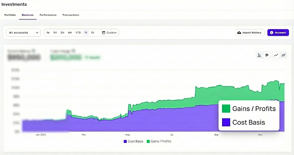
The Solution (See Attached Mockup):Since Simplifi already tracks the Cost Basis and Market Value for holdings, please visualize this data as a stacked chart.
- Layer 1 (Bottom): Total Cost Basis (The principal/cash invested).
- Layer 2 (Top): Total Gain/Profit (The market appreciation).
Why this is critical:For users focused on long-term wealth building, knowing the source of the net worth (savings vs. returns) is just as important as the total number. This is a standard view in many other portfolio tools and is a massive quality-of-life improvement for the Simplifi Investment dashboard.
Visual Reference:I have mocked up exactly how this should look in the attached image.