Transfer category accounts list in transactions got drastically narrower after 6.11.0 update

KB2014
KB2014 Member ✭✭✭
edited March 18 in Troubleshooting

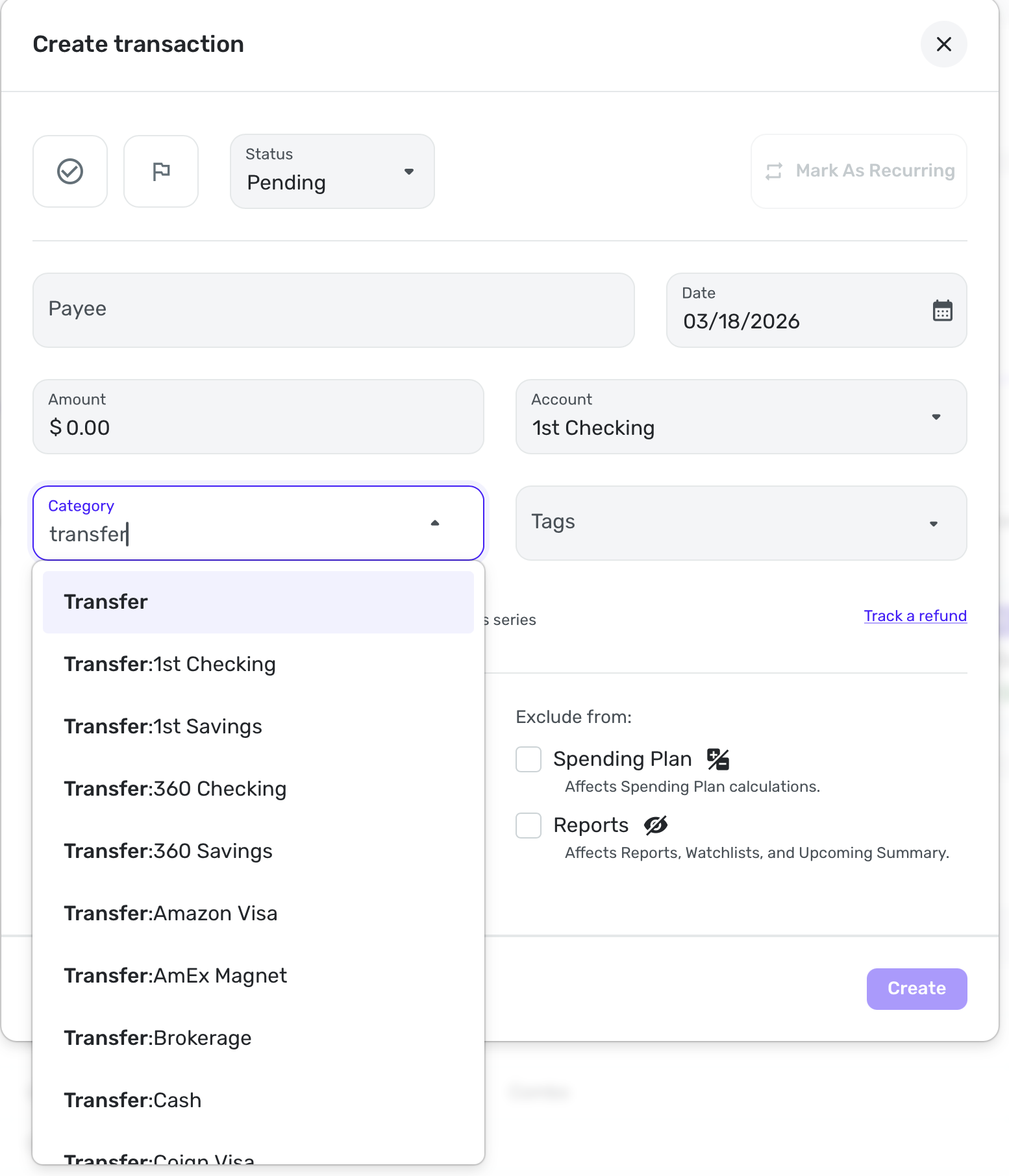
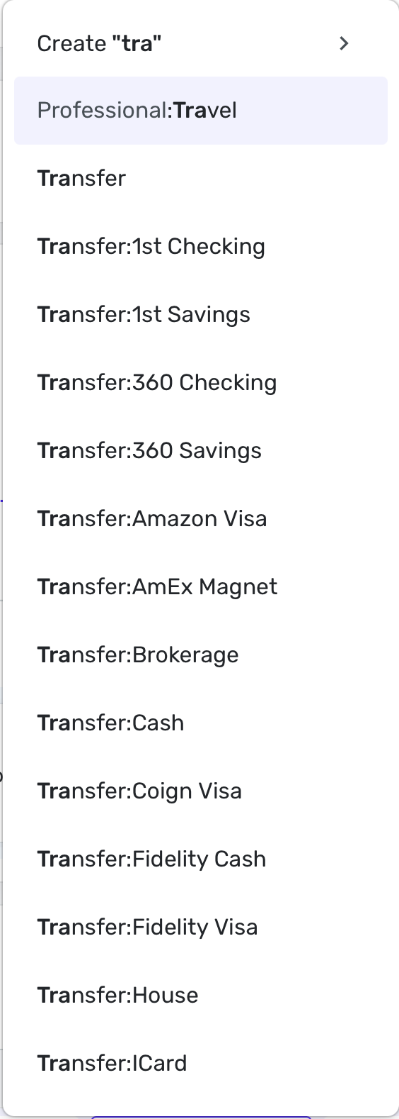
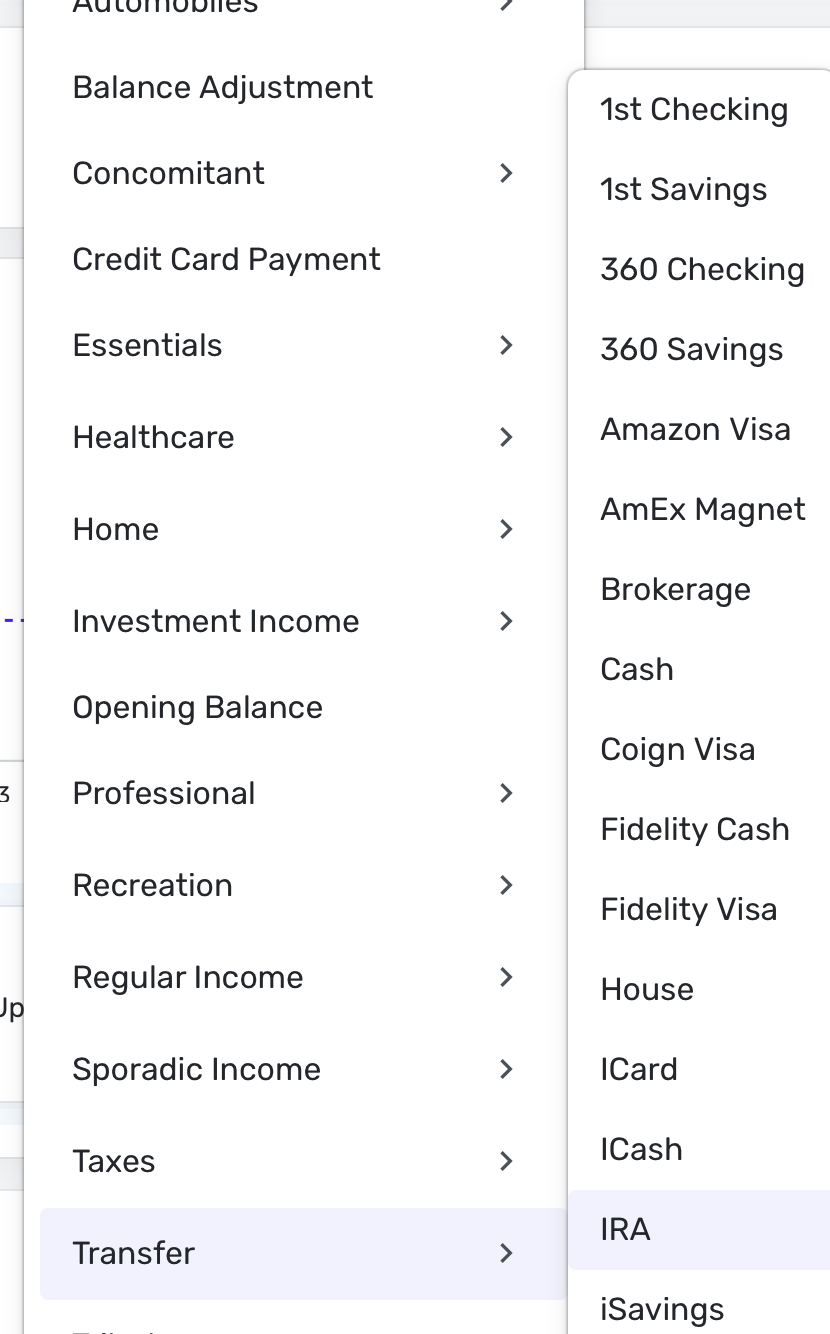
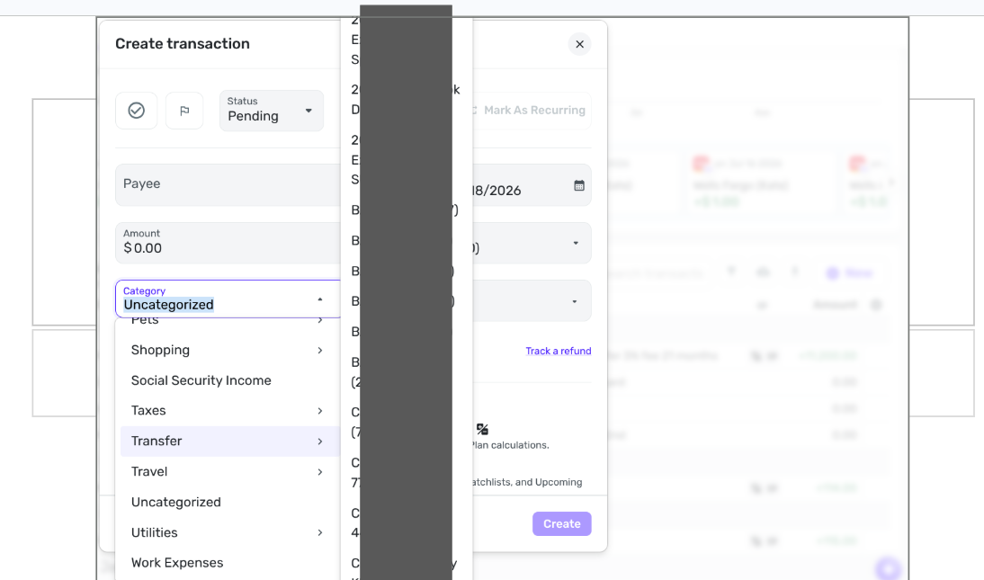
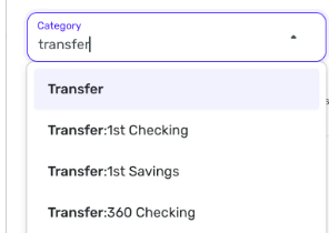
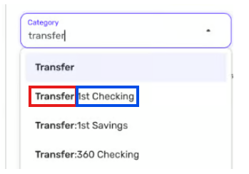
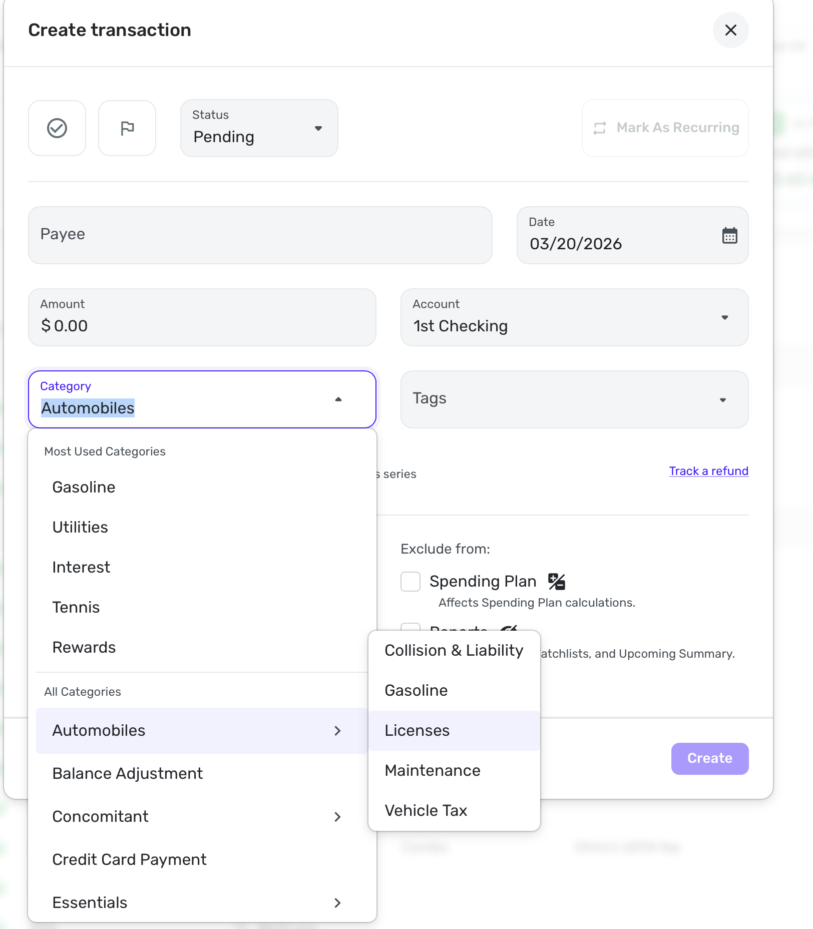
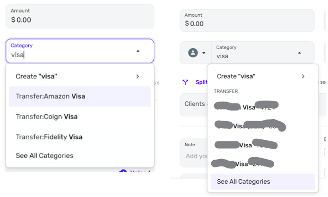
This probably doesn't technically qualify as a bug, but it definitely is either an unintended consequence of some other change, or an outright mistake, or just a bad decision by someone messing around with the UI. The account list used to be one line per account, and was much easier to use. Now it's about an inch wide on my laptop screen (that's more than a foot wide) and most of my accounts listed are either two or three rows. There is no reason to wrap any account name; there's plenty of screen real estate available for a pop-up menu that's only used for a few seconds; it can cover anything to the right of it. I'm sure not everyone uses long account names like I do, but because so many other features are missing, I pack as much as I can into the account name, like the credit limit, for example, which I append to the name, along with last 4 of acct# and which spouse's name the account is in, e.g., "Chase Free 1234 KB (9.0)". That now uses about 1 2/3 lines, and my vehicles take up 3 lines. It's just not necessary to make the account list narrow at all, and makes it harder to use.

[edited title for clarity]

«1

Comments

  • Coach Jon
    Coach Jon Moderator admin
    edited March 18

    Hello @KB2014,

    Thanks for reaching out! I believe you are referring to the accounts listed in the category field of transactions when viewing transfer categories. I am not seeing this specific issue from my side in Quicken Simplifi. Could you please provide a screenshot of the issue on your end so we can better assist you?

    -Coach Jon

  • KB2014
    KB2014 Member ✭✭✭
    edited March 18

    Did you try to enter a transaction and set the category to transfer? That's where it shows up. It wasn't clear to me if that's what you did when you tried to replicate it. If you enter a trans, set the category to transfer, and don't see it, I'll do a screenshot, but not for public consumption.

  • Coach Jon
    Coach Jon Moderator admin

    Hello @KB2014,

    Thanks for the reply! That is indeed where I tried reproducing the behavior you reported. I am not seeing it myself from my end. If you wish, you can send the screenshot I requested via DM to me.

    -Coach Jon

  • EL1234
    EL1234 Member ✭✭✭✭

    I'm not seeing it either… when creating a new Transfer transaction, or editing one inline, it doesn't look smaller than before (that I can recall). Most of my account names show on one line, a few spill over onto the second line.

  • SRC54
    SRC54 Superuser ✭✭✭✭✭
    edited March 18

    So this is what you mean @kb2014?

    Screenshot 2026-03-18 at 3.26.14 PM.png

    And here is the list when editing a transaction in-line:

    Screenshot 2026-03-18 at 3.29.13 PM.png

    In this view, it is a little tighter:

    Screenshot 2026-03-18 at 3.33.02 PM.png

    I can see if you have several words in your account names that you will run out of space. I keep mine to 1-2 words.

    Steve
    Quicken Simplifi (Safari & iOS) Since 2021
    Quicken Classic (MacOS) Since 2009
    MS Money (1991-2009) and Dollars & Sense (1987-1991)

  • KB2014
    KB2014 Member ✭✭✭

    OK, I don't have much in the way of graphics skills (or tools) but I managed to blot out all my personal information in the list, while hopefully still conveying the idea of 2- and 3-line account descriptors in the pop-up list. Steve seemed to be typing the word "transfer." I don't type; I just click the category ⏷ down arrow and scroll down to the Transfer category. It automatically pops up the account list. I'm pretty sure this is a new look; I don't believe it was ever necessary to wrap the account names. That's only necessary because the list is now so narrow. Nothing that it would block needs to be seen; at this moment, the only pertinent info is the account list, so it can be as wide as necessary, and prior to this new update, I believe it was.

    Screenshot 2026-03-18 4.41.41 PM.png
  • Coach Jon
    Coach Jon Moderator admin

    Hello @KB2014,

    Thank you for the screenshot. In this case, since the issue is not exactly a bug, I would suggest creating an idea post so you and other users can vote for it, follow it for updates, and contribute feedback there. This way, our product team can review the idea as well.

    -Coach Jon

  • SRC54
    SRC54 Superuser ✭✭✭✭✭
    edited March 18

    OK, @KB2014 Your screenshot is analogous to my 3rd one. It's hard to tell but I think the main problem you are having is putting more info in the account name than you need.

    Steve
    Quicken Simplifi (Safari & iOS) Since 2021
    Quicken Classic (MacOS) Since 2009
    MS Money (1991-2009) and Dollars & Sense (1987-1991)

  • EL1234
    EL1234 Member ✭✭✭✭

    I see what you mean now! When I scroll to Transfers and hover over it, I see the narrower list. But usually I just type Transfer and then choose from the transfers that come up, and over there the width is fine.

  • KB2014
    KB2014 Member ✭✭✭

    Yes, I never type it, and since that takes longer, I don't think I'll start. I just tried it and I needed to type "transf" before I got the transfer category; until then it was selecting a zillion subcategories of "Auto & Transport". 🙄 Once the category box opens, I just immediately click the down arrow in the category box, flip my scroll wheel a couple times and I'm at Transfer. That's where popup window of all the accounts just got narrowed (for no reason I can think of, as there's nothing to the right of it that needs to be seen). Oh well, it's just a minor annoyance; I'll deal with it. I just wish Quicken's programmers wouldn't arbitrarily break things that were working fine.

  • KB2014
    KB2014 Member ✭✭✭

    Steve, I don't "need" those long account names. I want them. I know I'm probably a bit unusual and not the typical Quicken user. I have several dozen accounts I actively use, including over 20 credit cards. Including additional info in the account name lets me differentiate them, as well as let's me see the credit limit for them. Up until now, there was no downside to having long account names, and it's still not much of a downside with the narrower account list; it just takes an extra second or two to scroll since they wrap to 2 or 3 lines. It's more a point of aggravation: we use Quicken to make it EASIER to manage our finances, so when they arbitrarily make something take longer, even a few seconds per transaction, 1. it's annoying, and 2. why?

  • EL1234
    EL1234 Member ✭✭✭✭

    For me it's faster than scrolling all the way down to the Transfer section and then scrolling down to the one I want. But I definitely agree that this is an annoying issue for those who do!

    Honestly I usually just start typing the name of the account I'm looking for. But when I went to replicate your issue I typed Transfer.

  • SRC54
    SRC54 Superuser ✭✭✭✭✭
    edited March 19

    I hear you, and I am glad you have found the workaround of starting to type the account, which is faster and what I do, which is why it took me a while to find the narrowness you were talking about. I agree that the Transfer to List could be a bit wider.

    I tend to keep my account and category names as pithy as possible (and exclusive so I don't get confused as I am more easily confused these days!) and it all fits in my web app. For example, Maintenance will be in Automobiles and Upkeep in Home so I don't reuse the categories. And I prefer short so I can easily see every thing in the transaction list.

    So instead of Capstone Chiropractic Center, the payee is Capstone Chiropractic. Instead of Fidelity Rewards Visa, which is what Fidelity downloads, I rename it Fidelity Visa. But it is user preference and I am all for Simplifi letting us do our thing.

    I noticed you put some part of your account number in the account name. Simplifi has added more information in the title bar for its connected accounts that show some of that information. It is not perfect and is dependent on what the bank downloads.

    Short names also helps me because I am often sharing screenshots so I disclose less personal information. 1st Checking and 1st Savings really don't tell you what bank that is. I admit that AmEx and Fidelity do, but no account numbers. I rarely use them anyhow.

    All the work on the Transaction List has led to quick UI changes in an effort to pack as much information as possible into valuable space. We've had another discussion recently about how much room the Account Name bar takes up as well as the Cash Flow line. So each week brings a few slight changes that sometimes are great and sometimes no sot because of all the compromises.

    P.S. There is one compromise (ha) that is a bug that bled over from QBP where I have to have a category of Taxes and Federal Estimated Tax Payment (that is 4 words!). I don't need it or want it and cannot delete it, and it violates Simplifi's principle of letting us have our own category names and organization. I have been told they will find a way to let us hide "required" categories. The sooner the better.

    Steve
    Quicken Simplifi (Safari & iOS) Since 2021
    Quicken Classic (MacOS) Since 2009
    MS Money (1991-2009) and Dollars & Sense (1987-1991)

  • DryHeat
    DryHeat Superuser ✭✭✭✭

    @SRC54

    I never see anything that looks like your image below (with the ParentCategory:ChildCategory format). Even when I type in "transfer" as you have done.

    image.png

    I'm using QBP. Did you do anything to cause that format to be available?

    DryHeat
    -Quicken Classic (1990-2020), CountAbout (2021-2024), Simplifi (2025-…)

  • EL1234
    EL1234 Member ✭✭✭✭

    Try without typing transfer, that's how I found it. You need to scroll down to the word Transfer and then see the list of accounts that pops up to the right.

    It's not only transfers, by the way - any list of subcategories that shows when you hover over the parent category got narrower. I see the annoyance (though mostly I type to find what I seek so it's not such a big deal for me).

  • SRC54
    SRC54 Superuser ✭✭✭✭✭

    @DryHeat Yeah, I took a while to find it because I usually just start typing and then the category pops up, but as @el1234 says it you go inline (or in the transaction entry box), for example, and go down to transfer and then hit the > and open the menu on the right, it is very narrow. In my case, since I have short account names, it's not a problem, but if you have longer names, it won't fit.

    Steve
    Quicken Simplifi (Safari & iOS) Since 2021
    Quicken Classic (MacOS) Since 2009
    MS Money (1991-2009) and Dollars & Sense (1987-1991)

  • DryHeat
    DryHeat Superuser ✭✭✭✭

    @EL1234 @SRC54

    I must not have made my questions clear. I'm not asking about the submenu that pops up when you hover over a parent category. I see that all the time. I'm asking about the image I copied from @SRC54 and included in my post (marked up in color below).

    image.png

    It may be an illusion, but it looks like the categories in this list (the one immediately above) are presented in the format Parent_Category:Child_Category, with the Parent Category (outlined in RED) being "Transfer" and the child category (outlined in BLUE) being an Account name. But maybe @SRC54 just names his categories like that (with a prefix and a colon).

    If this really is a Parent_Category:Child_Category display, well, I never see anything like that when I am selecting a Category in the Create Transaction window in QBP. So my questions are:

    • Is this really showing parent_category:child_category in the pick list?
    • If it is, is there a way to get categories to display that way in QBP?

    DryHeat
    -Quicken Classic (1990-2020), CountAbout (2021-2024), Simplifi (2025-…)

  • EL1234
    EL1234 Member ✭✭✭✭

    When typing Transfer I do see all my transfer categories (really accounts) as "Transfer: Account Name". I think this is a recent addition and I was actually very happy about it since I have at least one account with the same name as a category. And moreso because sometimes when choosing a subcategory via the "type to search" method, you need to know which parent category its under to choose the right one.

    For example, when searching for "gas", I see these two options:

    image.png

    The fact that Simplifi shows which parent they fall under makes it much easier to ensure you choose the correct one. And since I am pretty sure it's possible to have subcategories of the same name, under different parents, it's even more important for those.

  • EL1234
    EL1234 Member ✭✭✭✭

    But what the original post was asking about is that the subcategory/transfer account list that pops up when you hover got narrower, and I am in full agreement that it's an annoying change and should be fixed.

  • SRC54
    SRC54 Superuser ✭✭✭✭✭

    @DryHeat No, I don't name them that way. As @EL1234 states, it is just the Transfer: and then the Account name. I use short names for everything. I rarely see any of this because what I really do if I am paying a credit card is I just start typing 1st Check(ing) and then it pops up and I hit enter.

    If I choose a main category from the list and then >, I get just a listing.

    Screenshot 2026-03-20 at 4.25.12 AM.png

    If I am making a Visa payment, I type Visa, I get the Transfer:Account Name

    Screenshot 2026-03-20 at 4.35.35 AM.png

    If I begin to type a subcategory (here it is inline), I will get the colons (parent:child).

    Screenshot 2026-03-20 at 4.33.05 AM.png

    I assume it's the same in QBP. It may just have to do with our habits. As I say, until KB2014 got me thinking about it, I rarely did it these other ways. I just type the category. I have most of them memorized.

    Steve
    Quicken Simplifi (Safari & iOS) Since 2021
    Quicken Classic (MacOS) Since 2009
    MS Money (1991-2009) and Dollars & Sense (1987-1991)

  • KB2014
    KB2014 Member ✭✭✭

    @DryHeat I was also confused when I first saw the posts from @SRC54 and @EL1234 . I've never seen that either. I guess the reason is they apparently type in the category, while I never do. For me, at least, it's much simpler and quicker to click the ⏷ and scroll to the category I want. Maybe they don't have a mouse with a scroll wheel? Dunno. I am so used to this that I flip the scroll wheel in the time it would take me to type the first letter and I can finish finding the category by the time I would have typed the second letter. When I want the category "Transfer" it takes me half a dozen letters to finally get to that category, as it sticks on Auto & Transport until then. I'm always trying to do things as quickly as possible, and I guess we all have different strategies which sometimes makes one procedure quicker than another. I think I remember in a previous post above that Steve deleted or renamed categories he doesn't use. (Maybe I dreamed that!) Anyway, I think that's why you were as puzzled as I was to see something like Steve's typing of "visa" and the popup menu he got. Just a different way of doing it.

  • DryHeat
    DryHeat Superuser ✭✭✭✭

    @SRC54, @KB2014

    I assume it's the same in QBP.

    I don't think it is, but I'm not sure why.

    Here's what I see when I type in "visa," compared to what you see. Yours on left, mine on right:

    image.png

    All of the entries on my image are credit card account names and thus considered "subcategories" of the main Transfer category. As you can see, they do not show up in the ParentCategory:ChildCategory format.

    Instead they show up with "TRANSFER" as a heading and the child account names underneath.

    DryHeat
    -Quicken Classic (1990-2020), CountAbout (2021-2024), Simplifi (2025-…)

  • EL1234
    EL1234 Member ✭✭✭✭

    I wonder if it's an early access thing. I'm on early access and I see it with the colons.

  • DryHeat
    DryHeat Superuser ✭✭✭✭

    @EL1234

    I'm on Early Access. Are you using QBP or Simplifi?

    DryHeat
    -Quicken Classic (1990-2020), CountAbout (2021-2024), Simplifi (2025-…)

  • SRC54
    SRC54 Superuser ✭✭✭✭✭

    @EL1234 @DryHeat It was the same before the changes in the transaction list. I just turned off Early Access and it's the same. It is interesting that it is different in QBP, but I think basically that @KB2014 is right that it is mainly how you do it.

    Steve
    Quicken Simplifi (Safari & iOS) Since 2021
    Quicken Classic (MacOS) Since 2009
    MS Money (1991-2009) and Dollars & Sense (1987-1991)

  • DryHeat
    DryHeat Superuser ✭✭✭✭

    @SRC54

    I think basically that @KB2014 is right that it is mainly how you do it .

    As far as I can tell I am doing it the same way you are. We both just typed the word "visa." (See previously posted images.)

    Probably the difference is Simplifi vs. QBP … QBP has an additional "top" level in the category list for Business or Personal, so things like "Transfer" appear one level down. But I'm unable to test any of that.

    DryHeat
    -Quicken Classic (1990-2020), CountAbout (2021-2024), Simplifi (2025-…)

  • KB2014
    KB2014 Member ✭✭✭

    I'm going to like @SRC54 's post and not @DryHeat 's because Steve said the words my wife never says: "I think basically that @KB2014 is right… " 😁

    Whenever I say "You were right" to her she acts hard of hearing and asks me to repeat it several times. 😂

  • SRC54
    SRC54 Superuser ✭✭✭✭✭
    edited March 21

    Well thanks @KB2014 (I think) but sure that Dryheat is right about QBP as he uses it.

    Steve
    Quicken Simplifi (Safari & iOS) Since 2021
    Quicken Classic (MacOS) Since 2009
    MS Money (1991-2009) and Dollars & Sense (1987-1991)