With the recent enhancements we made to navigation on the Quicken Simplifi Web App, we want to hear from our users! Let us know what you think by commenting below.
Our announcement here has more details on the changes:
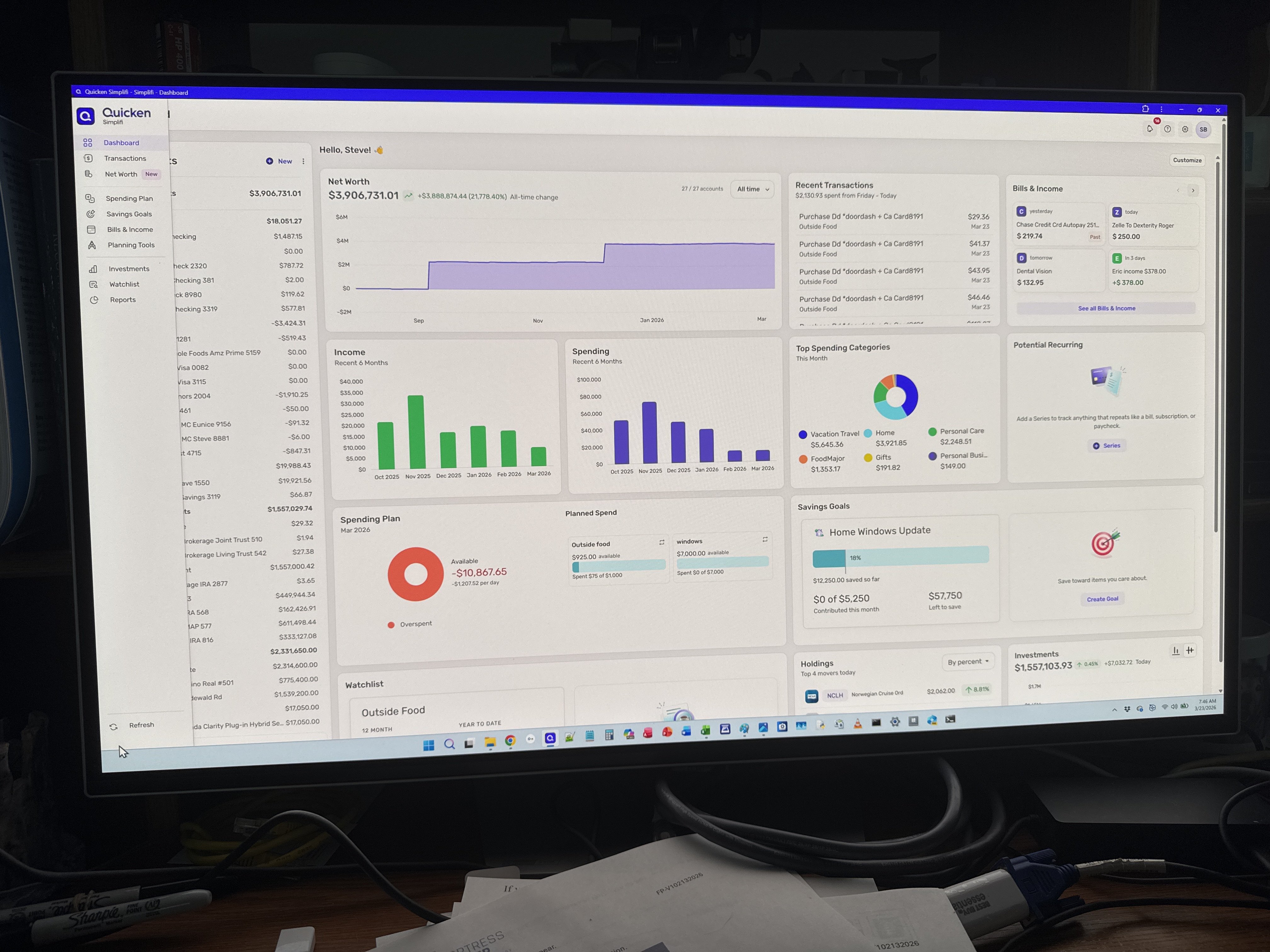
More logical placement and seems to work well.
Wow, that was fast; I had just closed out Simplifi not that long ago and reopened it, and there it is. I think it will be a bit easier to find things especially for new users.
Also, I think y'all made the account name bar a little more compact (not as tall) so it takes up less room? If so, nice touch.
This is a significant improvement over the old placement.
It is more in line with how modern apps position these kinds of resources, so it feels more intuitive.
the refresh button stands out more now. Also set up gear where it’s supposed to be. Thanks for the improvement.
You’ve moved Setting and other buttons from the lower left (off the active screen, so you had to scroll down to reach it ofttimes) to the top of the screen. That was good (great). But it’s absurd that you didn’t also move the refresh icon to the same location….Please make this change.
I like the cleaner look…more polished!
@LatAmSojourner, your post has been merged with the official feedback thread for the navigation changes, which are currently in Early Access testing, so it can be reviewed by our product team.
Thanks for your feedback!
@LatAmSojourner on my Web screen the refresh button shows up on the bottom left without having to scroll down. I concur that it should be moved to the upper right hand corner if it cannot be fixed scrolling.
Not everyone’s screen shows the same thing…
Faster Web App navigation is now live for ALL users!
I concurr with moving refresh to upper right
Same here!
I think this will likely happen. Or at least they will make it a little more obvious. It is sort of hard to see in its narrow gray down there in the corner.
Now that "Settings," "Help," "Alerts," etc. have been moved to the top right hand side of the main dashboard page instead of the left side panel, I think the white bar across the top of the page is taking up too much real estate and pushing down the dashboard page. The placement on the top right-hand side is sensible, but can the white bar be made narrower (more like the left-hand side bar, or even narrower than that)?
Marking transactions as "reviewed" appears to be bugged. When clicked, it doesn't actually apply and remove from view when filtered. You have to click off somewhere else to apply it. Then clicking somewhere else also unhides the sections you hid (ex. pending, specific months, etc), and jumps you back to the top of the transaction list.
It's not just Reviewed, anything inline like changing a category, tag, flag… doesn't actually "save" until the next click, so if you've done something that makes it no longer meet the filter criteria, it won't disappear until then. It's a newish issue in last few months.
I've gotten used to it. It gives me a chance to doublecheck before hitting enter then tab or else clicking elsewhere.
@ejs, your post has been merged with the official feedback thread for Faster Navigation for the Web App so it can be reviewed by our product team. Thanks for sharing your experience!
This thread is for feedback on the Web App navigation changes. If you want to discuss something else, you will need to create a separate post to do so:
Thank you!
We appreciate all of the feedback left here!