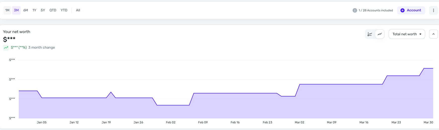
Why is the Zillow Market Value graph now showing with a scale to $0 in the Y axis?
The graph changed a couple weeks ago I believe. It used to show with a more zoomed in scale, where the "Y" axis showed closer to the minimum value in the range, and was variable depending on the min/max of your range.
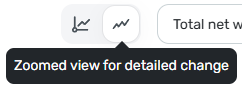
I assume this was an intentional change, but I want to see a zoomed in scaling, not to zero! It makes the graph look flat when looking at a short time range, which is OK unless you want to visually see the $ changes without scrolling your mouse over every single value to see what it actually was….
Can we please get an option to change the scaling??
Current graph: (Scale to zero)
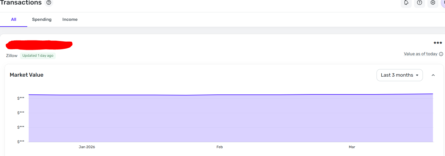
I want an option or this: (How it used to be, scale to minimum) This is the home value in the net work graph, but I want it in the actual asset page