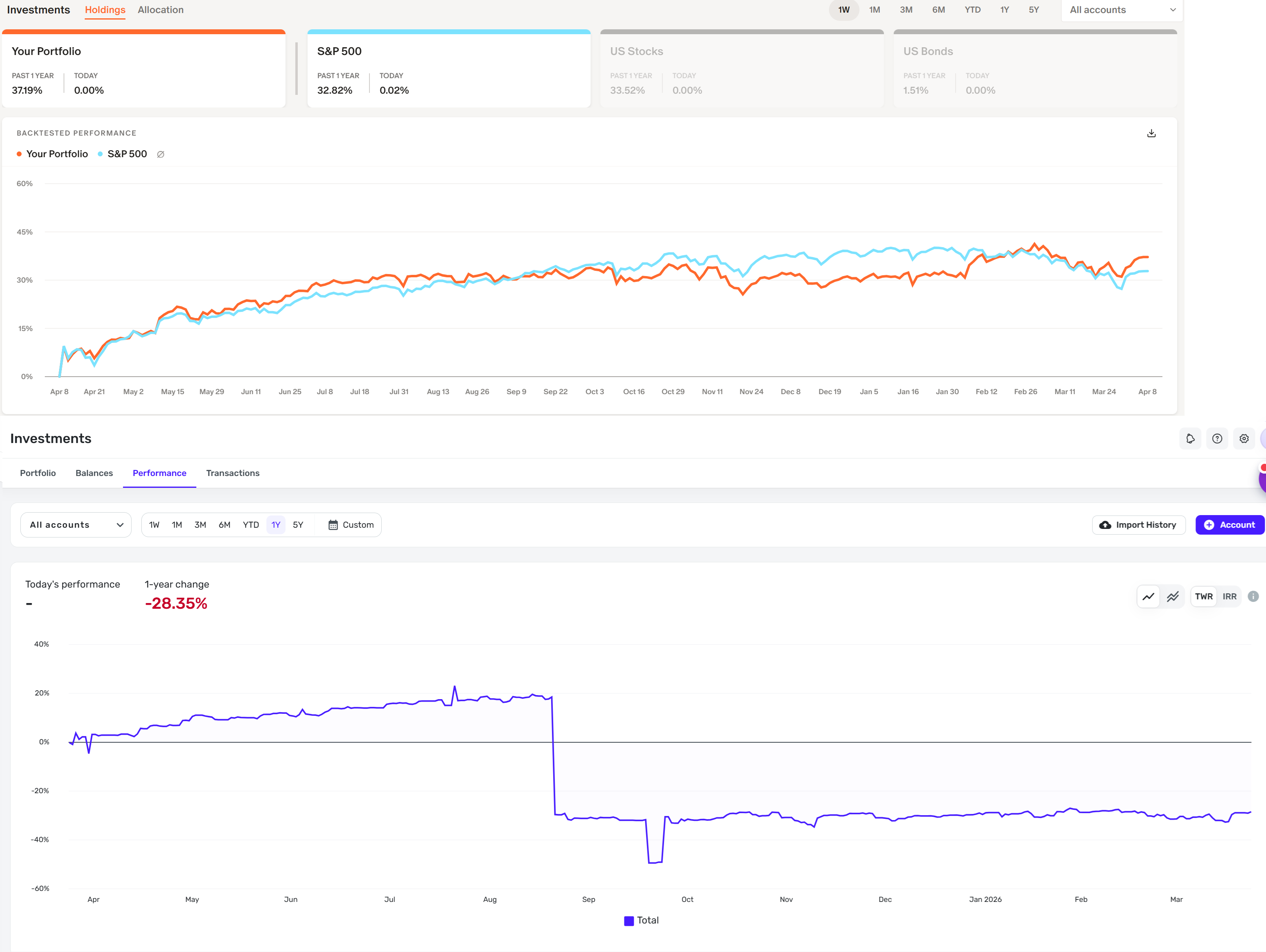
Monarch has a better look to their lines on the investment performance charts and also gives you a nice comparison to see how you stack up in performance against the S&P 500 (it even does this as you hover over the lines for all the dates). Would love to see these two areas improved.
See the attached image as an example of monarch compared to simplifi. The chart lines in simplifi look more bland. I think maybe increasing the thickness of the lines would help.