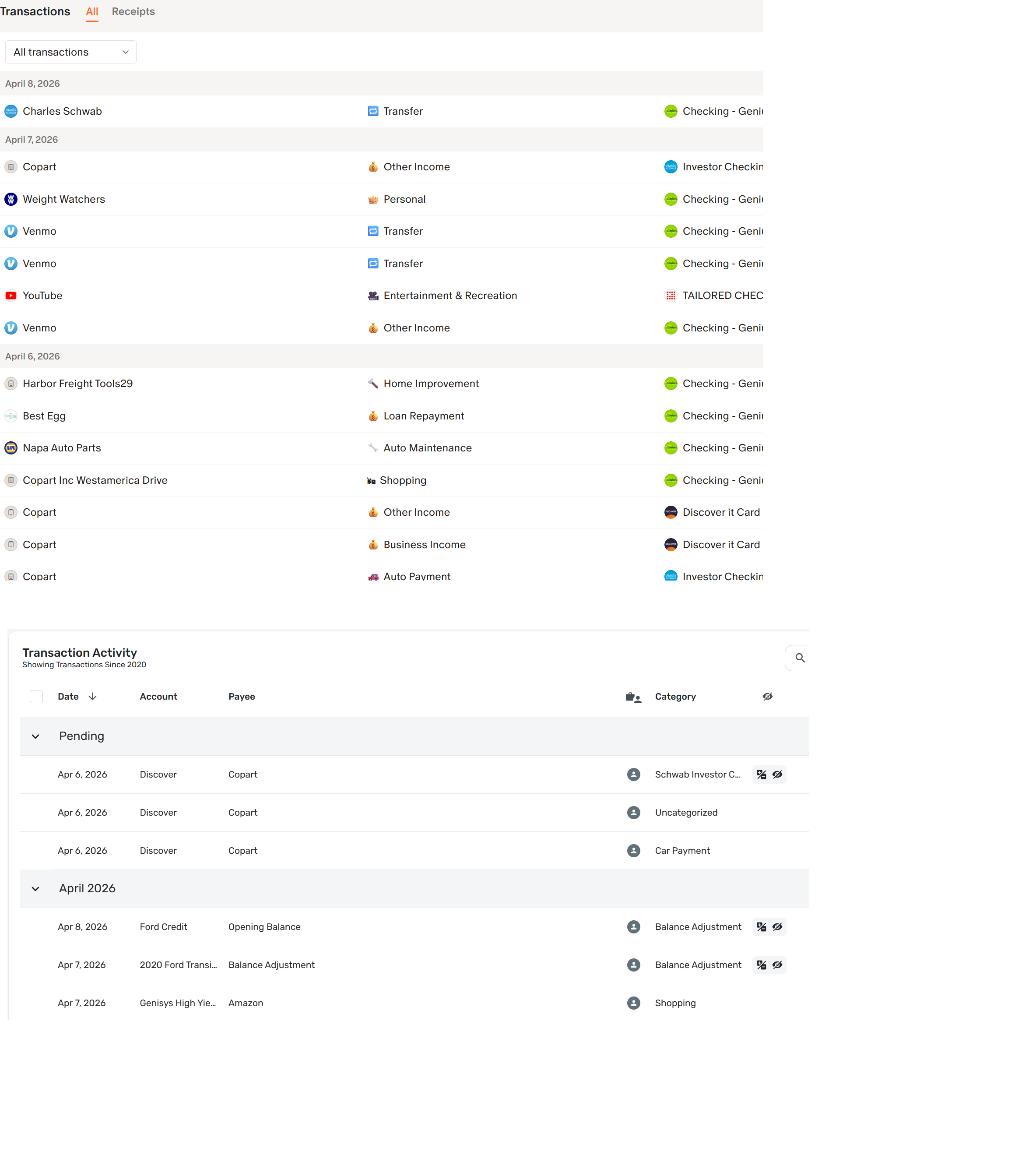
Take a look at the attached image. It does a great job of portraying how bland and boring the transactions view is in Simplifi compared to Monarch. Simplifi is painful to look at in comparison.
Please bring some life and color to the transactions area.