Net Worth Report: Add more granularity to the y-axis to better reflect small changes (edited)

Options
Jbenz
Jbenz Member
edited January 2024 in Feature Requests

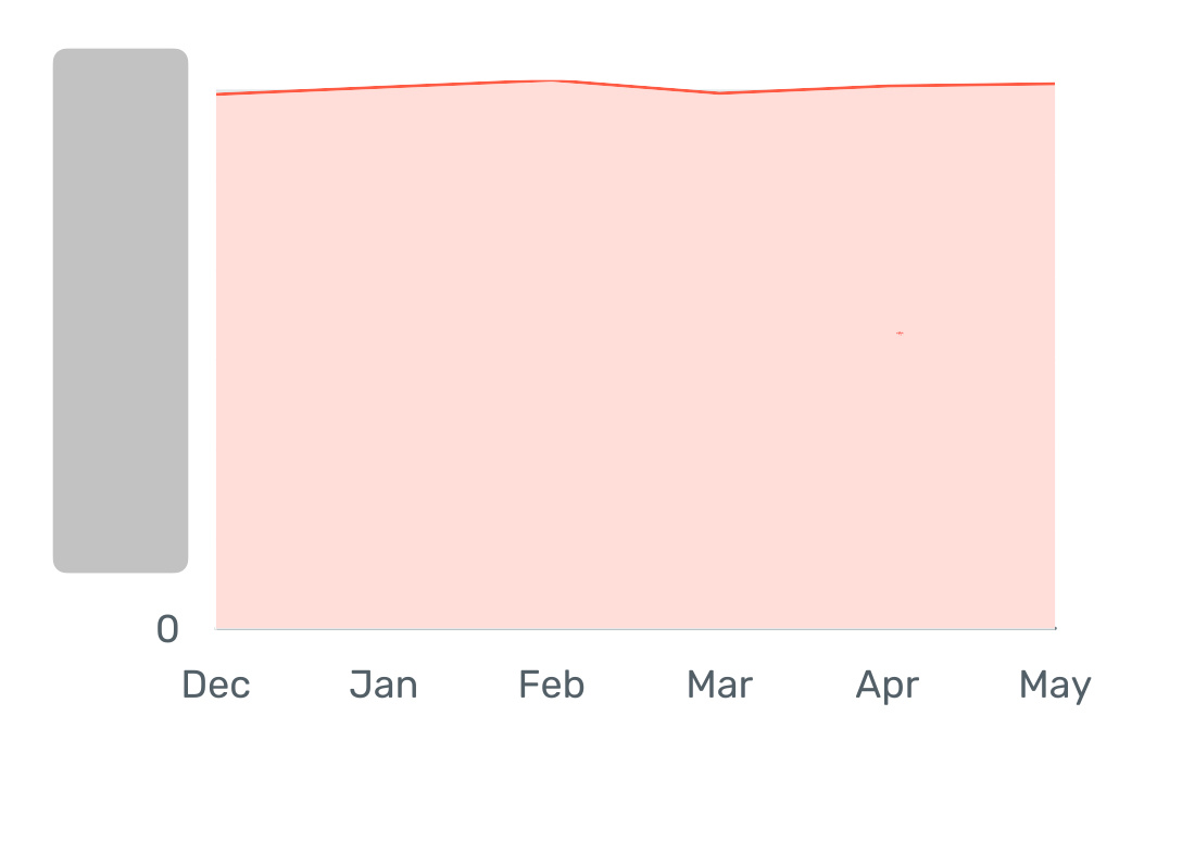
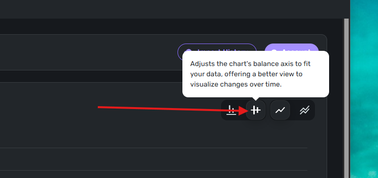
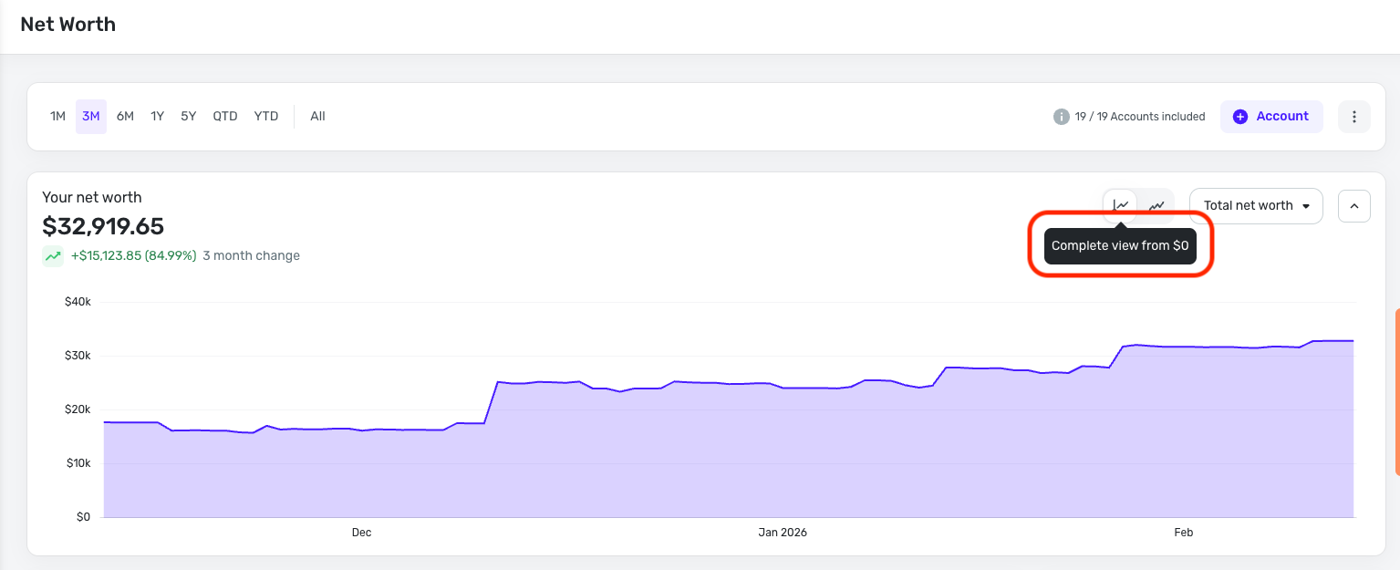
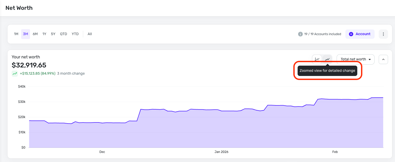
Currently the y-axis on the new worth graph is so set to such a large granularity that small changes don't even show up at all. It's basically just a horizontal line even though some significant changes have occurred. Please change the granularity so that these changes reflect on the graph.

33 votes

Active · Last Updated

Comments

  • Same with the investment value graph. It would be better if it didn't show all the way down to zero.

  • Bread01
    Bread01 Member ✭✭✭

    This is a lower priority fix to me, but I agree with the original poster. Having a virtually flat line for a graph is virtually useless. The Y-axis maximum should probably be pretty close to the highest net worth value for the time period displayed to show more variation beyond a straight line and not go all the way down to $0 (unless that's where the net worth has been in the time period displayed).

    Simplifi User from February 2024 - February 2025

    Mint User Since 2011

    User Type: Monitor Net Income and Grow Net Worth

  • ryan_a
    ryan_a Member
    edited February 2024

    The Y axis always starts at $0 for certain time series line charts like Net Worth. This is inconvenient to view the change over e.g. a month. It can end up looking similar to a straight line.

    It would be nice if the Y axis were variable dependent on the starting amount. So, it would shift for Date range = This month vs Date range = Last 6 months, depending on what the starting amount was, but I don't think that will be confusing for people to understand since it clearly shows the Y axis labels on the left. And this would give benefit of more easily seeing the difference from the starting value to the ending value.

    [Merged Post]

  • UrsulaA
    UrsulaA Superuser ✭✭✭✭
    edited February 2024

    This request already exists. Check it out. More votes improve the chances for consideration.

    [Merged Post]

    Simplifi User Since Nov 2023

    Minter 2014-2023

    Questionable Excel before 2014 to present

  • Bread01
    Bread01 Member ✭✭✭

    All 3 people with a $1 million net worth have already upvoted this. It is unlikely that this defect will get fixed.

    Simplifi User from February 2024 - February 2025

    Mint User Since 2011

    User Type: Monitor Net Income and Grow Net Worth

  • ajbopp
    ajbopp Member ✭✭✭✭
    edited March 2024

    I upvoted this and I certainly do not have anything approaching a $1 million net worth.

    But I certainly understand there are higher priority issues for the team to address right now.

    And...this is not the definition of a defect. It's an enhancement request.

    Anthony Bopp
    Simplifi User Since July 2022
    Money talks. But all my paycheck ever says is goodbye

  • Bread01
    Bread01 Member ✭✭✭

    I was just joking. I agree it’s not a high priority right now. However, I think it is a design defect for some users.

    Simplifi User from February 2024 - February 2025

    Mint User Since 2011

    User Type: Monitor Net Income and Grow Net Worth

  • mevans426
    mevans426 Member

    It would be nice if there were a way to have the Net Worth report adjust the scale of the Y-axis. As it is it always starts at zero and goes somewhere above the highest value on the chart, making it hard to see any changes if the values are high since it just looks like a pretty flat line even with meaningful changes in the values. If instead the chart started the Y axis somewhere just below the lowest value and ended somewhere just above the highest value, the chart would have some utility.

  • satyajitpatil
    satyajitpatil Member

    It would be awesome if this could be fixed. I love Simplifi and am glad I switched over from Mint. Improving the granularity of the Net Worth chart (using months instead of years) would make it far more useful.

  • jc303
    jc303 Member

    Please implement this! The charts (especially Net Worth) are worthless if they are not auto-scaled. Everything just looks like a flat line. Easy fix too.

  • KP_9
    KP_9 Member ✭✭✭✭

    +1 to implementing this, please! Scaling all graphs to adjust to the min/max values in whatever time period is set would make charts more useful.

  • kollock
    kollock Member

    Okay, this just hit the investment graphs. Now the others!

  • KP_9
    KP_9 Member ✭✭✭✭

    Bumping this - just noticed (like @kollock before me) that this appears to have been recently implemented for only the Investment graphs. These now show a toggle allowing the user to choose between "axis to fit" and "axis starts at $0," but the graphs in the Reports section still show only the old style with Y-axis always at $0.

    image.png

    Can the other Reports section graphs be switched to use this newer axis setting, too? Net Worth graph would be my top priority.

  • leothemack
    leothemack Member

    Since the y axis is showing from $0 to the peak net worth, it means that it’s hard to see any noticeable difference day-to-day or month-to-month. We should be able to see the y-axis from low to high point net worth during the period.

    Also, when looking at multiple months, it only shows one data point per month. And it’s not clear if this is month end, month start or otherwise. It would be useful to be able to see more granular daily/weekly data points when looking at multiple months.

  • flintster_99
    flintster_99 Member ✭✭

    Another option (not a replacement) would be to make the report be a change over time, e.g. zero means no change, and if 1 month later net worth had increased $1000 then the y axis would be $1000, etc. I think a lot of people may be interested in changes vs absolute.

    It shouldn't replace the current report because absolutes are also interesting, but agree the y-axis needs to be more reactive

  • bbarber
    bbarber Member
    edited May 4

    The visualization always starts at $0 making it useless

    IMG_9007.jpeg

    I have redacted the dollar values but this should give you the idea. The graph will always look flat once the numbers get large. Ideally the bottom range will be dependent on the values in the date ranges selected


    I have 12 months of data. The graph above is displaying the last 6mo

    [Merged Post]

  • RobWilk
    RobWilk Superuser ✭✭✭✭✭
    edited May 4
  • flintster_99
    flintster_99 Member ✭✭
    edited May 17

    Hi, don't know how long its been there… but the Investment/Balances has this exact feature - please just copy it to the net worth report, it would solve this!

    image.png
  • KP_9
    KP_9 Member ✭✭✭✭

    Revisiting this, as it continues to be source of frustration. The Net Worth report is incredibly valuable for helping people learn to break the earn-spend cycle mindset and improve motivation for saving & investing, but the current report's static y-axis means that unfortunately the more people grow their net worth, the more useless the graph becomes.

    The new, improved Investments visualizations have had this "axis to fit" feature for over 6 months now. Please prioritize switching the Net Worth report over to the same improved visualizations that Investments use!

  • RJE1999
    RJE1999 Member

    I agree with this post. I'm finding the current Net Worth report chart in Quicken Simplifi is not useful to me because of how the y-axis is scaled. This makes any fluctuation in net worth appear almost flat, even when there are meaningful changes.

    It would be extremely helpful to allow users to customize the y-axis range or enable automatic scaling that adjusts to the data range, similar to how many financial charting tools work and investment/balances works.

    This feature would improve the data visibility and make the Net Worth chart much more actionable and insightful. Please consider adding this enhancement!

    Thanks!