Have a monthly display option for longer date ranges in reports on the web app (edited)

Options
UrsulaA
UrsulaA Superuser ✭✭✭✭
edited February 5 in Feature Requests

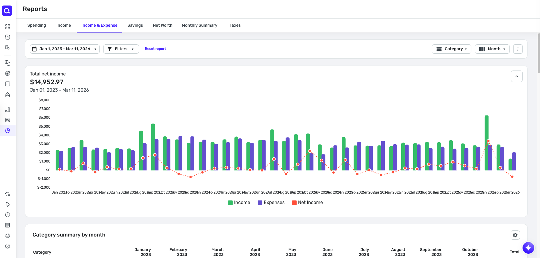
The mobile app, interestingly enough, does give me a long list of monthly data points for the net worth, spending, and net income reports for a date range longer than 5 years. The web app needs the option for the user to have a monthly display option for longer date ranges, not just years.

See comment below for more info.

Also, the option to switch between a monthly and yearly breakdown in the web app will be nice for reports.

Simplifi User Since Nov 2023

Minter 2014-2023

Questionable Excel before 2014 to present

6 votes

Active · Last Updated

Comments

  • UrsulaA
    UrsulaA Superuser ✭✭✭✭
    edited February 25
    Options

    I looked at my monthly net income, income, and spending over 10 years on the mobile app today. It was neat and I could even save a screenshot of it if I chose.

    Will be great to have this same feature on the web app, something like the screen shot below to change the time interval (View by time toggle) on the charts. It will be fine with me to click on a month and then view the transaction activity for that month, like I do on the mobile app.

    The web app currently gives 36 months in a chart, then the data gets summarized by year for periods longer than 36 months. While that works, it will be nice to have the monthly summary option for periods longer than 36 months.

    Simplifi User Since Nov 2023

    Minter 2014-2023

    Questionable Excel before 2014 to present

  • djweizle
    Options

    I would like to echo this request. Simplifi mobile app has this and Mint had this. I upvoted.

    Also, it would be good to clean up the interface in the web app when showing the 36-month monthly view—the x-axis labels overlap. I recommend rotating them 90 degrees so the text is vertical. Or angled (45 degrees). I will create a separate request for this but include here because it is related.