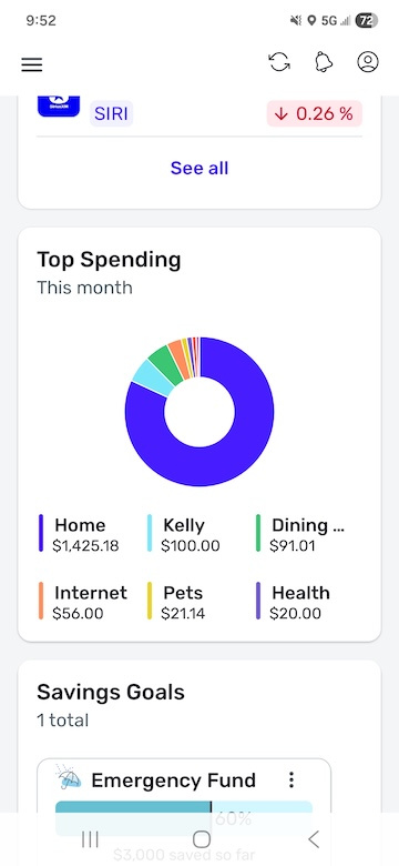
Did the "Top Spending" card on mobile always have this much white space?


Comments
-
I see the same amount of white space on the Android Google Play store app. I have not seen this before. I run an LG Velvet Android 10 phone.
Simplifi User Since Nov 2023
Minter 2014-2023
Questionable Excel before 2014 to present
0 -
@RockLee, thanks for posting!
I also see the white space on my Android, and I don't think it used to be that way so it must have been a design change. With that, the best thing to do would be to create an Idea post or turn this post into an Idea post requesting a change so other users can vote on it. If you'd like this post to be turned into the Idea post, please provide more details as to how you'd like to see this changed to give a clear outline.
For having a total displayed, I found an existing Idea post!
I hope this helps!
-Coach Natalie
-Coach Natalie
0 -
Thanks Coach, Yea, I already upvoted the "Total Spent" feature request when I signed on with Simplifi.
Honestly I'll probably submit the white spacing issues as a bug instead of a feature request. I think it is more likely that this is a subtle unintended change that made it into release rather than a design choice.
1 -
Somewhere around mobile app release 4.18 white space was added to the Top Spending card. I believe this must have been inadvertent. This is true for both iOS and Andriod.
 1
1 -
Hey everyone, I learned that the the pie chart should actually be displayed at the top of the Top Spending Dashboard card instead of to the side, which would clear up the extra white space issue. I got a ticket filed for this and will post back as soon as an update is received.
Thanks!
-Coach Natalie
SIMPL-19790
-Coach Natalie
1 -
Hey everyone!
I'm going through old escalations and I just wanted to let you all know that the ticket for this issue is still open and being worked on. I gave it a bump to see if we can get some movement.
We appreciate everyone's patience!
-Coach Natalie
1 -
This issue appears to be resolved!
-Coach Natalie
0

