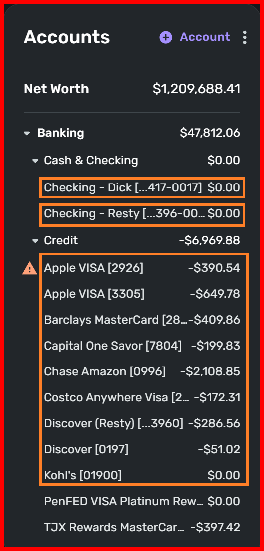
Ability to customize the size/width of the Accounts List on the Web App (edited)
Many of my account names are truncated because the Accounts window on the dashboard is so narrow compared to the other windows which really don't need to be so wide. Since the Accounts window is the most important window everyone wants to see, it would make sense to give it a bit more horizontal "real estate" on the dashboard screen and narrow the other windows down a bit to make everything fit nicely. I know we can't resize the windows because this is a web-based app, but having the Accounts window wide enough to read most of the account names would be a welcome change. Thanks!
Comments
-
I would vote for an adjustable (drag to strech/shrink) option, which I think may have been suggested already… Sometimes i have longer names, sometimes shorter names (I edit them by hand) I woudln't always need extra wide.
—
Rob Wilkens
3 -
Yes, please let us resize the accounts section of the dashboard so we can see all of our account names and values without truncation.
1 -
The Accounts column in the dashboard is very narrow and cannot be adjusted. Please add handles to adjust the width of the column. This is urgent as it is very difficult to see and track my accounts when only the first few letters show up.
0 -
Hello @Gisa,
Thank you for coming to the Community to share your feedback! Since you're requesting an improvement to the Accounts Dashboard tile, I've converted your post into an Idea Post.
Thank you!
-Coach Kristina
1 -
Not being able to fully read the names of my accounts due to the column/box width is really bothersome. I hope a resize feature will be added, or perhaps word wrapping to the text.
0 -
I would like to make a Feature Request. This request is to expand the [Accounts List] with to show more of the account description (Dashboard Account Widening image). But expanding these account lines, it will provide more of the account description to be displayed. As many users will insert their own versions of the account description that will help them to identify the accounts. By expanding the account lines, this will shorten or shrink on the other parts of the display. By this shrinking or shorting the other display areas, will not impact the information that is being shown in these areas.
Dick Davis
Wanting to Migrate from Quicken Classic Premier to Simplifi
0


