Report data display panel is always too tall to fit entirely on screen

In Chrome, the main report data panel always resizes itself to be a little too big to fit on the screen.
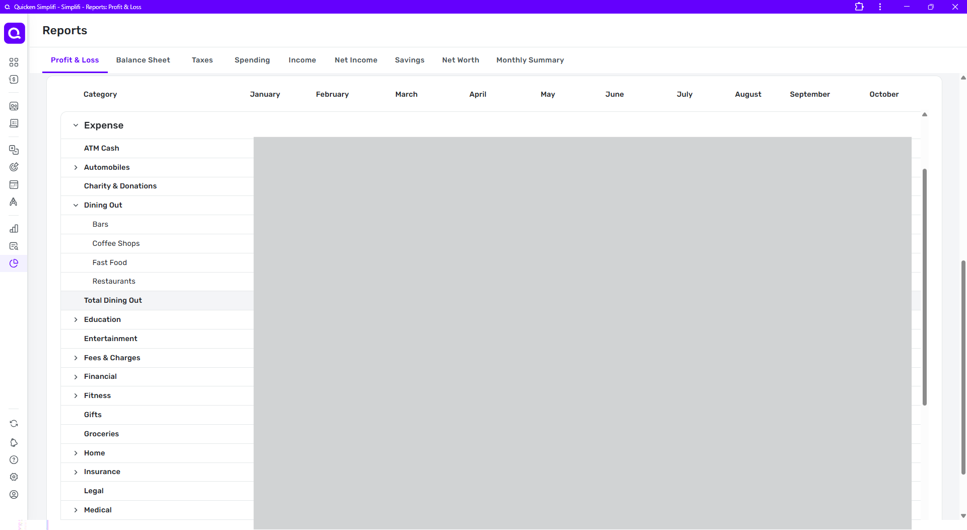
A typical report view has three panels. For example, in the Profit and Loss report the top panel is for setting parameters, the middle panel is the graph, and the bottom panel shows the report data.
No matter how I set my zoom factor in Chrome or in the Chrome App version of Simplifi (QBP), the data panel is always a little too tall to fit on the screen. If I want to see all the way to the bottom of the report and/or use the horizontal scroll bar, I have to position the panel so that the column headers are moved off-screen to the top.
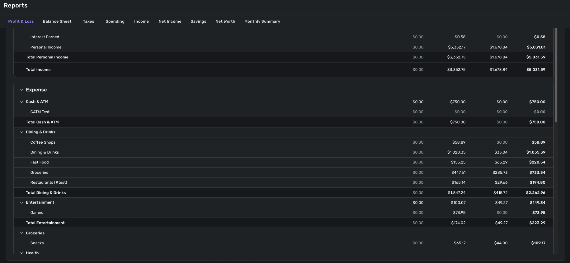
In this first full-window snip, the column headers are visible and the portion of the report visible in the window appears to stop at the line "Medical."
But if I scroll the entire report down slightly (using the farthest-right vertical scrollbar) you can see in the next snip that the report data panel actually extended below the screen and has two more lines as well as the horizontal scroll bar. (outlined in red)
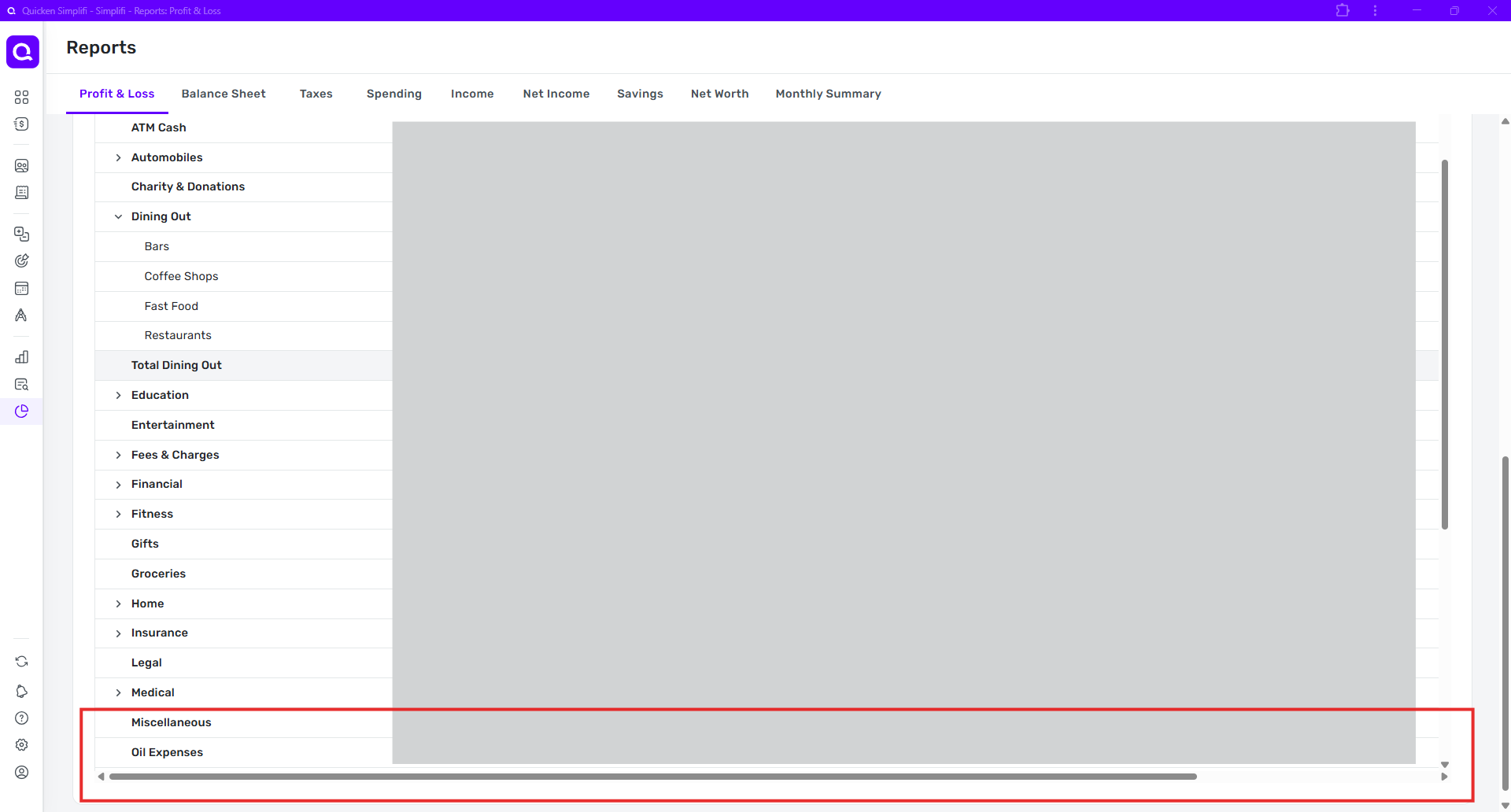
The result is that it is not possible to see the column headers, all the lines currently in the data panel, and the horizontal scroll bar at the same time.
The same result occurs no matter the main window size. Whenever I change window size or zoom or both, the data panel simply resizes itself again to be a little too tall.
DryHeat
-Quicken Classic (1990-2020), CountAbout (2021-2024), Simplifi (2025-…)
Comments
-
Hello @DryHeat,
Thank you for letting us know you're encountering this issue. Is this happening exclusively on the web app? Do you encounter the same issue using other browsers? Do you encounter this issue across multiple devices, or are you seeing it on just on device? In your example, you show the Profit & Loss report. What other reports have you noticed this issue happening with?
I look forward to your reply!
-Coach Kristina
0 -
@Coach Kristina — regarding your questions:
-Is this happening exclusively on the web app? - I only use the web browser and web app. It happens in both.
-Do you encounter the same issue using other browsers? — Yes. It is exactly the same in Edge.
-Do you encounter this issue across multiple devices, or are you seeing it on just on device? — I only access Simplifi on my computer, no other devices.
-What other reports have you noticed this issue happening with?
None other has this same problem, as far as I can tell.
It does not happen with the Taxes report, where the data panel fits vertically within the screen and the data scrolls within it (using it's own internal vertical scroll bar). This shows how the Profit & Loss report should work.
The Spending, Income, Net Income and Savings reports have Transaction Activity data panels, which expand to fit the rows of data (rather than having an internal vertical scroll bar). Their columns also auto-adjust to fit the screen width, so they don't have the same issue with the horizontal scroll bar not being accessible.
The Net Worth report data panel also expands to fit the rows of data, like the Transaction Activity panels.
DryHeat
-Quicken Classic (1990-2020), CountAbout (2021-2024), Simplifi (2025-…)0 -
Hello @DryHeat,
Thanks for the response. I believe this issue may be device-specific, as I am unable to reproduce the issue from my side. I even tried using a smaller screen, and could not reproduce this behavior. I noticed from your screenshots that you are using the Chrome web application. Can you share some screenshots from the other web browsers you tried as well, to assist us?
-Coach Jon
-Coach Jon
0 -
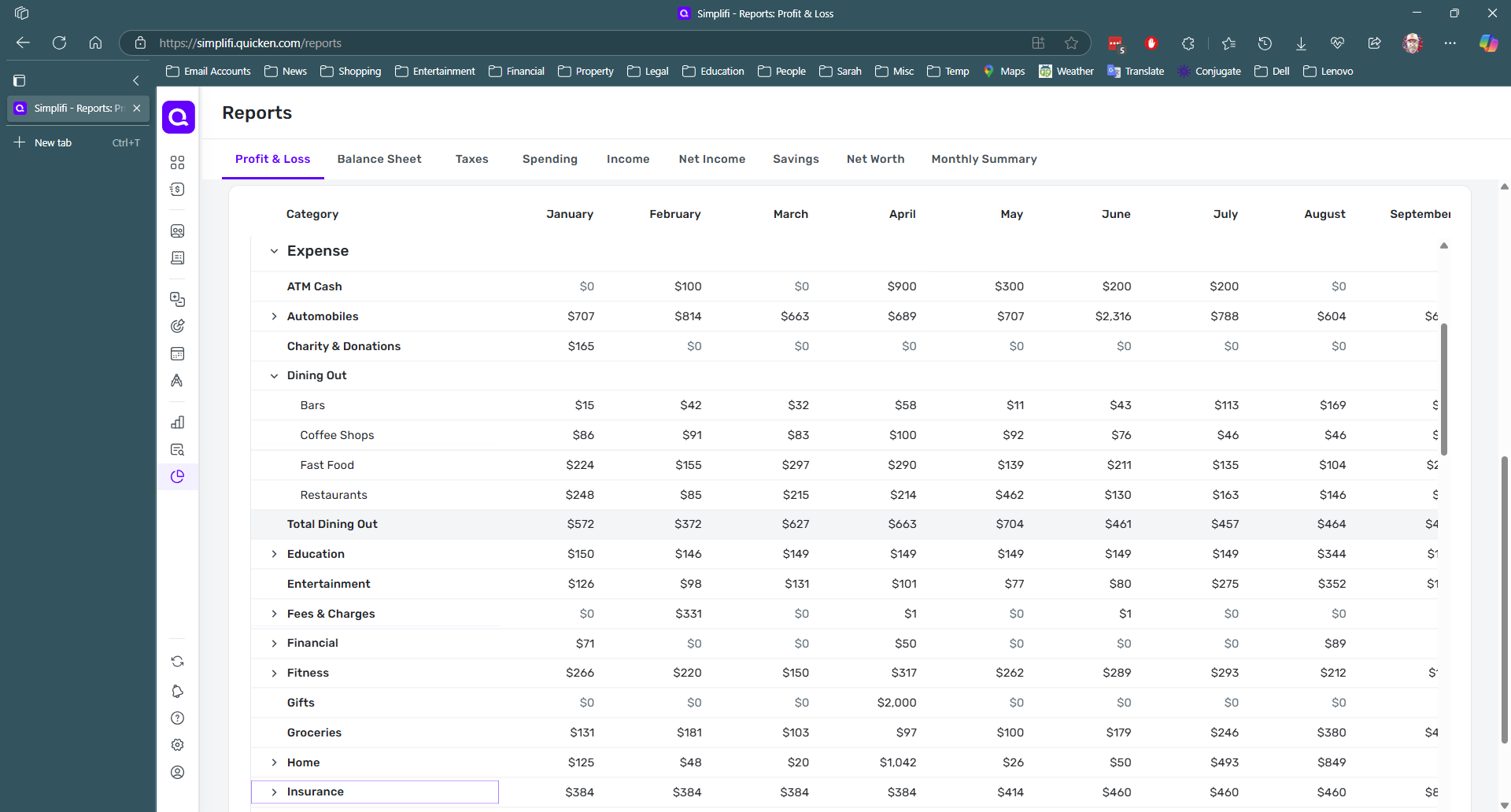
Ok, here are duplicates of the images I shared earlier, but this time from the Edge browser:
In this first full-window snip, the column headers are visible and the portion of the report visible in the window appears to stop at the line "Insurance."
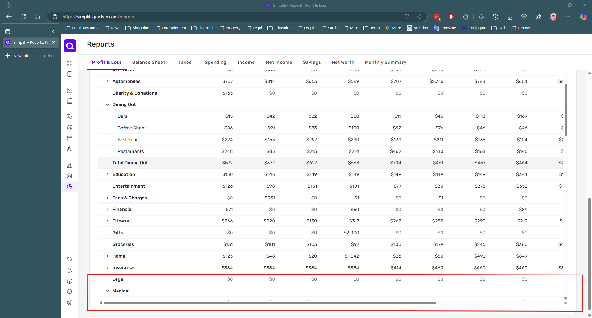
But if I scroll the entire report down slightly (using the farthest-right vertical scrollbar) you can see in the next snip that the report data panel actually extended below the screen and has two more lines as well as the horizontal scroll bar. (outlined in red)
REQUEST:
Can you post an image of how it looks on your computer so I can see what it is supposed to look like?
I am assuming that — as the data panel resizes itself based on window size — it is supposed to be sized such that both the column headers (at the top of the data panel) and the horizontal scroll bar (at the bottom of the data panel) are both visible on the screen.
DryHeat
-Quicken Classic (1990-2020), CountAbout (2021-2024), Simplifi (2025-…)0 -
Hello @DryHeat,
I would not know if that is specifically how it is supposed to work regarding resizing myself. However, from my side, I do not see a horizontal scroll bar. Which is why I think this is probably device-specific. I am not sure if this would be a bug, per se, either. Since the scroll bars do allow you to see the data by scrolling. Unless you are stating that even by scrolling, you cannot see all the data? Let us know!
-Coach Jon
-Coach Jon
0 -
"I do not see a horizontal scroll bar. Which is why I think this is probably device-specific."
In your image, you do not see a horizontal scroll bar because you have not scrolled the entire report window to its bottom. In fact, the way you have it positioned, you don't see the column headers either. Otherwise, your image looks just like my screen. So probably not device-specific.
In what follows (for clarity) I will call the panel within the Profit & Loss window — where the column headers, the lines of data, and the horizontal scrollbar live — the "data panel."
You can reveal the data panel column headers by moving up the outermost (rightmost) scrollbar up. (Don't use the scrollbar for the data panel. Use the one outlined in red below.)
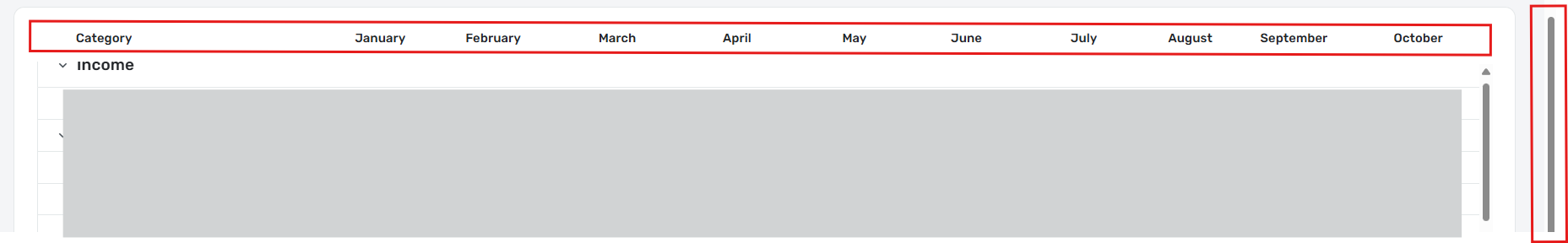
Then, when you move outermost (rightmost) scrollbar down a little bit, you will see the horizontal scrollbar for the data panel, which was just offscreen to the bottom by a few lines.

The problem is well-illustrated by the image you posted. The data panel resizes itself when the window is resized, but it always settles on a size that is just 3-4 lines too tall for the user to see both the column headers at the top and the last few lines of data and scrollbar at the bottom. (In your case, you positioned it where you couldn't see either one.)
I think this is a bug. There is no reason for the data panel to be just 3-4 lines to big to fit on the screen. It is not like it is resizing itself to show all the lines of data in the report. That would make some sort of sense. It's pretty obvious that the developers tried to make it resize to fit the screen. They just missed by a bit.
DryHeat
-Quicken Classic (1990-2020), CountAbout (2021-2024), Simplifi (2025-…)0 -
Hello @DryHeat,
I see what you mean, but I do not think this is a bug. The scroll bars are utilized to see any data that is currently not showing when scrolling.
What I would suggest doing is to create an idea post requesting what you beleive the report data should do/look like within the program. This way, others could vote for your post and provide feedback as well.
-Coach Jon
-Coach Jon
0 -
"The scroll bars are utilized to see any data that is currently not showing when scrolling."
True. And that's what is happening in the images above. The January-October columns are on screen while the November-December columns are off screen to the right and "currently not showing."
The way things stand now, users can either (1) see the column headings at the top, but the scroll bar at the bottom is just off-screen, or (2) see the scroll bar, but the column headings are just off-screen.
But if that's not a bug — meaning, I guess, that the designed behavior is for the data panel to be just a smidge too tall for the screen — well, I don't think I will be able to convince those designers to change it.
DryHeat
-Quicken Classic (1990-2020), CountAbout (2021-2024), Simplifi (2025-…)0 -
Hello @DryHeat,
Thanks for the reply. I guess I am still trying to understand the situation here from your viewpoint. When using the scroll bars, you should be able to utilize them to scroll and view all the data that is currently not visible, which is the purpose of the bars and why they are there. If you can do that, then this would not be a bug.
-Coach Jon
-Coach Jon
0 -
I'm not sure if I can do any better at explaining this to you.
I'll give it one more try if you will walk through these steps with me. I will number them so you can tell me which part you don't understand or don't agree with.
(1) Simplifi is setting the height of the data panel (see above definition) so that it is always slightly taller than the available space in the window. Lets call the height "X lines" for these purposes.
(2) Simplifi does not do this to accommodate all the lines of data. If you have more that X lines of data — as is usually the case — you still have to use the data panel's vertical scroll bar to see them.
(3) Because of the chosen data panel height, the user cannot see the column labels at the top of the panel and the horizontal scroll bar at the bottom of the panel at the same time. It's either one or the other.
(4) Many reports (like a yearly report) have enough columns (identified by column headings) to exceed the width of the screen so that the user has to use the horizontal scrollbar to move back and forth to see them all.
(5) If Simplifi chose a slightly lesser height, say "X-3 lines," the user could see the column headings and the horizontal scroll bar at the same time. Then the user would be able to see what months they were scrolling on and off the screen when they are using the scroll bar.
I believe the above are all factual statements, not evaluations or suggestions. They are either true or not.
The following, on the other hand, are my thoughts about what is wrong and what went wrong.
(6) Providing the extra 3 lines of data space in the data panel doesn't accomplish anything significant. The user still has to scroll to see most of their data. There is no reason to do it that way.
(7) Reducing the data space in the data panel by 3 lines, on the other hand, would allow easier viewing of reports that exceed the screen width, like yearly "by month" reports. So there is reason to do it this way.
(8) It is likely that the programmers intended the data panel to fit in the screen but botched the "current visible height" calculation. (I have made this same mistake myself in systems I have programmed.)
(9) This is a bug because what the program is actually doing does not match what was intended.
It's as if a text data field used font that was just a couple of pixels to tall to fit. You could still read it, so you could say "Well, it's not a bug." But I think most would agree that it was mistake to be corrected.
That's all I've got. I'm sure you'll let me know which of these you disagree with.
DryHeat
-Quicken Classic (1990-2020), CountAbout (2021-2024), Simplifi (2025-…)0 -
Hello @DryHeat,
Thanks for the reply and clarification. I do understand each point you are making, but I still do not think this is a bug. I would suggest creating an idea post for this topic. This way, other users could vote for this idea and provide feedback for us as well.
-Coach Jon
-Coach Jon
0 -
I structured my previous post to make it easy for you to clarify why you don't consider this a bug.
I was disappointed that your response was only "I understand … but I still do not think this is a bug."
In the absence of a more substantive response — and I am not asking for one at this point — I really have no idea how to look at future issues and determine whether to make a bug report.
I thought that the apparently unintentional nature of this "feature" and its negative impact on the usability of full-year Profit & Loss reports (critical to businesses) would be enough. It's not… because…
Anyway, thanks for being so prompt in responding on this thread.
(I don't think this is suitable for an Idea Post, so I won't be making one.)
DryHeat
-Quicken Classic (1990-2020), CountAbout (2021-2024), Simplifi (2025-…)0 -
Hello @DryHeat,
I can understand your frustration here. Generally, when we are reporting a bug, we need to be able to show our product team that whatever issue/design is being reported is preventing the user from accessing or working with their data within Quicken Simplifi. I did state earlier in the thread that when using the scroll bars, you should be able to utilize them to scroll and view all the data that is currently not visible within the report. Since you can use the scroll bars to view all of the data within the report this way, and no data is actually missing, I do not believe this would be a bug in this case.
This is why I suggested creating an idea post. Thank you for your patience and understanding!
-Coach Jon
-Coach Jon
0 -
I get it.
In my work, we looked at things differently. Whenever something that was not working as we intended it to work when we programmed it, we considered it a bug and put it on the backlog, rated for severity.
I view your analysis is more related to bug severity — where bugs are rated as Low/Medium/High/Critical severity (or priority) depending on their effect on the user. That rating determined how likely a bug was to be addressed anytime soon.
We put bugs of all severities on the backlog for two purposes: (1) the unlikely event that we would have the time to address low-severity bugs, and (2) the more likely event that we would be reworking a certain part of the program and could address the issue at that time for little or no cost.
It sounds like your product team only wants you to report bugs in the High and Critical range. As a user, I don't like that. But I can understand it.
DryHeat
-Quicken Classic (1990-2020), CountAbout (2021-2024), Simplifi (2025-…)0 -
Hello @DryHeat,
We do report bugs of all priorities here. However, since the scroll bars allow the user to view all the data within the report by scrolling, this would not be a bug. You can, of course, choose not to agree, but in that case, I would still suggest creating an idea post if you would like so that other users can also provide feedback and vote for your idea if they find it to be something they want.
Thank you for the replies.
-Coach Jon
-Coach Jon
0