Spending Plan Redesign: Share your feedback here!

We want to hear from our users on the redesigned Spending Plan! The good, the bad, the ugly—let us know what you think by commenting below.
Our announcement here has more details:
We can't wait to hear from you all!
-Coach Natalie
Comments
-
At least one "Other Spending" bubble does not accurately display bills. For example, the "Utilities" bubble includes our electric bill transaction, but not our water and sewer transaction for the month. Neither are "pending" and they are both already posted to the register of transaction. They are both categorized correctly and paid to the same entity.
We are two days in on the implementation of Simplifi and at the point of judging accuracy of the graphic displays, and therefore Simplifi's usefulness to us.
Why is the Utility bubble not displaying our water and sewer transaction as well as the electric transaction?
0 -
Goals in the Spending Plan tab show as due at start of Unix time (Jan 1970) when not configured with a target date in the new Spending Plan experince.
 0
0 -
I have a transaction which is split into interest income, and transfer. But positive amounts into my accounts (credits). But the transaction is showing up under the "Bills" catagory and messing up the spending plan.
Firstly, transfers shouldn't should up in the bills category. They aren't bills. I have a transfer into my checking account, which is making my total bills +$6k. Which isn't representative of my actual bills.
The problem is that because it's a split transaction, pay off it is income. So I don't want to ignore from spending plan or reports, those boxes are unchecked. So the transfer is also not ignored.
We need a way to set separate checkboxes for each split.
0 -
@LakGoy If I understand you right, you are getting interest and transferring it to another account in one transaction? Could you provide details of the transaction or at least an example?
If you have a transfer within a split, by default the new Spending Plan will include the entire transaction. Your only workaround is to have two transactions.
My question is this: is the transfer one sided or does it go into an account. If the latter, the transfer will be zeroed out in the Spending Plan because you will have a negative and a positive transfer. So it shouldn't affect the bottom line of the new spending plan "Bills".
However, if this is a one sided transfer, then yes, it will affect it. Before my wife retired, she paid into a retirement plan. Since I knew she was soon retiring, I didn't creat a separate asset account for that so that $600+ ended up an expense in my Spending Plan along with taxes and insurance. Well, it really was an expense I decided after all.
Also, if this is a one-sided transfer and you don't want it included, you can filter for just transfers and set a custom amount for transfers. For example, if your included transfers total $100, you can set it back to $0 and it will no longer affect your Bills total.
I just tested this with the new Spending Plan and it worked as I say above. But if I have mis-characterized your transaction, please correct me.
Steve
Quicken Simplifi (Safari & iOS) Since 2021
Quicken Classic (MacOS) Since 2009
MS Money (1991-2009) and Dollars & Sense (1987-1991)0 -
I can appreciate Income being separated from expenses, but lumping subscriptions in with bills just makes things more messy.
Right away, it feels more difficult to be able to tell what has changed from one month to another, and it requires more clicks to be able to see month to month on bills and subscriptions directly from the Spending Plan. It's always been very important to me to be able to see these things separately at a glance, since bills are a necessity and subscriptions are something I can control if I need to. One category in the left panel with two separate dropdowns in the right panel with their own totals would make much more sense to me.
I do appreciate Goals being their own category now though. I would like to see them above Planned and Other Spending though, since they're static numbers.
3 -
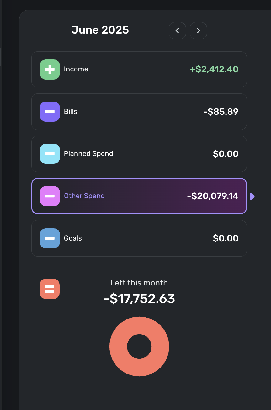
Thanks for pointing out this was available…. I was told it would initially be new users only receiving the new UI.. I mean, it's useful for me, but I am still trying to understand where this spending went: It claims I spent $20k in June (yes, this was a "medical emergency").. But somehow, I'm only $7k in debt, and I had well under $7k net worth to start I believe. I guess, maybe, 2 monthis income plus my starting net worth could explain some of that missing debt, but I really hope i haven't lost track of any accounts…
—
Rob Wilkens
0 -
With the new spending plan upgrade, the ability to see the money available per day was removed from the dashboard and I now have to click into the spending plan to see it. It seems like there is space to show the amount available per day under the total on the dashboard, so can it be added back?
2 -
New Spending Plan went live for me so I am testing it this morning. Very pastel (I'll say no more concerning the pale colors). Overall, I like the new organization.
Comments:
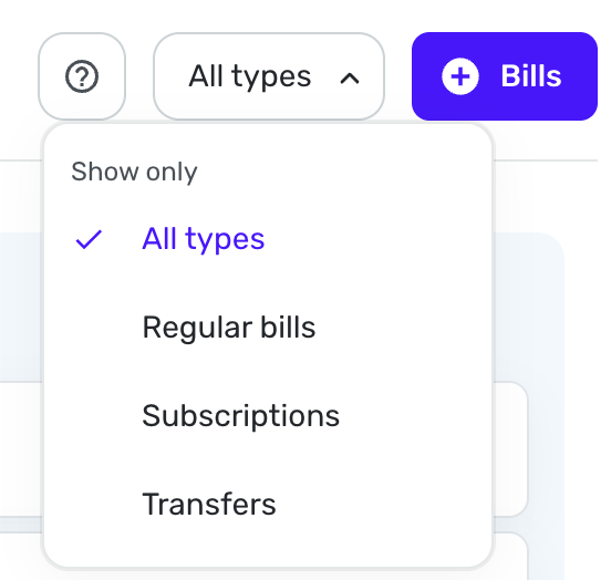
I wish we could sort Bills, then Subscriptions and then Transfers seeing each list one after the other instead of just showing all Bills or Just Bills, just subscriptions, just transfers. I am sure I will get used to it, and it is more logical to combine them this way.
I still don't like using the verb spend as a noun when a perfectly good noun, spending already exists. Planned Spending and Unplanned Spending would be clearer and better usage too.
Question:
I have noticed that the new Spending Plan automatically includes split transactions that include spending and/or income with transfers splits. Is this new or did I just miss it before? I haven't had any of those lately. But again, it makes sense to include those transfers since you would want to have the spending and income accounted for.
Steve
Quicken Simplifi (Safari & iOS) Since 2021
Quicken Classic (MacOS) Since 2009
MS Money (1991-2009) and Dollars & Sense (1987-1991)3 -
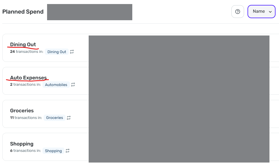
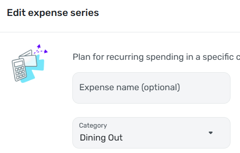
Sorting by Name does not work correctly.
As you can see in the image below, "Dining Out" is sorted above "Auto Expense." This persists even if I sort by amount, then resort by Name (as I did multiple times before taking this screenshot).
DryHeat
-Quicken Classic (1990-2020), CountAbout (2021-2024), Simplifi (2025-…)1 -
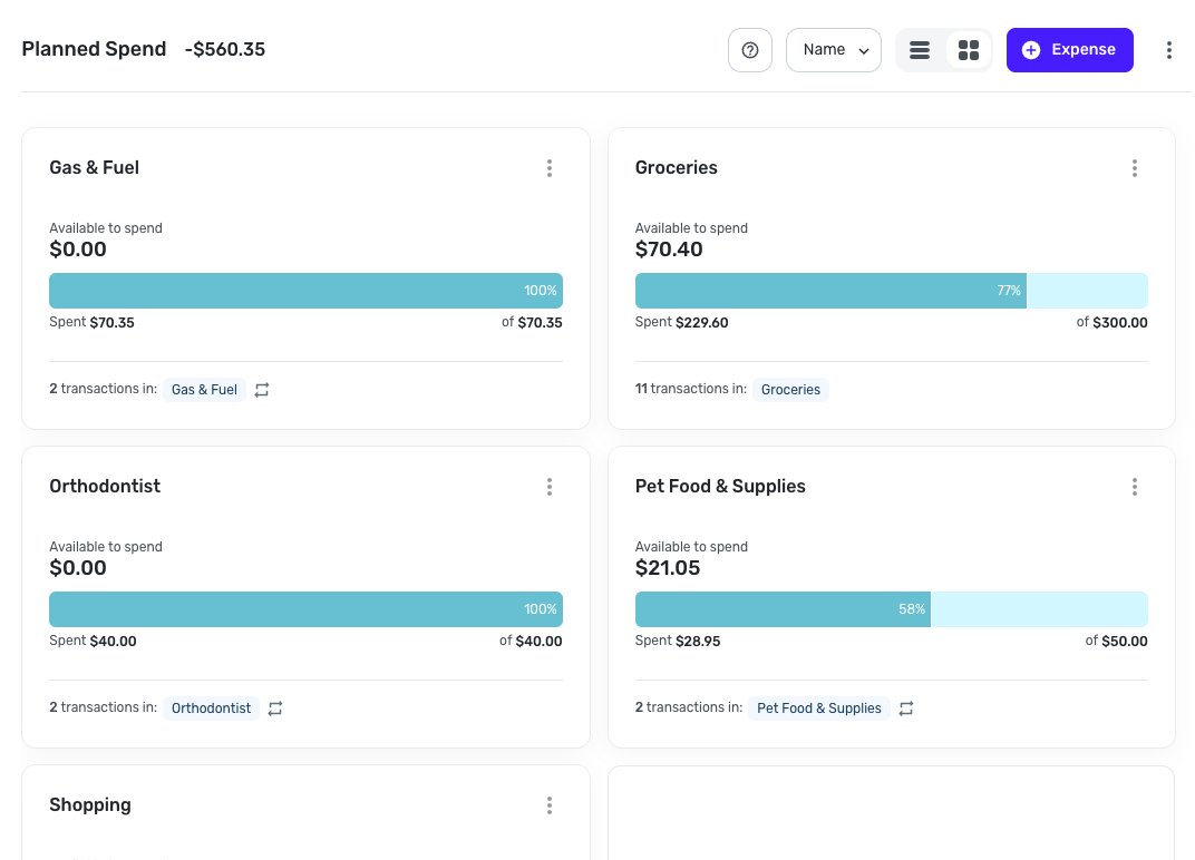
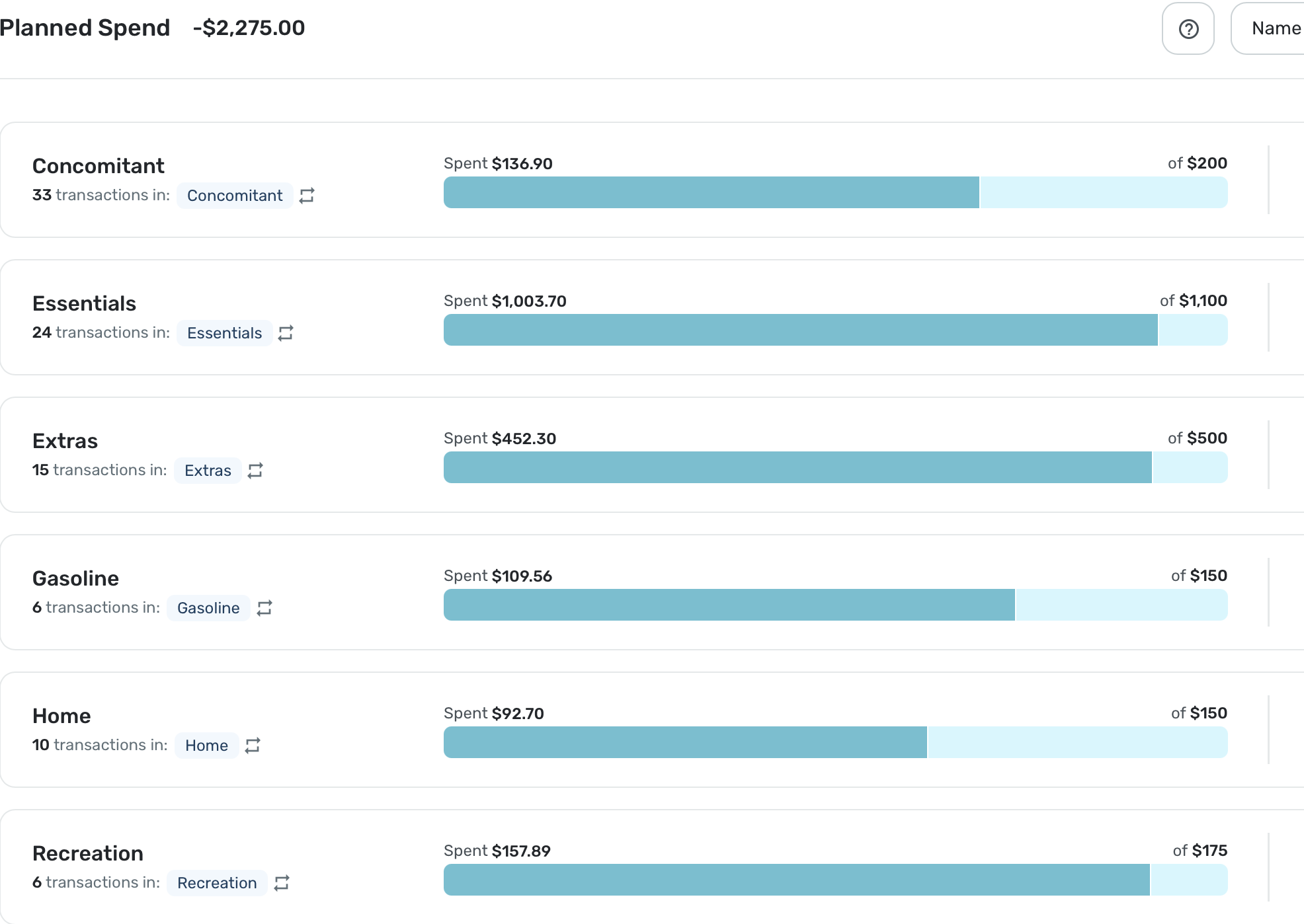
Column customizations in Planned Spend and Other Spend are not "sticky."
Unlike in the main Transaction Activity lists for accounts, your column customizations in Spending Plan are lost if you move away from the list. You have to redo them each time.
The lists in Planned Spend and Other Spend are using the new column customization system that allows you to select, move, and resize the columns to see the information you want. That's good, but…
—In Planned Spend the customizations are lost when you move from one Planned Spend expense to another. So if you customize the columns while looking at "Dining Out," for example, you have to do it all over again when you switch to "Auto Expense."
—The situation in Other Spend is a bit better. The customizations are maintained as you move from one expense bubble to another, but are lost if you switch to another section (Bills, for example) and then switch back.
DryHeat
-Quicken Classic (1990-2020), CountAbout (2021-2024), Simplifi (2025-…)3 -
I love it. It's a cleaner and a more updated look and feel. More control over what you can include and exclude with fewer clicks. Only suggestion is when filtering on bill type, for example subscriptions, the font could be a bit bigger for the bill type your filtering. Other then that, I think this is a homerun. Thanks
 0
0 -
I really like the look of it. Especially having the numerical operators on the left hand side illustrate what is happening with the budget nicely. You guys did great!
I second SRC54's comment - "Spend" should be corrected to "Spending"
1 -
Thank you all for the feedback thus far!
@ALavaPulsar, I also see the 1970 in the Spending Plan for Savings Goals with no target date, and have passed this along to our product team.
@DryHeat, we have an Idea post for column customizations not sticking in the Spending Plan:
For sorting Planned Spending, it seems to be working correctly for me —
Have you checked in other browsers or anything along those lines?
-Coach Natalie
0 -
Things I like
- It's colorful and looks nice
Things I don't like
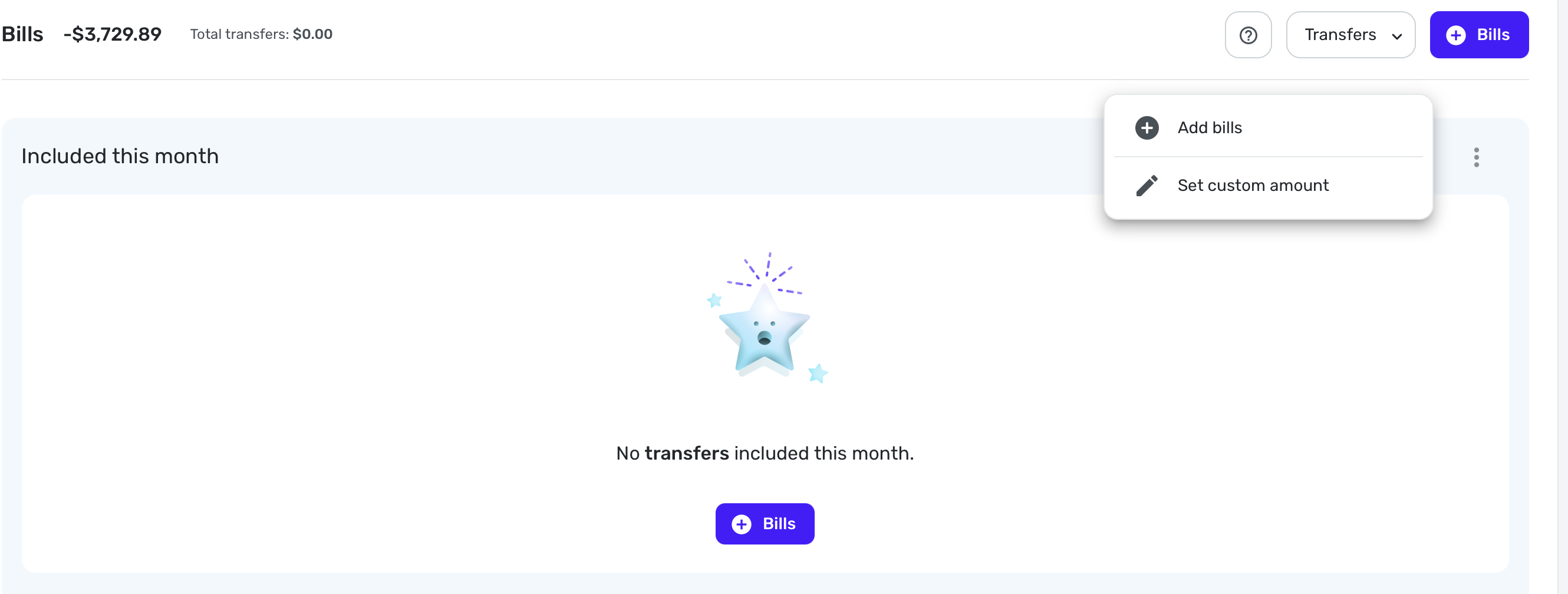
- I used to be able to go to spending plan and scroll down to see my transfers. Now I have to click spending plan, click bills, click the dropdown and select transfers.
- I can no longer hide one side of the transfer. The positive side of the transfer is greyed out because I have it hidden from the spending plan but it is still tied to and underneath of the negative side of the transfer. I no longer have the option to completely hide those.
For some added context; I have recurring transfers setup for my credit card bills every month with the average amount for them. This allows me to look at the projected cashflow for my bank account and include the average spend on those credit cards to give me a pretty good idea of projected cashflow. When I originally setup simplifi I wasn't able to find another way to do this. If there is a better more preferred way to accomplish this I'm willing to redo my setup. Looking forward to others feedback here as well.
1 -
The UI looks cleaner however new grouping of transfers under bills creates a messy situation.
I use transfers from savings to offset the upcoming planned expense, so that my available balance shows correctly. Example: I have planned $7k for travel expenses. I saved them in savings account. If I just add planned expense, then the formula typical income-bills - $7k = -(available balance). That is not true since I saved up money through goals for this specific expense. To fix it, I transfer money from savings to checking and I exclude negative transaction, but make positive transaction visible in spending plan. Then the formula goes Income-bills +$7k transfer -$7k planned spending = +( available to spend).With the update the formula still calculates correctly. However, because my positive transfers are reflected under Bills, now bills show +$4k. That really messes up financial picture.
please fix either grouping of transfers under bills (ungroup them please) or figure out how to accommodate the scenario of pre-saved money for upcoming expense so that available to spend is not affected by it.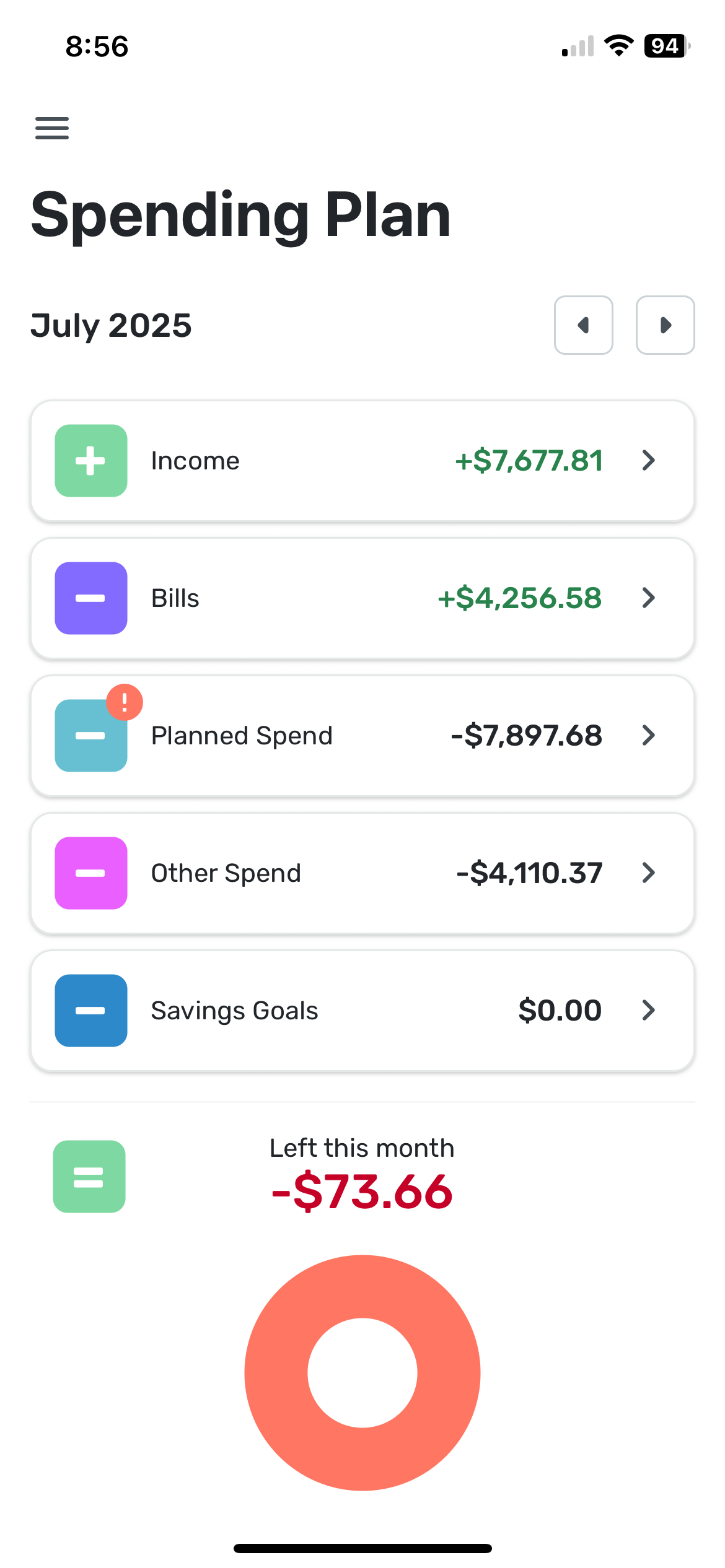 1
1 -
I liked it much better the old way. I don’t like that transfers are included in bills. They aren’t bills. Also can not hide the positive side of the transfer. I preferred subscriptions and bills to be separate but I can deal with that. Please separate transfers. Thanks
3 -
@Coach Natalie — "Have you checked in other browsers or anything along those lines?"
Yes. Chrome & Edge. Same result.
However, I believe I have discovered why it malfunctions. I believe Simplifi treats the name as "empty" for purposes of sorting when the default name is used for the "expense series."
As you know, the "Expense name (optional)" field is, well, optional when creating an "expense series." If you don't enter a name, the series automatically uses the name of the Category.
"Dining Out" is the only expense series where I left the optional name blank and allowed Simplifi to provide the name by default, like this:
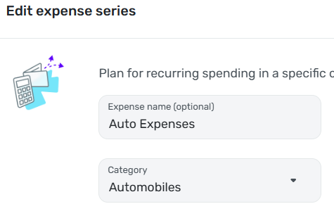
For all my other "expense series" I typed in the name myself, like this:
I tested this idea by manually entering "Dining Out" in the "Expense name (optional)" field. This caused the Name sort to function correctly.
NOTE: I believe this to be a bug, but I hesitate to suggest that. The response to other "bugs" I have reported has been that Simplifi considers something a bug only if there is no way for the user to work around it — which I obviously can do here. However, I have the advantage of having spent years in software development. I'm not sure a typical user would easily figure out that the fact that the expense series is labeled "Dining Out" doesn't mean that Simplifi will treat it as being named "Dining Out."
DryHeat
-Quicken Classic (1990-2020), CountAbout (2021-2024), Simplifi (2025-…)3 -
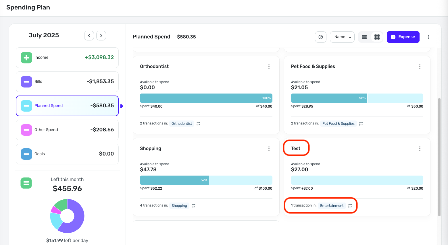
I swear that then I first opening the new Spending Plan on my phone for the first time there was an extra section labelled 'Health' which I thought could be useful for me. But when I came back to in on the web, and looking at the phone again, it's gone. Did I imagine this?
0 -
I believe @DryHeat is right as mine were not sorting alphabetically either and the first three random have no Expense Series Name specified. They sort correctly on amount.
I added the default name into the Series, and now it is alphabetized.
Steve
Quicken Simplifi (Safari & iOS) Since 2021
Quicken Classic (MacOS) Since 2009
MS Money (1991-2009) and Dollars & Sense (1987-1991)1 -
Thanks for the update and new design QS team. Below is Evaluated from Desktop
Like:
- General visual design is pleasant
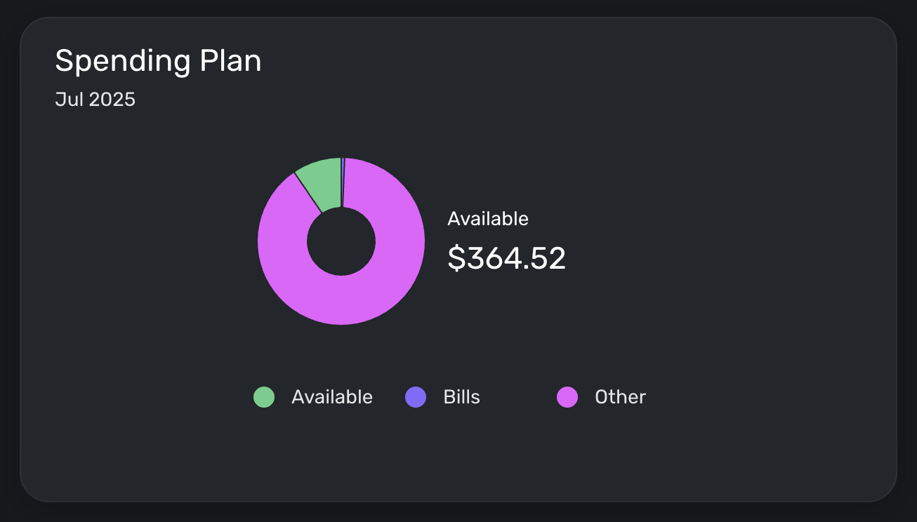
- "Left this month" pie chart is simple, math makes sense
- "Add to Planned Spend" in the Other Spend section (though I haven't given it try yet)
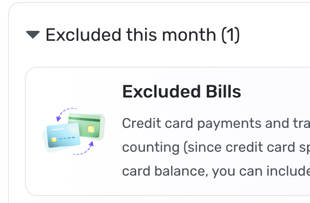
- "Excluded this Month" in the income section and the ability to include (though I haven't given it try yet)
Don't Like:
- For me, a Bill is a necessity, like electricity or health insurance
- For me, a Subscription is something that's nice to have, like Netflix
- It's good to see the Bills and Subs amounts when planning future cycles (now I have to select in the menu to see the amounts for each)
- So, I still wish I could see a single Bills/Subscription list, sorted by Type, (Bills then Subscriptions then Transfer) as in prior version.
- A Suggestion, refine the menu to say "All Bills" (currently All Types, sorted by date, since a bill is a bill) then add "All Bills by Type" (sorted and includes Regular, Subscriptions and Transfers, sorted by date). You can still maintain the 3 menu items to view them separately.
- Minor, but the Bubbles in Other Spend, visually, don't feel like the design of the info graphs from Other Spend or Bills.
Confusing UI:
- After selecting "Subscriptions" from the Spending Plan Bills, the bottom shows an Excluded Bill. I feel it should say Excluded Subscription instead of bill, since I selected Subscriptions and since Bills are separate section. I realize this box can be closed as it's informational, but it was confusing upon first read.
 0
0 -
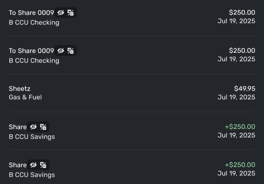
Transfers are showing up backwards: This was 2 transfers FROM savings TO checking. The + and - are reversed in the notations.
 0
0 -
@DryHeat & @SRC54, I'm still not seeing the issue. All of my Planned Spending expenses just use the category I selected for the name; I did not input a name myself.
I also just created a Planned Spending expense with a custom name, and it looks like the name is what is honored when sorting —
You may need to delete and recreate the Planned Spending expenses to have the names properly honored in the sorting. Maybe test with one or two to see if it works, and then go from there. Let us know!
@DryHeat, as for reported issues not being deemed a bug, I think there may be some misinterpretation. If something is able to be resolved through troubleshooting, it would be considered a one-off, and although it may have been a bug, it is not something we'd escalate. And if something is considered by design, such as having hover text to accommodate for a lack of real estate on the main screen (as discussed yesterday in a different thread), this is an intentional design aspect that is there for a reason.
For items like the latter, you can file an Idea post to request a change to the design. Idea posts can be just as effective, and maybe even more so sometimes, in getting our product team's attention to how the current functionality is impacting usability. I hope this helps to clear things up!
-Coach Natalie
0 -
@mf1192, the category is what is shown for transfers, not the account. You will see the name of the "other side" account, as this is the category for Linked Transfers.
Does this align with what you're seeing?
-Coach Natalie
0 -
When my Essentials category has default name empty, it goes before Concomitant:
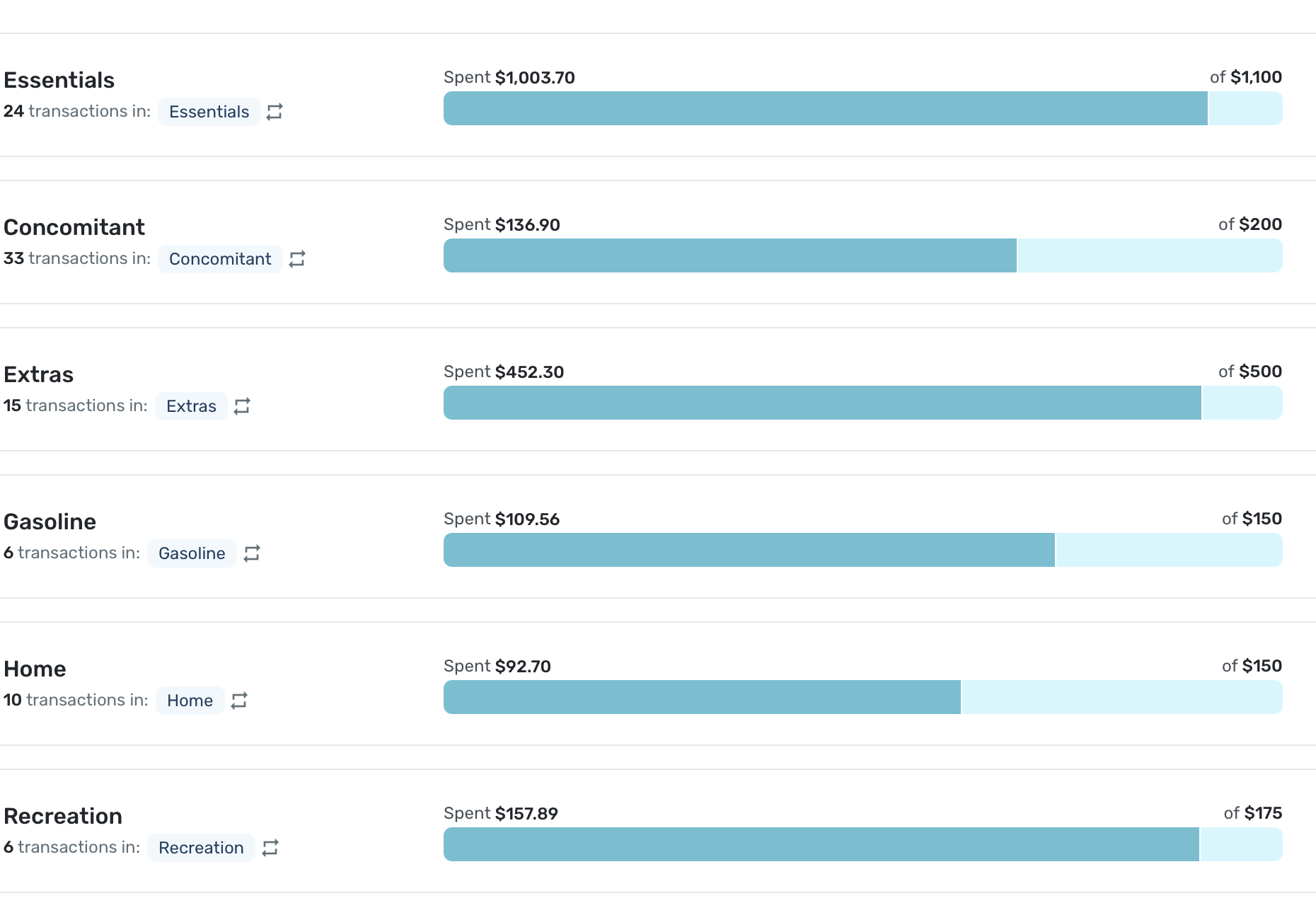
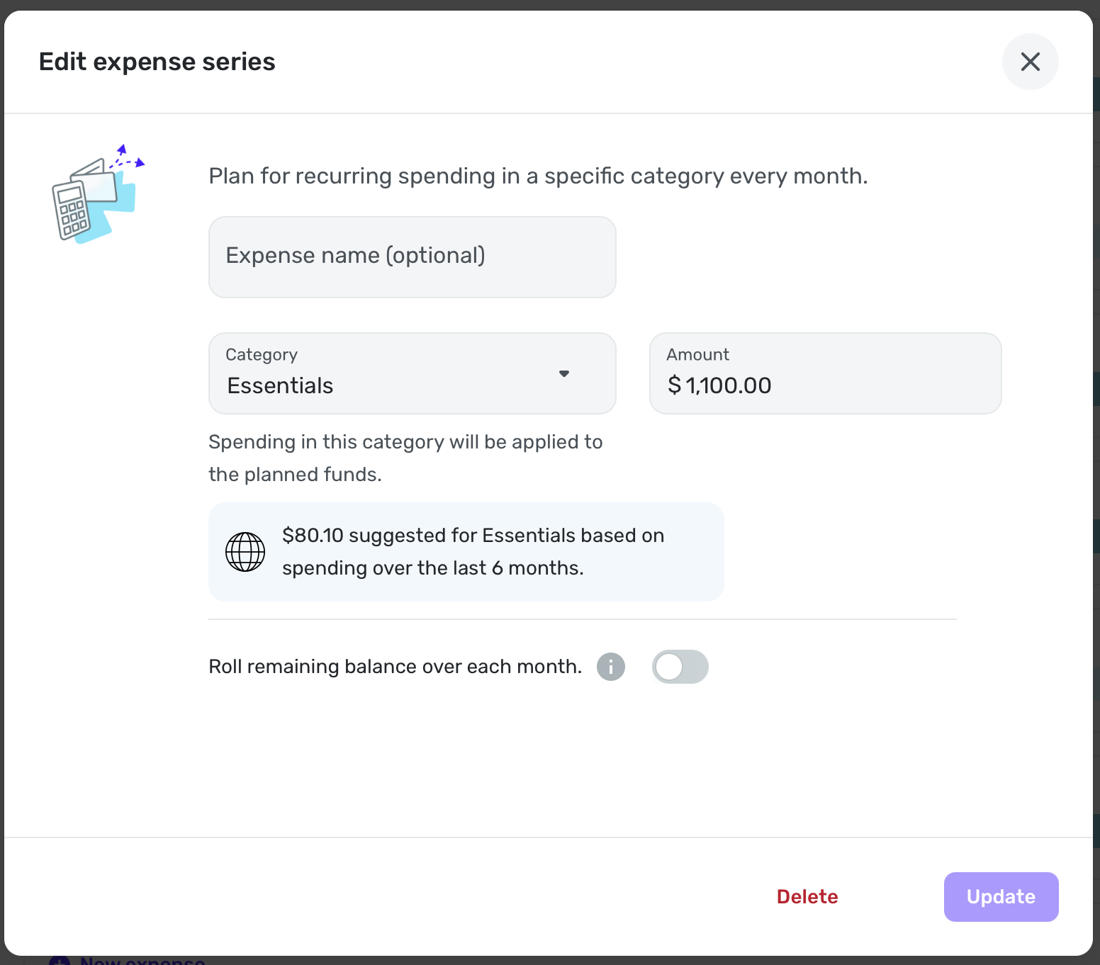
When I explicitly name it Essentials, it is sorted correctly:
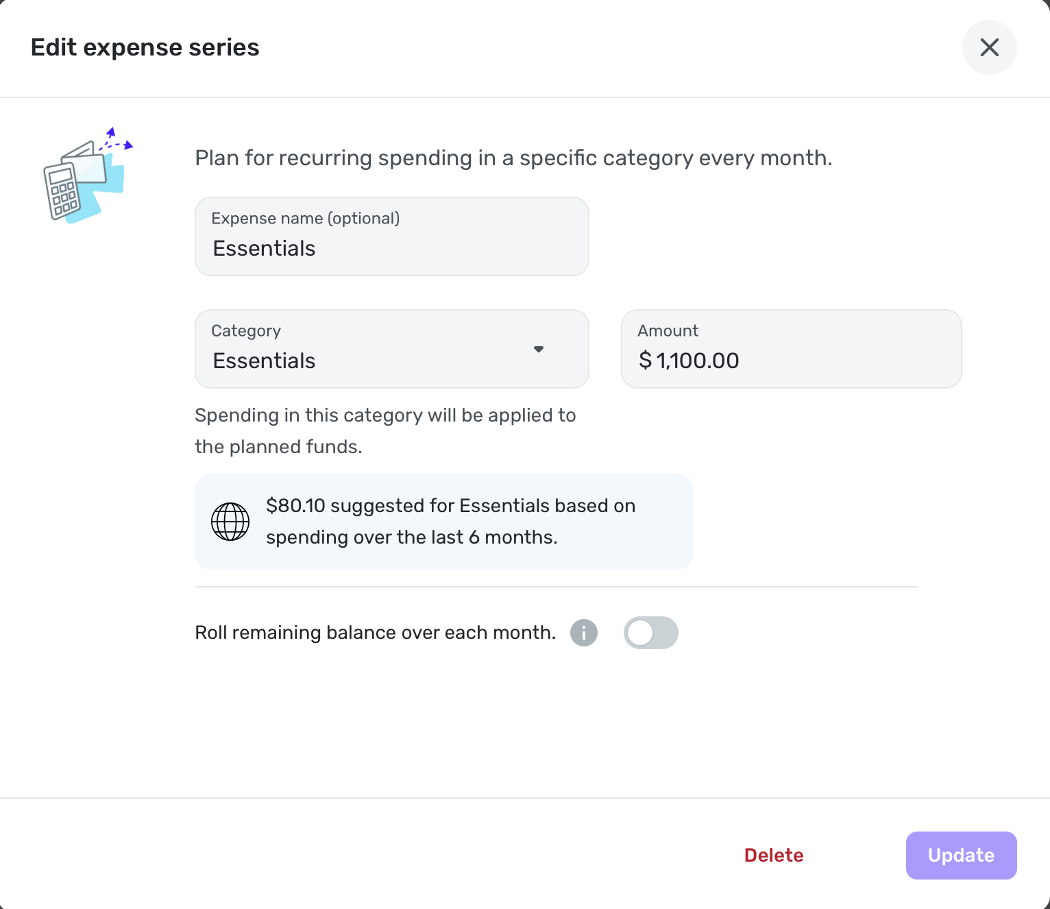
By the way, I spend $1-1.2K on this category every month yet Simplifi suggests $80.10. LOL
Essentials is Apparel, Food and Sundry (Personal) spending in case anyone wonders.
Steve
Quicken Simplifi (Safari & iOS) Since 2021
Quicken Classic (MacOS) Since 2009
MS Money (1991-2009) and Dollars & Sense (1987-1991)0 -
@SRC54, I'm not sure why the Expense Name field would be empty. When I leave it empty and just select the category for a newly created Planned Spending expense, Quicken Simplifi defaults the name to the category selected. When I edit the expense again, that is what I see in the Expense Name field.
-Coach Natalie
0 -
The Spending Plan redesign took the most valuable part of Quicken Simplifi and made it worse. I am not a fan of the redesign.
Let me start off by saying that the Spending Plan is the reason I use Quicken Simplifi. No other budgeting software I have tried has automatically allowed me to setup Bills and Subscriptions and Transfers as their own bucket in the Budget/Spending plan without having to mess with categorizations of transactions to force create Fixed and Flexible buckets. I want my budget to tell me just three main things:
1) what is my Fixed burn rate (i.e. Bills/Subscriptions and Debt Payments/Recurring Transfers that are out-the-door expenses that I've obligated myself to pay each month and either cancelling the payment is impossible without an asset sale of some sort or cancelling/adjusting the payment requires cancelling/adjusting a service I'm signed up for),
2) how much is left to spend after my Fixed burn rate is subtracted from my expected Income, and
3) how much is then left to Save after my expected Planned expenses (e.g. gas, groceries) and "Other Spending" allowances are covered.
I also want my budget to be easy and nice to look at so I don't avoid glancing at it when I'm making purchasing decisions.
The old Spending Plan covered most of my needs. It had a clean and simple design with the totals/what's left numbers being in large font and bolded where appropriate. The numbers were also the primary focus in the desktop version with its top-down design versus the left-right design of the new Spending Plan which makes you focus on the icons and the words first and so the numbers become a secondary feature that you have to train your eye to find on the page. Ultimately I don't like the new aesthetics/layout and thought the old version aesthetics of the Spending Plan to be much better in the desktop app and better focused on the important information, i.e. the numbers.
The old design looked much better on the Mobile version too with the pie chart front and center instead of being squished at the bottom like the new version has it since the left-right buckets are taking up 2/3 of the screen. I'll argue that when you are out shopping and want to quickly glance at how much flexible money do you have left to spend, the pie chart and the "Left this month" number are the only information you need in the moment to make a decision. So this should have front and center attention on the mobile version and the bucket details should go back to having a small focus on the page so you can go dig in if you want but aren't distracted by the clutter if you just need to know "how much do I have left this month and is it enough to splurge on a Starbucks coffee".
I also loved the collapsible sub-categorization of the Income/Bills bucket in the old Spending Plan. You got each sub-category (Bills/Subscription/Transfers/Income) sub-total in big font numbers and you could leave the categories collapsed for normal glancing through without the transaction clutter or if you wanted to dig in you could expand to see the transactions easily. The new Spending Plan destroyed all of this by creating a cluttered mess of a transaction register that is now everything that is a Bill/Subscription/Transfer and tried to pawn off a Filter drop-down as a viable solution to having messed up what was a good thing with the collapsible sub-category view. Also the sub-totals for each sub-category if you do Filter the Bills bucket are in TINY font. The individual transaction number fonts are much bigger than the highly valuable sub-total number. A budget should be simple to use which means total numbers need to be the focus of everything and detail views there as supporting actors for detailed monitoring and troubleshooting.
Now to get into some mechanical changes. Removing Savings from Bills/Income was the right move and will always be the right move. I approve of this entirely. When budgeting, I need to make sure my obligations (fixed expenses) are covered and that I can buy groceries and gas and pet food (Planned spending). After that, I can assess how much I can allocated to Savings versus giving myself free reign as Other spending. So while savings needs to be a priority when managing finances, it is also is one of the most flexible buckets that will ebb and flow as Fixed expenses change month-to-month (e.g. less available for Savings in months where semi-annual insurance bills hit or annual subscriptions like Microsoft 365 hit) or if emergencies happen (e.g. roof replacement). I usually keep my Savings goal automatic monthly allocation to zero and then may set custom amounts each month based on how much is indicated as "Left available" for the month. Or I just have a savings target in mind for the month and aim to keep my "Left available" above that target (e.g. if I want to save $2k then my left available needs to stay above $2k for that month).
Splitting Income and Bills/Subscriptions/Transfers is more controversial to me, and I ultimately do not like it at all. The only thing I think was missing on the old version was a total number on all the expenses sub-categories in the Income/Bills bucket. But you could easily math this yourself by subtracting the "left to spend" number from the Income number. Savings being in the mix in the old spending plan could make this more complicated if you didn't have your savings set to zero. But other than Savings being in the wrong bucket (always needed its own bucket), the old Spending Plan was NOT BROKE. That's my opinion, of course. It is nice seeing the Bills total number emphasized in the new version, but now I have to math the "left to spend" number myself. Which makes cross checking the Planned and Projected Other spending buckets against what is left after Bills a bit more annoying. I'd rather see the old version re-introduced and simply add that "Bills total" number somewhere (like an extra collapsible bucketing around the Bills/Subscriptions/Transfers).
If there's absolutely no going back to combining the Income/Bills buckets in the Spending Plan, then at least go back to the old view's collapsible sub-category bucketing for the Bills. Or add a toggle button so people can have that old view or the new transaction register hell view if they prefer.
Last complaint, there's no quick navigation button in the desktop version that I can find to jump you back to "Today" (i.e. current month) if you are looking forward many months in the Spending Plan. Did confirm the Today button is alive and well in the mobile version, but I don't see it in the desktop version. Would be a helpful add if this is a miss and not just me being blind.
TLDR overview of change requests on the new Spending Plan:
- Lean back towards the aesthetic of the old desktop version Spending Plan to focus more on numbers and less on unimportant details (i.e. less on words)
- Revert the mobile version back to the old aesthetic with the focus on the "Left this month" number and pie chart
- Keep Savings separate and everyone wins (i.e. don't change what you've changed; it's perfect)
- Lump Income/Bills back together but give Bills an extra collapsible total category that gives Bills total sum
- Or show somewhere the calculated "Left to spend" after Bills section expenses so we don't have to manually calculate that ourselves going forward
- Go back to collapsible sub-categories in the Bills section instead of a filterable register that is horrible to look at and use
- Add the Today quick navigation jump back to current month button in the desktop version
Edit: We also need a view option in Bills to hide the "Excluded from Spending Plan" side of transfers. I excluded those for a reason and don't want them junking up my Spending Plan views. A button or setting option to hide those would be perfect.
4 -
@Coach Natalie Nor am I. The only two that were empty this morning were Essentials and Concomitant. Essentials has always been first in my list, and I didn't mind because it was my major expense. But now they are all explicitly named and in alphabetical order. I like being able to do them by amount as well.
Steve
Quicken Simplifi (Safari & iOS) Since 2021
Quicken Classic (MacOS) Since 2009
MS Money (1991-2009) and Dollars & Sense (1987-1991)1 -
I'm loving the new spending plan interface. My one issue is that the "Available to spend per day" number disappeared from my Spending Plan tile on my dashboard. This was the primary metric I used to make budgeting decisions—would love if it was brought back.
 3
3 -
I figured it out, what a weird thing, very confusing/misleading to have the category be the name of the account rather than just the word Transfer.
0


