Spending Plan Redesign: Share your feedback here!
Comments
-
It doesn't show on the dashboard, but it does show when looking in the Spending Plan. So, it's not totally gone, just not available at a glance.
I don't want to speak for everyone, but this entire update feels very form over function to me. Not everyone uses the app in the same way though or will agree on how things should be setup. A change that's great for one person is probably going to be terrible for another. I think it would make sense for the UX team to try to focus more on customization going forward, just as a suggestion.2 -
Please let us sort by bill type instead of just filtering! I was using 'Bills' and 'Subscriptions' for different things and I'd prefer to be able to see them both on the same page, and expand them separately, like before.
5 -
(Also, can you please fix the bug where recurring transactions occasionally disappear altogether? I had a donation vanish earlier this month, had to manually change the 'subscriptions' total to be custom, and now that's gone and it looks like I have $200 more to spend than I actually do)
0 -
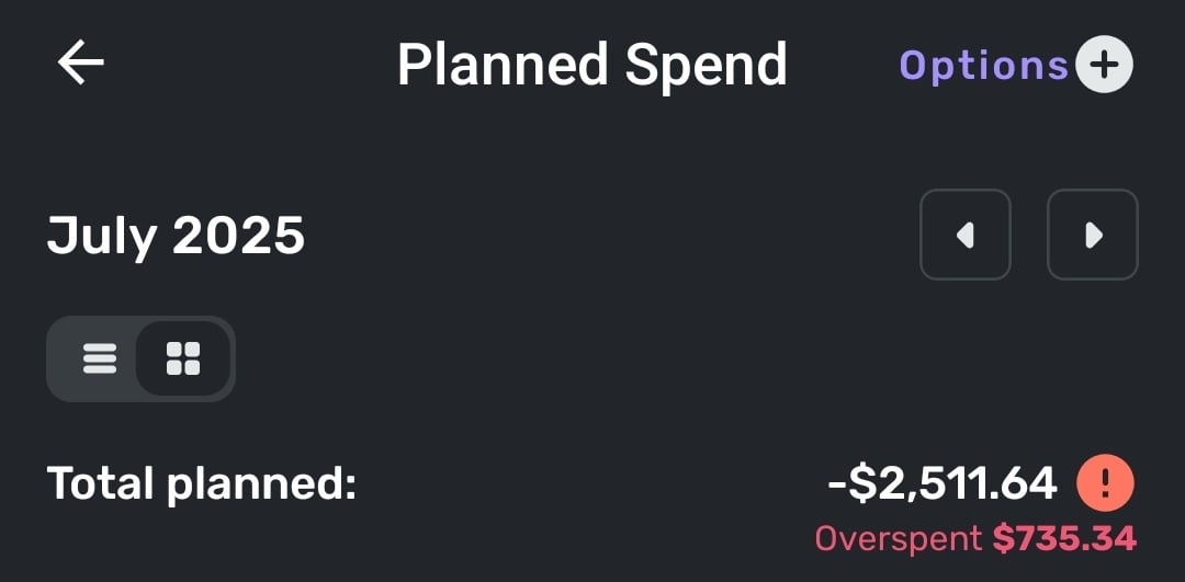
In the Planned Spend view Simplifi seems to be insisting I've overspent, despite not currently having any categories of planned spending that are overspent. Unsure if it's using my current categories today as its baseline or if it's using what they were on July 1, as I did modify them over the course of the month. If it's the latter I would suggest that this view instead uses current categories.
2 -
"I'm not sure why the Expense Name field would be empty. When I leave it empty and just select the category for a newly created Planned Spending expense, Quicken Simplifi defaults the name to the category selected. When I edit the expense again, that is what I see in the Expense Name field."
I think there is a pretty simple explanation. Basically, this appears to be an issue only with expense series that were created before certain changes were made to the expense series creation logic.
The images @SRC and I posted were of expense series created some time ago. Apparently, at that time the Expense Name field was left blank if not manually filled by the user. Now it seems the logic has changed such that Simplifi actually fills the Expense Name field if it is left blank. That's good … and mystery solved!
"You may need to delete and recreate the Planned Spending expenses to have the names properly honored in the sorting."
That would work.
Or maybe just change the Category, change it back, and hit Update.It's kind of a shame there wasn't logic put in place to update the legacy expense series for the user, but it is what it is.DryHeat
-Quicken Classic (1990-2020), CountAbout (2021-2024), Simplifi (2025-…)3 -
"And if something is considered by design, such as having hover text to accommodate for a lack of real estate on the main screen, this is an intentional design aspect that is there for a reason."
If that were what is happening, I would agree with you … But that is not what is happening.
[removed - off-topic/discussed elsewhere]
DryHeat
-Quicken Classic (1990-2020), CountAbout (2021-2024), Simplifi (2025-…)0 -
I like the new aesthetic! The layout and colors work very well.
I must agree with many others that Bills and Subscriptions (and Transfers) should be separate.
Also, the usefulness of the spending plan is limited as long as we are hindered by the functionality of Savings Goals. We need more flexibility with the savings goals. The solution of hiding savings goal transactions from the spending plan is insufficient because you cannot hide individual splits in a split transaction, and - what is more - it defeats the purpose of having a budget.
It seems that the ability to "Release to Spending Plan" would be a relatively straightforward upgrade, given that a similar function already exists for Planned Spending. It wouldn't be a perfect solution, but it would address a couple of the biggest shortcomings of Savings Goals: a) the inability to treat a withdrawal from a savings goal as a credit to the spending plan, and b) the inability to release planned savings to the spending plan. Since contributions to savings goals are debits against the spending plan, it seems logical that withdrawals from savings goals would be credits back to the spending plan.
Thanks for your hard work to continue making Simplifi more useful to all of us!
3 -
@DryHeat, you are welcome to contact Chat Support to report the issue there instead, in case they have a different take on things.
Otherwise, we would like this thread to stay on topic with the Spending Plan redesign, so the feedback and issues posted here are meaningful to our product team in regard to that topic.
Thanks!
-Coach Natalie
0 -
Reference: Mobile View
I’m sorry, but the redesign of the Spending Plan is really disappointing. Visually, it’s unattractive, and more importantly, the user experience feels like a step backward. It now takes multiple clicks to access information that used to be available in one clean, consolidated view. Before, I could move between spending categories and see breakdowns all in one spot. Now, trying to compare something as basic as bills versus subscriptions takes three separate clicks.
The original interface didn’t need a full redesign. It worked well. What it needed was refinement of the existing features, not a complete overhaul. For example, it would’ve been much more helpful to expand the functionality by allowing planned spending items to show up in the cash flow view. That’s a practical update that would’ve improved usability without compromising the simple layout that made this app stand out.
If other users like this new direction, fine, but is there at least an option to toggle between views? Because what drew me to Simplifi in the first place was how intuitive and clean it felt. This redesign trades that clarity for complexity.
And honestly, if you’re looking to improve functionality, a better use of development time would’ve been enhancements like making split transactions more flexible, being able to tag or link parts of a transaction to different subscriptions/recurring bills. That’s what users like me have been waiting for, not a cosmetic overhaul that makes navigation harder.
2 -
[removed - off-topic/unnecessary]
DryHeat
-Quicken Classic (1990-2020), CountAbout (2021-2024), Simplifi (2025-…)1 -
I also get this overspent error in the Planned Spending. I use my Planned Spending categories as general targets but will flex them during the month based on actual needs. For example some months I have no spend on Pets or Home Maintenance so I can reallocate that planned spending to Restaurants or Groceries if I prefer. The old Spending Plan would update immediately when you updated categories. This seems to be bugged now.
1 -
UPDATE on the Planned Spend Expense Series Sorting Issue:
If you edit an expense series to add the name in the Expense Name field — so it will sort correctly — it does not update the Expense Name for that series in previous months.
If you want the previous months to sort correctly, you will have to edit each one individually.
DryHeat
-Quicken Classic (1990-2020), CountAbout (2021-2024), Simplifi (2025-…)0 -
I don't think that Transfers should be mixed with Excluded Bills. That'll make it really hard for me to find bills that might have been excluded by mistake. I have many many transfers every month (eg: each credit card's payment comes with 2, and that's not all that there are) and I think they should be in a separate section - either within Bills or as a separate top-level section.
1 -
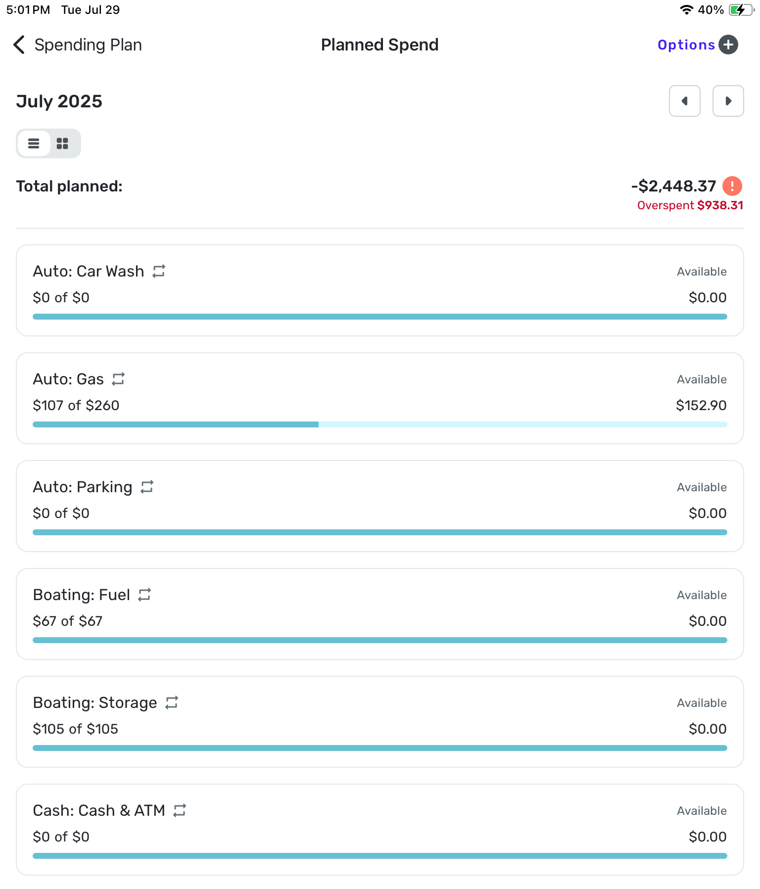
The overspent number above is entirely inaccurate!
1 -
I much prefer the bills, subscriptions and transfers to be listed separately as they previously were. It looks so disorganized now. Lease list them using a down arrow to expand each heading.
I wish all screens included a down arrow to expand the information in a list below each heading instead of the arrow to the right which creates an entirely new page; then all the info would be on one page!
And why do we have to include the option to list excluded transactions? They are excluded. Can we please have an option to exclude them entirely from the spending plan?
Thanks,Donna
1 -
We definitely need them listed if Simplifi is deciding on its own to exclude them!
0 -
I like the look of the new update but very frustrated that bills and subscriptions cannot be sorted and viewed at the same time. The only way to see them separated is showing one at a time. I really liked the previous view seeing my bills and subscriptions separated but on the screen at the same time.
2 -
I understand the not-entirely-positive reactions I have see in this thread.
But, on the whole, I much prefer the new Spending Plan layout.
I think the main navigation bar is better to look at and gives a more immediate understanding of how the pieces of the Spending Plan fit together.
And I like having Regular bills and Subscriptions in one listing. (I seem to be alone on that.) Conceptually they are very similar to me and prior to using Spending Plan I never segregated them. Sure, it's nice to be able to filter the list for one or the other. But having them all feed in to one negative number makes more sense to me.
I admit that having Transfers in a separate section might make even more sense. I would put it between Income and Bills with a +/- sign because Transfers can go either way. But I can live with that the way it is.
Spending Plan retains some of the flaws from the previous iteration — in particular the inability to preserve column layouts. But I think it's a big improvement.
DryHeat
-Quicken Classic (1990-2020), CountAbout (2021-2024), Simplifi (2025-…)1 -
I also think that bills and subscriptions make sense together, but I'd want transfers to be separate from that.
1 -
I completely disagree on the look of the new update but that is personal opinion. I personally never needed to be handheld on how the pieces fit together and prefer the old simpler and cleaner view of the full picture.
But on your Bills & Subscriptions spending being similar comment, you are very right from a minimum functional objective standpoint. I think a different execution of the objective would’ve caused less ire. Ultimately, what you are asking for is the sum total number of the Bills+Subscriptions. I agree this is a very helpful number and if they’d just added that one sum total in the old Spending Plan, like on the Income/Bills detail page somewhere, then that would have accomplished the mission perfectly and wouldn’t have required a wholesale redesign. The new transaction register view of Bills/Subscriptions/Transfers is chaotic to look at and far from simple to use because of the chaos. And it removes the quick glance ability to flip through future months on the Income/Bills page and see how your Bills/Subscriptions and even Income/Transfers total numbers are changing in future months without have to change filter settings each month, and it makes it just harder to see those Bill vs Subscription vs Transfer totals in general. So basically, to solve a simple “we need to add a total sum number somewhere of all Bills/Subscriptions” they removed highly valuable budget planning functionality that the old setup had. To me, this is the major flaw in this new update and a huge negative on the primary selling point for Quicken Simplifi over other budgeting apps.I will also add that for folks that prefer to just have one list, they always had the option to just categorize everything as Bills and never look back. But this choice removes functionality of easily seeing changes in subscription costs and identifying charges you didn’t intend to renew or increases in subscription charges that you’d rather cancel at new price. Subscriptions by nature are things that are easier to cancel than Bills.
2 -
"The new transaction register view of Bills/Subscriptions/Transfers is chaotic to look at and far from simple to use because of the chaos."
As I said above, I agree about the Transfers and think they should be separated out.
But "I personally never needed to be handheld" to distinguish bills from subscriptions. 😉 So being able to see them all together in date order — or filtered to show one or the other — works fine for me. Particularly since the filter is maintained as you flip from month to month making comparison over time fairly painless.
DryHeat
-Quicken Classic (1990-2020), CountAbout (2021-2024), Simplifi (2025-…)0 -
The handholding comment wasn’t directed at you. It was regarding the new design that puts the plus and minus icons next to each major bucket in the budget. To me, that was unnecessary but is a visual preference issue.
I think you are missing the point though that the old Spending Plan let you see all 4 things (Income, Bills, Subscriptions, Transfers) and their individual subtotals on the same page with no additional clicks on filters as you jump to future months. New spending plan maintains filter on page you are on but now you have to navigate to 3 different filters and a new bucket for each month to get those same 4 subtotal numbers. Very annoying especially on mobile version but even annoying on desktop. Budgeting and future month planning is now more tedious.
Edit: and I’m ignoring the fact that you could also see Savings on that same page because the one thing I am 100% on board with in this update is splitting that out because its location in the previous setup was harder to manage in setting up your budget.
0 -
"I think you are missing the point though that the old Spending Plan let you see all 4 things (Income, Bills, Subscriptions, Transfers) and their individual subtotals on the same page…"
No, I understood your point. Seeing the subtotals was very important to you and you want that back.
But it wasn't important to me. I always did my month-to-month comparisons by flipping through the expanded bills lists, then the expanded subscriptions lists, etc. So the new system works fine for me.
We understand each other… and we agree on moving the Transfers out. We just don't agree on everything.
DryHeat
-Quicken Classic (1990-2020), CountAbout (2021-2024), Simplifi (2025-…)1 -
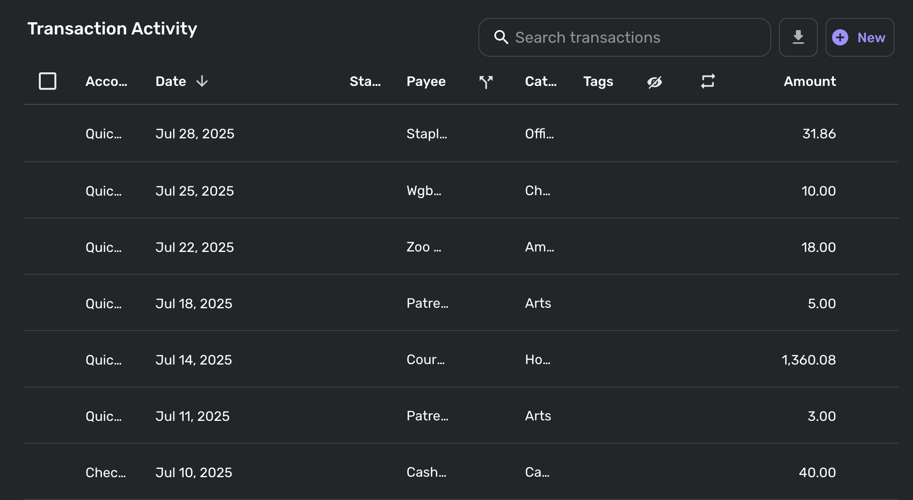
I just opened the new spending plan on my laptop (13" Macbook Air) and the itemized transaction activity for each section is completely unreadable, presumably because that horizontal real estate has been taken up by non-collapsible navigation categories (Income/Bills/Planned Spend/etc.). Now in order to actually be able to see the information I want for transactions, I have to manually resize or hide columns, and worse, it doesn't even remember my preferred setup as I navigate between sections!
Please add some kind of default setting or built-in remembered state so I can manually set my preferred column configuration and then not have to worry about it each time.
Here's a sample of my completely unreadable transaction activity in other spend. Note that for me the most important categories are Payee, Category, and Amount, two of which are incomprehensible as-is.
 1
1 -
(1) you can now (i believe) resize the columns, but last i checked they weren't sticking but they said they would work on that so maybe that's working now
(2) You can select fewer columns, that may or may not stick.
(3) you can zoom out with your browser, on a Mac Cmt + "-" is zoom out, Cmd + "+" is zoom in in Cmd + "0" is 100% zoom. 100% zoom is typically too big for simplifi.
—
Rob Wilkens
0 -
Yes, I have done (1) and (2) myself, but without my changes sticking it's quite irritating to quickly hop around and check on the state of my budget holistically. Good to know that they're working on that.
0 -
"I have to manually resize or hide columns, and worse, it doesn't even remember my preferred setup as I navigate between sections!"
It's a bit weird and inconsistent.
- In Other Spend, it remembers the column setup as you click on different category bubbles.
- In Planned Spend, it doesn't remember the setup when you open different planned expense items.
DryHeat
-Quicken Classic (1990-2020), CountAbout (2021-2024), Simplifi (2025-…)2 -
@onyx @silentdream @donnajean, I'm not personally seeing any issues with Planned Spend showing overspent. I have extra funds in some expenses, and I have edited monthly amounts, etc., and everything seems to update right away and reflect the accurate numbers. The only time I see "overspent" is when I adjust one of my expenses to be overspent. As soon as I adjust it back, the "overspent" aspect goes away.
I would recommend taking a deeper dive into your Planned Spend to see if you can identify where the issue is coming from. Look at the budgeted and spent amounts for each expense to see if you can narrow things down. I would also recommend looking at your Spending Plan as a whole to see if the overspent cue is perhaps just visual or something along those lines.
If you can't figure out where the issue may be coming from, you might also consider editing your expenses, or deleting and re-creating them under the new design, to see if doing so clears things up.
Let us know how it goes!
-Coach Natalie
0 -
I have done the math. While the overspent amount on the ‘Planned Spend’ is now shown as $938.81, on the ‘Dashboard’ it is shown as $246.80, which is the correct number. I have no idea what the other number could represent. It did not used to be there.
Also, I see ‘Bills’ as mandatory payments. ‘Subscriptions’ are usually optional and can be canceled in a pinch. ‘Transfers’ represent moving money around and of course, are another thing. I really appreciated the display of the breakdown in the previous release.
0 -
non sticky column set ups, I think happens across the board. There are other posts about retaining column set ups.
0


