Spending Plan Redesign: Share your feedback here!
Comments
-
The Idea post for column selections sticking can be found here:
-Coach Natalie
1 -
I do not like the new Planned Spend set up. For one the bills are all lumped together. I preferred to have the Bills, Subscriptions and transfers/Credit Cards all separated out and I do not want to have to filter by each category when I want to look at that category. I want to see an overview of Bills, Subscriptions and Credit Cared/Transfers at a glance and not in one long list.
Secondly, the columns in the Planned Spend are cluttered and the width is not appropriate. The date field specifically is very wide which shortens the column width for the Payee and category which are cut off. Additionally, if you modify the columns it resets to default when moving between different planned spend categories. Modifying the columns to revert back completely defeats the purpose of modifying the columns. Some people may want the other columns but we should be able to choose which columns appear and that setting should stay when navigating between categories. Please fix the default width of the date column so it is more appropriate and allow column modifications to actually save.
Thirdly, The Income and Bills have excluded transactions as a separate field below the main section. Please put it back in the main section and not separate. I want to see all the transactions in that Category and not have to click extra buttons to see it or scroll through a wasteland of extra landscape of screen to view the excluded transactions.
Personally I do not care for the Spending Plan updates. Too "unicorn and rainbows" and less financial business. Please revert it back to the previous version or at least give the option for those who really find the new updates inconvenient and not conducive to monitoring and planning financial budgeting.
3 -
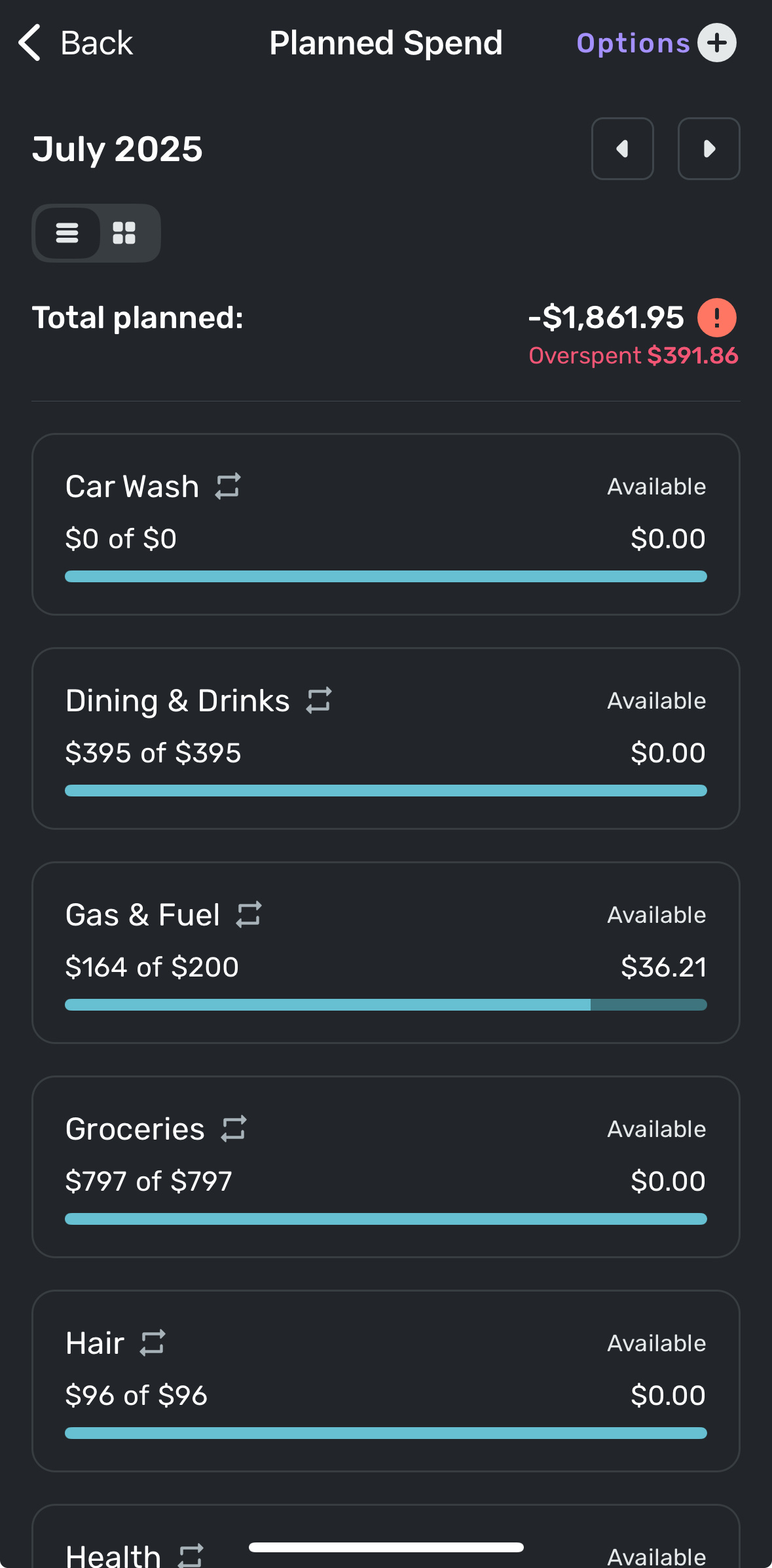
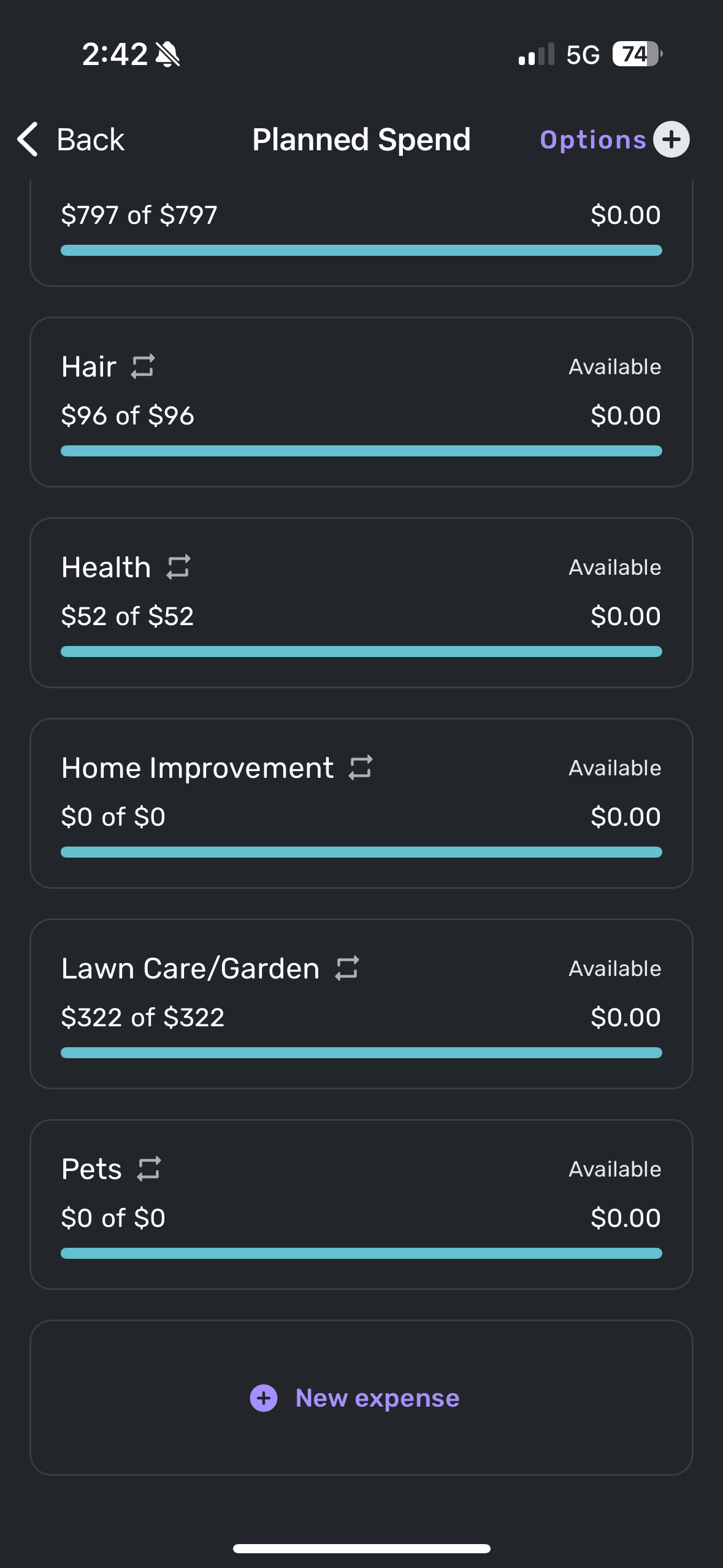
I overran this month’s planned spend on Dining and on Groceries due to unexpected family visits and on Lawn Care due to having to pay to take down a tree that fell over in a storm. What I can’t remember is which of those categories I had already corrected to give room in the Planned budget prior to the new Spending Plan update vs which ones I didn’t correct until after the update. But here are my screenshots showing no overruns in any categories but the overspent number at the top doesn’t want to go away. This could be an error caused by the update itself and may be no issue next month but I have no idea. Sharing details in case it does become a persistent problem. I only see this erroneous Overspent number on the Spending Plan in the Planned Spending page. Nowhere else.
 1
1 -
@silentdream, thanks for the reply!
I definitely see that none of your expenses are actually overspent. It's possible that the issue may be purely visual and won't pop up again in subsequent months. Can you check on the Quicken Simplifi Web App as well, please? Also, just to confirm, your overall Spending Plan amounts are correct, right? Is the "Total planned" in Planned Spend correct as well?
-Coach Natalie
0 -
The navigation panel (on the web) seems to be much wider than it needs to be. There is a large gap between the name of the section (like Planned Spend) and the dollar amount.

That horizontal space could be better used in the transaction/reminder listing panel.
DryHeat
-Quicken Classic (1990-2020), CountAbout (2021-2024), Simplifi (2025-…)1 -
Personally, I also don't really have a meaningful distinction between bills and subscriptions, but I was using both buckets. I have very few actual 'subscriptions' and most of them are annual, so I just put all of them in Bills, and then used the Subscriptions bucket for my donations (since I have quite a few monthly small-amount regular donations that I like to keep track of, and there isn't a separate Donations category).
0 -
One single data point, FWIW…
I just spent my weekly 45 minutes helping an 85-year-old relative use Simplifi. (This relative has had a lot of difficulty staying on top of her finances. I introduced her to Simplifi 3 months ago as a last ditch effort.)
She has had difficulty grasping the point of the Spending Plan up to now, but the new layout seemed to make it much easier for her to follow. (Although today's new topic, Savings Goals, is still a bit mysterious.)
As we went over the Spending Plan, suddenly she said, "Oh, I see. You start with this, and then you take out this this and this, and you end up with this."
And I said a silent "Hallelujah!"
DryHeat
-Quicken Classic (1990-2020), CountAbout (2021-2024), Simplifi (2025-…)3 -
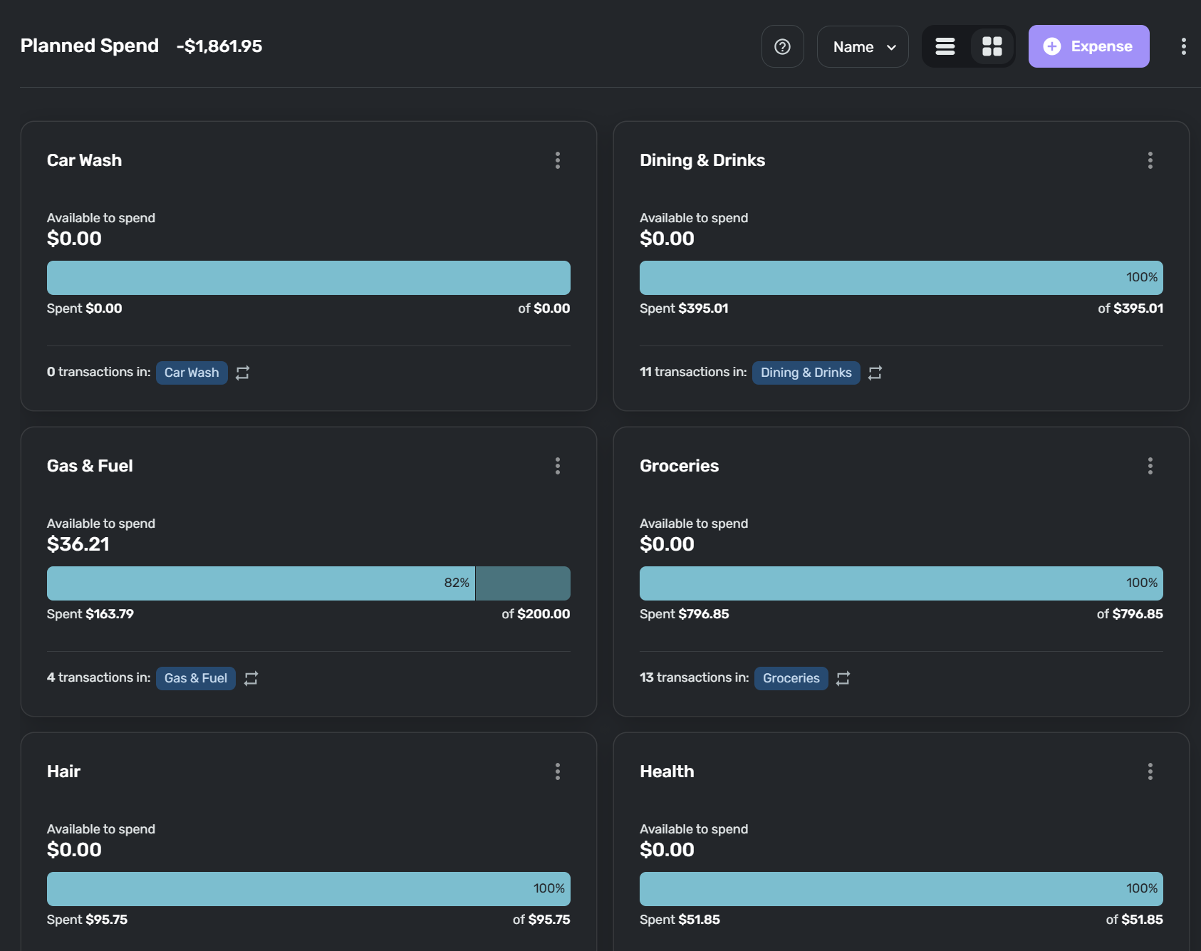
Just got home and confirmed on the web app that this does appear to be a Mobile app exclusive issue. And yes, the overall spending plan amounts appear correct. Here's a snip of same Planned Spending view but on Web app version and no overspent note. So definitely a Mobile app problem. I have refreshed, closed/restarted app and restarted phone also and the overspent error persists on my Mobile app. That narrows down the focus areas at least
 0
0 -
Hello @silentdream,
Thanks for the reply! I would see if uninstalling/reinstalling your device works to resolve the issue you are seeing exclusively on the mobile application. Let us know!
-Coach Jon
-Coach Jon
1 -
It's unfortunate in the new 'Spending Plan', with the bills, subscriptions and transfers lumped into one disorganized list, that it no longer reflects the structure of the same in 'Bills & Income'. I liked the consistency across the app and this is now lost. Please don't change the 'Bills & Income' in the same way.
0 -
@Coach Jon Tried deleting and reinstalling the app on my phone and can confirm that it did not fix the overspent error. Still shows same as before.
Also confirmed that if I force an overspend by changing one of the category amounts that this does not affect the erroneous overspent number by the total planned number. So it appears like it is a frozen snapshot value that the mobile app won't let go. Occurred after the Spending Plan update so I'm guessing the app is stuck on that snapshot of the overspent number. We'll see if it resets correctly next month.
1 -
Here are some of my initial thoughts:
- There is wasted real estate in the lefthand menu. There is a lot of white space between the category/grouping and the amount that would be much better used for the transaction details. Having the option to collapse/minimize the side bar might also be helpful, especially if wanting to maximize view of the transaction columns on a small screen.
- I like Income and Goals having their own groupings.
- Transfers should be separated from the Bills/Subscriptions as it's very confusing/visually overwhelming to me to have those intermingled.
- Undecided on whether I would prefer Bills & Subscriptions to be separated by default or if the ability to filter is sufficient for me.
- I like the separate sections for the Excluded items.
- I wish that Bills (i.e. all Series types) had the option to display more columns, including the ability to sort and with "sticky" selections. This is the only place that doesn't have at least some ability to customize the column views. One use case for ability to sort: sorting by category instead of date would make it easier for me to identify transactions that were inadvertently included/excluded. I use tags and notes a lot, including on recurring transactions, and would love to see that information at quick glance.
- While I think I overall like the spending plan update, I agree with many others that this redesign was by far not the top priority for me and would rather have seen development on goal registers, enhanced split transaction functionality, including planned spending in cash flow projections, rule improvements, full transaction details for upcoming reminders, or creating transactions from reminders (just to name a few). And yes, I have voted for all of these ideas and commented on many of them as well!
1 -
I agree with this comment and have the same question.
Simplifi User Since Nov 2023
Minter 2014-2023
Questionable Excel before 2014 to present
1 -
I would still like the option to easily add the reminder as a transaction. When I click on the reminder, options show, and in the options i can click "ADD as A Transaction" and it is added as a transaction. And maybe each reminder colour may change or in the upcoming text will change to paid and green.
 0
0 -
I just started playing with Spending Plan. I don't get the view above where it shows my total spend. Mine shows me me Planned spend even though I've overspent on every category. The same thing with the "Left this Month" it only accounts for planned spend. If my plan was to have $500 left at the end of the month, but my actual spend was 1250 instead of 1000, then it should tell me I have $250 left.
The planned spend should show actual spend in red if it's over the total, and you can drill into it for details but more importantly the "Left this month" should reflect what's actually left.
0 -
I'm not a fan of the change to the bills area. I liked being able to see my bills and subscriptions separately. I have too many transfers for the 'all' filter to be helpful because they're all jumbled together. I'm disappointed in the change. I hope you'll at least update it to allow viewing both bills and subscriptions, not just one at a time. I really liked how it was before.
1 -
Wanted to provide more feedback on the new spending plan after diving in and using it more. Overall, aesthetically it looks a lot cleaner and think from that standpoint it's a homerun. Functionally, I think it took a step back. Having separated the subscriptions and even transfers and having to drill down to see them is not ideal. It's nice seeing a view of that in one spot. I like to see a view of my subscriptions like it was before so I can see how much they are increasing. It should be pretty easy to add that to the new look. I know the team is working hard to make things better.
1 -
Still adjusting to this new layout. Like any change it will take a bit of time to adjust to the new design and functions.
Initial reactions:
- I like the new summary view in the left column.
- The way "Bills" when selected displays the data for my fixed expenses is where the most transitional work will be done on my part. My initial response to this section is that I miss the separation of Bills (fixed non-discretionary), Subscriptions (fixed discretionary) and Transfers all with the dropdown feature. The main thing here is the "neatness" of the landing page. Selecting "Bills" and then seeing a long list of all my recurring expenses is too much like seeing my bank account registers. Seeing the summary with the option to have the details in a dropdown list was more pleasing to me.
Danny
Simplifi user since 01/22
”Budget: a mathematical confirmation of your suspicions.” ~A.A. Latimer2 -
It's interesting to see the different ways people used subscriptions. I've been all over the place but have settled for those bills I have to initiate versus those subscriptions that are paid automatically.
I recently gave in and let Spectrum and the Power Company take it out automatically (I also went to even billing on the Power and will do the same with Gas this fall). So I have those as subscriptions. They don't require me to do anything except plan for them.
Steve
Quicken Simplifi (Safari & iOS) Since 2021
Quicken Classic (MacOS) Since 2009
MS Money (1991-2009) and Dollars & Sense (1987-1991)0 -
"The planned spend should show actual spend in red if it's over the total, and you can drill into it for details but more importantly the "Left this month" should reflect what's actually left."
If I understand you correctly, what you describe is pretty close to how it is working for me on computer.
—The total shown on the Planned Spend tile in the Spending Plan navigation panel is calculated using the greater of the planned amounts or the actual amounts for each planned expense.
—The "Left this month" takes that overspending into account.
—The navigation tile shows a red exclamation point when I have overspent in one of them:

—In the list of planned expenses, the overspent expenses show up in red, as does the the amount overspent for each.

—The total of the spending at the top of the list page includes the overspending, and the overspent amount is also broken out.

If yours isn't working like this, there may be something wrong.
DryHeat
-Quicken Classic (1990-2020), CountAbout (2021-2024), Simplifi (2025-…)0 -
Our product team has confirmed that the "per day" amount on the Spending Plan Dashboard card will be added back!
-Coach Natalie
5 -
Seems like everyone uses the term Bills and Subscriptions differently which is they way things work in general. Might be nice to allow for an individual to rename the titles to make sense for them? Then folks could manage their categories as they see fit.
Example:
Bills = Non Discretionary. Subs = Discretionary
Bills = Bills. Subs = Automatic payments
Bills = Non recurring Bills. Subs = Recurring Bills
Bills = Essential Bills. Subs = Non Essential Bills
etc etc.
That said, I'd still like to see them all in one line BUT broken out by the Bills and Subs to eliminate clicking into sub menus.
3 -
I actually liked bills split from subscriptions. With all the streaming platforms that are out there is was so helpful to get a quick glance at what im paying for in order to identify things that maybe i can swap our or eliminate all together. its nice to filter to it, but would be better to add the type as a column that you can sort by.
2 -
I have exported data from Quicken/Simplifi for 15 years just so i could get the view you finally created with Spending Plans in Simplifi. THANK YOU THANK YOU.
Key item: What is the actual cash I have left and how did i get there
Income
Minus Bills
Minus Planned Spending
Minus Other spending
Minus what i shoved into 401K, or Health savings account, or rainy day fund, or investment accounts (yea all of the cash that i did not SPEND but I CAN NOT ACCESS)
leaves you with what cash I really have left to spend.
2 -
You took it off … I know I can just click down … but my 3 adult children who I have gotten to use Simplifi over the last year … I want them (ok … and me!) … to see this as soon as they access the App
PLEASE PUT IT BACK!
0 -
i believe they have confirmed it is coming back already. I believe it was unintentionally removed, or it was removed and there was enough complaints about it being gone that - they decided it's coming back.
I don't know that they have a timeline.
—
Rob Wilkens
2 -
Yep, they have confirmed this feature is coming back. Now if I could only buy an -ing for Planned Spend and Other Spend? Please.😁
Steve
Quicken Simplifi (Safari & iOS) Since 2021
Quicken Classic (MacOS) Since 2009
MS Money (1991-2009) and Dollars & Sense (1987-1991)2 -
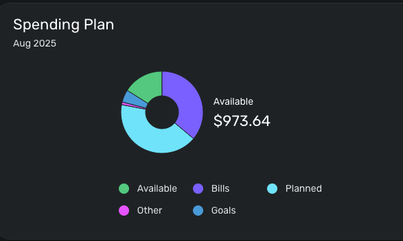
On the home page, in the Spending Plan widget at the very top, it shows the total amount available to spend, but no longer shows the available amount to spend per day. It would be nice if that could be shown again.
 0
0 -
As a side bar, I've actually never referred to the Per Day number. I typically take the total "left this month" to track how the Spending Plan is doing at large, then plan out how to use money or address overages. e.g Can I make a larger purchase, should I save some money, or where in the Planned spend do I cut back.
Here's another reason why the per day number doesn't make sense to me. Today Aug 1, I have $4 extra to spend per day. But I know that I have money to spend per day built into the Planned Spend. So the total left this month is what I use to asses how the overall Plan is doing.
I'd love to hear how folks use the Per Day number as I must be missing something. btw, this isn't a request to remove the Per Day, I just want to understand how people use it.
0