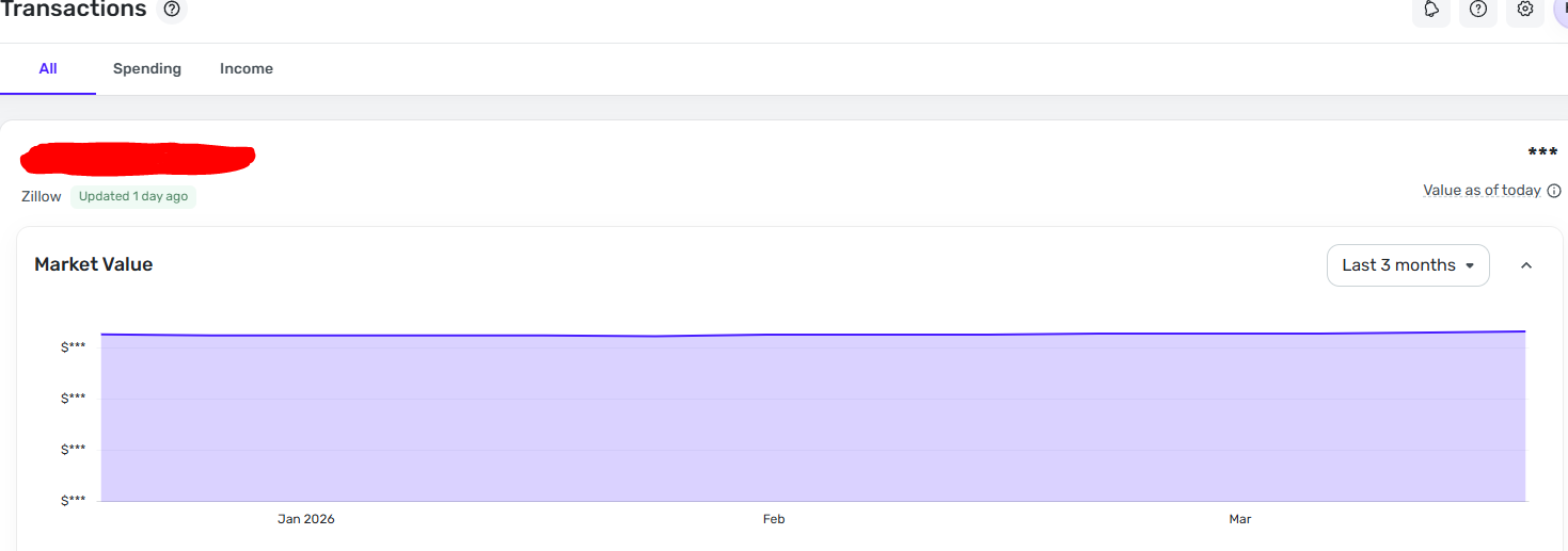
Zillow Market Value Graph Scaling (Graph Zoom)

Why is the Zillow Market Value graph now showing with a scale to $0 in the Y axis?
The graph changed a couple weeks ago I believe. It used to show with a more zoomed in scale, where the "Y" axis showed closer to the minimum value in the range, and was variable depending on the min/max of your range.
I assume this was an intentional change, but I want to see a zoomed in scaling, not to zero! It makes the graph look flat when looking at a short time range, which is OK unless you want to visually see the $ changes without scrolling your mouse over every single value to see what it actually was….
Can we please get an option to change the scaling??
Current graph: (Scale to zero)
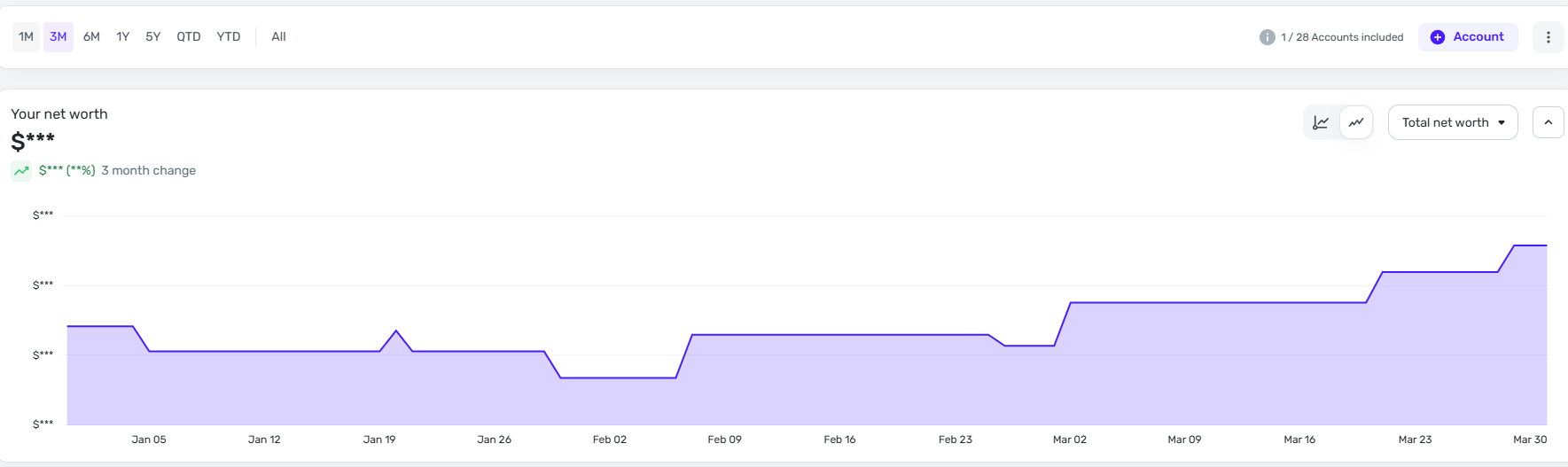
I want an option or this: (How it used to be, scale to minimum) This is the home value in the net work graph, but I want it in the actual asset page
Comments
-
Hello @KDC1996,
Thanks for reaching out and providing that feedback! We do have a couple of great idea posts on this topic that you may be interested in voting for:
If you want to create your own idea post that differs from these two, you are more than welcome to do so!
I hope this helps!
-Coach Jon
0 -
Thanks for the information. This, however, is not a "New feature Request" completely (Or exactly related tot he attached discussions). It is also a possible bug notification for a recent change (Although I assume was an intentional change).
The second graph I showed is how the Zillow Market value USED to show just ~2 weeks ago and it had been like that ever since it was initially implemented. I didn't originally post it because I didn't care enough, but it has been eating away at me and become more frustrating. I can't be the only one with this concern.
I would personally prefer it to be defaulted and reverted back to how it always used to be before ~2 weeks ago, but if this was a change due to opposing opinions of the community or developers, I understand that is an unrealistic request. The alternative though would be to provide the option, which to be clear, IS already implemented on other graphs in the software (Ex. Net Worth Graph).

 0
0 -
Hello @KDC1996,
Thanks for the reply! This wouldn't be a bug since it is working by design. I would still suggest creating an idea post requesting y-axis scaling options for more granularity for the Zillow account graph. This way, our product team could view the feedback there, and other users could vote on the idea post going forward.
Additionally, I believe you can also navigate to the Net Worth tab and filter to just your mortgage, since that offers scaling options.
-Coach Jon
0 -
I think the recent change involved limiting the time frame options to the following:
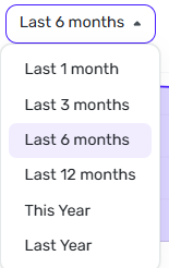
Whereas it used to show me the value over time since I added the account. This is an annoying change for me! And I wonder if the scale options got changed along with it.
0 -
I also believe that if we submit a bug request and they want us to convert it to an idea, the coaches should change the thread type for us, instead of asking us to go through the steps to create a brand new post. This seems to come up a lot and sometimes makes me hesitate to report issues since I'm just going to end up making more work for myself.
0