Access horizontal scroll bar on bottom of transaction screen without having to scroll down (edited)

using Chrome on MacOS Tahoe version 26.4.1 when scrolling left and right in the transaction window there is no navigation bar. Need to use the touchpad to go left and right. Inconsistently this defaults to going back a webpage, resetting anywork done in the transaction window. A simple, manual navigation bar on the bottom of the transaction window will solve this intermittent problem.
Comments
-
@Simpli_User_101, thanks for taking the time to post this to the Community!
I went ahead and moved this out of Feature Requests, since there is already a scroll bar at the bottom of the transactions list in Quicken Simplifi. We want to make sure you know how to access it. To do so, you'll need to scroll the right-hand scrollbar to the very bottom:
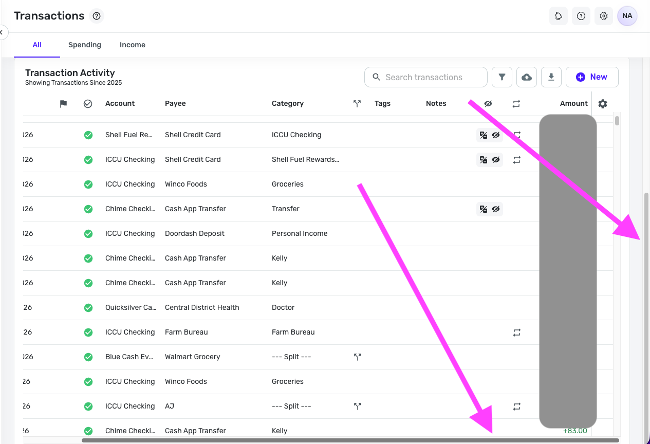
Let us know if this helps with what you're looking for!
-Coach Natalie
0 -
Confirming this feature exists. It needs to be available at any time, not when the right scroll bar is at the bottom. Some use cases that seem somewhat obvious to me:
- i want to scroll left and right ON THE TRANSACTION I AM LOOKING AT. I dont want to have to scroll all the the way to the bottom of my transaction list to scroll left than go find the transaction i was trying to originally looking at.
- The right scroll bar apparently only shows up when you first enter the transaction screen and disappears shortly after, forcing the trackpad scroll down to get to bottom of the list.
- Even if you do grab the right scroll bar and drag it all the way to the bottom, it doesnt go all the way to the bottom, for me it stopped at Nov 2023, I needed to scroll to Jul 2023.
Left-Right scroll bars have been around since the dawn of mozilla. This isnt a hard ask, its basic a GUI option going back like 30 years. A person shouldnt have to do mutiple steps to scroll left and right. We live in 2026.
Its also not addressing the weirdness of chrome just randomly deciding simplifi shouldnt scroll left and right in the transaction window and start treating like a web page back and forth options.
0 -
Thank you for sharing your feedback!
Since you want to see a change in how Quicken Simplifi currently functions, I changed this back to an Idea post and edited the title to make the request clearer. [Edited - Removed recommendation to create an Idea post, since this discussion was originally an Idea post]
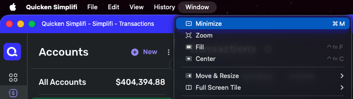
In the meantime, adjusting your browser's zoom may help reduce the annoyance. If you use the web app, clicking on Window gives some options which may help:
Thank you!
-Coach Kristina
0 -
Reading upthread, it was original a feature request and was switched by a coach. I'd be annoyed to have to recreate a post because of that!!
1 -
i want to scroll left and right ON THE TRANSACTION I AM LOOKING AT. I dont want to have to scroll all the the way to the bottom of my transaction list to scroll left than go find the transaction i was trying to originally looking at.
You don't have to scroll to the bottom of the transaction list. You can keep the same transaction in view the whole time.
The far-right scroll bar just brings the transaction list pane farther up the screen so you can see the entire pane, including the bottom of the pane (not the bottom of the transaction list itself). You need to see the bottom of the pane because that's where the scroll bar is.
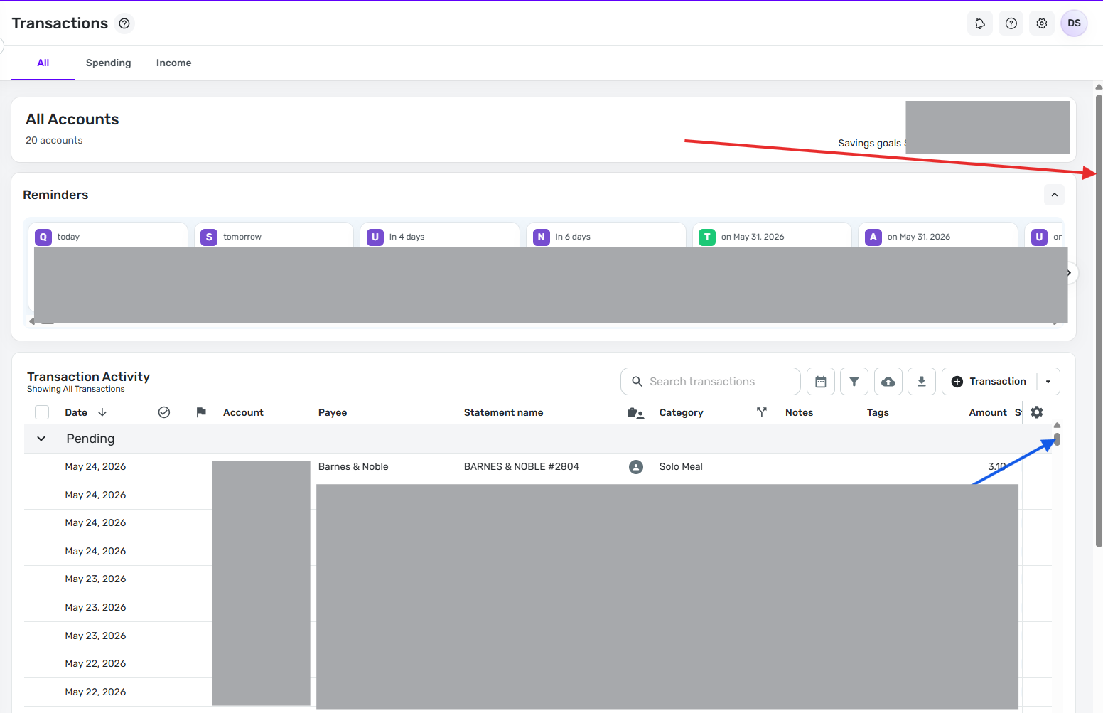
Here's an image before I pull the far-right scroll bar down. Note that the far-right scroll bar is at all the way to the top, the top transaction is for $18.45, and the left-right scroll bar is not on the screen.
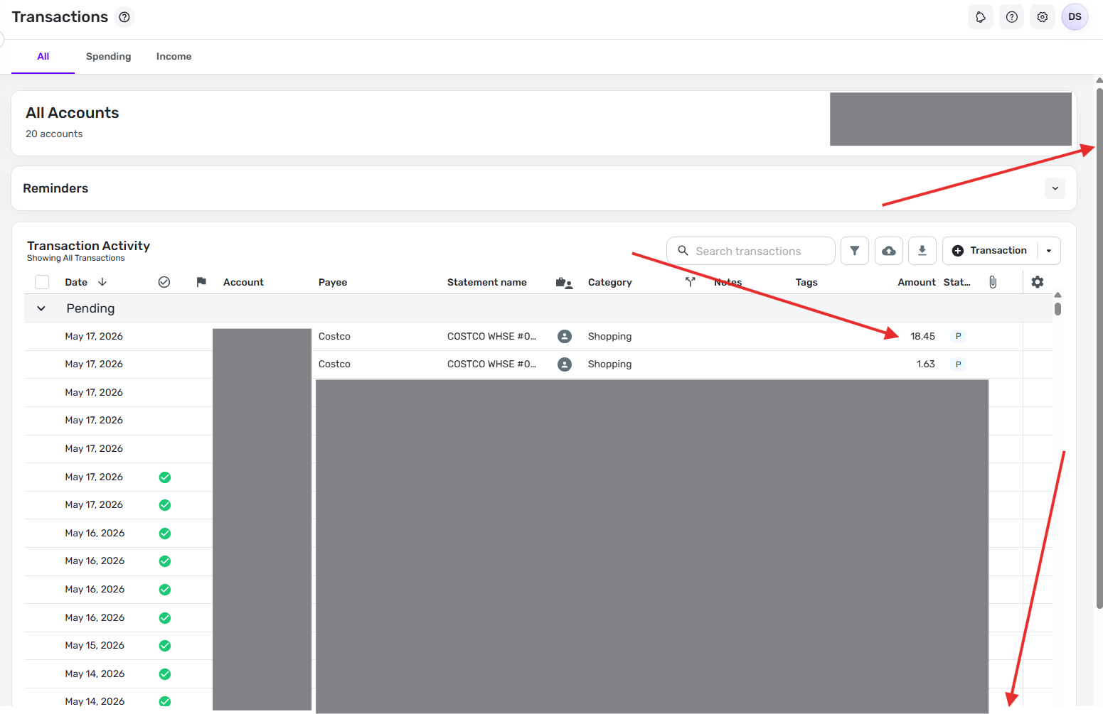
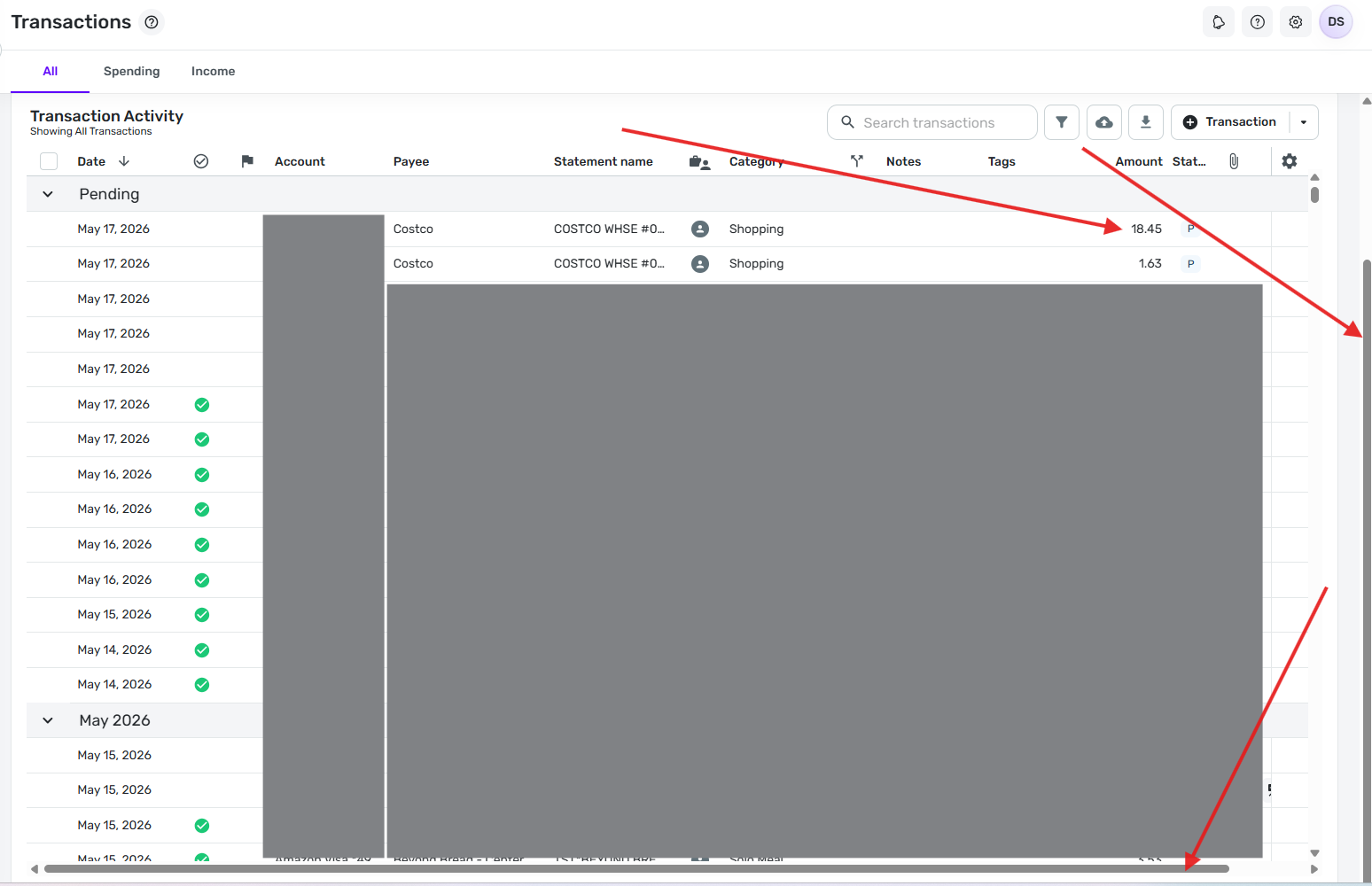
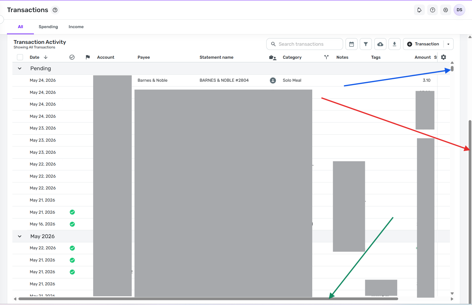
Now here's an image after I pull the far-right scroll bar all the way down (on my screen I move it about 1.5 inches). Note that the far-right scroll bar is now all the way to the bottom, the top transaction is still the same one for $18.45, and the left-right scroll bar is now showing at the bottom of the screen.
DryHeat
-Quicken Classic (1990-2020), CountAbout (2021-2024), Simplifi (2025-…)0 -
Have you had an opportunity to try using the far-right scroll bar as suggested in my last post?
I'd like to know if the explanation was clear enough to solve your problem
DryHeat
-Quicken Classic (1990-2020), CountAbout (2021-2024), Simplifi (2025-…)0 -
@DryHeat i think its relative to how many transactions you show in the transaction view. based on the size of your right side scroll bar it doesnt seem like you have to many transactions in your view. when all transactions are showing my screen continues to perform per my original post. This isn't asking for very much. This is basic webpage coding going back to the 1990s, scroll bar on the right, scroll bar on the bottom simple. doesn't need to be over thought.
0 -
I think it's also related to whether you have the Reminders section minimized.
0 -
i think its relative to how many transactions you show in the transaction view.
No, that's not the issue .. I have hundreds of transactions in that transaction view.
I think the problem is probably that you are moving the wrong scroll bar. In the image below, you can see that there are two scroll bars on the right hand side.
The outside one (red arrow) is for the main window. The inside one (blue arrow) is for the Transaction Activity window. In this first image, the outside scroll bar (red arrow) is at the top. In this position, you can see the top part of the Transaction Activity window but not the bottom part where the horizontal scroll bar is.
You need to scroll the outside scroll bar (red arrow) down so that the entire Transaction Activity window is in view. Then you can see the horizontal scroll bar (green arrow) at the bottom.
As you can see in this image, the Transaction Activity scroll bar (blue arrow) is still at the top of the screen so I am still seeing the same first transaction (from today) at the top of the list.
If that doesn't work for you, maybe you could upload images of what you are seeing on the screen so that we can try to figure out what the problem is.
It doesn't matter if the Reminders section is collapsed. When you scroll the outside scroll bar to the bottom the full Transaction Activity window comes up either way.
DryHeat
-Quicken Classic (1990-2020), CountAbout (2021-2024), Simplifi (2025-…)0 -
I think the bottom line is that you shouldn't need to scroll to the bottom to see the right-left scroll bar
0 -
you shouldn't need to scroll to the bottom to see the right-left scroll bar
What would be the best way to do that?
Would you want to make the Transaction Activity window shorter so that it would fit entirely on the screen along with the Account balance/info section and the Reminders section? That way you wouldn't have to scroll the main window to bring the full Transaction Activity window into view.
But then the Transaction Activity window would be kind of small. Is there another way?
DryHeat
-Quicken Classic (1990-2020), CountAbout (2021-2024), Simplifi (2025-…)0 -
Why not have the horizontal scroll bar show at the bottom of the transactions, even when the transaction activity window section isn't fully shown on the screen?
0 -
The scroll bars are usually built into the bottom of the list container control. Changing that would be hard.
But since I only have to scroll the main window scroll bar down a couple of inches to bring the entire Transaction Activity list onto the screen, and since doing that doesn't scroll the transactions at all (which is what @Simpli_User_101 was worried about), the current setup doesn't bother me.
DryHeat
-Quicken Classic (1990-2020), CountAbout (2021-2024), Simplifi (2025-…)0 -
Why can't it be stickied on top of the container like a header or footer on a website that's still there when you scroll?
In MS Excel and Word (when zoomed in) you can scroll right to left without scrolling all the way down.
0 -
Are we talking about the same thing?
When you say "scroll all the way down" are you talking about
- scrolling down through all the transactions in the transaction list?
- or just pulling the far-right (outer) scroll bar down an inch or two?
(See the images I posted above if that question isn't clear.)
As for "sticking it to the top of the container," the only thing I can offer is what I already said:
The scroll bars are usually built into the bottom of the list container control. Changing that would be hard.
DryHeat
-Quicken Classic (1990-2020), CountAbout (2021-2024), Simplifi (2025-…)0 -
I mean the second. I don't usually use that scroll bar on the right, the only time I've ever needed to is if I have columns that dont all fit and I need to find the horizontal scroll bar.
0 -
The only advantage that I see of having the scroll bar on the right is so that you can scroll to fill the window with the transaction list instead of dedicating the top 1/3 or so to the account details and reminders section. Maybe instead of having two scroll bars which can be confusing, there should be a toggle button to make the Transactions list full screen so that it covers the account info and reminders section, and can be toggled off as needed.
That way the horizontal scroll bar can always show, and there will just be one vertical scroll bar to scroll through the transaction list.
0 -
The only advantage that I see of having the scroll bar on the right is so that you can scroll to fill the window with the transaction list instead of dedicating the top 1/3 or so to the account details and reminders section.
Right… That's exactly the reason to have it. It lets me see about 20 transactions at a time instead of 12-13. I like to be able to scan a lot of transactions, so I use it all the time.
I'm used to database programs with nested containers, so I don't find the two scroll bars confusing. I could easily learn to use an "expand/shrink" button like you suggest, but it wouldn't really be any better for me than just moving the scroll bar an inch or two. And I already know how to do that.
DryHeat
-Quicken Classic (1990-2020), CountAbout (2021-2024), Simplifi (2025-…)0 -
I don't find it confusing either, but it seems that some people do. But if Simplifi can't find another way to show the horizontal scroll bar without having to scroll vertically then I would support switching to a full screen mode idea.
0 -
What I mentioned earlier, a way to expand the transaction list so it fills the height of the screen, temporarily. Optionally fill the width also but I'm not sure if that's necessary.
0 -
@DryHeat Confirming I am seeing the outside vs. inside right-hand scroll bar. The bottom (left-right) scroll bar will materialize if the outside right-hand scroll bar is all the way down, showing the full window for transactions. When the outside right-hand scroll bar is all the way down, the Mac touchpad will scroll left and right. When the outside right-hand scroll bar is still at the top, the Mac touchpad will default to webpage forward and backward, taking you away from transactions.
You've identified the issue; thank you. That helps.
This is some [Removed - Language] UI though. Just re-read that top paragraph again and try to explain that to a new user and not expect them to say "that's stupid."
[Edited - Readability]1 -
I'm glad it is finally working for you.
And you are not alone in your thinking on this. As you can see above, @EL1234 also thinks that the two scroll bars on the right can be confusing to new users.
DryHeat
-Quicken Classic (1990-2020), CountAbout (2021-2024), Simplifi (2025-…)0


