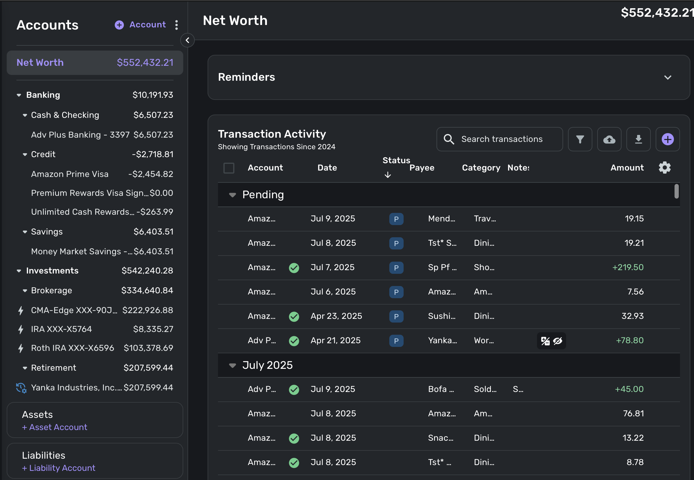
When you first open the transactions page, because the accounts tab is default open, you get ZERO info about your transactions at first glance because all the information is abbreviated for space. You get the exact same account information on the "Dashboard" page so providing it here is redundant and makes the page less useful for managing transactions. Having to manually collapse the window is an additional step that is now becoming a chore I'm sick of doing.
Please give me the option to add or REMOVE windows from this page. I would remove "Accounts" and "Reminders" and "net worth" - all not needed for a page dedicated to managing and updating transactions.
Also, please let me customize the columns and the width of the columns. Look at how much wasted space there is! There could be beautiful info there but instead just nothing.