Please add graph showing net worth change over set time periods that are changeable (3mo, 6mo, 1 year, All). This would be great to see also with investments and property etc..
It should show both the percent change, and the dollar amount of change.
@codyhaven, thanks for posting your suggestion to the Community!
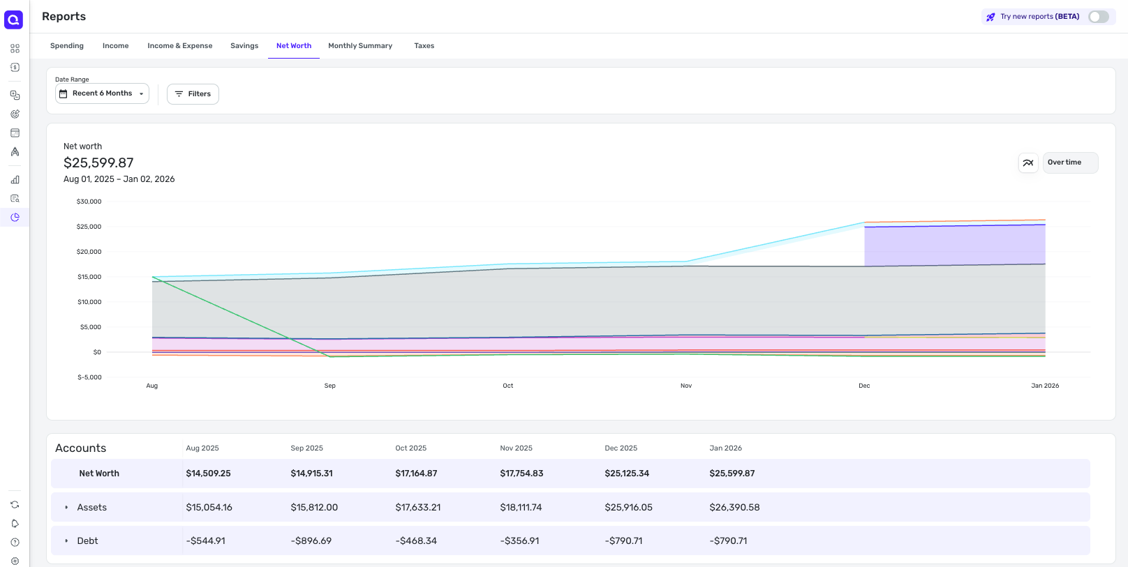
I have moved this out of Feature Requests so we can do some educating, as a Net Worth Report already exists in Quicken Simplifi. With the Net Worth Report, you can view your net worth over time, as well as filter to specific date ranges, accounts, etc.
If you're looking for percentages in Reports, we have an existing request here that you can vote for and follow for updates:
I'm not finding an existing request for the dollar amount of change in the Net Worth Report or Reports in general, but you are certainly welcome to create one for that. Just please keep in mind that Idea posts need to be limited to just one suggestion per post. The following FAQ has more details.
I hope this helps!