Hello! I am really liking Simplifi.
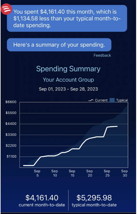
The app already has a notificatiom which shares how much your spending compares to the average per month, but it only shows up periodically.
It would be great if the app could show this information whenever the user wants such as a report or a different representation of the spending plan.
A really neat way to show it is a line graph of current spending compared with the average line graph for linked the last (3, 6, X months). I find trying to beat my average month's spending to be big motivator!
Thanks!