Reports: Add "All Time" range and "By Year" display option for annual comparison in all reports
Comments
-
I just noticed that Reports in the mobile app do list the months with the totals, but it would be very helpful if that was also in the desktop app. Would also be helpful to also show the average per month, lowest month, and highest month.
2 -
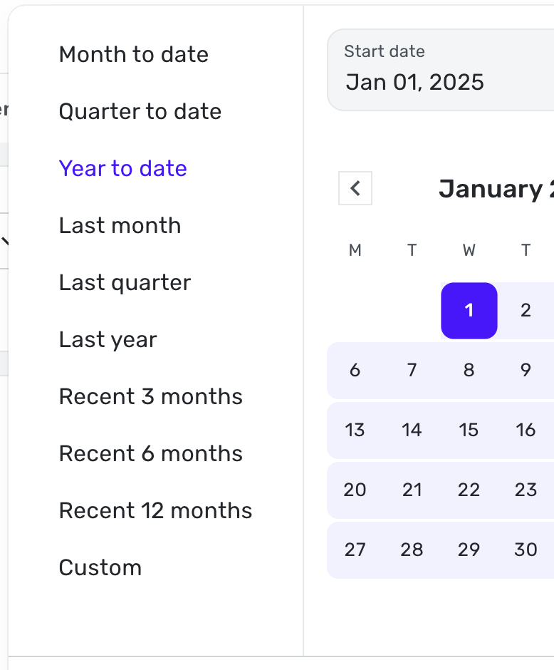
Within the reports tab it would be very helpful to have an additional date range of "All Time." I like to review expenses over time and I currently have manually select dates to capture data from account inception.
0 -
Agree- "All Time" is a crucial date range for all reporting, currently missing. Manually entering dates is cumbersome on the website. Also, need monthly average calculations when reporting over time. thank you.
0 -
QS team, Thanks for recently adding the Recent 12 months. It's helpful to see 12 months worth of spending.
I would like to see "All Time" added here as well. Here's an example:
- I want to see what my car is costing over the course of time, per year or a large interval.
- I want to see how my insurance costs have increased on an annual basis
- I want to see how how much I spend on vacation each year
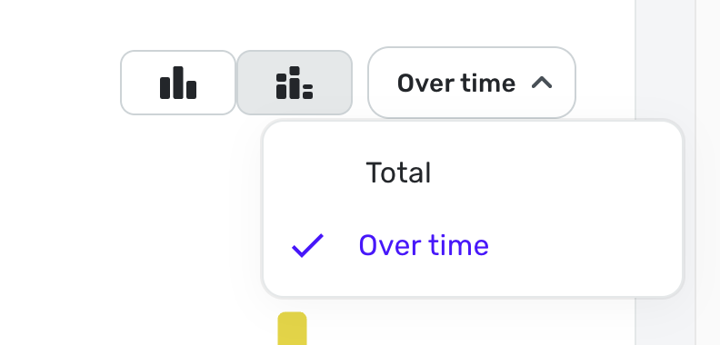
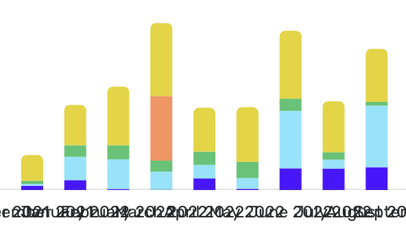
But here is a problem that will need to be addressed at the same time when viewing long periods of time. I selected about 3 years worth of time via Custom, then selected "Over Time".
Quicken continues to show each month vs showing a larger range, like quarters or years. The SW will need to adjust the view based on duration and available screen width.
For me, adding All Time AND to see the spend Over Time would be a complete solution. Of course the normal All Time pie chart should be part of the report.
2 -
Instead of having to select Custom, then select the correct date as the end end each time I want to use this function, it would be convenient to have an option to display All Time under Date Range. Mint used to have that and I used it heavily.
1 -
I added my vote as well. This seems an easy addition to Simplifi.
Steve
Quicken Simplifi (Safari & iOS) Since 2021
Quicken Classic (MacOS) Since 2009
Dollars & $ense (DOS) and MS Money (Windows) 1987-20090 -
bump! would be extra helpful with the ability to save reports now! would love to know how much i've spent on a tag in my lifetime.
1


