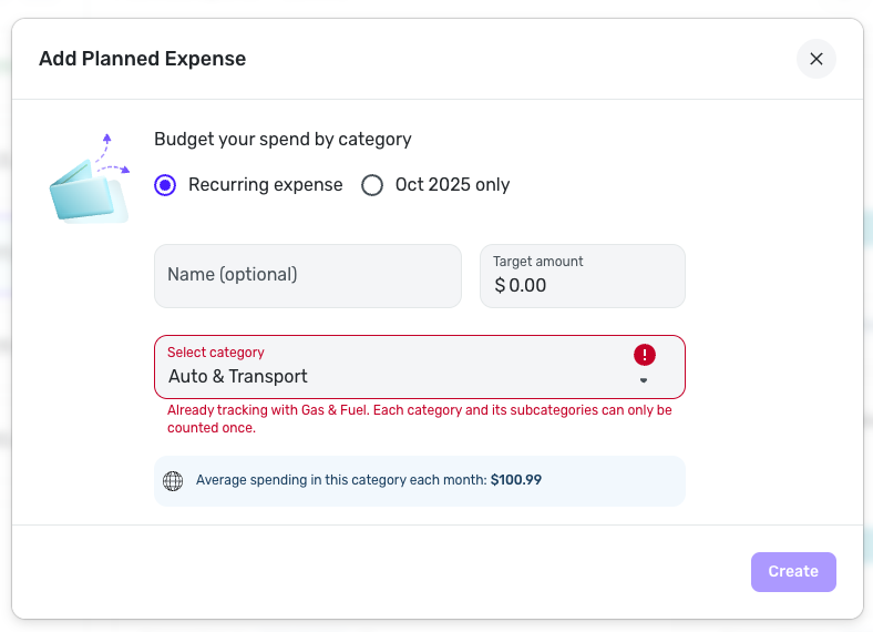
Ability to create Planned Spending Expenses for both Parent and Child Categories (edited)
It would be the most helpful to get more customized options for the planned spending categories. Rather than creating only one planned spend for the umbrella category it would be helpful to get the option to break those out into their own should i choose to or to create my own custom category.
Also, While the interface is decent enough, Having a view option to have a better overview in single list form with the graph would be easier to view rather than the two column format.
Comments
-
i would really like that the numbers in planned spending align with the bar graph - right now the amount left is on the left side but it is on the right side of the chart in green. Vice versa the amount used is noted on the right side but it is on the left side in blue on the chart. Completely counterintuitiv
0 -
I think having the bars in one column in a more compressed format would easier to read. I agree with moving the "amount left" to the right. I'd also like a way to reorder them.
0 -
Hey everyone, thanks for sharing your feedback!
Since we want to limit Idea posts to just one suggestion per post, this request has been edited to include just the ability to create Planned Spending expenses for both parent and child categories. For the request to see Planned Spending items in a list format, please be sure to add your votes here instead:
And if there are any other requests regarding Planned Spending, such as inverting the "spent" and "left" amounts on the Planned Spending cards in what I'm assuming is the Quicken Simplifi Mobile App, please be sure to create a separate post requesting this so other users can vote on it.
Thanks, and great suggestions!
-Coach Natalie
-Coach Natalie
0 -
For example:
I want to track both my general auto spending and my specific fuel spending. However, if I add both of them to my Spending Plan, my fuel purchases get counted twice since they appear in both entries.
Is there a way for the system to recognize that a transaction appears twice in the Spending Plan? I would want it counted for each category so I had an accurate picture of each category, but I'd only want it counted once in the "Planned Spend" total.
I'd love to see what others think of this as well!
0 -
I solved the dilemma by using Planned Spending for gasoline, and then anything else is a bill.
Recurring Bills are Oil Changes 2x a year, Personal Property Tax 1x a year, Car Tags 1x a year. Any unexpected bills are marked one-time bills.
But I agree that it would be nice to be able to have 2 Planned Spending categories for Auto - Gasoline and one for Gasoline only.
However budgeting for unexpected car repairs is difficult. So I just make it a one-time bill. And this works for me.
Steve
Quicken Simplifi (Safari & iOS) Since 2021
Quicken Classic (MacOS) Since 2009
Dollars & Sense (DOS) and MS Money (Windows) 1987-20090 -
Double Counting (if that's what's happening) transactions under TWO planned spending categories should not be happening if it is, that sounds like a bug to me. Transactions should start counting towards planned spending at the most -specific- category before being considered at the. more -general- (higher level) category.
—
Rob Wilkens
0 -
@mmmartian, thank you for posting your suggestion to the Community!
Since your request is similar to this existing request, I have merged it here. However, I agree with Rob that transactions are NOT supposed to be counted twice in the Spending Plan. In fact, since I have Gas & Fuel set up as a Planned Spend expense, I am unable to set one up for the Parent Category of Auto & Transport.
With that, if you are truly seeing transactions being double-counted in the Spending Plan, or Planned Spend specifically, I would recommend creating a troubleshooting post rather than a feature request so others can help you.
I hope this helps get you pointed in the right direction!
-Coach Natalie
0


