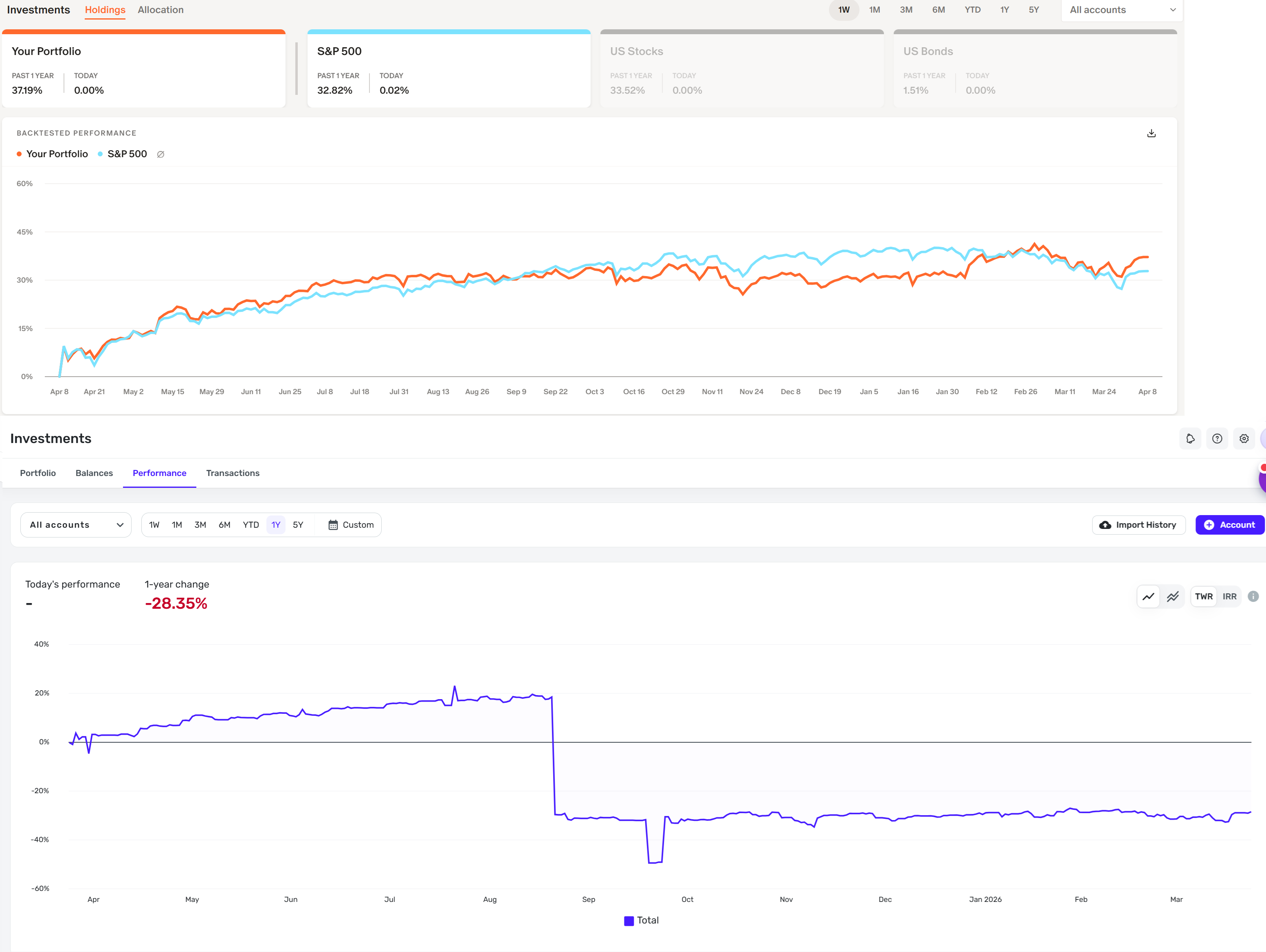
Improve the look of the lines on the investment performance chart and include S&P 500 comparison

Monarch has a better look to their lines on the investment performance charts and also gives you a nice comparison to see how you stack up in performance against the S&P 500 (it even does this as you hover over the lines for all the dates). Would love to see these two areas improved.
See the attached image as an example of monarch compared to simplifi. The chart lines in simplifi look more bland. I think maybe increasing the thickness of the lines would help.
Comments
-
@gerard143, thanks for posting your suggestions to the Community!
The best way to request changes or enhancements for Quicken Simplifi is to create an Idea post for each individual request so other users can vote on it and our product team can review it. You can also search through existing requests to add your vote and feedback to any you'd like to see implemented. Our FAQ here has more details on the Idea process in the Community:
In this case, there is an existing request for investment performance comparisons that can be found here:
Any additional requests, such as increasing the line thickness in the Investments Performance graph, can be submitted by creating a separate request for each one. If you end up creating a duplicate Idea, we will merge it with the original Idea that already has votes and user feedback.
I hope this helps get you pointed in the right direction!
-Coach Natalie
2
